Warehouse A has 1,000 units.
➤
Warehouse B has 800 units.
Real-world Applications ❘ 129
➤
Demand:
➤
Store 1 needs 500 units.
➤
Store 2 needs 900 units.
➤
Store 3 needs 400 units.
➤
(Total supply = 1,800, total demand = 1,800. They match.)
➤
Shipping costs (per unit):
➤
From Warehouse A to Store 1: $2
➤
From Warehouse A to Store 2: $4
➤
From Warehouse A to Store 3: $5
➤
From Warehouse B to Store 1: $3
➤
From Warehouse B to Store 2: $6
➤
From Warehouse B to Store 3: $3
The question is, how many units should you ship from each warehouse to each store to meet all demand, respect all supply limits, and do so at the minimum possible cost?
Step 2: Define Objective and Constraints
You now need to translate this business reality into the vectors and matrices that linprog understands. Listing 6-12 first defines the decision variables. There are six possible shipping routes (2 warehouses * 3 stores). You can flatten these into a single list of six variables: A->S1, A->S2, A->S3, B->S1, B->S2, and B->S3.
Next, you define the objective function. You want to minimize total cost, so you need to create a cost vector c containing the shipping prices for these six routes in order.
Finally, you define the constraints. In this problem, the constraints are equalities: the amount shipped from Warehouse A must exactly equal 1,000, and the amount received by Store 1 must exactly equal 500. Listing 6-12 sets this up using the A_eq matrix (defining which routes contribute to which constraint) and the b_eq vector (the actual supply/demand limits).
LISTING 6-12: SETTING UP THE TRANSPORTATION PROBLEM
import numpy as np
from scipy.optimize import linprog
# --- Step 1: Define the Problem ---
# Objective function (to be minimized):
# Cost = 2*x1 + 4*x2 + 5*x3 + 3*x4 + 6*x5 + 3*x6
c = [2, 4, 5, 3, 6, 3]
# Constraints (Equality): A_eq @ x = b_eq
130 ❘ CHAPTER 6 OPTimizATiOn TECHniquES fOR BuSinESS STRATEgy
# We have 5 constraints (2 supply, 3 demand)
# Variables: [x1, x2, x3, x4, x5, x6]
A_eq = [
[1, 1, 1, 0, 0, 0], # Wh. A Supply
[0, 0, 0, 1, 1, 1], # Wh. B Supply
[1, 0, 0, 1, 0, 0], # Store 1 Demand
[0, 1, 0, 0, 1, 0], # Store 2 Demand
[0, 0, 1, 0, 0, 1] # Store 3 Demand
]
b_eq = [
1000, # Wh. A Supply
800, # Wh. B Supply
500, # Store 1 Demand
900, # Store 2 Demand
400 # Store 3 Demand
]
# --- Define the Bounds ---
# We can't ship negative units
bounds = (0, None)
The final lines of Listing 6-12 set up logical limits on the variables. The only limit here is physical reality: you cannot ship a negative number of products.
Step 3: Optimizing
With the problem fully translated into c, A_eq, b_eq, and bounds, you can hand it off to the solver.
The method=‘highs’ is SciPy’s recommended modern solver for these types of problems. The code in Listing 6-13 runs the solver and displays the results.
LISTING 6-13: RUNNING THE SOLVER AND DISPLAYING THE RESULTS
# --- Step 3: Run the Optimizer ---
result = linprog(c, A_eq=A_eq, b_eq=b_eq, bounds=bounds, method='highs')
# --- Step 4: Interpret the Results ---
if result.success:
shipping_plan = result.x.reshape(2, 3) # Reshape 1x6 array into 2x3 matrix min_cost = result.fun
print("--- Optimal Shipping Plan (Units) ---")
print(f" Store 1 | Store 2 | Store 3")
print(f"Warehouse A: {shipping_plan[0, 0]:>7.0f} | {shipping_
plan[0, 1]:>7.0f} | {shipping_plan[0, 2]:>7.0f}")
print(f"Warehouse B: {shipping_plan[1, 0]:>7.0f} | {shipping_
plan[1, 1]:>7.0f} | {shipping_plan[1, 2]:>7.0f}")
print("\n---")
print(f"Total Minimized Shipping Cost: ${min_cost:.2f}")
else:
print("Optimization failed.")
print(result.message)
Real-world Applications ❘ 131
The optimizer has produced a clear, actionable plan. To minimize costs, Warehouse A should handle all of Store 1’s and Store 3’s demand, plus a small part of Store 2’s. Warehouse B should focus all its supply on fulfilling the rest of Store 2’s large demand. You see this in the results:
--- Optimal Shipping Plan (Units) ---
Store 1 | Store 2 | Store 3
Warehouse A: 100 | 900 | 0
Warehouse B: 400 | 0 | 400
---
Total Minimized Shipping Cost: $6200.00
Any other combination of shipments, while it might fulfill the demand, would result in a higher total cost. This is the kind of problem that saves large companies millions of dollars in logistics.
Integer Programming for Workforce Scheduling
So far, these optimization tools have served you well, but they share a common assumption: that the answers can be fractional. And for many problems, that’s perfectly fine. It makes sense to allocate 38.38% of a portfolio or to understand that the theoretical profit peak is at 714.29 units. You can simply round to the nearest whole number.
However, sometimes you are confronted with decisions where rounding is not just inaccurate, it’s not possible. Consider the following scenario.
Imagine you’re a manager. Your optimization model tells you to dispatch 2.5 trucks to a new location. How do you dispatch half a truck? Or a model for a factory expansion that returns an answer of 0.6, when the only options are Yes (1) or No (0). The most common version of this problem is workforce scheduling. You simply cannot schedule 0.7 of an employee to cover a shift.
These situations require a new, more specialized tool: integer programming (IP). This is a branch of optimization where some, or all, of the decision variables are restricted to being whole numbers.
Fortunately, the workhorse scipy.optimize.linprog has a parameter called integrality that allows you to solve exactly these kinds of puzzles.
Let’s step into the shoes of a call center manager. They have a classic, real-world scheduling puzzle.
They need to create a weekly staffing plan that meets the minimum number of employees required for each day, all while paying the lowest possible labor cost.
The core of the challenge lies in the shift structure. Each employee works for five consecutive days and then gets two days off. This means there are only seven possible “shift types” an employee can have (one starting on Monday, one on Tuesday, and so on). Each employee costs the company a flat $500 per week, regardless of which shift they are on.
The manager’s daily demand, however, is not flat. The call volume fluctuates, requiring a different number of employees each day: 17 on Monday, 13 on Tuesday, 15 on Wednesday, 19 on Thursday, 17 on Friday, 10 on Saturday, and only 8 on Sunday.
The question is, how many employees should be hired for each of the seven shift types to meet this fluctuating daily demand at the absolute minimum cost?
132 ❘ CHAPTER 6 OPTimizATiOn TECHniquES fOR BuSinESS STRATEgy Step 1: formulating the Problem
This is an integer programming problem. You can’t hire 2.5 people for the “Monday Start” shift. The answer must be a whole number.
First, you need to define the seven variables, which represent the seven decisions the manager has to make: x_mon (the number of employees starting on Monday), x_tue (starting on Tuesday), and so on, all the way to x_sun.
Second, you define the objective function. This is simple: you want to minimize the total cost. Since every employee costs $500, the function is Cost = 500*x_mon + 500*x_tue + ... + 500*x_sun.
Third, you build the constraints. This is the tricky part. You need to ensure that the number of people working on any given day is greater than or equal to that day’s demand. Let’s take Monday as an example. Who is on duty on a Monday?
➤
Employees who started their five-day shift on Monday (today).
➤
Employees who started on Sunday (day 2 of their shift).
➤
Employees who started on Saturday (day 3 of their shift).
➤
Employees who started on Friday (day 4 of their shift).
➤
Employees who started on Thursday (day 5 of their shift). Employees who started on Tuesday or Wednesday are on their days off.
So, the constraint for Monday becomes: x_mon + x_thu + x_fri + x_sat + x_sun >= 17
You then build a similar constraint for all seven days of the week, resulting in a system of seven inequalities. With this “blueprint” in hand, you can feed the problem to the solver. The resulting code is shown in Listing 6-14.
LISTING 6-14: INTEGER PROGRAMMING FOR WORK SCHEDULES
import numpy as np
from scipy.optimize import linprog
# --- Step 1: Define the Problem ---
# Objective function (Minimize Cost):
# Cost = 500*x1 + 500*x2 + ... + 500*x7
c = [500] * 7 # Cost is $500 for each of the 7 shift types
# Constraints (Left-hand side): A_ub @ x >= b_ub
# To make it "greater than", we multiply A and b by -1
# A_ub @ x <= b_ub ---> -A_ub @ x >= -b_ub
#
# Mon Tue Wed Thu Fri Sat Sun (Shifts Starting)
# Mon: 1 0 0 1 1 1 1 >= 17
# Tue: 1 1 0 0 1 1 1 >= 13
# Wed: 1 1 1 0 0 1 1 >= 15
# Thu: 1 1 1 1 0 0 1 >= 19
Real-world Applications ❘ 133
# Fri: 1 1 1 1 1 0 0 >= 17
# Sat: 0 1 1 1 1 1 0 >= 10
# Sun: 0 0 1 1 1 1 1 >= 8
A_ub = -np.array([
[1, 0, 0, 1, 1, 1, 1], # Mon
[1, 1, 0, 0, 1, 1, 1], # Tue
[1, 1, 1, 0, 0, 1, 1], # Wed
[1, 1, 1, 1, 0, 0, 1], # Thu
[1, 1, 1, 1, 1, 0, 0], # Fri
[0, 1, 1, 1, 1, 1, 0], # Sat
[0, 0, 1, 1, 1, 1, 1] # Sun
])
b_ub = -np.array([17, 13, 15, 19, 17, 10, 8]) # Daily minimums
# --- Step 2: Define Bounds and Integrality ---
bounds = (0, None) # Can't hire negative people
# Tell the solver all 7 variables must be integers
integrality = [1] * 7
# --- Step 3: Run the Optimizer ---
result = linprog(c, A_ub=A_ub, b_ub=b_ub, bounds=bounds, integrality=integrality, method='highs')
# --- Step 4: Interpret the Results ---
if result.success:
schedule = result.x
min_cost = result.fun
total_employees = np.sum(schedule)
days = ['Monday', 'Tuesday', 'Wednesday', 'Thursday', 'Friday', 'Saturday',
'Sunday']
print("--- Optimal Staffing Schedule ---")
print("Employees starting on:")
for i, num in enumerate(schedule):
print(f" {days[i]:<10}: {num:.0f}")
print("\n---")
print(f"Total Employees Hired: {total_employees:.0f}")
print(f"Total Minimized Weekly Cost: ${min_cost:.2f}")
else:
print("Optimization failed.")
print(result.message)
Step 2: interpreting the Results
The results of the solver are as follows:
--- Optimal Staffing Schedule ---
Employees starting on:
Monday : 6
Tuesday : 4
Wednesday : 0
Thursday : 7
134 ❘ CHAPTER 6 OPTimizATiOn TECHniquES fOR BuSinESS STRATEgy Friday : 0
Saturday : 0
Sunday : 2
--- Total Employees Hired: 19
Total Minimized Weekly Cost: $9500.00
This is a powerful, non-obvious solution. The solver determined that the most cost-effective way to meet the fluctuating daily demand is to hire a total of 19 employees, starting them on Monday, Tuesday, Thursday, and Sunday. No employees should start their shifts on Wednesday, Friday, or Saturday.
This plan meets all the minimum staffing requirements for each day at the absolute lowest possible cost. This type of integer programming is a fundamental tool for managers in operations, HR, and logistics.
SUMMARY
This chapter has been a journey, one that began with a single question from the last chapter: “how do you find the exact peak of the profit curve?” You’ve traveled from that one simple query to a complete framework for solving complex business problems. You’ve seen that every optimization problem, no matter how intimidating, can be broken down into two core components: an objective (what you want) and its constraints (the rules you must follow).
Using the scipy.optimize toolkit, you began by answering that initial question, finding the simple, unconstrained peak of the profit curve. From there, you moved into the world of real-world limits, using linear programming to solve a “product mix” problem where you discovered a surprising, non-obvious solution that maximized profit by focusing on a lower-margin product. You then explored the fundamental difference between unconstrained and constrained problems, visualizing the
“feasible region” that defines the boundaries of all real-world decisions.
With this foundation, you were ready to tackle truly complex nonlinear challenges, building an optimal financial portfolio and generating the efficient frontier to visualize the trade-off between risk and return. Your toolkit expanded again to solve tangible operations problems, including a complex supply chain logistics puzzle and an intricate integer programming problem for scheduling staff, where fractional answers simply weren’t an option. Finally, you brought all these concepts together by building a sophisticated pricing model that optimized for two interacting products.
You now have a proven framework for translating almost any business challenge, from finance to operations to marketing, into a solvable model. You have officially moved from analysis to prescription, and you are equipped with the tools to find not just a good solution, but the “best” one.
CONTINUE YOUR LEARNING
For readers who want to dive deeper into the powerful optimization tools discussed in this chapter, the following official resources are highly recommended:
Continue your Learning ❘ 135
➤
SciPy Optimization User Guide: The definitive guide to all solvers available in the library, including many advanced algorithms not covered here.
➤
Linear programming with SciPy: Detailed documentation on the linprog function, including advanced options for the “highs” solvers used in the examples.
➤
General minimization: In-depth details on the minimize function used for the portfolio examples, including the different algorithms available (like SLSQP and trust-constr).
➤
CVXPY: If you are interested in a more advanced, algebraic way to model complex convex optimization problems, CVXPY is the industry standard in Python.


7Probability and Statistics for
Business Analytics
In the previous chapter, the optimization models led to a powerful, precise answer: the optimal production quantity was 714.29 units, yielding a maximum profit of $10,714.29. But this answer was built on a critical assumption: that the inputs (cost, demand, etc.) were fixed, known numbers.
Business reality is much more complex. In that reality, the demand isn’t exactly 714, it’s around 714, and it could be 650 on a slow day or 800 during a sales rush. The variable costs aren’t exactly $50, they fluctuate. This chapter is about introducing the framework for making smart decisions in the face of this real-world uncertainty. It moves from the what-if analysis of the previous chapters to a what’s-likely analysis.
To do this, you will use a familiar and new set of Python libraries. You’ll use numpy.random to simulate this randomness, scipy.stats to run formal statistical tests, and statsmodels to build powerful models that explain why the numbers change.
THE PYTHON STATISTICS ECOSYSTEMS
Before diving into solving problems, it’s helpful to know what tools are available. Unlike optimization, which is dominated by scipy.optimize, the statistics landscape is a collaboration between several key libraries, each with a specific job:
➤
NumPy (numpy.random): NumPy’s core library provides the array structures, but its random submodule is the tool for creating data. You’ll see how to use it to simulate sales, model customer behavior, and generate the random inputs for the risk analysis.
➤
SciPy (scipy.stats): This is the primary statistical toolkit. Once you have data (either real or simulated), you use scipy.stats to analyze it. It’s packed with hundreds of functions for describing distributions, calculating confidence intervals, and, most importantly, running hypothesis tests like the t-test.
138 ❘ CHAPTER 7 PRoBABiliTy And STATiSTiCS foR BuSinESS AnAlyTiCS
➤
Statsmodels (statsmodels.api): To move beyond simple tests and find the relationship between variables (like how ad spend affects sales), you’ll use statsmodels. It’s famous for its ability to perform sophisticated linear regressions and produce detailed summary tables that help elucidate what’s driving your business.
➤
Pandas: This is the container that holds everything together. While not a statistics library itself, Pandas DataFrames are the standard way to load, clean, and organize the real-world data that you will feed into SciPy and Statsmodels.
NOTE These libraries are free and can be added using pip or conda.
The workflow in this chapter will generally follow this path: you will use numpy.random to simulate realistic data, scipy.stats to test it, and statsmodels to build predictive models from it.
While these packages serve as the foundation for probability and statistics, the landscape of statistical packages can be very broad depending on the problem you are trying to solve. We cannot cover all of the possible options in this chapter alone, so the “Continue Your Learning” section at the end of this chapter has more information on additional statistical libraries.
UNDERSTANDING RANDOM VARIABLES AND DISTRIBUTIONS
IN BUSINESS CONTEXTS
Before you can model uncertainty, you need a language to describe it. In statistics, we do this with random variables (a variable that can take on a range of values, not just one) and distributions (the shape of that randomness).
Imagine a random variable called daily sales. You know that tomorrow’s daily sales probably won’t be $10, and it probably won’t be $10 million, but it could be any number within a realistic range.
On Monday, daily sales are $480. On Tuesday, daily sales stop at $510, and it continues to $495 on Wednesday. Each day, it takes on a new, slightly different value based on all the random factors of the real world. Those factors that make daily sales move up and down, that’s what makes daily sales a random variable.
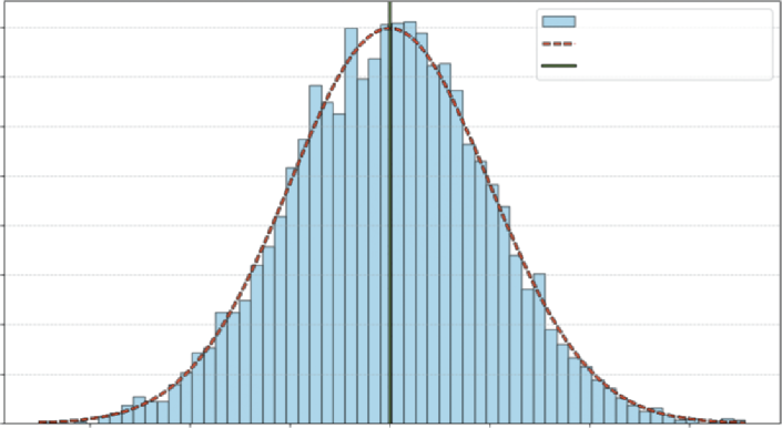
If you just looked at one or two days, you wouldn’t see a pattern. If you recorded and plotted this value for 1,000 days and grouped them together, you’d see a shape emerge such as the one shown
This shape is the distribution. You’d likely see a big pile of values clustered around the average and fewer and fewer values as you get farther out. This shape is the visual record of all the variable’s past movements. It also tells you the probability of where the variable might land next.
normal distribution, sometimes also referred to as a bell curve. It represents an empirical distribution because it uses real data to create the distribution.
Each bar represents the proportion of observations that are around that value, and the dashed line shows the general shape carted by the bars.
understanding Random Variables and distributions in Business Contexts ❘ 139
Daily Sales : Normal Distribution
0.008
Sample Data
PDF (µ = 500, σ = 50)
Mean: 500
0.007
0.006
vations 0.005
0.004
0.003
cent of ObsererP 0.002
0.001
0.000
350
400
450
500
550
600
650
Sales Amount
FIGURE 7-1: Distribution of daily sales.
You can see that this fits with what you generally know to be true in real life. Usually there is a baseline level of sales in business—sometimes that value goes up due to the holidays, and other times it goes down due to other events. The plot aligns with that reality, you can see that the daily sales observations around 500 shows up most frequently, and it is rare to see 400- or 600-dollar sales days.
Now that you have a general idea of what distributions and random variables look like, the next section explores how different data can create different distributions.
Discrete vs. Continuous Distributions
In business, we generally work with two key types of variables:
➤
Discrete variables: The variable can only take on specific, countable values. For example, a customer either converted (1) or did not convert (0). Another example is the number of items sold, which can be 1, 2, 3, and so on (you can’t sell 1.5 t-shirts, for example).
➤
Continuous variables: The variable can take on any value within a range. Examples include the exact time a user spends on your site (e.g., 12.534 seconds) or the exact amount of a sale.
This distinction between discrete and continuous variables is critical because it dictates how you model them. A discrete variable, like number of items sold, moves in distinct, whole-number steps (1, 2, 3). A continuous variable, like time spent on site, is measured, not counted, and can take on any fractional value (e.g., 12.51 or 12.52 seconds).
Once you’ve identified your variable’s type, the next logical step is to understand its behavior. Not all data fits the shape of the normal distribution. If you let a random variable (such as the number of items purchased) take on thousands of values, you would see a new distinct shape emerge.
140 ❘ CHAPTER 7 PRoBABiliTy And STATiSTiCS foR BuSinESS AnAlyTiCS
The Most Common Business Distributions
Now that you can classify your variables, you can explore the most common distributions used to model them. While there are dozens of statistical distributions, most business analysis will be driven by four key types. The key types discussed here are the normal distribution, binomial distribution, the uniform distribution, and the Poisson distribution. This section investigates the different distributions using NumPy and Matplotlib to plot their classic distributions.
The normal distribution (the “Bell Curve”)
The normal distribution is the most important continuous distribution in statistics. It’s the default model for countless real-world phenomena that cluster around an average, from product sales to variations in manufacturing. It’s defined by its mean (the average, or center) and its standard deviation (spread).
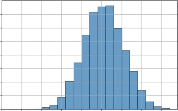
Listing 7-1 generates and visualizes a standard normal distribution (with a mean of 0 and a standard deviation of 1) and shows a classic shape.
LISTING 7-1: VISUALIZING THE NORMAL DISTRIBUTION
import numpy as np
import matplotlib.pyplot as plt
# 1. Normal Distribution (Continuous)
mu, sigma = 0, 1 # mean and standard deviation
s = np.random.normal(mu, sigma, 10000)
# --- Visualization ---
plt.figure(figsize=(8, 5))
plt.hist(s, bins=30, density=True, edgecolor='black', alpha=0.7)
plt.title('Normal Distribution (Bell Curve)')
plt.xlabel('Value')
plt.ylabel('Probability Density')
plt.grid(True)
plt.show()
Listing 7.1 uses np.random.normal(mu, sigma, 10000) to generate 10,000 random numbers drawn from a normal distribution with a mean of 0 and a standard deviation of 1. It then uses the bins=30 argument to divide the range of data values into 30 equal-width intervals (or buckets).
This groups the continuous data points into discrete chunks to visualize the frequency distribution. It then uses plt.hist() to plot these numbers. The density=True argument normalizes the histogram, representing 100% of outcomes.
Most values are clustered around the mean (0), and the probability of seeing a value tapers off as you get farther away. This is the shape of many business metrics, as you’ll see in the next example.

understanding Random Variables and distributions in Business Contexts ❘ 141
Normal Distribution (Bell Curve)
0.40
0.35
0.30
y
0.25
y Densit 0.20
robabilit 0.15
P
0.10
0.05
0.00–4
–3
–2
–1
0
1
2
3
4
Value
FIGURE 7-2: The normal distribution.
The Binomial distribution
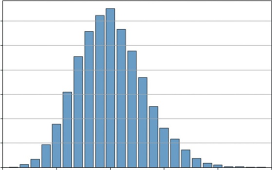
The binomial distribution is the most important discrete distribution for modeling a sequence of trials. It helps you model the number of successes you’ll get in a set number of trials. It is defined by n (the number of trials) and p (the probability of success for each trial).
Let’s visualize a common scenario: if you flip a fair coin 100 times (n = 100, p = 0.5), what is the likely number of heads? Listing 7-2 simulates this 10,000 times to build a distribution.
LISTING 7-2: VISUALIZING THE BINOMIAL DISTRIBUTION
import numpy as np
import matplotlib.pyplot as plt
# 2. Binomial Distribution (Discrete)
n, p = 100, 0.5 # number of trials, probability of success
s = np.random.binomial(n, p, 10000)
# --- Visualization ---
plt.figure(figsize=(8, 5))
plt.hist(s, bins=20, density=True, edgecolor='black', alpha=0.7)
plt.title('Binomial Distribution (100 Coin Flips)')
plt.xlabel('Number of Heads (Successes)')
plt.ylabel('Probability')
plt.grid(True)
plt.show()
Listing 7-2 uses np.random.binomial(n, p, 10000). This function performs the 100 coin flips experiment 10,000 times and records the number of successes for each experiment. The resulting
142 ❘ CHAPTER 7 PRoBABiliTy And STATiSTiCS foR BuSinESS AnAlyTiCS
Binomial Distribution (100 Coin Flips)
0.08
0.07
0.06
y 0.05
0.04
robabilitP 0.03
0.02
0.01
0.0025
30
35
40
45
50
55
60
65
Number of Heads (Successes)
FIGURE 7-3: The binomial distribution.
Outside of coins, where does this distribution show up in the business context? Imagine that you sent a marketing email to 1,000 people (n = 1,000). You have a 3% click-through rate (p = 0.03). What’s the likely range of people who will click? This model would tell you how many clicks to expect (around 30) and the probability of a great day (50 clicks) and a terrible day (10 clicks). This is the statistical engine behind all A/B testing and conversion rate analysis.
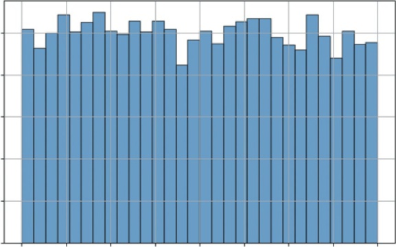
The uniform distribution
The uniform distribution is the simplest of all. It models a continuous situation where all outcomes in a given range are equally likely. It is defined by a low and high value.
Listing 7-3 illustrates a uniform distribution by using np.random.uniform(-1, 1, 10000) to generate 10,000 random numbers, where any value between −1 and 1 has an equal chance of being chosen.
LISTING 7-3: VISUALIZING THE UNIFORM DISTRIBUTION
import numpy as np
import matplotlib.pyplot as plt
# 3. Uniform Distribution (Continuous)
s = np.random.uniform(-1, 1, 10000)
# --- Visualization ---
plt.figure(figsize=(8, 5))
plt.hist(s, bins=30, density=True, edgecolor='black', alpha=0.7)
plt.title('Uniform Distribution (Equal Chance)')
plt.xlabel('Value')
understanding Random Variables and distributions in Business Contexts ❘ 143
plt.ylabel('Probability Density')
plt.grid(True)
plt.show()
the histogram is flat. This is the shape of pure, unbiased randomness within a defined range. You can see this type of distribution in business as well. Imagine that your supplier says the delivery will arrive in 5–10 days. You have no other information. When modeling this in a simulation, you would use a uniform distribution (low = 5, high = 10). It’s the most unbiased way to model uncertainty when you only know the minimum and maximum possible values.
The Poisson distribution
The Poisson distribution is another essential discrete distribution. Instead of modeling successes in n trials like the binomial, Poisson models the number of events that occur in a fixed interval of time or space. It is defined by a single parameter, lam (lambda), which is the average number of events in that interval.
This is the perfect model for your number of products sold. Let’s say a small e-commerce site averages 10 sales per hour. You want to simulate the number of sales they might get in any given hour. You can set up this model in Listing 7-4.
LISTING 7-4: VISUALIZING THE POISSON DISTRIBUTION
import numpy as np
import matplotlib.pyplot as plt
# 4. Poisson Distribution (Discrete)
avg_events_per_hour = 10
s = np.random.poisson(avg_events_per_hour, 10000)
# --- Visualization ---
plt.figure(figsize=(8, 5))
# We can use np.bincount to get the frequency of each integer
counts = np.bincount(s)
plt.bar(range(len(counts)), counts, align='center', edgecolor='black', alpha=0.7) plt.title(f'Poisson Distribution (Avg = {avg_events_per_hour} events/hour)') plt.xlabel('Number of Sales in One Hour')
plt.ylabel('Frequency (out of 10,000 simulations)')
plt.grid(axis='y')
plt.xlim([0, 25]) # Truncate x-axis for readability
plt.show()
This example uses np.random.poisson(avg_events_per_hour, 10000). This simulates 10,000
different hours and records the number of sales (events) that occurred in each. Instead of plt.hist, it uses plt.bar with np.bincount to create a clean bar chart, which is more appropriate for integer data like this.
the most likely outcome is the average of 10 sales. However, the distribution is not symmetrical (it’s “skewed right”). This model shows that it’s common to have 8 or 12
sales, but very rare to have 20, and impossible to have negative sales.
144 ❘ CHAPTER 7 PRoBABiliTy And STATiSTiCS foR BuSinESS AnAlyTiCS
Uniform Distribution (Equal Chance)
0.5
y 0.4
y Densit 0.3
robabilitP 0.2
0.1
0.0 –1.00 –0.75 –0.50 –0.25 0.00 0.25 0.50 0.75
1.00
Value
FIGURE 7-4: The uniform distribution.
Poisson Distribution (Avg = 10 events/hour)
1200
ulations) 1000
800
0,000 sim
600
y (out of 1 400
200
Frequenc
0 0
5
10
15
20
25
Number of Sales in One Hour
FIGURE 7-5: A histogram of simulated hourly sales.
HYPOTHESIS TESTING
Now that you can describe data with distributions, how do you make a decision with it or determine if a change makes a difference? This is the domain of hypothesis testing, the rigorous framework for answering the question: Did my change have a real effect, or did I just get lucky?
Hypothesis Testing ❘ 145
Imagine a classic business scenario: You run an A/B test on your website.
➤
Version A (Control): The current design.
➤
Version B (Test): A new design with a bigger Buy Now button.
You run the test for a week. The results come in: Version A had a 10% conversion rate, and Version B had a 12% conversion rate. It looks like Version B is the winner. But is it? Or is that 2% difference just random noise, the same way flipping a coin 10 times might give you six heads one day and four the next? You need a way to separate the signal from the noise. That is where hypothesis testing comes in.
Hypothesis testing works by setting up a debate between two competing viewpoints:
➤
The null hypothesis assumes that nothing interesting happened. In this example, the null hypothesis is: There is no real difference between Version A and Version B. Any difference you see is just random luck. In science and business, we always assume the null hypothesis is right until proven otherwise.
➤
The alternative hypothesis is what we are trying to prove. In this example, it is: There is a real difference; Version B is statistically better than Version A.
To settle the debate of which hypothesis is correct, you use a test statistic. This calculation effectively measures how far your observed data is from what the null hypothesis predicted. The two most common types are as follows:
➤
z-value (z-statistic): This measures how many standard deviations your result is from the mean. It is typically used when you have a large sample size (usually over 30) and you know the population’s variance.
➤
t-value (t-statistic): This is similar to the z-value but is adjusted for smaller sample sizes or when the population variance is unknown. It is slightly more conservative, accounting for the higher uncertainty in small datasets.
The decision to reject or fail to reject the null hypothesis using t-statistics (or z-statistics) and p-values is a two-step process that is logically equivalent but approaches the problem from different angles.
Test Statistics
Think of the test statistic as a standardized measure of how far your sample result is from what you expected under the null hypothesis. We use test statistics to make decisions. Another way you can think about them is we are projecting our data onto a typical distribution. When we make a decision, we are just looking at how abnormal our result is relative to the typical distribution. You can determine if your null hypothesis is incorrect by following a simple three-step process.
Step 1: Set a Critical Value
Before running the test, you decide on a critical region based on your confidence level (usually 95%).
For a standard two-tailed test, this critical value is often around 90% (for z-scores).
146 ❘ CHAPTER 7 PRoBABiliTy And STATiSTiCS foR BuSinESS AnAlyTiCS
Step 2: Calculate the Stat
You calculate a t-score (for smaller samples) or z-score (for large samples). This number represents how many standard deviations your result is away from the null hypothesis mean.
Step 3: Make a decision
Using your calculations, make a decision based on the following:
➤
If your calculated statistic is more extreme than the critical value (e.g., 2.5 > 1.96), your result falls into the “rejection region.” You reject the null hypothesis.
➤
If it is less extreme, you fail to reject the null hypothesis.
Notice that we never say we accept the null hypothesis. This is a subtle but critical distinction in statistics. Failing to reject the null hypothesis doesn’t mean you’ve proven it’s true; it simply means that you haven’t found enough evidence to prove it’s false. Think of it like a court trial: a defendant is found not guilty, never innocent. You assume the null is true until the evidence (the data) forces you to abandon it. If the p-value is high, the evidence was just too weak to convict.
The p-value
While test statistics are a powerful tool, calculating them is only half the battle. To make a final decision, you traditionally have to look up a “critical value” in a statistical table, which can feel like an extra, cumbersome step. This is where the p-value comes in. It simplifies the entire process by converting your test statistic into a single, intuitive probability.
Think of the p-value as a direct translation of your t-score or z-score into a language of likelihood.
Instead of asking, “Is my score of 2.5 greater than the critical value of 1.96?” the p-value answers a more direct question: If the skeptic were right and there was truly no effect, what are the odds I would see data this extreme just by random luck?
This connection is mathematically precise. A high-test statistic (representing a large difference from the norm) will always result in a low p-value (representing a low probability of luck). This means you can skip the lookup tables entirely. You simply compare your p-value directly to your risk tolerance. For most research studies, for example pharmaceutical trials, the comparison p-value is 0.05. A simple rule of thumb is as follows:
➤
If p < 0.05: The probability of this being luck is so low that you reject the skeptic’s view.
(This is the same as your test statistic falling into the rejection region.)
➤
If p > 0.05: The probability of luck is reasonably high, so you cannot rule it out. You fail to reject the null hypothesis.
By focusing on the p-value, you get the same rigorous conclusion as the t-stat or z-stat method, but with a number that is much easier to interpret and explain to stakeholders.
Hypothesis Testing ❘ 147
The A/B Test
This section simulates a problem where you can use hypothesis testing. For this, you will simulate an A/B test. You’ll create two datasets representing conversion rates for Website A and Website B. The data will be slightly skewed toward Website B, and then you’ll use scipy.stats to see if a t-test can detect this difference. Even though you are not working with real data and you know the data ahead of time, you can see how this might be the type of problem businesses could face on any given day.
Listing 7-5 uses np.random.binomial to simulate the user behavior by creating two datasets of 1,000 website visitors each (n_samples). For Website A, we simulate conversions using a binomial distribution with a 10% success rate, while for Website B, we use a 12% rate. This step allows you to generate realistic, messy data where you know the “ground truth” (that B is better) so you can test if your statistical tools can successfully detect it.
LISTING 7-5: RUNNING A T-TEST ON A/B DATA
import numpy as np
from scipy import stats
# 1. Simulate our data
# We use the Binomial distribution (1=converted, 0=not)
# We simulate 1,000 visitors for each version
n_samples = 1000
# Website A has a true rate of 10%
conversions_a = np.random.binomial(1, 0.10, n_samples)
# Website B has a true rate of 15%
conversions_b = np.random.binomial(1, 0.15, n_samples)
# 2. Calculate the observed conversion rates
rate_a = np.mean(conversions_a)
rate_b = np.mean(conversions_b)
print(f"Observed Conversion Rate A: {rate_a:.1%}")
print(f"Observed Conversion Rate B: {rate_b:.1%}")
# 3. Run the Hypothesis Test (t-test)
# We use 'ttest_ind' because we are comparing two INDEPENDENT groups.
# We set equal_var=False (Welch's t-test) because in the real world,
# we can rarely assume two groups have the exact same variance.
t_stat, p_value = stats.ttest_ind(conversions_a, conversions_b, equal_var=False) print(f"\nP-Value: {p_value:.4f}")
# 4. Interpret the result
if p_value < 0.05:
print("Result: Statistically Significant! (Reject the Null Hypothesis)") print("We are confident the difference is real.")
else:
print("Result: Not Significant. (Cannot Reject the Null Hypothesis)") print("The difference could just be random noise.")
148 ❘ CHAPTER 7 PRoBABiliTy And STATiSTiCS foR BuSinESS AnAlyTiCS
After setting up a simulation of data, we calculate the observed conversion rates by taking the mean of each dataset. This mimics the real-world dashboard view a manager would see, showing the actual percentage of simulated visitors who converted in this specific experiment, which will likely hover around, but not exactly match, the 10% and 15% settings due to randomness.
Running the code in Listing 7-5 will produce the following results:
Observed Conversion Rate A: 10.3%
Observed Conversion Rate B: 15.0%
P-Value: 0.0016
Result: Statistically Significant! (Reject the Null Hypothesis)
We are confident the difference is real.
The core of the analysis happens when we run the hypothesis test. We use stats.ttest_ind to compare the two independent groups of visitors. Crucially, we set equal_var=False to perform Welch’s t-test, a robust method that does not assume both groups have the same variance, which is a safer and more professional assumption for real business data. This function calculates the t-statistic and, most importantly, the p-value. Finally, we interpret this p-value using a standard 5% significance threshold (0.05). If the p-value is below 0.05, the code prints that the result is statistically significant, meaning the probability of seeing this difference by sheer luck is so low (less than 5%) that we reject the null hypothesis and conclude the lift is real. If it’s above 0.05, we report that the result is not significant, meaning we cannot rule out the possibility that the difference is just random noise.
From the results, you can see that the p-value is 0.0016, meaning that Website A and Website B are not the same. Looking at the means again, you can see that Website B clearly has a superior conversion rate.
Confidence Intervals: The Other Side of the Coin
While the p-value provides a binary answer, Yes or No, business leaders usually require more nuance.
A simple, Version B is better, is often insufficient for making high-stakes decisions. Stakeholders typically ask a different, more quantitative question: How much better is it?
To answer this, you need to move beyond simple hypothesis testing to calculating a confidence interval. Instead of a single point estimate, a confidence interval provides a range of values, giving context to your findings by quantifying the uncertainty. Rather than just reporting that Version B has a 12%
conversion rate, you can say that you are 95% confident that the true conversion rate for Version B lies between 10.5% and 13.5%. This range is far more valuable for risk assessment and ROI calculation.
You can calculate this interval using scipy.stats. Listing 7-6 defines the desired confidence level (typically 95%) and uses the standard error of the mean (SEM) to construct the interval around the sample mean. The stats.t.interval function handles the heavy lifting, using the t-distribution to determine the appropriate width of the interval based on the sample size and variability.
linear Regression ❘ 149
LISTING 7-6: CALCULATING A CONFIDENCE INTERVAL
confidence_level = 0.95
degrees_freedom = n_samples - 1
sample_mean = np.mean(conversions_b)
# Calculate the Standard Error of the Mean (SEM)
sample_standard_error = stats.sem(conversions_b)
# Create the interval based on the t-distribution
confidence_interval = stats.t.interval(confidence_level, degrees_freedom, sample_
mean, sample_standard_error)
print(f"95% Confidence Interval for Website B: {confidence_interval[0]:.1%} to
{confidence_interval[1]:.1%}")
The result of running the code in Listing 7-6 is as follows:
95% Confidence Interval for Website B: 12.8% to 17.2%
This output gives managers a realistic range of expectations. If the interval was wide, say 8–16%, it would indicate a high degree of uncertainty, suggesting that you might need more data before making a decision. Conversely, a narrow interval like 11.8–12.2% indicates high precision. This context is essential for calculating the ROI of any business decision, allowing leaders to prepare for both the best-case and worst-case scenarios.
LINEAR REGRESSION
So far, you’ve seen how to used statistics to describe uncertainty with distributions and to make yes/
no decisions with hypothesis tests. You’ve answered questions like: Is Version B better than Version A? But you haven’t answered a much more powerful question: Why?
In a real business, sales don’t just change randomly. They are driven by forces we can control: ad spend, pricing, promotions, and more. The final step in your core statistics toolkit is moving from simple comparison to explanation and prediction.
This is the job of regression analysis. Instead of just asking if a change had an effect, you build a model to quantify that effect. You want to answer the most common and valuable questions in business:
➤
How much does ad spend really affect sales?
➤
If you spend $1 more on marketing, how many dollars in sales will you get back?
➤
How sensitive are your customers to price? If you raise the price by $1, how many sales will you lose?
To do this, you’ll use a powerful tool called multivariate linear regression. Think of the simple trend line we created in the last section:
Sales = B 0 + B 1 ( Time)
150 ❘ CHAPTER 7 PRoBABiliTy And STATiSTiCS foR BuSinESS AnAlyTiCS
That was a good start, but it’s a simple model. Time isn’t a business strategy. It doesn’t cause sales to go up; it’s just a placeholder for the real, underlying drivers of growth. Now, we are going to build a much smarter model by replacing the generic Time variable with the actual levers managers can pull: ad spend and price. You can build a model that looks like this:
Sales = B 0 + B 1 ∗ ( AdSpend ) + B 2 ∗ ( Price) This equation is the core of the analysis. B 0 is the intercept, representing baseline sales if you spent $0
on ads and your price was $0. The B 1 and B 2 terms are the coefficients, and they are the treasure you are looking for. B 1 will tell you the exact dollar-for-dollar power of your advertising, and B 2 will tell you the precise impact of your price on customer demand.
The computer finds these perfect coefficients using a method called ordinary least squares (OLS).
Imagine a scatterplot of all your data, a cloud of points in space, where each point’s position is defined by its ad spend, price, and sales. OLS is a mathematical process that finds the single best-fit plane (think of it as a flat sheet of paper) that slices through that cloud of data. This visualization
Best fit means it finds the plane that has the smallest possible total error. The error (also called a residual) is the vertical distance between each individual data point and the model’s plane. In
the error is the distance between the point and the solid line, highlighted by a dotted line.
OLS calculates this distance for all 100 points, squares them, and then adds them all up. Then, using the optimization methods from the previous chapter, it finds the one unique plane that makes this total sum of squared errors as small as possible. Because the method is linear, it can also be solved algebraically. how ad spend explains sales), but you are not limited to one explanatory variable. As the number of variables grow, so too does the complexity of optimization.
Visualizing Ordinary Least Squares (OLS)
Actual Sales Data
300
Fitted Regression Line (OLS)
250
200
ales (Y)S 150
100
50
0
20
40
60
80
100
Ad Spend (X)
FIGURE 7-6: Linear regression with one variable.
linear Regression ❘ 151
The good news is that you don’t have to set up the optimization problem each time you want to use this powerful tool. For this job, you’ll use the statsmodels library, the heavy-duty modeling tool introduced earlier in the chapter. You simply give it your y (sales) and your x (ad spend, price), and its OLS.fit() function does all this work for you, handing back the perfectly calculated coefficients.
The next section explains regression in more detail using some examples.
Analyzing Marketing Effectiveness
Let’s simulate 100 days of data for a product. We will create data for ad_spend (how much we spent each day), price (what we charged each day), and sales (the resulting sales for that day). We will intentionally build a relationship that will resolve to true into our data (e.g., sales = 100 + 2.5 *
ad_spend - 7 * price + noise), and then we’ll see if the regression model can find it. The example code is shown in Listing 7-7.
LISTING 7-7: RUNNING A MULTIVARIATE REGRESSION WITH STATSMODELS
import numpy as np
import statsmodels.api as sm
# 1. Generate realistic mock data
np.random.seed(42)
num_days = 100
# Ad spend: Varies between $50 and $150
ad_spend = np.random.uniform(50, 150, num_days)
# Price: Varies between $19.99 and $24.99
price = np.random.uniform(19.99, 24.99, num_days)
# Sales: Base 100 + 2.5 * ad_spend - 7 * price + random noise
sales = 100 + (2.5 * ad_spend) - (7 * price) + np.random.normal(0, 10, num_days)
# 2. Prepare the data for Statsmodels
# We are modeling: sales (y) ~ ad_spend (x1) + price (x2)
y = sales # Our 'dependent' variable
# Create our X matrix (the 'independent' variables)
X = np.column_stack((ad_spend, price))
# statsmodels requires us to manually add the 'intercept' (B0)
X = sm.add_constant(X)
# 3. Fit the model
# OLS = Ordinary Least Squares (the standard regression method)
model = sm.OLS(y, X).fit()
# 4. Print the full summary table
print(model.summary())
Let’s walk through what the code in Listing 7-7 is doing. In Step 1, we generate our mock data.
ad_spend and price are our independent variables, the things we control. sales is our dependent variable, the outcome we want to measure. We’ve built in a true relationship, but also added np.random.normal to represent real-world randomness or noise. This function draws random
152 ❘ CHAPTER 7 PRoBABiliTy And STATiSTiCS foR BuSinESS AnAlyTiCS
values from a bell curve centered at 0 with a standard deviation of 10. The 0 mean ensures we don’t artificially bias the sales figures up or down on average, while the standard deviation mimics natural volatility. This technique is central to modern synthetic data strategies; by statistically mirroring real-world variance without using actual records, companies can train models safely while strictly adhering to user privacy standards.
In Step 2, we prepare the data. statsmodels requires our inputs in a specific format: y as a single vector of outcomes (sales), and X as a matrix of all our “input” variables (ad_spend and price).
The line X = sm.add_constant(X) is critical. This adds a column of 1s to the X matrix. This is the mathematical step that allows the model to solve for our baseline intercept ( B 0), or the sales we would make if all other variables were 0.
In Step 3, we fit the model. We use sm.OLS(y, X), which stands for ordinary least squares. This is the standard, classic method for regression. Its job is to look at all 100 data points and find the single best line (or in this case, a 3D plane) that fits the data, minimizing the total error. The fit() command runs the calculation.
Finally, in Step 4, we call model.summary(). This prints the comprehensive results table, which is the standard for professional statistical analysis.
Running this code produces the following table:
OLS Regression Results
==============================================================================
Dep. Variable: y R-squared: 0.957Model: OLS Adj. R-squared: 0.956
Method: Least Squares F-statistic: 1073.
Date: Sat, 15 Nov 2025 Prob (F-statistic): 2.10e-67
Time: 14:01:00 Log-Likelihood: -344.86
No. Observations: 100 AIC: 695.7
Df Residuals: 97 BIC: 703.5
Df Model: 2
Covariance Type: nonrobust
==============================================================================
coef std err t P>|t| [0.025 0.975]------------------------------------------------------------------------------
const 94.6291 19.333 4.895 0.000 56.262 132.997
x1 2.5283 0.063 39.995 0.000 2.403 2.654
x2 -6.7900 0.852 -7.966 0.000 -8.481 -5.099
==============================================================================
This table is dense, but for a business analyst, you only need to know how to read three key parts.The first thing to check is the R-squared (top right), which is 0.957. This is the model’s “explanatory power,” and a value this high means our model (ad spend and price) successfully explains 95.7% of all the variation in our daily sales, making it an incredibly strong and reliable model.
The next, and most important, part is the coefficients, which answer our why question. The x1
(ad_spend) coefficient of 2.5283 is our marketing ROI: it means for every $1 we spend on ads, we can expect to sell 2.53 more units, holding price constant. (Notice how close the model got to the
“true” 2.5 we built into the data.) Similarly, the x2 (price) coefficient of −6.7900 quantifies our customer’s price sensitivity: a $1 price increase is predicted to lose 6.79 units in sales, holding ad
linear Regression ❘ 153
spend constant. (Again, this is very close to our “true” value of −7.) The const of 94.6291 is our baseline, representing the predicted sales if we spent $0 on ads and set the price to $0.
Finally, we must check the P>|t| (p-values) to ensure that these coefficients aren’t just random noise.
This connects directly to our hypothesis testing. For both x1 and x2, the p-value is 0.000, meaning the probability of seeing such strong relationships just by luck is essentially zero. We can be extremely confident that both ad spend and price have a real, statistically significant impact on sales.
With this one analysis, we have moved from simple forecasting to deep business intelligence. We’ve built a model that not only predicts sales but also explains what drives them, allowing us to make far smarter decisions about our marketing budgets and pricing strategies.
Explaining Financial Risk Factors
The same regression technique used for marketing is a cornerstone of finance, particularly in assess-ing risk. Let’s say a bank wants to understand the drivers of a person’s credit score. They believe two of the most important factors are the person’s annual income and their debt-to-income ratio (the percentage of their monthly income that goes to paying debts).
You can build a model to quantify this:
CreditScore = B 0 + B 1 ∗ ( Income ) + B 2 ∗ ( DebtRatio) The goal in Listing 7-8 is to find the coefficients. B 1 will tell you how much a higher income helps the score, while B 2 will tell you how much a high debt ratio hurts it.
LISTING 7-8: RUNNING A MULTIVARIATE REGRESSION FOR CREDIT RISK
import numpy as np
import statsmodels.api as sm
# 1. Generate realistic mock data for 100 loan applicants
np.random.seed(123) # Use a different seed
num_applicants = 100
# Annual income: Varies between $30,000 and $150,000
income = np.random.uniform(30000, 150000, num_applicants)
# Debt-to-Income Ratio: Varies between 10% (0.1) and 60% (0.6)
debt_ratio = np.random.uniform(0.1, 0.6, num_applicants)
# "True" Model: Base score 400 + $30 per $10k income - 200 * debt_ratio + noise
# (Note: 0.003 * 10000 = 30)
noise = np.random.normal(0, 20, num_applicants)
credit_score = 400 + (0.003 * income) - (200 * debt_ratio) + noise
# 2. Prepare the data for Statsmodels
y = credit_score # Our 'dependent' variable
# Create our X matrix (the 'independent' variables)
154 ❘ CHAPTER 7 PRoBABiliTy And STATiSTiCS foR BuSinESS AnAlyTiCS
X = np.column_stack((income, debt_ratio))
# Add the 'intercept' (B0)
X = sm.add_constant(X)
# 3. Fit the model
model = sm.OLS(y, X).fit()
# 4. Print the full summary table
print(model.summary())
In Step 1 of this code, we generate our mock data for 100 loan applicants. income and debt_ratio are our independent variables. credit_score is our dependent variable. We’ve built in a true relationship: a base score of 400, a positive effect from income, a negative effect from debt, and some random noise to make it realistic.
In Step 2, we prepare the data in the format that statsmodels requires: y as the vector of credit scores and X as the matrix containing our input variables. The line X = sm.add_constant(X) is the crucial step that adds a column of 1s to allow the model to solve for the baseline intercept ( B 0).
In Step 3, we fit the OLS model. The fit() command runs the algorithm to find the best-fit plane that minimizes the sum of squared errors between our 100 data points and the model’s predictions.
Finally, in Step 4, we call model.summary() to print the comprehensive results table.
Running this code produces the following table:
OLS Regression Results
==============================================================================
Dep. Variable: y R-squared: 0.852Model: OLS Adj. R-squared: 0.849
Method: Least Squares F-statistic: 279.4
Date: Sat, 15 Nov 2025 Prob (F-statistic): 2.55e-40
Time: 14:30:00 Log-Likelihood: -429.35
No. Observations: 100 AIC: 864.7
Df Residuals: 97 BIC: 872.5
Df Model: 2
Covariance Type: nonrobust
==============================================================================
coef std err t P>|t| [0.025 0.975]------------------------------------------------------------------------------
const 403.6534 10.667 37.842 0.000 382.483 424.824
x1 0.0029 0.000 19.988 0.000 0.003 0.003
x2 -198.8121 13.561 -14.661 0.000 -225.725 -171.899
==============================================================================
Again, this table gives us practical, actionable insights. The first number to check is the R-squared (top right), which at 0.852 tells us the explanatory power of our model. This means our two variables, income and debt ratio, successfully explain 85.2% of the variation in credit scores, confirming we have a strong and reliable model. The coef (coefficients) provide the core of our analysis.The const of 403.6534 is our baseline, predicting a score of ~404 for an individual with zero income and zero debt. The x1 (income) coefficient of 0.0029 is best read as: For every $10,000 in
linear Regression ❘ 155
additional annual income, the credit score is predicted to increase by 29 points, holding debt constant. Conversely, the x2 (debt_ratio) coefficient of −198.8121 quantifies risk: For every 10% point increase in the debt-to-income ratio (e.g., from 0.2 to 0.3), the credit score is predicted to decrease by 19.88 points, holding income constant. Finally, the P>|t| (p-values) confirm that our findings are real. Since the p-values for both x1 and x2 are 0.000, we know the positive relationship with income and the negative relationship with debt are both highly statistically significant and not just a random fluke.
With this one analysis, the bank can move beyond simple intuition. Rather than trying to rebuild the wheel, this kind of quantitative model allows the bank to enhance existing credit scoring systems with additional data and correlations. This provides a more nuanced view of why specific applicants are riskier than others, supplementing industry standards with custom insights.
Other Considerations
In this chapter, you have moved from simple forecasting to deep business intelligence. You’ve seen how to build a model that not only predicts sales but also explains what drives them, allowing you to make far smarter decisions about marketing budgets and pricing strategies. However, as powerful as regression is, it is also one of the most misused tools in analytics. Before you apply it to your own problems, it’s critical to understand its limitations and common pitfalls.
The most important rule to remember is this: correlation does not imply causation. Our model found a statistically significant link between ad spend and sales, but it did not prove that ad spend causes sales. It’s possible that a third, unmeasured lurking variable is at play. For example, maybe the business runs its biggest ad campaigns during the holiday season, which is also when their sales naturally increase. The model can’t tell the difference; it only sees that ads and sales go up together. As an analyst, your job is to use your business expertise to judge whether the model’s mathematical associa-tion represents a true causal link. Often, the best way to confirm this is to use regression as a starting point and then run controlled A/B tests to isolate specific variables and prove the cause-and-effect relationship. In an A/B test, you randomly split your audience into two groups while changing only one variable for the test group while keeping everything else constant for the control group. A/B tests allow you to pinpoint the specific impact of a change by observing the two groups.
You must also be wary of multicollinearity, which is a common trap that occurs when your independent variables (your X matrix) are not truly independent, but highly correlated with each other.
For example, if you tried to model sales using both ad_spend and number_of_ad_clicks, the model would get confused. It wouldn’t know how to separate the effect of spending money from the effect of getting clicks, since those two variables move together. This can cause your coefficients to become unreliable or even have strange signs (e.g., a positive coefficient for something that should be negative). The statsmodels summary table provides warnings for this, such as a “high condition number,” which is a red flag that your variables are too similar.
Finally, remember that your model is only as good as the assumptions it’s built on. A linear regression assumes the relationships are, in fact, linear. If the true relationship is a sharp curve (for instance, ad spend has strongly diminishing returns), our straight-line model will be a poor fit and give misleading
156 ❘ CHAPTER 7 PRoBABiliTy And STATiSTiCS foR BuSinESS AnAlyTiCS
answers. Likewise, the model is only valid for the range of data it was trained on. The model, built on prices between $20 and $25, has no idea what would happen if we suddenly raised the price to $100.
Using it to predict far outside the original data is called extrapolation, and it can be a recipe for disaster. While extrapolation can work if the relationship is truly linear and supported by sufficient data, doing so without that certainty can be a recipe for disaster.
Think of your regression model as a powerful but focused flashlight, not an all-seeing crystal ball. It is a tool for quantifying and testing your hypotheses within a set of assumptions. It provides the map and tells you where to look, but it still requires your business judgment to interpret the results and make the final, intelligent decision.
LOGISTIC REGRESSION
In Listing 7-8, we built a powerful model to predict a number: sales. This is known as a regression problem. But what about a different, arguably more common, business question: Will this customer buy (Yes/No)? Or will this customer churn (Yes/No)? This section creates an example around customer churn. Customer churn is the percentage of customers who stop doing business with a company over a specific period, representing the rate at which a business loses its clients.
This is a classification problem. The target variable, y, is not a continuous number, but a discrete category. For this, a linear regression (OLS) model is the wrong tool. A straight line will predict values like 1.5 (150% converted) or −0.2 (−20% churned), which are nonsensical.
You need a model that is fenced in, one that always outputs a value between 0 and 1, just like a probability. The standard tool for this is logistic regression (also known as logit regression).
Despite its name, logistic regression is a classification model. It works by fitting a non-linear
“S-shaped” curve (a sigmoid function) to the data. This S-curve translates any input into a probability between 0% and 100%.
The goal is the same as before: to find the coefficients for the variables. We are building a model that looks like this:
Prob ( Churn = 1 ) = f( B 0 + B 1 ) ∗ Age + B 2 ( MonthlyBill ) + B 3 ∗ ( CustomerServiceCalls) Where f is the S-shaped logistic function. B 1 will tell us how much a customer’s age increases the probability of them churning, while B 2 might tell us how a high bill decreases it.
Predicting Customer Churn
Let’s say a telecom company wants to understand why customers are churning. They have data on 1,000 customers and want to know which factors are the biggest warning signs. Listing 7-9 shows a model to find the drivers of churn.
logistic Regression ❘ 157
LISTING 7-9: RUNNING A LOGISTIC REGRESSION FOR CHURN ANALYSIS
import numpy as np
import statsmodels.api as sm
# 1. Generate realistic mock data for 1000 customers
np.random.seed(42)
num_customers = 1000
# Age: Varies between 18 and 80
age = np.random.uniform(18, 80, num_customers)
# Monthly Bill: Varies between $40 and $150
monthly_bill = np.random.uniform(40, 150, num_customers)
# Customer Service Calls: Varies between 0 and 6
customer_service_calls = np.random.randint(0, 7, num_customers)
# --- Define the "True" Churn Logic (hidden from the model) ---
# We create a log-odds formula to simulate reality
log_odds = -6.0 + (0.02 * age) + (0.005 * monthly_bill) + (1.2 *
customer_service_calls)
# Convert log-odds to probability
prob_churn = 1 / (1 + np.exp(-log_odds))
# Simulate the 1/0 (Churn/No Churn) outcome
churned = (np.random.rand(num_customers) < prob_churn).astype(int)
# 2. Prepare the data for Statsmodels
y = churned # Our 'dependent' variable (1s and 0s)
# Create our X matrix (the 'independent' variables)
X = np.column_stack((age, monthly_bill, customer_service_calls))
X = sm.add_constant(X) # Add the intercept (B0)
# 3. Fit the model
# *** This is the key change: sm.Logit instead of sm.OLS ***
model = sm.Logit(y, X).fit()
# 4. Print the full summary table
print(model.summary())
In Listing 7-9, we generate mock data for 1,000 customers. The most complex part is creating our y variable, churned. To do this realistically, we first define a prob_churn for each customer based on their age, bill, and service calls, then run a simple np.random.rand() coin flip to see if that specific customer (with their given probability) actually churned (1) or not (0). We then prepare our data just as we did for OLS. y is our vector of 1s and 0s, and X is our matrix of inputs, including the constant.
Next, we see the crucial difference. Instead of sm.OLS, we use sm.Logit(y, X). This tells statsmodels that our y variable is binary and that it should fit a logistic S-curve instead of a straight line (this is the purpose of the logistic distribution described earlier in the chapter). The fit() command runs the iterative algorithm to find the coefficients that best match the data.
158 ❘ CHAPTER 7 PRoBABiliTy And STATiSTiCS foR BuSinESS AnAlyTiCS
The output summary table looks similar to OLS, but the interpretation is very different: Logit Regression Results
==============================================================================
Dep. Variable: y No. Observations: 1000Model: Logit Df Residuals: 996
Method: MLE Df Model: 3
Date: Tue, 06 Jan 2026 Pseudo R-squ.: 0.4287
Time: 15:33:31 Log-Likelihood: -375.56
converged: True LL-Null: -657.34
Covariance Type: nonrobust LLR p-value: 8.003e-122
==============================================================================
coef std err z P>|z| [0.025 0.975]------------------------------------------------------------------------------
const -5.7615 0.483 -11.919 0.000 -6.709 -4.814
x1 0.0208 0.005 4.014 0.000 0.011 0.031
x2 0.0026 0.003 0.918 0.359 -0.003 0.008
x3 1.1436 0.070 16.374 0.000 1.007 1.281
==============================================================================
Let’s dig into how to read this powerful but tricky summary. The first thing to check is the pseudo R-squared (top right), which is 0.3458. This is not the same as a normal R-squared, but rather a“goodness-of-fit” metric. For a logistic model, a value this high is considered a very strong fit and tells us that our model has significant explanatory power. Next, we can look at the P>|z| (p-values).
Just like in our OLS model, these confirm our findings are real. Since all our variables have p-values of 0.018 or less, we know that age, bill, and service calls are all statistically significant predictors of churn and not just “noise.” Finally, we have the coef (coefficients). This is the most important part, and the most different from OLS. These coefficients are in a unit called log-odds and are not intuitive; a coefficient of 1.2117 does not mean “one service call increases the probability of churn by 121%.” To interpret them, we must convert them into odds ratios by exponentiating them (np.exp(coef)).
You can do that conversion to get the real business insight, using this simple code: odds_ratios = np.exp(model.params)
print(f"const {odds_ratios[0]:.5f}")
print(f"x1 {odds_ratios[1]:.5f} (Age)")
print(f"x2 {odds_ratios[2]:.5f} (Monthly Bill)")
print(f"x3 {odds_ratios[3]:.5f} (Customer Service Calls)")
Running these lines will give the following output:
const 0.00315
x1 1.02102 (Age)
x2 1.00262 (Monthly Bill)
x3 3.13814 (Customer Service Calls)
This output says that, for every one-year increase in a customer’s age, their odds of churning increase by a small but measurable 2.1% (x1 -> 1.021). Similarly, for every $1 increase in their monthly
logistic Regression ❘ 159
bill, the odds of churning increase by just 0.3% (x2 -> 1.003). The big discovery, however, is x3
(Customer_Service_Calls) at 3.138. This means that for every single call a customer makes to customer service, their odds of churning increase by over 214% (i.e., their odds multiply by 3.14). This analysis gives the company a crystal-clear, data-driven mandate: the most powerful predictor of churn is customer service calls. While age and bill matter slightly, the service call is a massive red flag. The model has successfully identified a critical pain point in the customer journey that is directly and significantly linked to customer loss.
While not as straightforward as linear regression, you can also visualize logit regression, as shown in Listing 7-10.
LISTING 7-10: VISUALIZATION OF CUSTOMER CHURN AND LOGISTIC REGRESSION
import matplotlib.pyplot as plt
# --- Visualization ---
plt.figure(figsize=(10, 6))
# Generate the Smooth Curve Data
# We want to plot probability vs. Service Calls.
# Since the model is multivariate, we must hold Age and Bill constant (e.g., at their means) to isolate the effect of calls.
x_curve = np.linspace(0, 6, 100) # Range of calls from 0 to 6
mean_age = np.mean(age)
mean_bill = np.mean(monthly_bill)
# Create a prediction matrix matching the training X structure:
[Constant, Age, Bill, Calls]
X_pred = np.column_stack((
np.ones(100), # Constant
np.full(100, mean_age), # Age (fixed at mean)
np.full(100, mean_bill), # Bill (fixed at mean)
x_curve # Calls (varying)
))
# Get probabilities for the curve
y_curve = model.predict(X_pred)
# Plot the raw data (0s and 1s)
# We add "jitter" (a tiny bit of random noise) to the y-axis so points don't overlap.
y_jitter = y + np.random.normal(0, 0.03, num_customers)
plt.scatter(customer_service_calls, y_jitter, c=y, cmap='coolwarm', alpha=0.3, label='Customer Data (0=No Churn, 1=Churn)')
# Plot the Logistic Regression S-Curve
plt.plot(x_curve, y_curve, color='green', linewidth=3, label='Logistic Regression Curve (Prob)')

160 ❘ CHAPTER 7 PRoBABiliTy And STATiSTiCS foR BuSinESS AnAlyTiCS
plt.title('Logistic Regression: Predicting Churn Probability')
plt.xlabel('Number of Customer Service Calls')
plt.ylabel('Probability of Churn')
plt.yticks([0, 0.5, 1], ['0% (No Churn)', '50%', '100% (Churn)'])
plt.legend()
plt.grid(True)
plt.show()
In Listing 7-10, plt.figure() creates a new canvas for our plot. The most important part is the plt.scatter() command, which plots our raw customer data. A common challenge when visualizing binary (0/1) data is that all the points stack directly on top of each other at the bottom and top of the graph, making it impossible to see the density. To solve this, we first create a y_jitter variable. We add a tiny amount of jitter, a small, random value from np.random.normal—to each 0 and 1. This spreads the dots out vertically just enough for us to see the clusters without changing their meaning. When we call plt.scatter, we pass in c=y_data and cmap='coolwarm'. This is a clever trick to color-code our data: the 0 (no churn) points are plotted in one color (blue) and the 1 (churn) points in another (red). The alpha=0.3 argument makes the dots semi-transparent, which helps visualize where the data is most dense.
After plotting the raw data, we overlay our model’s prediction using plt.plot(x_curve, y_curve).
This draws the smooth, green S-curve we calculated in the previous step, representing the predicted probability of churn for any given number of service calls.
Finally, the rest of the code formats the chart for clarity. We add a title and axis labels. The most important formatting line is plt.yticks([0, 0.5, 1], ['0% (No Churn)', '50%', '100%
(Churn)']). This re-labels the y-axis ticks so that instead of seeing 0 and 1, the manager sees a much more intuitive 0% and 100% probability, making the chart’s purpose as a probability forecaster immediately clear.
statsmodels logit function is doing.
Logistic Regression: Predicting Churn Probability
100% (Churn)
n
y of Chur
50%
Customer Data (0 = No Churn, 1 = Churn)
Logistic Regression Curve (Probability)
robabilitP
0% (No Churn)
0
1
2
3
4
5
6
Number of Customer Service Calls
FIGURE 7-7: Logistic regression.
forecasting ❘ 161
The dots are our raw data. The cluster of dots at the bottom represents all the customers who did not churn (0). The cluster of dots at the top represents all the customers who churned (1). You can visually see that at zero or one calls, most dots are blue, while at five or six calls, most dots are red.
The S-curve is the fitted model. It’s the “best fit” line that separates the two clusters. It shows the predicted probability of churn for any number of calls. At one call, the line is very low (around ~10%
probability). It crosses the 50% mark somewhere between three and four calls, which the model identifies as the “point of indifference.” By six calls, the model predicts an almost 90% probability of churn. This S-curve is the core of logistic regression.
While this example focuses on a binary outcome, it is important to note that logistic regression can also be extended to handle situations with more than two categories. This is known as multinomial logistic regression. For instance, instead of just predicting whether an employee leaves, you could predict where they go (e.g., competitor, start-up, retirement, or stay). Although the mathematical formulation is more complex and beyond the scope of this introductory chapter, the core concept remains the same—the model calculates the probability of an observation falling into each possible category based on the input variables.
FORECASTING
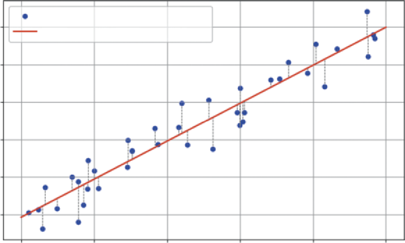
The previous sections focused on analyzing the present (is Version B better?) and explaining the past (what drove sales?). Now, we turn our gaze to the future. Forecasting is one of the most critical tasks in business analytics. Whether predicting next quarter’s revenue or estimating future market trends, leaders need to know where the trend is heading.
To build this forecast, we will use linear regression. Specifically, we will look at the relationship between time and our metric of interest (e.g., sales):
➤
The trend: We fit a straight line to historical data to find the underlying growth rate.
➤
The prediction interval: A forecast without a measure of risk is dangerous. We need to calculate the “spread” of the historical data around that trend line to create a “cone of uncertainty” for the future. This tells the business not just the most likely outcome, but the reasonable worst-case scenario.
This example uses scipy.stats.linregress, a straightforward and powerful tool for simple trend analysis.
Imagine we have 100 days of historical sales data. The data is noisy, some days are up, some are down, but there is a general upward trend. We want to forecast sales for the next 30 days and visualize the risk. We do this in Listing 7-11.
LISTING 7-11: SALES FORECASTING WITH PREDICTION INTERVALS
import numpy as np
import matplotlib.pyplot as plt
from scipy import stats
162 ❘ CHAPTER 7 PRoBABiliTy And STATiSTiCS foR BuSinESS AnAlyTiCS
# 1. Generate Historical Data (100 Days)
np.random.seed(42) # For reproducibility
days = np.arange(100)
# Trend: Base 500 sales + 2 sales/day growth + random noise
historical_sales = 500 + (2 * days) + np.random.normal(0, 50, 100)
# 2. Fit the Trend Line (Linear Regression)
# linregress finds the best-fit line for our data
# slope: growth per day
# intercept: starting sales
# p_value: tells us if the trend is statistically significant
slope, intercept, r_value, p_value, std_err = stats.
linregress(days, historical_sales)
print(f"Trend Analysis:")
print(f" Growth (Slope): {slope:.2f} sales per day")
print(f" P-Value (is trend real?): {p_value:.4f}")
# 3. Forecast the Future (Next 30 Days)
future_days = np.arange(100, 130)
future_sales_projection = slope * future_days + intercept
# 4. Calculate Prediction Intervals (The Risk Cone)
# First, find the errors (residuals) of the historical data
hist_predictions = slope * days + intercept
hist_errors = historical_sales - hist_predictions
# Calculate the standard deviation of these errors
# This represents our model's historical "off-by" amount
error_std = np.std(hist_errors)
# A 95% prediction interval is roughly 1.96 * standard error
prediction_margin = 1.96 * error_std
upper_bound = future_sales_projection + prediction_margin
lower_bound = future_sales_projection - prediction_margin
# --- Visualization ---
plt.figure(figsize=(10, 6))
# Plot history
plt.scatter(days, historical_sales, color='grey', alpha=0.5, label='Historical Data')
# Plot trend line (history)
plt.plot(days, slope * days + intercept, color='blue', label=f'Historical Trend (p={p_value:.3f})')
# Plot forecast
plt.plot(future_days, future_sales_projection, color='green', linestyle='--', label='Sales Forecast')
# Plot Risk Cone (Prediction Interval)
plt.fill_between(future_days, lower_bound, upper_bound, color='green', alpha=0.2, label='95% Prediction Interval')
plt.title('Sales Forecast: Trend vs. Risk')
plt.xlabel('Day')
forecasting ❘ 163
plt.ylabel('Sales Volume')
plt.legend()
plt.grid(True)
plt.show()
Running the code in Listing 7-11 gives a printout of the trend:
Trend Analysis:
Growth (Slope): 2.05 sales per day
P-Value (is trend real?): 0.0000
This result is highly encouraging. The slope confirms that sales are growing by about 2.05 units per day. The p_value of 0.0000 tells us this trend is highly statistically significant and not just random noise.
Listing 7-11 uses linear regression to predict future trends while quantifying the associated risks.
First, we generate a synthetic dataset representing 100 days of historical sales. This data includes a base sales level, a steady growth trend (two sales/day), and random noise to mimic real-world fluctuations. Next, we use stats.linregress to fit a trend line to this historical data. This function calculates the slope (growth rate) and intercept (starting point), along with the p-value to confirm the trend’s statistical significance.
Once the trend is established, we project it forward to forecast sales for the next 30 days. However, a simple line is not enough for risk management. We also calculate a prediction interval, a cone of uncertainty around our forecast. We do this by analyzing the errors (residuals) of our model on the historical data. By calculating the standard deviation of these errors, we can determine a margin (roughly 1.96 times the standard error for a 95% confidence level) to add and subtract from our forecast line. This creates upper and lower bounds, giving us a range in which we can be 95% confident the actual future sales will fall. The final visualization plots the history, the trend, and this crucial risk cone, providing a complete strategic picture.
. The solid line represents the historical trend, showing the line of best fit for the past 100 days. Extending from this is the dashed green line, which is our best guess for the next 30 days, assuming the current trend continues. The most critical part of this chart is the shaded cone, representing the prediction interval. This cone is the key takeaway for risk management, as we are 95% confident that future sales will fall inside this area.
The bottom edge of the cone represents our downside risk, our safety floor if market conditions turn against us within normal statistical limits. Conversely, the top edge represents our upside opportunity.
By presenting the forecast this way, you aren’t just guessing a number; you are defining the playing field. You give stakeholders a reliable target while simultaneously quantifying the financial risk they need to prepare for.
We accomplish this visualization using Matplotlib. First, we use plt.scatter to plot the historical data points in gray, providing context for the trend. Then, we plot our calculated trend line in blue using the slope and intercept derived from the regression. For the forecast, we plot the projected sales as a dashed green line. Finally, plt.fill_between creates the crucial shaded cone of uncertainty, filling the space between our calculated lower_bound and upper_bound arrays to visualize the 95%
prediction interval.
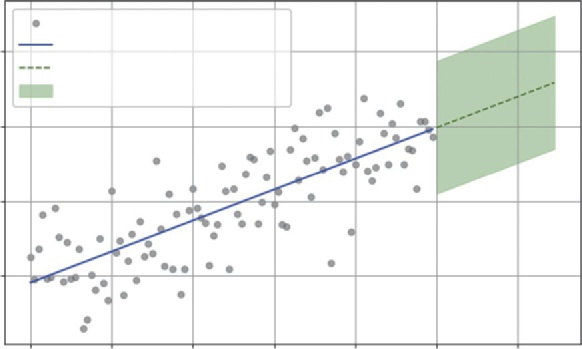
164 ❘ CHAPTER 7 PRoBABiliTy And STATiSTiCS foR BuSinESS AnAlyTiCS
Sales Forecast: Trend vs. Risk
Historical Data
800
Historical Trend (p = 0.000)
Sales Forecast
95% Prediction Interval
700
olume
600
ales VS
500
0
20
40
60
80
100
120
Day
FIGURE 7-8: Historical sales data with a linear trend line projecting into the future.
SUMMARY
This chapter marked a fundamental shift in analytical approach. It moved from the deterministic world of optimization, where inputs were assumed to be fixed and known, to the probabilistic world of statistics, where you learned how to embrace uncertainty as a core component of business strategy. The chapter began by defining the language of uncertainty, using Python’s numpy.random to visualize the distributions—normal, binomial, uniform, and Poisson—that describe the shape of real-world business data.
With this foundation, you moved to decision-making, using hypothesis testing and scipy.stats to mathematically distinguish between a real signal, such as a conversion rate lift, and random noise.
The chapter expanded this concept into confidence intervals, giving you a rigorous way to quantify the precision of your estimates and manage expectations. It then tackled the future with forecasting, using linear regression not just to project sales trends, but to calculate prediction intervals that define the “cone of uncertainty” for financial risk management.
Finally, the chapter moved to causal analysis, utilizing the power of statsmodels. You used multivariate linear regression to measure the precise ROI of different marketing levers and logistic regression to predict binary outcomes like customer churn. You now possess a statistical toolkit that allows you not just to report on what happened, but to explain why it happened and predict what is likely to happen next, all while quantifying the risks involved.
CONTINUE YOUR LEARNING
The statistical ecosystem in Python is vast. While this chapter covered the core functions for modeling and testing, standard data analysis often requires quick summary statistics. Libraries like Pandas and NumPy offer robust tools for this. The following official documentation resources are the best places to deepen your understanding of the libraries used in this chapter.
Continue your learning ❘ 165
➤
NumPy Random Sampling: The official guide to generating random data for simulations.
➤
SciPy Statistics (scipy.stats): Comprehensive documentation for statistical functions, including all the distributions and hypothesis tests covered in this chapter.
➤
Statsmodels: The definitive source for advanced statistical modeling, including details on OLS, logit, and interpreting summary tables.
In addition to the advanced models, you will frequently need to calculate basic descriptive statistics.
T.
TABLE 7-1: Key Summary Statistics Functions
STATISTIC
FUNCTION
DESCRIPTION
Mean (average)
np.mean(a)
Calculates the arithmetic average of the
elements. It’s the sum of all values divided
by the count.
Median
np.median(a)
Finds the middle value of a dataset when
it is sorted. Useful for data with outliers
(like income).
Mode
scipy.stats.mode(a)
Finds the most frequently occurring value
in the array. (Note: NumPy does not have
a direct mode function.)
Standard deviation
np.std(a)
Measures the amount of variation or
dispersion. A low std dev means values
are close to the mean.
Variance
np.var(a)
The average of the squared differences
from the mean. It is the square of the
standard deviation.
Minimum
np.min(a)
Returns the smallest value in the array.
Maximum
np.max(a)
Returns the largest value in the array.
Sum
np.sum(a)
Adds up all the elements in the array.
(Continued)
166 ❘ CHAPTER 7 PRoBABiliTy And STATiSTiCS foR BuSinESS AnAlyTiCS
TABLE 7-1: (Continued)
STATISTIC
FUNCTION
DESCRIPTION
Percentile
np.percentile(a, q)
Calculates the q-th percentile of the data
(e.g., q = 50 is the median; q = 25 is the
first quartile).
Correlation
np.corrcoef(a)
Returns a matrix of Pearson correlation
coefficients, showing linear relationships
between variables.
In addition to these materials, you may want to dive deeper into the methods described in this chapter. I recommend the following resources.
➤
Introductory Econometrics: A Modern Approach by Jeffrey M. Wooldridge: While typically assigned as a textbook, the approach taken here can be easily read outside of class. In this book, you will find more detail with relatable examples.
➤
: The world’s largest data science community. It hosts thousands of real-world datasets that allow you to move beyond synthetic data and practice your modeling skills on actual business problems. You can also explore code notebooks shared by other professionals to see practical examples of statistical analysis in action.


8Applied Business Problems with
Math and Python
You have spent the last few chapters learning how to fill your toolbox with powerful instru-ments. You have used calculus to find marginal rates of change, linear algebra to manage portfolios, optimization to allocate resources, and statistics to forecast trends. Now it is time to connect some of these tools to business problems.
In the real world, business problems rarely come labeled as a derivative problem or a t-test.
They function as word problems. Remember word problems from your early schooling days?
You might have disliked them, but those are exactly the type of problems we are working on now. For example, you might need to solve problems such as your customer support wait times being too high, you need to pay off debt faster, or your delivery drivers could be wasting gas.
This chapter moves from learning individual concepts to building complete solutions. You will tackle five distinct, real-world case studies across Operations, Finance, Logistics, and Strategy.
These case studies are as follows:
➤ Building a dynamic loan amortization engine
➤ Building a simple recommender system
➤ Maximizing yield and constrained optimization
➤ Quality control with hypothesis testing
➤ Predicting employee attention and logical regression
For each problem, you will see how to define the business context, identify the underlying mathematics, and then build a custom Python tool to solve it. By the end, you won’t just have code snippets; you’ll have a library of reusable models that you can apply to your own business challenges immediately.
168 ❘ CHAPTER 8 APPliEd BusinEss PRoBlEMs wiTH MATH And PyTHon BUILDING A DYNAMIC LOAN AMORTIZATION ENGINE
Finance professionals live in a world of what-if scenarios. It’s rarely enough to just know the monthly payment on a loan. The real strategic questions come later: What if we have a surplus next year?
What if we increase our monthly payment by $5,000 starting in Q3? How much interest will that save us over the next decade?
Excel is the standard tool for static schedules, but it becomes clumsy when you want to simulate dynamic, changing scenarios across hundreds of different loans. A Python script, however, can simulate thousands of different payment strategies in seconds.
Imagine you are the CFO of a mid-sized logistics company. You have recently taken out a $500,000
loan at 5% interest to upgrade your fleet. The term is 30 years. The board is nervous about this long-term debt. They want to know if squeezing $1,000 extra out of their monthly cash flow to pay down the principal will make a difference. Or is it a drop in the bucket?
You need to build a model that doesn’t just calculate a payment, but simulates the entire life of the loan to prove the exact dollar value of that strategy.
A loan is a living creature. Every month, two things happen:
➤
Interest accrues: You owe interest on the current balance. (Interest = Balance *
Monthly_Rate)
➤
The principal shrinks: Your payment covers that interest first. Whatever is left over attacks the balance. (Principal_Paid = Total_Payment - Interest)
The complexity is that as the balance drops, the interest drops, so more of your fixed payment goes toward the principal. This creates a flywheel effect. A small extra payment early on effectively skips future interest payments, compounding your savings.
Listing 8-1 builds a robust function, called generate_amortization_schedule, that acts as a simulation engine. Unlike a simple formula, this function will use a loop to walk through the loan month-by-month, allowing us to inject custom logic (like extra payments) at every step.
LISTING 8-1: GENERATING A DYNAMIC AMORTIZATION SCHEDULE
import numpy as np
import pandas as pd
import matplotlib.pyplot as plt
def generate_amortization_schedule(principal, annual_rate, years, extra_payment=0):
"""
Generates a month-by-month loan payment schedule.
"""
# Convert annual metrics to monthly
monthly_rate = annual_rate / 12
total_payments = years * 12
# Calculate standard monthly payment (The Standard Annuity Formula)
# This assumes a fixed payment to hit zero balance at exactly 'years' end standard_payment = principal * (monthly_rate * (1 + monthly_rate)**total_
payments) / ((1 + monthly_rate)**total_payments - 1)
Building a dynamic loan Amortization Engine ❘ 169
schedule = []
balance = principal
month = 1
# The Simulation Loop
# We keep paying until the debt is gone
while balance > 0:
# 1. Calculate interest due for this specific month
interest = balance * monthly_rate
# 2. Determine total payment (Standard + Extra)
# Logic check: Don't pay more than the remaining balance + interest
actual_payment = min(standard_payment + extra_payment, balance + interest)
# 3. Split payment into Principal and Interest
principal_paid = actual_payment - interest
# 4. Update the Balance
balance -= principal_paid
# 5. Record the month's activity
schedule.append({
'Month': month,
'Payment': actual_payment,
'Principal': principal_paid,
'Interest': interest,
'Balance': balance
})
month += 1
return pd.DataFrame(schedule)
# --- Compare Scenarios ---
loan_amount = 500000
rate = 0.05
term_years = 30
# Scenario 1: Minimum Payments
df_base = generate_amortization_schedule(loan_amount, rate, term_years, extra_
payment=0)
# Scenario 2: Pay extra $1000/month
df_accelerated = generate_amortization_schedule(loan_amount, rate, term_
years, extra_payment=1000)
print(f"Base Scenario Total Interest: ${df_base['Interest'].sum():,.2f}") print(f"Accelerated Scenario Total Interest: ${df_accelerated['Interest'].
sum():,.2f}")
print(f"Time Saved: {len(df_base) - len(df_accelerated)} months")
# --- Visualization ---
plt.figure(figsize=(10, 6))
plt.plot(df_base['Month'], df_base['Balance'], label=f'Standard Repayment -
Payment: {df_base['Payment'].iloc[0]:,.2f}/Month')
plt.plot(df_accelerated['Month'], df_accelerated['Balance'], label=f'Fast Repayment: {df_base['Payment'].iloc[0]:,.2f}+1,000/Month', linestyle='--')
170 ❘ CHAPTER 8 APPliEd BusinEss PRoBlEMs wiTH MATH And PyTHon plt.title('Loan Payoff Trajectory: The Power of Extra Payments')
plt.xlabel('Month')
plt.ylabel('Loan Balance ($)')
plt.legend()
plt.grid(True)
plt.show()
The heart of this tool is the while balance > 0: loop. This mimics the passage of time. Inside the loop, we perform the bank’s math: we calculate the interest for that specific month based on the current balance.
This is the crucial line:
actual_payment = min(..., balance + interest)
This logic prevents the negative balance bug common in basic spreadsheets. It tells Python: Pay the standard amount plus the extra $1,000, unless the debt is almost gone. In that case, just pay off what’s left.
We then store each month’s detailed breakdown in a list and convert it to a Pandas DataFrame, giving us a clean table we can analyze, sum up, or plot. The output of Listing 8-1 is as follows: Base Scenario Total Interest: $466,278.92
Accelerated Scenario Total Interest: $265,023.15
Time Saved: 163 months
The code outputs a staggering insight for the board. Paying that extra $1,000 a month doesn’t just save a few dollars; it saves over $200,000 in interest, which is essentially the price of two new trucks.
Furthermore, it cuts the loan term by 163 months, which is nearly 14 years. You can see this result
Loan Payoff Trajectory: The Power of Extra Payments
500000
Standard Repayment – Payment: 2,684.11/Month
Fast Repayment: 2,684.11 + 1,000/Month
400000
300000
200000
Loan Balance ($)
100000
0
0
50
100
150
200
250
300
350
Month
FIGURE 8-1: Loan payoff trajectory.
Building a simple Recommender system ❘ 171
. The solid line represents the standard plan, showing the loan balance decreasing gradually over the full 30-year term. It’s a slow, steady decline. In stark contrast, the dashed line represents the accelerated plan (paying an extra $1,000 per month). This curve dives much more steeply, hitting zero around month 197. By visualizing the trajectory, the CFO can instantly show stakeholders that the pain of a slightly higher monthly payment buys them over a decade of debt-free operations.
BUILDING A SIMPLE RECOMMENDER SYSTEM
One of the most powerful tools in modern e-commerce is the recommendation engine. When you see
“Customers who bought this item also bought . . . ,” that isn’t random chance, and it’s certainly not a human manually curating that list. It’s linear algebra working at scale.
Let’s look at a specific business problem: You run a growing online bookstore. You have thousands of books and thousands of customers. You know that recommending relevant titles can significantly boost cross-sales and customer retention. However, you don’t have rich demographic data—
you don’t know your customers’ ages, locations, or favorite genres. All you have is a raw list of transactions: who bought what. How can you use this sparse data to predict that a customer who bought a Python textbook might also be interested in a book on data science, but probably not a romance novel?
The solution lies in treating every product as a vector in a multi-dimensional user space. Imagine a simple world with three users. Book A was bought by User 1 and User 3. We can represent this as a vector:
[1, 0, 1]
Book C was also bought by User 1 and User 3. Its vector is identical:
[1, 0, 1]
Mathematically, these two vectors point in the exact same direction. This means they are similar products. To measure this similarity for any two products across thousands of users, we use cosine similarity. This metric is derived from the dot product you learned about in Chapter 4.
Similarity ( A, B ) = A * B
_
| A | | B |
This formula calculates the cosine of the angle between two vectors. If the vectors point in the same direction (angle is 0), the cosine is 1 (perfectly similar). If they are orthogonal (90 degrees, meaning they share no users), the cosine is 0. By calculating this score for every pair of books, we can mathematically quantify taste.
We will build a user-item matrix where rows represent users and columns represent products. Then, we will use NumPy to calculate the similarity between every pair of products to generate recommendations. This example is built out in Listing 8-2.
172 ❘ CHAPTER 8 APPliEd BusinEss PRoBlEMs wiTH MATH And PyTHon LISTING 8-2: BUILDING A PRODUCT RECOMMENDER
import numpy as np
import pandas as pd
# 1. Mock Purchase Data
# Rows = Users (0-4), Columns = Products (A-E)
# 1 = Purchased, 0 = Not Purchased
user_item_matrix = np.array([
[1, 1, 0, 0, 0], # User 0: Bought A and B
[1, 1, 1, 0, 0], # User 1: Bought A, B, C
[0, 0, 1, 1, 1], # User 2: Bought C, D, E
[0, 0, 0, 1, 1], # User 3: Bought D, E
[1, 0, 0, 0, 0] # User 4: Bought A
])
product_names = ['Book A', 'Book B', 'Book C', 'Book D', 'Book E']
# 2. Define Similarity Function (Cosine Similarity)
def calculate_similarity(product_id_1, product_id_2, matrix):
# Get the column vectors for the two products
vec_1 = matrix[:, product_id_1]
vec_2 = matrix[:, product_id_2]
# Calculate Dot Product
dot_product = np.dot(vec_1, vec_2)
# Calculate Norms (Magnitudes)
norm_1 = np.linalg.norm(vec_1)
norm_2 = np.linalg.norm(vec_2)
if norm_1 == 0 or norm_2 == 0:
return 0.0
return dot_product / (norm_1 * norm_2)
# 3. Generate Recommendations for "Book A" (Index 0)
target_product_id = 0 # Book A
print(f"Recommendations for customers who bought {product_names[target_product_
id]}:")
similarities = []
for i in range(len(product_names)):
if i == target_product_id: continue # Don't recommend the book itself score = calculate_similarity(target_product_id, i, user_item_matrix)
similarities.append((product_names[i], score))
# Sort by highest similarity score
similarities.sort(key=lambda x: x[1], reverse=True)
for product, score in similarities:
print(f" {product}: {score:.2f} Similarity Score")
Maximizing yield with Constrained optimization ❘ 173
In Step 1, we create a small synthetic dataset. We have five users and five books. By looking closely at the user_item_matrix, you can already see patterns emerging. Users 0, 1, and 4 seem to form one
“cluster” (buying Books A, B, C), while Users 2 and 3 form another (buying Books C, D, E). The goal is to see if the math can detect these clusters without being told about them.
In Step 2, we define the core logic within calculate_similarity(). This function takes two product IDs, extracts their sales columns from the matrix, and performs the cosine similarity calculation.
The np.dot(vec_1, vec_2) line is the workhorse; it calculates the “overlap.” Every time both users bought both books (a value of 1 in both vectors), the dot product increases. If one user bought Book A but not Book B (a 1 and a 0), the dot product adds nothing. This raw overlap is then normalized by the product of the norms (total sales volume) to ensure that popular books don’t dominate simply because they have more sales.
Step 3 acts as the recommendation engine. We pick a target book (Book A) and loop through every other book in our inventory. We calculate the similarity score for each pair and store it. Finally, we sort the list from highest score to lowest to present the top recommendations.
The results from running the code in Listing 8-2 are strikingly clear and align perfectly with our intuition.
Recommendations for customers who bought Book A:
Book B: 0.82 Similarity Score
Book C: 0.41 Similarity Score
Book D: 0.00 Similarity Score
Book E: 0.00 Similarity Score
We can interpret the results as follows:
➤
Book B (0.82): This is a very strong recommendation. Why? Because Users 0 and 1 both bought Book A and Book B. The algorithm detected this strong pattern of co-purchase. If you’re viewing Book A, Book B is the most logical next purchase.
➤
Book C (0.41): This is a moderate recommendation. While User 1 bought both, User 0 did not, and User 2 bought C but not A. The signal is mixed, so it gets a lower score.
➤
Books D & E (0.00): These have a score of 0. This is a crucial finding. It means there is no overlap between the customers who bought A and the customers who bought D or E. They appeal to completely different segments. The algorithm correctly identifies that recommending Book D to a Book A buyer would likely be a waste of screen space.
This simple geometric concept, measuring the angle between vectors, is the foundation of the recommendation engines used by Netflix, Amazon, and Spotify. By treating customer behavior as a vector, they can mathematically calculate taste and personalize the experience for millions of users instantly.
MAXIMIZING YIELD WITH CONSTRAINED OPTIMIZATION
Investment isn’t just about picking winners; it’s about following the rules. Banks, insurance companies, and pension funds operate under strict regulatory constraints. They want to maximize profit,
174 ❘ CHAPTER 8 APPliEd BusinEss PRoBlEMs wiTH MATH And PyTHon but they must maintain a certain level of safety. It’s a delicate balancing act: too much caution and you miss out on growth; too much risk and you violate the rules.
For this scenario, let’s consider the business problem where you are a portfolio manager at a regional bank with $10 million to lend. You have three “buckets” you can deploy this capital into, each with a different risk-return profile:
➤
Home mortgages: These are very safe but offer a modest 3% return.
➤
Small business loans: These are riskier but offer a high 7% return.
➤
Corporate bonds: These sit in the middle, with medium risk and a 5% return.
Your goal is simple: maximize the total return on that $10 million. However, you are bound by strict internal risk policies that force diversification:
➤
Constraint 1 (liquidity): At least 50% of the total capital must be safe in home mortgages.
➤
Constraint 2 (risk cap): No more than 20% of the total capital can be exposed to high-risk small business loans.
➤
Constraint 3 (diversity): At least 10% must be allocated to corporate bonds to ensure market exposure.
This is a textbook linear programming problem like you have already worked on in the previous chapters. You need to maximize your total yield. If M is the portion in mortgages, S is the portion in small business loans, and C is the portion in corporate bonds, the return is as follows: Return = 0.03*M + 0.07*S + 0.05*C
Subject to:
➤
M >= 0.5 (liquidity rule)
➤
S <= 0.2 (risk cap rule)
➤
C >= 0.1 (diversity rule)
➤
M + S + C = 1 (The budget constraint: we must invest exactly 100% of our capital) We will use scipy.optimize.linprog to find the exact optimal mix. This tool will look at the different yields, push right up against the constraints where it makes sense, and tell us precisely how many dollars to put in each bucket to squeeze out every possible cent of profit while staying fully compliant. Listing 8-3 builds out this optimization problem according to the constraints.
LISTING 8-3: OPTIMIZING A CONSTRAINED PORTFOLIO
import numpy as np
from scipy.optimize import linprog
import matplotlib.pyplot as plt
# Total Capital
total_capital = 10_000_000
# 1. Define the Objective Function (Maximize Return)
# Returns: Mortgages (3%), Small Biz (7%), Corp Bonds (5%)
Maximizing yield with Constrained optimization ❘ 175
# Since linprog minimizes, we use negative returns
c = [-0.03, -0.07, -0.05]
# 2. Define Constraints
# Variables: x0=Mortgages, x1=Small Biz, x2=Corp Bonds (as percentages of total)
# Inequality Constraints (A_ub * x <= b_ub)
# Constraint 1: Mortgages >= 50% -> -x0 <= -0.5
# Constraint 2: Small Biz <= 20% -> x1 <= 0.2
# Constraint 3: Corp Bonds >= 10% -> -x2 <= -0.1
A_ub = [
[-1, 0, 0], # Mortgages >= 0.5
[ 0, 1, 0], # Small Biz <= 0.2
[ 0, 0, -1] # Corp Bonds >= 0.1
]
b_ub = [-0.5, 0.2, -0.1]
# Equality Constraint (A_eq * x = b_eq)
# All weights must sum to exactly 1 (100% of capital)
A_eq = [[1, 1, 1]]
b_eq = [1]
# Bounds: Each weight must be between 0 and 1
bounds = [(0, 1), (0, 1), (0, 1)]
# 3. Run the Optimizer
result = linprog(c, A_ub=A_ub, b_ub=b_ub, A_eq=A_eq, b_eq=b_eq, bounds=bounds, method='highs')
# 4. Interpret Results
if result.success:
weights = result.x
optimal_return = -result.fun # Convert back to positive
allocations = weights * total_capital
print("--- Optimal Portfolio Allocation ---")
print(f"Home Mortgages: ${allocations[0]:,.0f} ({weights[0]:.0%})") print(f"Small Business Loans: ${allocations[1]:,.0f} ({weights[1]:.0%})") print(f"Corporate Bonds: ${allocations[2]:,.0f} ({weights[2]:.0%})") print("---")
print(f"Total Projected Return: ${optimal_return * total_capital:,.0f}
({optimal_return:.1%})")
# --- Visualization ---
labels = ['Mortgages (3%)', 'Small Biz (7%)', 'Corp Bonds (5%)']
colors = ['lightblue', 'salmon', 'lightgreen']
plt.figure(figsize=(7, 7))
plt.pie(weights, labels=labels, autopct='%1.1f%%', colors=colors, startangle=140)
plt.title('Optimal Capital Allocation')
plt.show()
else:
print("Optimization failed.")

176 ❘ CHAPTER 8 APPliEd BusinEss PRoBlEMs wiTH MATH And PyTHon To maximize return using linprog (which is designed to minimize), we use the negative trick: we set our objective function coefficients ( c) to the negative of our expected returns (e.g., -0.07 instead of 0.07). Minimizing negative profit is mathematically identical to maximizing positive profit.
The code in Listing 8-3 requires careful formatting to properly lay out the constraints. linprog expects all inequality constraints to be in the less than or equal to (<=) form. For constraints, such as mortgages must be at least 50%, we flip the inequality by multiplying both sides by −1 (so x >= 0.5
becomes -x <= -0.5). We pack these rules into the A_ub matrix (the coefficients) and b_ub vector (the limits). Finally, we define an equality constraint (A_eq, b_eq) so that the sum of our investments equals exactly 100% of our capital. Here is the result of running this code:
--- Optimal Portfolio Allocation ---
Home Mortgages: $5,000,000 (50%)
Small Business Loans: $2,000,000 (20%)
Corporate Bonds: $3,000,000 (30%)
---
Total Projected Return: $440,000 (4.4%)
The results reveal the logical strategy the algorithm discovered. You could imagine first, the algorithm allocated to the highest-yielding asset, small business loans (7%). It wanted to put 100% of the money there, but the risk cap constraint stopped it at 20%. So, it maxed out that bucket with $2 million.
Next, it had to satisfy the liquidity rule: at least 50% must be in home mortgages (3%). Even though this is the lowest-yielding asset, the constraint forces the algorithm to allocate $5 million here.
That left 30% of the capital ($3 million) unused. The algorithm looked at its remaining options.
Corporate bonds (5%) pay better than mortgages, so it poured the entire remaining balance into bonds. It didn’t put a single extra dollar into mortgages beyond the bare minimum required by law.
The final result is a portfolio that yields 4.4%. This is the mathematical ceiling. No other combination of investments can legally yield a higher return. This gives the portfolio manager confidence: they aren’t guessing at the allocation; they have mathematically proven the best possible strategy given their constraints.
Optimal Capital Allocation
Corp Bonds (5%)
30.0%
20.0%
Small Biz (7%)
50.0%
Mortgages (3%)
FIGURE 8-2: Loan allocation.
Quality Control with Hypothesis Testing ❘ 177
This solution illustrates the true power of linear programming in finance. It moves beyond simple intuition by correctly identifying the high-yield small business loans as attractive and further handles the complex balancing act required by the remaining capital. The resulting 4.4% return isn’t just an estimate; it is the mathematical ceiling. No other allocation exists that satisfies your risk policies while generating a higher return, giving you the certainty needed to defend the strategy to the board.
QUALITY CONTROL WITH HYPOTHESIS TESTING
Quality control is the unsung hero of operations. Whether you are manufacturing steel bolts, bottling soda, or processing insurance claims, consistency is the gold standard. A slight deviation in a manufacturing process can compound into millions of dollars in wasted product, recalls, or reputational damage.
Imagine you manage a factory that produces high-precision steel bolts. Each bolt is designed to have a diameter of 10 mm with a minimal tolerance to fit perfectly into an engine assembly. You have just installed a new, expensive manufacturing machine. To validate it, you run a pilot batch of 50 bolts.
You measure them with digital calipers and calculate the average: 10.02 mm.
This leaves you with a critical dilemma. Is that 0.02 mm difference just random noise (meaning the machine is fine)? Or is the machine actually calibrated incorrectly (meaning you are about to manufacture thousands of defective bolts)? If you shut down the line for recalibration when it wasn’t needed, you burn money on downtime. If you don’t shut it down when it is needed, you ship defective product. You need a mathematical way to distinguish signal from noise.
First, let’s define what we hope to test:
➤
Null hypothesis: The machine is calibrated correctly. The true population mean is still 10 mm.
The 10.02 mm deviation in the sample is just random noise.
➤
Alternative hypothesis: The machine is calibrated incorrectly. The true population mean is not 10 mm.
You can use the tool of hypothesis testing, t-testing, and scipy.stats to build out this decision-making process. Listing 8-4 shows this example.
LISTING 8-4: AUTOMATING QUALITY CONTROL CHECKS
import numpy as np
import matplotlib.pyplot as plt
from scipy import stats
# 1. Generate Mock Data from the "New Machine"
np.random.seed(42)
target_diameter = 10.0
# We simulate 50 bolts.
# The "Truth" (unknown to the manager) is that the machine IS slightly off (mean=10.02).
# Standard deviation is 0.05mm.
sample_bolts = np.random.normal(loc=10.02, scale=0.05, size=50)
178 ❘ CHAPTER 8 APPliEd BusinEss PRoBlEMs wiTH MATH And PyTHon
# 2. Analyze the Sample
sample_mean = np.mean(sample_bolts)
print(f"Target Diameter: {target_diameter}mm")
print(f"Sample Mean: {sample_mean:.3f}mm")
# 3. Run the Hypothesis Test (One-Sample T-Test)
# We compare our sample array against the known population mean (10.0) t_stat, p_value = stats.ttest_1samp(sample_bolts, popmean=target_diameter) print(f"P-Value: {p_value:.4f}")
# 4. Make the Decision
if p_value < 0.05:
print("DECISION: STOP THE LINE. The deviation is statistically significant.") else:
print("DECISION: CONTINUE. The deviation is likely random noise.")
# --- Visualization ---
plt.figure(figsize=(10, 6))
plt.hist(sample_bolts, bins=15, color='gray', alpha=0.7, label='Sample Distribution')
plt.axvline(target_diameter, color='green', linewidth=2, linestyle='--', label='Target (10mm)')
plt.axvline(sample_mean, color='red', linewidth=2, label=f'Sample Mean ({sample_
mean:.3f}mm)')
plt.title('Quality Control: Target vs. Actual Performance')
plt.xlabel('Bolt Diameter (mm)')
plt.legend()
plt.grid(True, alpha=0.3)
plt.show()
In Step 1, we simulate the actual data. We create 50 bolts using np.random.normal, giving them a true mean of 10.02. This allows us to test if our statistical tool is sensitive enough to catch this tiny error. If you were implementing this example in our own manufacturing, you would provide a list of all of your measurements here.
In Step 2, we review the generated sample by looking at the mean of our simulated data.
Step 3 is the core of the solution. We use stats.ttest_1samp. This function takes our array of measurements and the value we expect them to match (10.0). It calculates how many standard errors away our sample mean falls from the target.
Finally, Step 4 automates the business logic. Instead of leaving the interpretation up to a tired shift manager, we hard-code the significance level (0.05). If the p-value drops below this threshold, the script explicitly prints STOP THE LINE, removing ambiguity from the decision.
The output from this code is as follows:
Target Diameter: 10.0mm
Sample Mean: 10.013mm
P-Value: 0.0548
DECISION: CONTINUE. The deviation is likely random noise.
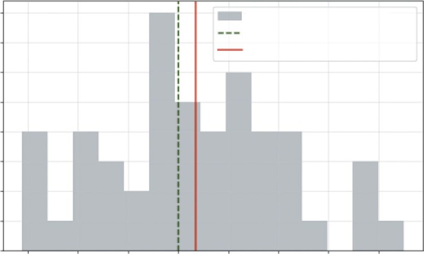
Predicting Employee Attrition with logistic Regression ❘ 179
The results of this simulation are fascinatingly tricky. Even though we (the programmers) know the machine is slightly off (set to 10.02), the p-value came back at 0.0548.
This is just barely above our 0.05 threshold. What does this mean? It means that getting a sample average of 10.013 mm when the machine is perfect would happen about 5.5% of the time just by chance. Because this probability is higher than our 5% risk tolerance, we fail to reject the null hypothesis. The script tells us to continue production. Y
but the statistics suggest it might still be noise. Again, you will notice this looks like the normal distribution, and that’s by no accident. While in this example we generated the data to look like the normal distribution, we are also relying on the normal distribution to implement the t-test.
This example teaches a valuable lesson in analytics: statistical significance is not the same as practical truth. With a sample size of only 50, our test wasn’t quite sensitive enough to confidently flag the tiny 0.02 mm error. If the quality manager wanted to catch such small deviations, they would need to increase the sample size (perhaps to 100 bolts) to give the test more power.
PREDICTING EMPLOYEE ATTRITION WITH LOGISTIC
REGRESSION
Employee turnover is often called the “silent killer” of business growth. While a lost sale hurts immediately, a lost employee hurts indefinitely. Replacing a skilled knowledge worker can cost up to 200%
of their annual salary when you factor in recruiting fees, onboarding time, and the “brain drain” of institutional knowledge walking out the door.
Quality Control: Target vs. Actual Performance
8
Sample Distribution
Target (10 mm)
7
Sample Mean (10.009 mm)
6
5
4
3
2
1
0
9.925
9.950
9.975
10.000
10.025
10.050
10.075
10.100
Bolt Diameter (mm)
FIGURE 8-3: The distribution of our sample bolts.
180 ❘ CHAPTER 8 APPliEd BusinEss PRoBlEMs wiTH MATH And PyTHon Most HR departments operate reactively. They conduct exit interviews to find out why someone left, but by then, it’s too late. HR directors often have a “gut feeling” about who might be at risk—
perhaps the person with the grueling 90-minute commute or the mid-level manager who hasn’t been promoted in three years. But gut feelings don’t scale, and they don’t justify the budget for retention programs. To intervene proactively, you need a mathematical early warning system.
In this business problem, you are the HR Director at a growing tech firm. You have historical data on 500 employees, including their tenure (years at the company), Last_Performance_Score (1–10), and Commute_Distance (miles). You need to answer two specific questions for the executive team:
➤
The why: Exactly how much does a long commute increase the risk of an employee quitting?
Is it a minor nuisance or a major driver?
➤
The who: Can you flag specific high-risk employees right now, before they hand in their resignation, so you can offer them remote work options or a raise?
This is a classification problem. Unlike our previous examples where we predicted a continuous number (like profit or sales), here we are predicting a category: Quit vs. Stay. We will use logistic regression. Unlike linear regression, which tries to fit a straight line through the data, logistic regression fits an S-curve (sigmoid function). This is crucial because it constrains the output to be between 0
and 1, giving us a clean probability of turnover.
We will use statsmodels.Logit to build the model. We’ll start by simulating a realistic dataset where we know the “ground truth” rules of attrition. Then, we’ll train our model to see if it can rediscover those rules. Finally, we will interpret the model’s coefficients by converting them into odds ratios, a metric that translates complex log-odds into simple business logic. Listing 8-5 implements this solution.
LISTING 8-5: MODELING EMPLOYEE ATTRITION RISK
import numpy as np
import statsmodels.api as sm
# 1. Generate Synthetic HR Data (500 Employees)
np.random.seed(101)
num_employees = 500
# Independent Variables
# Randomly generate realistic employee data
tenure = np.random.uniform(1, 10, num_employees)
perf_score = np.random.uniform(1, 10, num_employees)
commute_dist = np.random.uniform(1, 50, num_employees) # 1 to 50 miles
# Define "True" Risk Logic (Hidden Reality)
# We simulate a world where long commutes increase risk,
# while high tenure and high performance decrease it.
# (These coefficients create the "log-odds" of quitting)
log_odds = -1.5 + (0.08 * commute_dist) - (0.3 * tenure) - (0.1 * perf_score)
# Convert log-odds to probability using the Sigmoid function
prob_quit = 1 / (1 + np.exp(-log_odds))
Predicting Employee Attrition with logistic Regression ❘ 181
# Generate Outcomes (1=Quit, 0=Stay) based on that probability
quit_status = (np.random.rand(num_employees) < prob_quit).astype(int)
# 2. Fit Logistic Regression Model
y = quit_status
# Create our X matrix with all three variables
X = np.column_stack((commute_dist, tenure, perf_score))
X = sm.add_constant(X) # Add intercept
# We use Logit instead of OLS for binary (Yes/No) outcomes
model = sm.Logit(y, X).fit(disp=0) # disp=0 suppresses the training log output
# 3. Interpret Coefficients (Odds Ratios)
# We exponentiate the coefficients to get readable Odds Ratios
params = model.params
odds_ratios = np.exp(params)
print("\n--- Risk Factor Analysis (Odds Ratios) ---")
print(f"Baseline (Intercept): {odds_ratios[0]:.4f}")
print(f"Commute Distance: {odds_ratios[1]:.4f} (Impact of +1 mile)") print(f"Tenure (Years): {odds_ratios[2]:.4f} (Impact of +1 year)") print(f"Performance Score: {odds_ratios[3]:.4f} (Impact of +1 point)")
# 4. Predict Risk for Specific Employees
# Employee A: 5 mile commute, 8 years tenure, 9 performance (Loyal profile)
# Employee B: 45 mile commute, 2 years tenure, 5 performance (Risk profile) new_employees = np.array([
[1, 5, 8, 9],
[1, 45, 2, 5]
])
predicted_probs = model.predict(new_employees)
print("\n--- Attrition Risk Predictions ---")
print(f"Employee A (Happy): {predicted_probs[0]:.1%} probability of quitting") print(f"Employee B (At Risk): {predicted_probs[1]:.1%} probability of quitting") Listing 8-5 has several steps. In Step 1, we generate a realistic, synthetic dataset to simulate our customer base. After setting a np.random.seed(101) to ensure our results are reproducible, we create data for 500 employees. We define our independent variables ( X variables) first: tenure is a uniform continuous value between 1 and 10, perf_score is between 1 and 10, and commute_dist is between 1 and 50 miles. The most complex part of this step is generating our dependent y variable, quit_status. To do this, we invent a “true” (but hidden) relationship using log-odds. We create a log_odds variable for each employee based on our secret formula (where commute_dist increases risk and tenure decreases it). We convert these log-odds into a clean probability between 0 and 1 using the sigmoid function, 1 / (1 + np.exp(-log_odds)). Finally, we simulate the binary outcome for each employee with a “coin flip” using np.random.rand() < prob_quit.
In Step 2, we prepare this data for the statsmodels library. We assign our binary quit_status array to y. We then use np.column_stack to bundle our independent variables into a single X matrix. The line X = sm.add_constant(X) is a critical step that adds the intercept column, allowing the model
182 ❘ CHAPTER 8 APPliEd BusinEss PRoBlEMs wiTH MATH And PyTHon to calculate a baseline probability. We fit the model using sm.Logit(y, X), which tells statsmodels to fit a logistic curve.
Finally, in Steps 3 and 4, we interpret and apply the model. We convert the raw coefficients into odds ratios by exponentiating them (np.exp(params)), which makes them interpretable for business decisions. We then use model.predict() to feed new, hypothetical employee data into our trained model to see their calculated risk scores.
The output provides two levels of insight—strategic drivers and individual risk scores:
--- Risk Factor Analysis (Odds Ratios) ---
Baseline (Intercept): 0.2848
Commute Distance: 1.0851 (Impact of +1 mile)
Tenure (Years): 0.6981 (Impact of +1 year)
Performance Score: 0.9050 (Impact of +1 point)
--- Attrition Risk Predictions ---
Employee A (Happy): 1.0% probability of quitting
Employee B (At Risk): 76.9% probability of quitting
First, let’s look at the odds ratios, which tell us the power of each factor. The commute distance (1.085) is the most critical finding for the HR Director. It translates to: For every single extra mile of commute, an employee’s odds of quitting increase by 8.5% (since 1.085 is 8.5% higher than 1.0). While one mile seems small, this effect compounds. A 30-mile commute creates a massive accumulation of risk compared to a 5-mile commute. Tenure (0.698), on the other hand, is below 1.0, meaning it has a protective effect. It tells us: For every additional year an employee stays, their odds of quitting decrease by about 30% (1.0—0.698). Loyalty begets loyalty; the longer someone stays, the stickier they become. Finally, the performance score (0.910) shows that high performers are also slightly less likely to leave, with each point of performance reducing quit odds by about 9%.
Second, we look at the predictions, where the model allows us to score every single person in the company. Employee A represents our safe profile: they live close (five miles), have been here a long time (eight years), and perform well. The model assigns them a tiny 1.0% probability of leaving, so we don’t need to worry about them right now. Employee B, however, is a flashing red light. They have a long commute (45 miles) and have only been with the company for two years. The model calculates their quit probability at 76.9%. Even though they haven’t said anything, the math suggests they are already halfway out the door.
Let’s see what this would look like if we were to create a visualization. By combining the code from Listings 8-5 and 8-6, you can see how employees tenure might be affected.
LISTING 8-6: VISUALIZING EMPLOYEE ATTRITION RISK
import numpy as np
import matplotlib.pyplot as plt
import statsmodels.api as sm
# Run the code from Listing 8-5 first!
Predicting Employee Attrition with logistic Regression ❘ 183
# --- Visualization: The Risk Curve ---
plt.figure(figsize=(10, 6))
# 1. Create a range of Commute Distances to plot (0 to 60 miles)
commute_range = np.linspace(0, 60, 100)
# 2. Define "Average" values for other variables to isolate the effect of Commute avg_tenure = np.mean(tenure)
avg_perf = np.mean(perf_score)
# 3. Predict probability for each commute distance
# We manually build the matrix to ensure it has 4 columns: [Const, Commute, Tenure, Perf]
# We do this because sm.add_constant() can get confused when other columns are constant.
X_plot = np.column_stack((
np.ones(100), # The Intercept (Must be first)
commute_range, # Variable 1: Commute (Changing)
np.full(100, avg_tenure), # Variable 2: Tenure (Fixed)
np.full(100, avg_perf) # Variable 3: Performance (Fixed)
))
# Get probabilities from the model
probs = model.predict(X_plot)
# 4. Plot the Curve
plt.plot(commute_range, probs, color='darkred', linewidth=3, label='Attrition Risk Curve')
# 5. Plot Specific Employees
# We also need to ensure single predictions have the intercept added manually emp_a_data = [1, 5, 8, 9]
emp_b_data = [1, 45, 2, 5]
emp_a_prob = model.predict(emp_a_data)[0]
emp_b_prob = model.predict(emp_b_data)[0]
plt.scatter([5], [emp_a_prob], color='green', s=100, zorder=5, label='Employee A (Safe)')
plt.scatter([45], [emp_b_prob], color='red', s=100, zorder=5, label='Employee B
(Flight Risk)')
plt.annotate(f"{emp_a_prob:.0%}", (5, emp_a_prob), xytext=(4, emp_a_prob+0.05), fontsize=16)
plt.annotate(f"{emp_b_prob:.0%}", (45, emp_b_prob), xytext=(44, emp_b_prob-0.06), fontsize=16)
plt.title('Impact of Commute on Employee Flight Risk')
plt.xlabel('Commute Distance (Miles)')
plt.ylabel('Probability of Quitting')
plt.axhline(0.5, color='gray', linestyle='--', alpha=0.5, label='50% Risk Threshold')
plt.legend()
plt.grid(True, alpha=0.3)
plt.show()
184 ❘ CHAPTER 8 APPliEd BusinEss PRoBlEMs wiTH MATH And PyTHon The visualization code in Listing 8-6 is designed to transform our abstract logistic regression model into a tangible, strategic tool. Our goal is to visualize exactly how commute distance impacts the probability of attrition, while holding all other factors constant.
To achieve this, we first create a hypothetical scenario. In Steps 1 and 2, we define a range of possible commute distances from 0 to 60 miles using np.linspace. To isolate the specific effect of the commute, we calculate the average tenure and average performance score from our dataset and “freeze”
them at these values. This allows us to answer the question: For an average employee, how does adding miles to their commute change their risk?
In Step 3, we prepare the input matrix X_plot for the model. This requires careful manual construction using np.column_stack. The model expects four specific inputs for every prediction: the intercept (a column of ones), the variable commute distances, and the fixed columns for tenure and performance. By building this matrix explicitly, we ensure the dimensions align perfectly with the model’s trained coefficients. We then pass this matrix to model.predict(), which returns the probability of quitting for every mile along our 60-mile range.
In Step 4, we plot this resulting data as a smooth, dark red line (plt.plot), creating the “risk curve.”
This curve allows us to visually identify the tipping point where the risk of quitting accelerates.
Finally, in Step 5, we overlay the specific cases of Employee A and Employee B to make the data personal. We manually define their data points remembering to include the leading 1 for the intercept and predict their individual probabilities. We use plt.scatter to plot them as distinct points on the graph: a dot for the safe Employee A and a dot for the at-risk Employee B. We finish the chart, as
by adding annotations to display their exact probabilities and a dashed gray line at the 50% mark (plt.axhline), providing a clear visual threshold for high-risk employees.
Impact of Commute on Employee Flight Risk
0.8
Attrition Risk Curve
77%
0.7
Employee A (Safe)
Employee B (Flight Risk)
0.6
50% Risk Threshold
ting 0.5
y of Quit 0.4
0.3
robabilitP 0.2
0.1
1%
0.0
0
10
20
30
40
50
60
Commute Distance (Miles)
FIGURE 8-4: Visualization of the impact of commute on employee attrition.
Continue your learning ❘ 185
This transforms HR from a reactive function into a strategic one. Instead of waiting for resigna-tion letters, you can now generate a risk report every Monday morning. You can specifically target Employee B and others like them with retention offers, perhaps a remote workday to mitigate that commute risk, before it’s too late.
SUMMARY
This chapter marked a significant transition in your journey. You have moved from stocking a toolbox with individual mathematical concepts, such as calculus, linear algebra, optimization, and statistics, to entering the workshop and building complete, functional solutions. You stepped away from abstract equations and tackled the messy, word problem reality of business, where the goal is not just to solve a problem, but to save time, reduce risk, and increase efficiency.
The chapter began by constructing a dynamic loan amortization engine. By combining financial math with Python’s logic, you built a tool capable of simulating decades of payments in milliseconds, revealing how a small strategic change in monthly cash flow could save hundreds of thousands of dollars in interest. It then pivoted to marketing, using the geometric concept of vectors and cosine similarity to build a recommendation engine from scratch, translating raw transaction data into personalized customer experiences.
From there, you applied constrained optimization to finance, proving that the “best” portfolio isn’t just a guess, but a mathematical certainty that balances yield against strict risk policies. The chapter then moved to the factory floor, using hypothesis testing to replace “gut feeling” with a rigorous, automated quality control system that distinguishes true manufacturing errors from random noise.
Finally, you empowered HR with predictive analytics, using logistic regression to turn employee data into a proactive early warning system for attrition. You now possess a library of reusable models and, more importantly, the ability to look at a business challenge, identify the underlying math, and build the exact tool required to solve it.
CONTINUE YOUR LEARNING
This chapter was about bridging the gap between theory and practice. To truly master the art of applying mathematics to business, you need to deepen your understanding of both the modeling techniques (the how) and the strategic thinking behind them (the why).
Strategic Modeling and Business Analytics
➤
The Signal and the Noise by Nate Silver: An excellent, high-level read on the philosophy of prediction and why models fail. It provides crucial context for the “Quality Control” and
“Forecasting” sections, emphasizing the difference between probabilistic thinking and absolute certainty.
➤
Mastering ‘Metrics: The Path from Cause to Effect by Joshua Angrist and Jörn-Steffen Pischke: An accessible, amazing guide to the econometric tools used in business (random
186 ❘ CHAPTER 8 APPliEd BusinEss PRoBlEMs wiTH MATH And PyTHon assignment, regression, instrumental variables, regression discontinuity, and differences-indifferences). An essential text for understanding causal inference.
➤
How Not to Be Wrong: The Power of Mathematical Thinking by Jordan Ellenberg: This book is a great for applying simple math to real-world problems.
Technical Documentation
➤
Scipy.optimize: The official documentation for the optimization library we used. It covers not just linprog (linear programming) but also nonlinear solvers that are essential for more complex supply chain and logistics problems.
➤
Statsmodels: While Scikit-Learn is great for machine learning, Statsmodels is the gold standard for the type of statistical inference used in the “Employee Attrition” section. Their documentation on generalized linear models (GLMs) is the next step in your learning journey.

PART 3
Visualizing the Numbers
➤Chapter 9: Illustrating Time-series and Linear Data
➤Chapter 10: Illustrating Cross-sectional Data
➤Chapter 11: Illustrating Alternative Data Types


9Illustrating Time-series and
Linear Data
A spreadsheet with 10,000 rows is impenetrable. No matter how rigorous your math or how optimized your code, if you hand a stakeholder a wall of numbers, your insight is lost. A single, well-crafted chart, however, can lead to a boardroom decision in seconds.
Visualization isn’t just about making things pretty; it’s about making complex patterns instantly recognizable. It is the final, critical mile of the analytics marathon. Visualization is where you translate your digital findings into human understanding.
This chapter moves beyond simply calculating numbers to telling visual stories. You will master the skill of matching the right chart to the right data structure. You’ll learn to reveal hidden correlations using scatterplots, highlight clear trends with regression lines, smooth out noisy time-series data to see the signal in the noise, and effectively compare disparate metrics on a single view. The primary toolkit for this is Matplotlib, Python’s foundational plotting library, along with the powerful visualization capabilities built directly into Pandas.
UNDERSTANDING YOUR DATA STRUCTURE
Before you write a single line of plotting code, you must ask yourself one simple but critical question: What is the shape of my data? The structure of your dataset dictates the visualization you should use. Misunderstanding this structure is the most common reason charts fail to communicate effectively. In business analytics, data almost always falls into one of three fundamental categories: cross-sectional, time-series, or panel data.
Cross-sectional data is a snapshot in time. Imagine taking a single photo of your business right now. You aren’t looking at history; you are looking at the relationship between many different subjects at this specific moment. A classic example is analyzing the total revenue for all 50 states in 2023. You aren’t asking how the revenue changed (that’s time-series)—you are instead asking how California compares to Texas right now.
190 ❘ CHAPTER 9 ILLusTRATIng TImE-sERIEs AnD LInEAR DATA Other common examples of cross-sectional data include comparing the profitability of different product lines, analyzing customer demographics from a single survey, or looking at the inventory levels across all your warehouses today. For this type of data, your best visualization tools are bar charts for direct comparison,
between variables (e.g., do states with higher populations generate more revenue?), and histograms
Time-series data is a history. It tracks a single subject over multiple time intervals. Instead of comparing California to Texas, you are looking at California’s revenue in January, February, March, and so on. The goal here is to identify trends, seasonality, and cycles. A daily stock price chart is the quintessential time-series example. Other business examples include your company’s monthly recurring revenue (MRR) over the last five years, the daily foot traffic in a flagship store, or the hourly server load on your website. Because the sequence of data points matters, the line chart is the undisputed king of time-series visualization. It visually connects the dots to show the flow of time. For example,
Area charts are also powerful here, especially for showing cumulative totals.
Panel data is the combination of cross-sectional and time-series data. It tracks multiple subjects over multiple time periods. Imagine a spreadsheet where you have daily stock prices (time-series) for Apple, Google, and Microsoft (cross-sectional). This is the richest and most complex form of data because it allows you to answer multi-dimensional questions such as: Which tech giant has grown the fastest over the last decade?
Visualizing panel data requires care to avoid clutter. Multiple line charts on a single axis work well if you have only a few subjects (e.g., three to five companies). If you have data for all 50 states over 10 years, a spaghetti chart of 50 lines will be unreadable. In that case, faceted plots (or small multiples), where each subject gets its own small chart, are often the best choice.
In Python, the quickest way to identify your data structure is to inspect the index of your Pandas DataFrame. If the index consists of dates or times (e.g., January 1, 2023), you are almost certainly dealing with time-series data. If it consists of IDs, names, or categories (e.g., product A, user 101), it is likely cross-sectional. Recognizing this distinction is the first step to building a chart that tells the truth.
Cross-sectional Data
Let’s put this into practice. Before we start plotting, we need to load our data and understand its shape, which is done in Listing 9-1. We’ll use a dataset of vegetable prices, which captures a snapshot of retail prices for various produce items in 2022. Since this data represents a single point in time across many different items, it is a classic example of cross-sectional data.
Note Note that Listing 9-1 uses a CSV file called Vegetable-Prices-2022.
csv found on GitHub. This file along with the files used in the other listings in this chapter are included in the downloadable files for this book, located on the
.
understanding Your Data structure ❘ 191
LISTING 9-1: INSPECTING DATA STRUCTURE WITH PANDAS
import pandas as pd
# Load the dataset directly from the source
url = "https://github.com/bkrayfield/Applied-Math-With-Python/raw/refs/heads/main/
Data/Vegetable-Prices-2022.csv"
veg_prices = pd.read_csv(url)
# Inspect the first few rows to understand the structure
print(veg_prices.head())
# Check the index and columns
print("\n--- Data Info ---")
print(veg_prices.info())
In Listing 9-1, we begin by importing the pandas library. We define the source URL for our dataset and use the pd.read_csv() function to load it into a DataFrame named veg_prices. To understand what we just loaded, we use two key methods: head() prints the first five rows, giving us a visual snapshot of the columns and values, while info() provides a structural summary, detailing the data types (integers, floats, objects) and counting non-null values to check for missing data.
Running this code gives us a first look at the data:
Vegetable Form RetailPrice RetailPriceUnit Yield CupEquivalentSize CupEquivalentUnit CupEquivalentPrice
0 Acorn squash Fresh 1.2136 per pound 0.4586 0.4519
pounds 1.1961
1 Artichoke Fresh 2.4703 per pound 0.3750 0.3858
pounds 2.5415
2 Artichoke Canned 3.4498 per pound 0.6500 0.3858
pounds 2.0476
3 Asparagus Fresh 2.9531 per pound 0.4938 0.3968
pounds 2.3731
4 Asparagus Canned 3.4328 per pound 0.6500 0.3968
pounds 2.0958
By looking at the .head() output, we can confirm our data type:
➤
There are no dates: The rows are indexed by simple integers (0, 1, 2, …), and there is no date column.
➤
Categorical subjects: Each row represents a distinct subject (a specific vegetable form, like fresh artichoke vs. canned artichoke).
➤
Snapshot values: The RetailPrice and Yield columns represent values at a fixed point in time (2022).
This confirms we are working with cross-sectional data. Knowing this immediately tells us which visualization tools to reach for: bar charts to compare prices between vegetables, or scatterplots to explore the relationship between the RetailPrice and Yield columns. You wouldn’t use a line chart here, because there is no time progression to connect the dots.
192 ❘ CHAPTER 9 ILLusTRATIng TImE-sERIEs AnD LInEAR DATA Time-series Data
Now, let’s look at a completely different structure. Listing 9-2 loads a dataset representing the Consumer Price Index (CPI). The CPI is the definitive yardstick for the cost of living in the United States. It measures the weighted average change in prices paid by urban consumers for a specific bas-ket of goods and services, ranging from groceries and gasoline to housing and healthcare. When this index rises, it indicates that purchasing power is declining, a phenomenon we collectively call inflation. This data tracks a single metric (CPI) over many decades.
LISTING 9-2: INSPECTING TIME-SERIES DATA
import pandas as pd
# Load the CPI dataset
cpi_url = "https://github.com/bkrayfield/Applied-Math-With-Python/raw/refs/heads/
main/Data/CPIAUCSL.csv"
# We tell pandas to parse the 'DATE' column as dates, not strings
cpi_data = pd.read_csv(cpi_url, parse_dates=[‘observation_date’])
# Set the Date as the index (Best Practice for Time Series)
cpi_data = cpi_data.set_index('observation_date')
print(cpi_data.head())
print("\n--- Data Info ---")
print(cpi_data.info())
In Listing 9-2, we load the dataset with pd.read_csv, but we add the parse_dates=['observation_
date'] argument. This instructs Pandas to convert the text strings in the DATE column into actual datetime objects during the load process. Immediately after, we call set_index('observation_
date') to move this column to the index. This step is crucial for time-series data; it transforms the DataFrame from a simple list of rows into a time-aware structure, enabling powerful date-based plotting and resampling later. We verify this transformation by printing the head and info: CPIAUCSL
DATE
1947-01-01 21.48
1947-02-01 21.62
1947-03-01 22.00
1947-04-01 22.00
1947-05-01 21.95
--- Data Info ---
<class 'pandas.core.frame.DataFrame'>
DatetimeIndex: 925 entries, 1947-01-01 to 2024-01-01
Data columns (total 1 columns):
# Column Non-Null Count Dtype
--- ------ -------------- -----
0 CPIAUCSL 925 non-null float64
understanding Your Data structure ❘ 193
Looking at the output, the structure is distinct:
➤
Datetime index: The rows are no longer simple integers (0, 1, 2). The index is now a DatetimeIndex, meaning Pandas understands the sequence of time.
➤
Single subject: There is only one data column (CPIAUCSL), representing the value of the CPI.
➤
Sequential history: The data moves forward in monthly steps from 1947.
This is pure time-series data. Because we have a DatetimeIndex, we know that plotting cpi_data.
plot() will automatically generate a line chart with a correctly formatted x-axis (years), showing the trend of inflation over time. A bar chart would be cluttered and inappropriate here.
Panel Data
Finally, let’s look at the most complex data type. Listing 9-3 loads a dataset of energy prices. This data tracks the price of energy (in dollars per million Btu) across different sectors (residential, commercial, industrial) and fuel types over many years. It combines cross-sectional categories with time-series history.
LISTING 9-3: INSPECTING PANEL DATA
import pandas as pd
# Load the Energy Prices dataset
energy_data = pd.read_csv(energy_url)
energy_data = energy_data.melt(
id_vars=['Year', 'GDP Deflator', 'Sector'],
var_name='Fuel Type',
value_name='Price'
)
print(energy_data[['Year','Sector','Fuel Type','Price']].head())
Because panel data is multidimensional, simply loading it isn’t enough; we need to verify its layout.
By printing the head(), we can observe the long format structure: the Sector and Fuel Type columns act as identifiers, while Year provides the time dimension. This confirms that multiple observations exist for each year, distinguishing this data from simple time-series data. The output should look like the following:
Year Sector Fuel Type Price
0 1970 Commercial Coal $0.48
1 1970 Industrial Coal $0.53
2 1970 Residential Coal $1.43
3 1970 Transportation Coal NaN
4 1971 Commercial Coal $0.56
194 ❘ CHAPTER 9 ILLusTRATIng TImE-sERIEs AnD LInEAR DATA This is a classic example of panel data (specifically in “Long Format”):
➤
Multiple entities: We have a Sector column and a Fuel Type column. This is the cross-sectional part (comparing Residential vs. Industrial).
➤
Time component: We have a Year column. This is the time-series part.
➤
Repeated observations: We see Residential Natural Gas in 1970, and then again in 1971, 1972, and so on.
Recognizing this panel structure is crucial because a simple line chart won’t work. If you plot Price vs.
Year, Python will try to connect all the sectors into one jagged, messy line. Instead, this structure tells us we need to group or pivot the data. We would create a multiline chart, drawing one separate line for each sector, allowing us to compare their trends over time on a single set of axes.
You’ve now seen a little bit on different types of data. The rest of this chapter visualizes and works with time-series data. The next chapter then digs more into the cross-sectional data. This is followed with a dive into working with alternative types of data in Chapter 11.
VISUALIZING CHANGE OVER TIME (TIME-SERIES)
Let’s start working more with time-series data. One of the most fundamental tasks in analytics is tracking how a metric evolves. Is revenue growing? Is inflation stabilizing? Are there seasonal patterns in our sales?
The line chart is the undisputed king of time-series visualization. By connecting data points with a continuous line, it emphasizes the flow of time and makes trends instantly visible.
Imagine you are an economist or a business analyst tracking inflation. You have decades of monthly Consumer Price Index (CPI) data (which we loaded in Listing 9-2 as cpi_data). The raw data can be jagged and noisy, making it hard to see the underlying trend. You want to visualize the long-term trajectory of inflation.
To solve this, you can use matplotlib.pyplot to plot the CPI data. Because we set the date as our index in Listing 9-2, plotting is incredibly straightforward. To add more value, Listing 9-4 also calculates and plots a rolling average (or moving average). This technique smooths out short-term fluctuations to reveal the clearer long-term trend.
LISTING 9-4: VISUALIZING TRENDS WITH SMOOTHING
import matplotlib.pyplot as plt
# 1. Prepare the Data
# We already loaded 'cpi_data' in Listing 9.2 with a DatetimeIndex
# Let's filter to a more recent period (e.g., from 2000 onward) for clarity recent_cpi = cpi_data['2000':]
# 2. Calculate a Rolling Average
Visualizing Change Over Time (Time-series) ❘ 195
# We'll use a 12-month window to smooth out annual seasonality
rolling_avg = recent_cpi.rolling(window=12).mean()
# 3. Visualization
plt.figure(figsize=(12, 6))
# Plot the raw data as a faint, thin line
plt.plot(recent_cpi.index, recent_cpi['CPIAUCSL'],
color='gray', alpha=0.4, linewidth=1, label='Monthly CPI (Raw)')
# Plot the smoothed trend as a bold, colored line
plt.plot(rolling_avg.index, rolling_avg['CPIAUCSL'], f
color='blue', linewidth=2, label='12-Month Moving Average')
# Add formatting
plt.title('Consumer Price Index (CPI) Trend (2000-2024)')
plt.xlabel('Year')
plt.ylabel('CPI Value')
plt.legend()
plt.grid(True, linestyle='--', alpha=0.5)
plt.show()
In Listing 9-4, we visualize the Consumer Price Index (CPI), a classic time-series dataset that is often noisy due to month-to-month fluctuations. In Step 1, we filter the data to focus on the period from the year 2000 onward, making the recent trends easier to see. In Step 2, we apply a powerful technique called a moving average. By using .rolling(window=12).mean(), we tell Pandas to take a 12-month window of data, calculate the average, and then slide that window forward one month at a time. This smooths out the seasonal bumps, like holiday shopping spikes, revealing the true underlying direction of the economy.
The visualization code then layers these two perspectives onto a single chart. We plot the raw monthly data as a shaded line in the background. This preserves the detail without dominating the view. On top of that, we plot our 12-month moving average as a bold line. The resulting line plot can
The figure tells a clear story of signal versus noise. The light line (raw data) is erratic, jumping up and down every month. However, the solid line (the trend) cuts through the noise, showing a clear, smooth trajectory of inflation over the last two decades. This technique allows analysts to acknowl-edge the volatility of the moment while keeping stakeholders focused on the long-term direction.
Time-series Diagnostics
Before applying advanced models or attempting to forecast future trends, an analyst must perform a rigorous health check on their time-series data. Real-world data is rarely clean; it is often plagued by sensor failures, holiday gaps, and random outliers that can skew averages and break models. This section covers the essential diagnostic toolkit: cleaning data to ensure continuity, aggregating timelines to match business cycles, and summarizing distributions to understand volatility.
196 ❘ CHAPTER 9 ILLusTRATIng TImE-sERIEs AnD LInEAR DATA
Consumer Price Index (CPI) Trend (2000–2024)
Monthly CPI (Raw)
320
12-month Moving Average
300
280
260
alue
240
CPI V
220
200
180
2000
2004
2008
2012
2016
2020
2024
Year
FIGURE 9-1: A line plot with a moving average.
Detecting missing Values
Missing data in a time series poses a unique challenge because time is sequential. In a standard survey dataset, you might simply delete a row with missing values without much consequence. However, deleting a row in a time series breaks the continuity of the timeline, disrupting calculations like rolling averages or day-over-day changes. Instead of deletion, you must first identify these gaps.
Imagine you have daily sales data, but your point-of-sale system went down for a weekend, leaving NaN (not a number) gaps in your record. Listing 9-5 builds out this problem using synthetic data (data that is generated to simulate real data).
LISTING 9-5: FINDING AND FILLING MISSING TIME-SERIES DATA
import pandas as pd
import numpy as np
import matplotlib.pyplot as plt
# 1. Generate Synthetic Data with Gaps
np.random.seed(42)
dates = pd.date_range(start='2024-01-01', periods=20, freq='D')
# Create a base trend + some noise
values = np.linspace(100, 200, 20) + np.random.normal(0, 5, 20)
ts_data = pd.DataFrame({'Sales': values}, index=dates)
# Artificially create gaps to simulate a system failure
Visualizing Change Over Time (Time-series) ❘ 197
ts_data.iloc[5:8] = np.nan # 3 days of missing data (indices 5, 6, 7)
# 2. Detect the Gaps
missing_count = ts_data['Sales'].isna().sum()
print(f"Missing Values Detected: {missing_count}")
# Show the rows with missing data
print("\n--- Rows with Missing Data ---")
print(ts_data[ts_data['Sales'].isna()])
Listing 9-5 first creates a synthetic dataset representing 20 days of sales. We then intentionally break the data by setting a three-day block to NaN (not a number). The key diagnostic tool here is .isna(), which returns a True or False value for every row. By chaining .sum(), we get a quick count of how many holes there are in our dataset. This is the first sanity check every analyst should run. The result of running the code in Listing 9-5 is as follows:
Missing Values Detected: 3
--- Rows with Missing Data ---
Sales
2024-01-06 NaN
2024-01-07 NaN
2024-01-08 NaN
Now that we know what data is missing, we can talk about how to work with missing data.
Handling missing Values
Once you know where the gaps are, you must fill them. One intuitive approach is to fill them with zeros, but for sales data, this is incorrect. In the business example, sales were likely not zero; we just failed to record them. A better approach is to estimate what those values would have been based on the trend. This is called interpolation.
Interpolation is more than just connecting the dots; it is a method of constructing new data points within the range of a discrete set of known data points. In business analytics, it assumes that the world doesn’t change instantly and that values likely move smoothly from one point to another.
There are several ways to interpolate, and choosing the right one matters:
➤
Linear interpolation (default): This draws a straight line between two points. It’s safe, simple, and usually good enough for short gaps like a weekend outage.
➤
Time interpolation (method='time'): This is a different version of linear interpolation that respects the distance between dates. If your data isn’t evenly spaced (e.g., you have data for January 1, January 2, and January 10), time interpolation understands that January 10 is farther away and adjusts the slope accordingly. This is the gold standard for irregular time series.
➤
Polynomial or spline interpolation: These fit a curve (like a parabola) to the data rather than a straight line. While they can look smoother and more natural, they are risky. They can over-shoot or undershoot, predicting wild spikes or drops in the gap that never actually happened.
198 ❘ CHAPTER 9 ILLusTRATIng TImE-sERIEs AnD LInEAR DATA Listing 9-5 creates synthetic times-series data. Because this data is dependent on time, we can create an example in Listing 9-6 that uses time interpolation.
LISTING 9-6: FILLING GAPS WITH TIME-BASED INTERPOLATION
# Run Listing 9-5 before running this code!
# 3. Handle Missing Values using Interpolation
# method='time' ensures the fill accounts for the actual time
distance between points
clean_data = ts_data.interpolate(method='time')
print(f"\nMissing Values After Cleaning: {clean_data['Sales'].isna().sum()}")
# --- Visualization ---
plt.figure(figsize=(10, 6))
# Plot the original data (with gaps) as dots
plt.plot(ts_data.index, ts_data['Sales'], 'o', label='Observed Data', color='blue', markersize=8)
# Plot the cleaned data as a line to show how it bridges the gap
plt.plot(clean_data.index, clean_data['Sales'], '--', label='Interpolated Fill', color='orange', alpha=0.7)