plt.title('Handling Missing Data with Time-Based Interpolation')
plt.xlabel('Date')
plt.ylabel('Sales')
plt.legend()
plt.grid(True, linestyle='--', alpha=0.5)
plt.show()
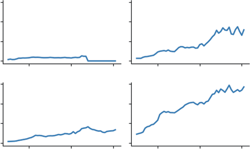
Listing 9-6 uses the .interpolate() function. Specifically, we use method='time'. This is critical for time-series data. It looks at the index (the dates) and draws a line between the valid points surrounding the gap. If the gap is three days long, it calculates the slope needed to get from the start to the end of that three-day period and fills in the missing days accordingly. This preserves the overall trend of the data without introducing artificial dips (like filling with 0) or plateaus (like filling with the mean). The result now is no missing data points. You can visualize what is happening in
The biggest risk with interpolation is hallucinating data. If you have a gap of three months in your sales data, drawing a straight line across it creates 90 days of fake data that implies a smooth, steady trend that likely never existed. As a rule of thumb, interpolate short gaps (to fix glitches) but treat long gaps as separate periods of analysis.
Aggregating and Resampling
Often, the raw data you collect is too granular for strategic decision-making. You might have data recorded every second or every hour, but your stakeholders care about the monthly total. This is where resampling becomes essential. It allows you to change the frequency of your data—for example, converting daily sales into monthly revenue—and define exactly how to aggregate those values, whether by summing them, taking the average, or finding the maximum.
Visualizing Change Over Time (Time-series) ❘ 199
Handling Missing Data with Time-based Interpolation
Observed Data
Interpolated Fill
180
160
alesS 140
120
100
1-01
1-03
1-05
1-07
1-09
1-11
1-13
1-15
1-17
1-19
2024-0
2024-0
2024-0
2024-0
2024-0
2024-0
2024-0
2024-0
2024-0
2024-0
Date
FIGURE 9-2: Handling missing data with time-based interpolation.
This is distinct from the rolling averages used earlier. A rolling average smooths the noise while keeping the original frequency (e.g., daily), whereas resampling fundamentally changes the shape of the data, condensing it into a new timeframe that aligns with your business reporting cycles. In Listing 9-7, daily data is resampled into monthly totals.
LISTING 9-7: RESAMPLING DAILY DATA TO MONTHLY TOTALS
# Make sure to run the previous listings before running this code
# Resample 'D' (Daily) data to 'ME' (Monthly) and calculate the Sum
monthly_sales = clean_data.resample('ME').sum()
print("\n--- Monthly Aggregates ---")
print(monthly_sales.head())
Listing 9-7 uses the .resample('ME') method. This tells Pandas to group our daily data into bins of months. This setting can be set to your data, for example, W for week. We then chain .sum() to tell it how to handle the data in those bins: add it all up. This transforms our 20 rows of daily data into a single row representing the total sales for January. The result of running this code is as follows:
--- Monthly Aggregates ---
Sales
2024-01-31 2967.030383
200 ❘ CHAPTER 9 ILLusTRATIng TImE-sERIEs AnD LInEAR DATA However, .sum() is just one of many aggregation methods available. Depending on your business question, you might choose differently:
➤
.mean(): Useful for finding the average daily performance over a month (e.g., What was our average daily active user count in March?).
➤
.max() or .min(): Essential for capacity planning (e.g., What was the peak server load last week? or What was the lowest inventory level this quarter?).
➤
.last(): Critical for financial data like stock prices or account balances, where you care about the value at the end of the period, not the sum or average.
Choosing the right aggregation function is as important as choosing the right timeframe; summing stock prices would be nonsensical, while averaging total revenue would be misleading.
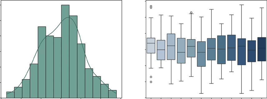
Boxplots and Histograms
While a line chart shows you when things happened, it can obscure what actually happened in terms of variability. To understand the behavior of your metric, you need to ignore time for a moment and look at the distribution. This answers critical questions such as: Is our server load usually stable at around 50%, or does it swing wildly between 10% and 90%?
Two visualizations are particularly powerful here. The histogram (often combined with a density plot) shows the overall shape of your data, whether it follows a normal bell curve or is skewed by extreme values. The boxplot is excellent for identifying outliers and visualizing the spread of data across different categories, such as comparing the volatility of sales in January versus July. Listing 9-8 creates this visualization.
LISTING 9-8: VISUALIZING TIME-SERIES DISTRIBUTIONS
import seaborn as sns
# Generate more data for a better distribution visual
np.random.seed(101)
long_dates = pd.date_range(start='2023-01-01', periods=365, freq='D')
# Data with a trend and some seasonality
daily_volatility = np.random.normal(0, 10, 365)
long_ts = pd.DataFrame({'Value': 100 + daily_volatility}, index=long_dates)
# --- Visualization ---
fig, (ax1, ax2) = plt.subplots(1, 2, figsize=(14, 6))
# 1. Histogram with Density (KDE)
sns.histplot(long_ts['Value'], kde=True, ax=ax1, color='teal')
ax1.set_title('Histogram & Density Plot')
ax1.set_xlabel('Daily Value')
# 2. Boxplot by Month (Checking for Seasonal Volatility)
# We add a 'Month' column for grouping
long_ts['Month'] = long_ts.index.month_name().str[:3] # Jan, Feb, Mar...
sns.boxplot(x='Month', y='Value', data=long_ts, ax=ax2, palette="Blues") ax2.set_title('Value Distribution by Month')
Visualizing Change Over Time (Time-series) ❘ 201
plt.tight_layout()
plt.show()
In Listing 9-8, the seaborn library is used. This library builds on top of Matplotlib and makes creating statistical plots much easier. We use sns.histplot to create the histogram on the left, adding a kde=True (kernel density estimate) line to smooth out the shape. For the right chart, we use sns.
boxplot. By setting x='Month', we slice our time-series data into 12 separate buckets, as shown
This visualization allows us to instantly compare the volatility of different months side-by-side, revealing seasonal patterns in variance that a simple line chart would hide.
Seasonality and Autocorrelation
In the previous section, we used a rolling average to smooth out short-term fluctuations so we could see the long-term trend. For many businesses, those fluctuations aren’t just noise, they are critical patterns. A retailer needs to know exactly how much of their December revenue is due to true growth versus just the holiday rush.
To understand these patterns deeply, we need to look at the memory of our time series. Does high sales today predict high sales tomorrow? Does a spike in January always lead to a slump in February?
This is the domain of autocorrelation.
Autocorrelation and Partial Autocorrelation
Autocorrelation function (ACF) is the correlation of a time series with itself at previous time steps, known as lags. Think of it as a measure of the echo in your data. If you shout in a canyon, you hear your voice bounce back a few seconds later. In time-series data, an event today (like a hot summer day) might “echo” into tomorrow’s sales. ACF answers the question: How much does the value at time t depend on the value at time t − 1, t − 2, and so on?
Histogram & Density Plot
Value Distribution by Month
130
60
120
50
110
40
100
30
ount
alue
C
V
20
90
10
80
0
70
70
80
90
100
110
120
130
Jan Feb Mar Apr May Jun Jul Aug Sep Oct Nov Dec
Daily Value
Month
FIGURE 9-3: Histogram and density plot and value distribution by month.
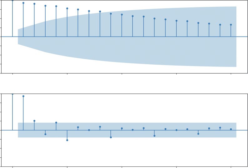
202 ❘ CHAPTER 9 ILLusTRATIng TImE-sERIEs AnD LInEAR DATA High autocorrelation means the past strongly predicts the future. If today’s sales are high, tomorrow’s sales are also likely to be high. The echo is loud. Seasonal autocorrelation is a specific type of echo that repeats. You might see a strong correlation every seven days (a weekly cycle where Mondays look like other Mondays) or every four quarters (an annual cycle where Q4 always spikes). Partial autocorrelation (PACF) is a slightly more sophisticated tool that helps us isolate the direct cause of a correlation. It measures the correlation between today and a past lag, but crucially, it removes the influence of all the steps in between.
In the real world, data is rarely influenced by a single cycle. Most economic datasets exhibit multiperiodicity, where multiple echoes overlap simultaneously. For example, a retail store might see a daily cycle (evenings are busier than mornings), a weekly cycle (Saturdays outperform Tuesdays), and an annual cycle (the December holiday rush). When we plot these correlations, we aren’t just looking for one spike; we are looking for a complex interference pattern of these different waves. Recognizing multiperiodicity is crucial because it prevents us from misidentifying a short-term weekly spike as a long-term trend.
To see how PACF helps isolate these layers, imagine a heatwave that affects sales. Imagine a five-day scorcher:
Days 1 and 2: Sales are high due to the onset of the heat.
Day 3: Sales remain high, but is this because of Day 1 or simply because Day 2 was hot?
Days 4 and 5: The trend continues.
If we use standard autocorrelation (ACF), Day 1 will appear highly predictive of Day 5. However, this is a false direct link caused by the intervening days (the ripple effect). PACF mathematically controls for Days 2, 3, and 4. It asks: Once we account for the fact that yesterday was hot, does the temperature from four days ago add any new information? If the answer is no, the PACF for that lag will drop to zero. This allows us to ignore the noise of the heatwave and identify the true seasonal lag, perhaps a recurring weekly delivery day, that actually dictates the inventory we need to stock.
To demonstrate this, Listing 9-9 uses a classic economic dataset: Real Personal Consumption Expenditures (PCE). This data tracks how much money American households spend on goods and services, adjusted for inflation. Crucially, we are using the non-seasonally adjusted version. This means the raw data still contains all the natural spikes and drops of the calendar year.
LISTING 9-9: VISUALIZING AUTOCORRELATION IN ECONOMIC DATA
import pandas as pd
import matplotlib.pyplot as plt
from statsmodels.graphics.tsaplots import plot_acf, plot_pacf
# 1. Load the Real Economic Data
# Real Personal Consumption Expenditures (Quarterly)
url = "https://github.com/bkrayfield/Applied-Math-With-Python/raw/refs/heads/main/
Data/ND000349Q.csv"
pce_data = pd.read_csv(url, parse_dates=['observation_date'],
index_col='observation_date')
Visualizing Change Over Time (Time-series) ❘ 203
# 2. Visualization: ACF and PACF
fig, (ax1, ax2) = plt.subplots(2, 1, figsize=(12, 8))
# Plot Autocorrelation (ACF)
# We look at 20 lags (5 years of quarterly data)
plot_acf(pce_data['ND000349Q'], lags=20, ax=ax1)
ax1.set_title('Autocorrelation Function (ACF) - The "Echo"')
# Plot Partial Autocorrelation (PACF)
plot_pacf(pce_data['ND000349Q'], lags=20, ax=ax2)
ax2.set_title('Partial Autocorrelation Function (PACF) - The "Direct Link"') plt.tight_layout()
plt.show()
Listing 9-9 uses statsmodels to generate the ACF and PACF plots. We load the PCE dataset, ensuring the dates are parsed correctly. Then, we create a figure with two subplots. The plot_acf function calculates the correlation between the time series and its lagged versions for up to 20 quarters (five years). Similarly, plot_pacf calculates the partial autocorrelation. You can see the results of
Autocorrelation Function (ACF)—The “Echo”
1.00
0.75
0.50
0.25
0.00
–0.25
–0.50
–0.75
–1.00
0
5
10
15
20
Partial Autocorrelation Function (PACF)—The “Direct Link”
1.00
0.75
0.50
0.25
0.00
–0.25
–0.50
–0.75
–1.00
0
5
10
15
20
FIGURE 9-4: Autocorrelation and partial autocorrelation plots.
204 ❘ CHAPTER 9 ILLusTRATIng TImE-sERIEs AnD LInEAR DATA
CF) shows a very slow decay. The bars remain high and positive for many lags, indicating a strong long-term trend, values don’t change much from one quarter to the next. The bottom chart (PACF) tells a sharper story. The massive spike at Lag 1 indicates that the single best predictor of this quarter’s spending is the immediately preceding quarter.
To elaborate more on why these plots are important, the slow decay in the ACF plot (top chart) is a classic signature of a trend. It tells us that the data points are sticky. For example, if sales were high last quarter, they are likely to be high this quarter, next quarter, and so on. This confirms that the long-term growth we saw in the line chart isn’t an illusion; it’s a statistically significant property of the data. This plot shows how each progressive data point is linked as a chain. The second PACF plot (bottom plot) looks at how specific historical data points affect what happens to future data points.
For example, if the line was larger four quarters ago, then we can conclude what happened one year ago has a direct influence on what happens today.
In short, these plots mathematically demonstrate why we need to use a model that accounts for both trend and seasonality (like seasonal_decompose or SARIMA), rather than a simple average. They move you from guessing there’s a pattern to knowing exactly what that pattern looks like.
Time-series Decomposition
The previous section used a rolling average to smooth out short-term fluctuations so we could see the long-term trend. For many businesses, those fluctuations aren’t just noise, they are critical patterns. A retailer needs to know exactly how much of their December revenue is due to true growth versus just the holiday rush.
To answer this, we use time-series decomposition. This statistical technique takes a single line chart and mathematically splits it into three distinct components:
➤
Trend: The long-term direction (up or down), stripped of all other noise.
➤
Seasonality: The repeating patterns that happen at fixed intervals (e.g., every December, every weekend).
➤
Residuals (noise): The random randomness that remains after the trend and seasonality are removed. This is the “unexplained” part of the data.
To demonstrate this, we’ll continue with the PCE dataset. Even more important, we are using the non-seasonally adjusted version. This means the raw data still contains all the natural spikes and drops of the calendar year (like the massive surge in spending every Q4 for the holidays). This makes it the perfect candidate for decomposition: we can use Python to find that holiday signal and separate it from the underlying economic growth.
In this analysis, we use a multiplicative model. Unlike an additive model, which assumes seasonal swings are a constant dollar amount, a multiplicative model assumes that seasonal effects are proportional to the trend. As the economy grows, the holiday spike scales up with it. Mathematically, we are representing the data as follows:
Observed = Trend ∗ Seasonality ∗ Residual
Visualizing Change Over Time (Time-series) ❘ 205
We can perform this advanced analysis with a single function from the statsmodels library called seasonal_decompose, shown in Listing 9-10.
LISTING 9-10: VISUALIZING SEASONALITY VS. TREND IN ECONOMIC DATA
import pandas as pd
import matplotlib.pyplot as plt
from statsmodels.tsa.seasonal import seasonal_decompose
# 1. Load the Real Economic Data
# Real Personal Consumption Expenditures (Quarterly)
url = "https://github.com/bkrayfield/Applied-Math-With-Python/raw/refs/heads/main/
Data/ND000349Q.csv"
pce_data = pd.read_csv(url, parse_dates=['observation_date'],
index_col='observation_date')
# 2. Run the Decomposition
# We specify 'period=4' because the data is Quarterly (4 points per year)
# model='multiplicative' is often better for economic data where volatility grows with the trend,
# but 'additive' is easier to interpret for a first example.
result = seasonal_decompose(pce_data['ND000349Q'], model=' multiplicative', period=4)
# 3. Visualization
# The result object has a built-in .plot() function that creates a 4-panel chart fig = result.plot()
fig.set_size_inches(10, 8) # Make it large enough to read
plt.suptitle('Decomposing Personal Consumption Expenditures (PCE)', fontsize=16, y=1.02)
plt.show()
In Listing 9-10, the core analysis happens with the seasonal_decompose function. We pass it two critical arguments. First, model='multiplicative' tells the function to treat the seasonal component as a percentage or factor of the trend. This is a more realistic x-ray for the PCE data because, over several decades, U.S. spending has increased significantly; it makes sense that the holiday surge in 2023 is much larger in absolute dollars than it was in 1970, even if the percentage of growth remains similar. Second, period=4 informs the algorithm that our data is quarterly, identifying the pattern that repeats every four observations.
The top panel, Observed, shows the raw, jagged path of the economy. The second panel, Trend, reveals the smooth underlying growth, clearly highlighting structural shifts like the flattening during the 2008 financial crisis.
The third panel, Seasonal, is where the multiplicative logic shines. Instead of showing dollar amounts, it shows a ratio. A value of 1.05 in Q4 would indicate that spending is 5% higher than the trend due to the season. This consumer heartbeat remains consistent even as the economy scales. Finally, the Residuals panel shows the noise. Because this is a multiplicative model, the residuals are centered on 1.0 rather than 0. Any sharp deviations from 1.0 represent shocks to the system, unpredictable events like the 2020 pandemic lockdowns that disrupted both the trend and the expected seasonal rhythm.
206 ❘ CHAPTER 9 ILLusTRATIng TImE-sERIEs AnD LInEAR DATA
Decomposing Personal Consumption Expenditures (PCE)
ND000349Q
4000
3500
3000
2500
4000
3500
Trend 3000
2500
1.02
1.00
Seasonal 0.98
1.00
0.75
esid 0.50
R 0.25
0.00
2004
2008
2012
2016
2020
2024
FIGURE 9-5: A time-series decomposition of U.S. consumer spending.
PANEL DATA
Finally, we turn to the most complex data structure: panel data. This is data that tracks multiple subjects over multiple time periods. Imagine a dataset tracking the price of energy across different sectors (residential, commercial, industrial) and fuel types over 50 years.
If you try to plot this on a single line chart, you get a spaghetti chart, a tangled mess of overlapping lines that is impossible to read. The solution is small multiples (or faceting). Instead of one big chart, you create a grid of smaller charts, one for each category. This allows the eye to easily compare trends without visual clutter.
Listing 9-11 creates small multiples using data composed of energy prices by sectors. We use a dataset of energy prices in New York State from 1970 to 2022. It contains prices for different fuel types (natural gas, electricity) across different economic sectors.
Panel Data ❘ 207
LISTING 9-11: CREATING SMALL MULTIPLES WITH SEABORN
import pandas as pd
import matplotlib.pyplot as plt
import seaborn as sns
# 1. Load the Raw Data
energy_data = pd.read_csv(url)
# 2. Reshape from "Wide" to "Long" Format
# The data has fuel types as separate columns (Coal, Natural Gas, etc.).
# Seaborn prefers "Long" format: one column for "Fuel Type" and one for "Price".
fuel_cols = ['Coal', 'Propane', 'Natural Gas', 'Electricity']
energy_long = energy_data.melt(
id_vars=['Year', 'Sector'], # Identifiers to keep
value_vars=fuel_cols, # Columns to unpivot
var_name='Fuel Type', # New column name for headers
value_name='Price' # New column name for values
)
# 3. Clean the Price Column
# Prices have '$' signs (e.g., "$1.09"), so pandas reads them as strings/objects.
# We must remove the '$' and convert to float.
energy_long['Price'] = energy_long['Price'].astype(str).str.
replace('$', '', regex=False)
energy_long['Price'] = pd.to_numeric(energy_long['Price'], errors='coerce')
# Filter for just "Residential" to make the chart focused
residential_energy = energy_long[energy_long['Sector'] == 'Residential']
# 4. Create Small Multiples
g = sns.relplot(
data=residential_energy,
x="Year", y="Price",
col="Fuel Type", # Create a separate chart for each Fuel Type kind="line",
col_wrap=2, # Start a new row after 3 charts
height=2, aspect=1.5,
linewidth=2
)
# Add Titles
g.fig.suptitle('Residential Energy Price Trends (Per Million BTU1970-2021)', y=1.02, fontsize=16)
plt.show()
In Listing 9-11, we use seaborn’s relplot function, which is designed specifically for handling complex, multi-dimensional data. The key argument is col="Fuel Type". This tells seaborn to slice the data by fuel type and automatically generate a separate subplot for each one. The col_wrap=2 code
208 ❘ CHAPTER 9 ILLusTRATIng TImE-sERIEs AnD LInEAR DATA
Residential Energy Price Trends (Per Million BTU, 1970–2021)
Fuel Type = Coal
Fuel Type = Propane
60
40
riceP 20
0
Fuel Type = Natural Gas
Fuel Type = Electricity
60
40
riceP 20
0
1980
2000
2020
1980
2000
2020
Year
Year
FIGURE 9-6: Residential energy prices.
ensures the charts are arranged in a neat grid rather than in one long row. You can see this visual in
This visualization technique reveals insights that would be hidden in a single chart. We can instantly see that electricity prices have been relatively stable and high, while fuel oil and propane prices are extremely volatile, spiking dramatically during geopolitical crises. By separating the signals, we respect the complexity of the data while keeping the story clear.
SUMMARY
This chapter explored the critical role of data visualization in translating raw numbers into actionable business insights. It established that the first step in any visualization task is diagnosing the fundamental structure of the data: cross-sectional (a snapshot in time), time-series (a historical sequence), or panel data (multidimensional history). The chapter demonstrated how identifying these structures allows analysts to select the appropriate visualization strategy, whether utilizing bar charts for direct comparisons, line charts for analyzing trends, or faceted plots to untangle complex, multi-subject datasets.
It then focused heavily on the mechanics of working with time-series data, utilizing Python’s Matplotlib and Pandas libraries to move beyond simple plotting. You learned about techniques for revealing long-term signals amid short-term noise using rolling averages and addressed common real-world data issues by applying time-based interpolation to repair missing values. The chapter also examined how to change the temporal resolution of data through resampling, aggregating granular observations into meaningful business cycles, and how to visualize volatility and distribution using histograms and boxplots.
Finally, the chapter introduced advanced diagnostic techniques to mathematically quantify the patterns hidden within time-series data. It utilized autocorrelation (ACF) and partial autocorrelation
Continue Your Learning ❘ 209
(PACF) to measure the memory or echo within a dataset and applied time-series decomposition to separate data into its constituent parts: trend, seasonality, and residual noise. The chapter concluded by applying these principles to panel data, using seaborn to create organized, comparative views that prevent visual clutter and highlight relationships across different categories over time.
CONTINUE YOUR LEARNING
Data visualization and time-series analysis are disciplines that bridge the gap between engineering and art. While this chapter provided the technical foundation for revealing patterns in noise, mastering the aesthetic and theoretical sides of these topics will make your analysis significantly more persuasive.
The following resources are curated to help you master the libraries we used and deepen your theoretical understanding:
Official Documentation
➤
Matplotlib: The foundational library for Python plotting. The gallery section is particularly useful for finding code snippets for specific chart types.
➤
Seaborn: The high-level interface for statistical graphics. Their tutorial on visualizing statistical relationships is excellent for understanding panel data and complex distributions.
➤
Pandas Time Series: The definitive guide to the functionality that makes Python so powerful for financial and economic analysis, covering offsets, shifting, and frequency conversion.
➤
Statsmodels Time Series analysis: Deep documentation for the advanced components we touched on, such as decomposition, stationarity tests, and autocorrelation.
Recommended Reading
➤
Storytelling with Data by Cole Nussbaumer Knaflic: This book focuses less on code and more on the design principles for creating charts that effectively communicate a message to stakeholders. It is essential reading for the “last mile” of analytics.
➤
Python for Data Analysis by Wes McKinney: Written by the creator of Pandas, this book offers the most in-depth look at the mechanics of data manipulation, particularly for time-series operations and cleaning messy datasets.
➤
Effective Pandas 2 by Matt Harrison: A standard in the field for learning idiomatic Pandas and data manipulation patterns. This is an excellent resource for those looking to write
“Treading on Python” style code, with updated editions covering the latest features in Pandas.
➤
Forecasting: Principles and Practice by Hyndman and Athanasopoulos: While the code examples are in R, this is widely considered the gold standard textbook for the theory behind time-series decomposition and forecasting.
210 ❘ CHAPTER 9 ILLusTRATIng TImE-sERIEs AnD LInEAR DATA In addition to generating charts, you will frequently need to manipulate the shape of your time-series data to prepare it for analysis. T
Pandas and Statsmodels used to structure, smooth, and diagnose temporal data.
TABLE 9-1: Essential Visualization and Time-series Functions FUNCTION/METHOD
LIBRARY
DESCRIPTION
.to_datetime()
Pandas
Converts string arguments to datetime
objects. The critical first step for any
time-series analysis.
.set_index()
Pandas
Moves a column (usually the date) to the
DataFrame index, enabling time-aware
slicing and plotting.
.rolling(window=n).mean()
Pandas
Calculates a moving average over a
specified window n to smooth out
short-term noise and reveal trends.
.interpolate(method='time')
Pandas
Fills missing values (NaN) by drawing a
line between existing points, respecting
the time distance between them.
.resample(rule).func()
Pandas
Changes the frequency of the data (e.g.,
Daily to Monthly). Must be chained with
an aggregation function like.sum() or.
mean().
.shift(periods=n)
Pandas
Shifts the index by n periods. Essential
for calculating percent changes or
creating lag features for models.
seasonal_decompose()
Statsmodels
Mathematically separates a time series
into three distinct components: Trend,
Seasonality, and Residuals.
plot_acf() / plot_pacf()
Statsmodels
Visualizes autocorrelation and partial
autocorrelation to diagnose the “mem-
ory” and cyclic dependency in the data.
sns.relplot(kind='line')
Seaborn
The primary function for creating “small
multiples” (faceted plots) to visualize
panel data without clutter.


10
Illustrating Cross-sectional Data
If time-series analysis, covered in the previous chapter, is akin to watching a movie of your business history, cross-sectional analysis is like examining a high-resolution photograph. You are freezing time to look at the relationships between different entities at a single, distinct moment. In the previous chapter, we asked how we got here. This chapter pivots to an equally critical question—where are we right now?
Cross-sectional visualization allows you to ignore the timeline and focus on structure. It answers questions of rank, such as identifying which product is the current bestseller; questions of distribution, such as determining if your customer base is predominantly young or old; and questions of correlation, such as asking if higher advertising spend actually leads to higher sales volume. In this chapter, you will master the art of comparison using bar charts, explore the shape of data using histograms and boxplots, and reveal hidden relationships between variables using scatterplots.
DATA CATEGORIES
Business questions often revolve around structure rather than magnitude. We need to understand the makeup of our data. This is the domain of categorical analysis, specifically part-to-whole comparisons. Whether you are breaking down a marketing budget, analyzing market share, or looking at the inventory mix of a warehouse, the goal is to visualize how multiple small parts combine to form the total picture. The following sections explore how to answer these questions using visuals.
The Pie Chart
When the analytical question shifts from ranking to composition, we are no longer looking for the highest value; we are looking for the share of the total. We want to know how a specific entity, like a budget, a market, or a dataset, is divided into its constituent parts. The fundamental tool for this is the pie chart.
212 ❘ CHAPTER 10 IllusTRATIng CRoss-sECTIonAl DATA The pie chart represents a single categorical variable as a circle, where the entire area corresponds to 100% of the data. The circle is sliced into sectors, with the arc length and angle of each slice proportional to the category’s contribution to the whole. It provides stakeholders with an immediate, intuitive sense of proportion, allowing them to quickly identify dominant categories without reading specific numbers.
Listing 10-1 visualizes the composition of our vegetable dataset (from Chapter 9) to see the breakdown of different forms (Fresh, Canned, Frozen, etc.). As a reminder, the vegetable dataset is a cross-sectional dataset showing the prices of different vegetables and the manner they are delivered (form: like Frozen or Fresh).
NOTE Note that Listing 10-1 uses a CSV file called Vegetable-Prices-2022.
csv found on GitHub. This file, along with the files used in the other listings in this chapter, are also included in the downloadable files for this book, located on the Wiley site at .
LISTING 10-1: THE STANDARD PIE CHART
import matplotlib.pyplot as plt
import pandas as pd
import seaborn as sns
# Load the Data
url = "https://github.com/bkrayfield/Applied-Math-With-Python/raw/refs/heads/main/
Data/Vegetable-Prices-2022.csv"
veg_prices = pd.read_csv(url)
# 1. Prepare the Data
# We count the frequency of each form to get the 'parts' of the whole form_counts = veg_prices['Form'].value_counts()
# 2. Visualization
plt.figure(figsize=(8, 8))
# We use Matplotlib's native pie function
plt.pie(
form_counts,
labels=form_counts.index,
autopct='%1.1f%%', # Format the percentages (e.g., 15.5%)
startangle=140, # Rotate the chart to a pleasing angle
colors=sns.color_palette('pastel') # Use a soft color palette
)
plt.title('Composition of Vegetable Forms', fontsize=16)
plt.show()
In Listing 10-1, we utilize Matplotlib’s .pie() function. Unlike bar or scatterplots, which require X
and Y coordinates, a pie chart requires only a single array of numerical values (form_counts). The
Data Categories ❘ 213
function automatically calculates the total sum and determines the angle for each slice. We utilize the autopct parameter to overlay the calculated percentages directly onto the chart; the string format
'%1.1f%%' instructs Python to display the number as a float with one decimal place followed by a percent sign. Finally, startangle=140 allows us to rotate the entire chart, ensuring that the labels are positioned in the most readable orientation.
This figure utilizes a pie chart to visualize the composition of the dataset by vegetable form, providing an immediate “part-to-whole” comparison. The chart reveals that fresh vegetables dominate the dataset, accounting for nearly half of all items at 45.2%.
The remaining half is split between processed forms, with canned vegetables representing 25.8%, frozen vegetables representing 20.4%, and dried vegetables making up the smallest portion at 8.6%.
This distribution clearly indicates that the dataset is balanced roughly 50/50 between fresh produce and preserved alternatives.
We can further customize the pie chart to emphasize specific insights or improve aesthetics. If a particular category requires immediate attention, such as highlighting the prevalence of fresh vegetables, we can use the explode parameter. This argument accepts a collection of values corresponding to the slices; setting a non-zero value (e.g., 0.1) for a specific slice will “explode” or offset it from the center, isolating it visually. Additionally, analysts often prefer a donut chart variation, which can be achieved in Matplotlib by adding the wedgeprops argument (e.g., wedgeprops={'width': 0.5}).
This hollows out the center, reducing the visual mass of the chart and shifting the focus to the length of the arcs rather than the total area.
Donut Charts
In the business world, the pie chart is ubiquitous. It is the default choice for showing part-to-whole composition, such as market share or budget allocation. However, among data scientists and Composition of Vegetable Forms
Frozen
Dried
20.4%
8.6%
25.8%
Canned
45.2%
Fresh
FIGURE 10-1: Pie chart of vegetables.
214 ❘ CHAPTER 10 IllusTRATIng CRoss-sECTIonAl DATA visualization experts, it is viewed with skepticism. The criticism is not just aesthetic; it is functional.
Pie charts are notoriously difficult to read with precision. When slices are similar in size, it is nearly impossible for a viewer to distinguish the difference based on the angle alone. Furthermore, comparing slices that are not adjacent requires the viewer to mentally rotate the shapes, increasing cognitive load and the likelihood of error.
Despite these limitations, stakeholders often demand them because they provide an immediate, intuitive sense of “wholeness” that a bar chart lacks. If you must use a circular visualization, the donut chart is a superior alternative. By removing the center, you remove the most difficult aspect of the chart to interpret, the angles at the vertex. This forces the eye to compare the arc lengths of the outer ring, which is slightly more intuitive. Additionally, the empty center provides valuable real estate to display a summary statistic, such as the grand total, making the chart more information-dense.
Listing 10-2 visualizes the composition of our vegetable dataset to show the proportion of items that are fresh versus canned versus frozen.
LISTING 10-2: CREATING A DONUT CHART WITH MATPLOTLIB
import matplotlib.pyplot as plt
import pandas as pd
# Load the Data
url = "https://github.com/bkrayfield/Applied-Math-With-Python/raw/refs/heads/main/
Data/Vegetable-Prices-2022.csv"
veg_prices = pd.read_csv(url)
# 1. Prepare the Data
# Count the frequency of each form
form_counts = veg_prices['Form'].value_counts()
# 2. Visualization
plt.figure(figsize=(8, 8))
# Create the Pie Chart
# autopct formats the values as percentages (e.g., '12.5%')
# startangle=90 rotates the start to the top (12 o'clock)
plt.pie(
form_counts,
labels=form_counts.index,
autopct='%1.1f%%',
startangle=90,
colors=sns.color_palette('pastel'),
wedgeprops={'edgecolor': 'white', 'linewidth': 2}
)
# 3. Transform into a Donut
# We draw a white circle in the center to cover the middle
centre_circle = plt.Circle((0, 0), 0.70, fc='white')
fig = plt.gcf()
fig.gca().add_artist(centre_circle)
Data Categories ❘ 215
plt.title('Distribution of Vegetable Forms in Dataset', fontsize=16)
plt.show()
In Listing 10-2, we rely on Matplotlib’s foundational .pie() function. The transformation into a donut is a visual hack. Matplotlib does not have a native donut function. Instead, we create a standard pie chart and then instantiate a plt.Circle object. The arguments (0, 0) and 0.70 place the circle at the origin with a radius of 0.7 (covering 70% of the pie). We then access the current figure using plt.gcf() and “add the artist” (the circle) on top of the existing plot. This technique creates the modern ring aesthetic while preserving the underlying statistical proportions.
The .pie() function offers several parameters to refine the presentation of categorical data beyond basic slices. You can use explode to pass an array of offsets that pull specific slices away from the center, which is ideal for highlighting a particular data point. The wedgeprops dictionary allows for fine-grained control over the slices themselves, such as setting edgecolor and linewidth to create clear boundaries or using width to transform the pie into a donut chart. Additionally, textprops can be used to modify the font size and color of labels, while the normalize parameter ensures that the data scales correctly to a full circle even if the input values don’t sum to 1 or 100.
format. By removing the center, the visualization shifts the viewer’s focus from the angles at the vertex to the arc lengths of the outer ring, which many find easier to compare. The statistical breakdown remains identical; fresh vegetables comprise the clear majority at 45.2%, followed by canned at 25.8%, frozen at 20.4%, and dried at 8.6%, but the inclusion of whitespace in the middle produces a cleaner aesthetic and eliminates the visual clutter where the slices would normally converge.
Distribution of Vegetable Forms in Dataset
Dried
8.6%
Frozen
20.4%
Fresh
45.2%
25.8%
Canned
FIGURE 10-2: Donut plot.
216 ❘ CHAPTER 10 IllusTRATIng CRoss-sECTIonAl DATA The .pie() function offers several parameters to further refine the presentation of categorical data beyond basic slices. You can use the explode parameter to pass an array of offsets that pull specific slices away from the center, which is ideal for highlighting a particular data point like the dominant Fresh category. The wedgeprops dictionary allows for fine-grained control over the slices themselves; beyond setting the edgecolor and linewidth to create clear boundaries, you can also use the width key here to create a donut chart natively (without the circle overlay hack). Additionally, textprops can be used to modify the font size and color of labels, while the normalize parameter ensures that the data scales correctly to a full circle even if the input values don’t sum to exactly 1 or 100.
Stacked Bar Charts
While pie and donut charts are effective for high-level summaries, they can be inefficient when space is limited or when you need to compare multiple compositions side-by-side. In these instances, the stacked bar chart offers a distinct advantage. It functions effectively as a linear pie chart, unrolling the circle into a single rectangular bar.
This transformation allows viewers to judge proportions based on length, a task the human eye performs with high accuracy, rather than angle or area. Furthermore, stacked bars are exceptionally space-efficient. They allow you to display complex part-to-whole relationships within the compact rows of a table or a tight dashboard panel, where a circular chart would be too bulky to be legible.
Listing 10-3 utilizes Matplotlib’s core primitives to build a custom visualization. This is necessary because a stacked bar is technically just a series of standard bars placed end-to-end.
LISTING 10-3: THE STACKED BAR (A BETTER ALTERNATIVE)
import matplotlib.pyplot as plt
import pandas as pd
# Load the Data
url = "https://github.com/bkrayfield/Applied-Math-With-Python/raw/refs/heads/main/
Data/Vegetable-Prices-2022.csv"
veg_prices = pd.read_csv(url)
# 1. Create a Frequency Table (Composition Data)
# We count how many vegetables exist for each form
composition = veg_prices['Form'].value_counts().reset_index()
composition.columns = ['Form', 'Count']
# Calculate Percentage
total = composition['Count'].sum()
composition['Percentage'] = (composition['Count'] / total) * 100
# 2. Visualization
plt.figure(figsize=(10, 2))
# Create a horizontal stacked bar
# We use the 'Percentage' column for the width so the axis spans 0-100
left = 0
Correlations and Distributions ❘ 217
for i, row in composition.iterrows():
plt.barh(
y=0,
width=row['Percentage'],
left=left,
label=f"{row['Form']} ({row['Percentage']:.0f}%)"
)
left += row['Percentage']
plt.title('Dataset Composition: Vegetable Forms by Percentage')
plt.yticks([]) # Remove y-axis ticks
plt.xlabel('Percentage of Total (%)')
plt.xlim(0, 100) # Force the axis to end exactly at 100
# Adjust legend placement
# bbox_to_anchor moves the legend relative to the anchor point
plt.legend(ncol=4, loc='upper center', bbox_to_anchor=(0.5, -0.35), frameon=False)
# Explicitly add space at the bottom for the legend
plt.subplots_adjust(bottom=0.45)
plt.show()
For this stacked bar chart, we manage the placement of the bars using the left variable, which acts as an accumulator. It starts at 0 and increments by the width of each bar (left +=
row['Percentage']) after every iteration of the loop. This ensures that the start of the next bar aligns perfectly with the end of the previous one.
Critically, Listing 10-3 visualizes the percentage of vegetable forms (Canned, Fresh, or Frozen), not the raw count. By setting width=row['Percentage'] and enforcing plt.xlim(0, 100), we normalize the visual scale, guaranteeing the bar spans exactly from 0 to 100 units regardless of the dataset size.
Finally, we address the common issue of legend overlap using plt.subplots_adjust(bottom=0.45).
This command essentially shrinks the height of the chart content within the window, creating a reserved margin of whitespace at the bottom where the legend can reside without obstructing the data or being clipped by the window frame.
This figure visualizes the dataset composition using a horizontal stacked bar chart, essentially unrolling the previous pie chart into a single linear track. The entire length of the bar represents 100% of the data, segmented by color to show the relative contribution of each form. Fresh vegetables clearly dominate the distribution, occupying the first 45% of the bar, followed by canned at 26%, frozen at 20%, and dried at 9%. This layout facilitates a direct comparison of segment lengths along the x-axis, offering a more precise and space-efficient alternative to circular charts for gauging part-to-whole relationships.
CORRELATIONS AND DISTRIBUTIONS
The most common task in business analytics is ranking. You are often presented with a categorical list, sales reps, product lines, or store locations, and the immediate business need is to identify who is
218 ❘ CHAPTER 10 IllusTRATIng CRoss-sECTIonAl DATA Dataset Composition: Vegetable Forms by Percentage
0
20
40
60
80
100
Percentage of Total (%)
Fresh (45%)
Canned (26%)
Frozen (20%)
Dried (9%)
FIGURE 10-3: Stacked bar chart.
outperforming the pack and who is lagging behind. While a spreadsheet or a table offers precision to the umpteenth decimal place, it fails at pattern recognition. To find the maximum value in a table of 50 states, your brain must read 50 individual numbers, hold them in short-term memory, and compare them. A visual comparison makes the maximum obvious in milliseconds. Two ways to do visual comparisons are bar charts and boxplots.
Bar Charts
The bar chart (sometimes called a bar plot) is the undisputed workhorse for this type of cross-sectional comparison. However, a common mistake that analysts make is sticking to the default vertical alignment found in most software. When your category names are long, for example, “Enterprise Software License” versus “Consumer App,” vertical labels often overlap, become unreadable, or get rotated 90 degrees, forcing the readers to tilt their heads to read the axis.
To solve this, we apply a simple heuristic: if you have more than five categories, or if your category names are long, use a horizontal bar chart. Furthermore, the order of the bars matters immensely.
An unsorted bar chart is just a column forest that forces the eye to jump back and forth to compare heights. Sorted bars create a staircase effect, allowing the viewer to instantly group the high-cost items versus the low-cost items. Another solution to this issue could be to rotate the labels 45 degrees.
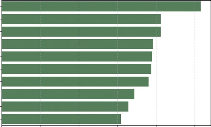
Listing 10-4 creates a hierarchal bar chart of the vegetable data we introduced earlier in this chapter to compare retail prices effectively.
LISTING 10-4: THE HORIZONTAL BAR CHART
import pandas as pd
import matplotlib.pyplot as plt
import seaborn as sns
# 1. Load the Data
url = "https://github.com/bkrayfield/Applied-Math-With-Python/raw/refs/heads/main/
Data/Vegetable-Prices-2022.csv"
veg_prices = pd.read_csv(url)
# 2. Prepare the Data
# Filter for just "Fresh" vegetables to make a fair comparison
Correlations and Distributions ❘ 219
# and sort the values to create a logical "staircase" visual fresh_veg = veg_prices[veg_prices['Form'] == 'Fresh'].sort_values('RetailPrice', as cending=False).head(10)
# 3. Visualization
plt.figure(figsize=(10, 6))
# We use orient='h' for horizontal bars to accommodate long labels
sns.barplot(
data=fresh_veg,
x='RetailPrice',
y='Vegetable',
color='seagreen'
)
plt.title('Top 10 Most Expensive Fresh Vegetables (2022)', fontsize=14) plt.xlabel('Price per Pound ($)')
plt.ylabel('') # Remove the y-label as it's self-explanatory
plt.grid(axis='x', linestyle='--', alpha=0.7)
plt.show()
In Listing 10-4, the code begins with a rigorous data preparation phase using Pandas chained operations. We first apply a Boolean mask [veg_prices['Form'] == 'Fresh'] to isolate a specific subset of data; comparing fresh produce to canned or frozen goods would introduce skew due to processing costs, so this filtering is statistically essential. Immediately following the filter, we invoke.
sort_values('RetailPrice', ascending=False). This is a critical step for visualization; without sorting the DataFrame before passing it to the plotting library, the resulting chart would display bars in random index order, destroying the ability to quickly rank items. We conclude the chain with.
head(10) to limit our dataset to the top outliers, preventing the chart from becoming overcrowded.
The visualization itself relies on Seaborn’s sns.barplot() function. We explicitly map the quantitative variable RetailPrice to the x-axis and the categorical variable Vegetable to the y-axis. While modern versions of Seaborn can infer orientation based on data types, explicit mapping ensures stability. By setting color='seagreen', we override the default multi-colored palette; in a ranking chart where distinct colors do not represent distinct data groups, using a single uniform color reduces cognitive load and keeps the focus on the length of the bars. Finally, plt.grid(axis='x') is added to improve readability, allowing the eye to trace the end of a bar down to the specific value on the x-axis.
W followed by spinach, mushrooms, and more. The bar chart provides a simple way to determine quantity. The choice of vertical or horizontal is usually based on the preference or the shape of your data.
Seaborn’s barplot function offers extensive customization options to adapt the chart to more complex data stories. While we used color to set a uniform tone, you can use the hue parameter to introduce a second categorical variable, which will split each bar into sub-groups (comparing prices across different years side-by-side). You can also utilize the palette parameter to apply meaningful color maps, such as a diverging palette if your data centers around zero, or a sequential palette to emphasize magnitude. Additionally, because Seaborn is built on top of Matplotlib, you can fine-tune axes using standard commands; for example, if you prefer vertical bars but have tight spacing, you
220 ❘ CHAPTER 10 IllusTRATIng CRoss-sECTIonAl DATA
Top 10 Most Expensive Fresh Vegetables (2022)
Okra
Spinach, boiled
Spinach, eaten raw
Mushrooms, sliced
Mushrooms, whole
Tomatoes, grape, & cherry
Cauliflower florets
Kale
Lettuce, romaine, hearts
Collard greens
0
1
2
3
4
5
Price per Pound ($)
FIGURE 10-4: Bar chart of fresh vegetables.
can use plt.xticks(rotation=45) to angle your labels legibly. Finally, the errorbar parameter (formerly ci) allows you to automatically calculate and display confidence intervals, adding a layer of statistical rigor to your visual comparison.
Boxplots
One of the most misunderstood concepts in data analysis is the average. Averages obscure reality. For example, if you have two people, and one earns nothing and the other earns $100,000, the average salary is $50,000, a number that accurately describes neither person. To truly understand cross-sectional data, you must understand its distribution. You need to know if your data is clustered tightly around the middle (a normal distribution) or if it is skewed by a few (a long-tail distribution).
For example, we can ask whether fresh produce is significantly more volatile in price than canned produce.
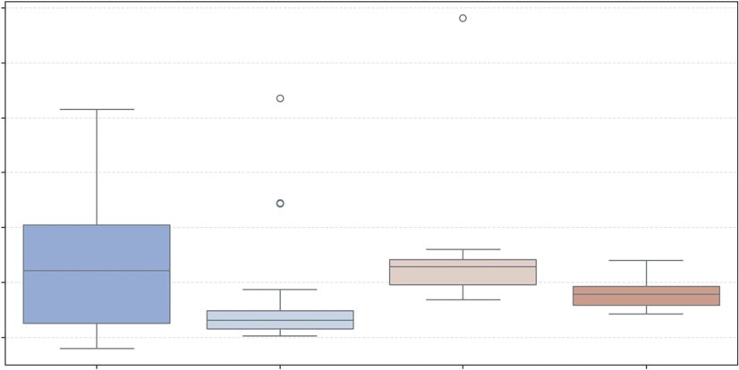
To visualize this in Listing 10-5, we use the boxplot. It is a standardized way of displaying data based on a five-number summary: minimum, first quartile (25%), median, third quartile (75%), and maximum.
LISTING 10-5: COMPARING DISTRIBUTIONS WITH BOXPLOTS
import pandas as pd
import matplotlib.pyplot as plt
import seaborn as sns
Correlations and Distributions ❘ 221
# Load the Data
url = "https://github.com/bkrayfield/Applied-Math-With-Python/raw/refs/heads/main/
Data/Vegetable-Prices-2022.csv"
veg_prices = pd.read_csv(url)
plt.figure(figsize=(12, 6))
# We filter out rare forms to keep the chart clean
common_forms = veg_prices[veg_prices['Form'].isin(['Fresh', 'Canned', 'Frozen',
'Dried'])]
sns.boxplot(
data=common_forms,
x='Form',
y='RetailPrice',
palette='coolwarm'
)
plt.title('Price Distributions by Vegetable Form')
plt.xlabel('Form')
plt.ylabel('Retail Price per Pound ($)')
plt.grid(axis='y', linestyle='--', alpha=0.3)
plt.show()
The code in Listing 10-5 delegates significant statistical computation to the sns.boxplot function.
When we pass x='Form' and y='RetailPrice', Seaborn groups the DataFrame by the unique values in the Form column. For each group, it automatically calculates the interquartile range (IQR), which is the distance between the 25th percentile and the 75th percentile. This range forms the
The function then calculates the whiskers (usually 1.5
times the IQR) to determine reasonable boundaries for the data. Any data point existing outside these calculated whiskers is rendered as an individual diamond or dot. This automatic outlier detection is why the boxplot is superior to a bar chart for risk analysis; it visually separates the “normal” variation from the extreme anomalies (like the wildly expensive dried mushrooms) without requiring the user to write manual filtering logic.
which utilizes a boxplot to compare the statistical distribution of retail prices across four vegetable forms: fresh, canned, frozen, and dried.
it is important to understand the specific statistical attributes that define the boxplot’s structure. The box represents the interquartile range (IQR), while the horizontal line within it denotes the median. In Seaborn, these elements are controlled by specific parameters: whis defines the length of the whiskers (commonly set to 1.5 times the IQR), and showfliers determines whether the extreme outliers (the dots seen in the Canned and Frozen categories) are displayed.
Furthermore, you can enhance the comparison using the notch=True attribute, which creates a narrowed area around the median to represent a confidence interval, or showmeans=True to add a distinct marker for the arithmetic average. These coded values allow for a precise fine-tuning of the styles, box widths, and cap lengths to make the volatility in the Fresh category even more visually distinct.
, evidenced by its tall interquartile range (the height of the box) and long whiskers, indicating that fresh produce prices vary
222 ❘ CHAPTER 10 IllusTRATIng CRoss-sECTIonAl DATA
Price Distributions by Vegetable Form
7
6
5
ound ($)
4
rice per P 3
ail PetR
2
1
Fresh
Canned
Frozen
Dried
Form
FIGURE 10-5: Boxplot.
widely from under $1 to over $5 per pound. In contrast, canned vegetables (the gray box in the middle) show a highly compressed distribution with a low median price, suggesting stability and consistency in pricing, though the distinct dots appearing above the whiskers reveal specific outliers, likely specialty items, that break this trend. The Frozen category shows a tighter price spread than fresh produce but contains the single most extreme outlier in the dataset, reaching nearly $7 per pound. Finally, the Dried category does not show outliers and has a median price around $2.
CORRELATIONS IN THE CROSS SECTION
Analyzing cross-sectional data requires more than just looking at individual distributions; it requires an investigation into how different variables interact with one another. To uncover these relationships, we primarily rely on two distinct but complementary visualization techniques. First, we use scatterplots to observe the raw, granular interaction between two or more variables, allowing us to spot nonlinear patterns and individual outliers. Second, we utilize correlation heatmaps to provide a high-level statistical summary of the entire dataset, using color-coded grids to quantify the strength of relationships between all numerical variables at once. By combining these two views, you can move from identifying broad trends to inspecting the specific data points that drive them.
Scatterplots
Cross-sectional data shines when you want to understand how two different variables interact. This is the domain of correlation. In our vegetable dataset, we have a unique variable called Yield. This
Correlations in the Cross section ❘ 223
represents the percentage of the vegetable that is edible (e.g., a yield of 1.0 means you eat the whole thing; 0.5 means half is waste, like peels or seeds).
We might ask: Do vegetables with higher waste (lower yield) per pound? The scatterplot is the primary tool for this investigation. It maps one variable to the x-axis and another to the y-axis.
However, we can enhance this 2D plot to show four dimensions of data by utilizing Color (Hue) to represent the form (Fresh vs. Canned) and Size to represent the cost per cup (the true cost of eating).
Listing 10-6 creates a scatterplot to view the correlation. This listing builds on the vegetable prices data.
LISTING 10-6: MULTIVARIATE SCATTERPLOTS
import pandas as pd
import matplotlib.pyplot as plt
import seaborn as sns
# 1. Load the Data
url = "https://github.com/bkrayfield/Applied-Math-With-Python/raw/refs/heads/main/
Data/Vegetable-Prices-2022.csv"
veg_prices = pd.read_csv(url)
veg_prices = veg_prices[veg_prices['Form'].isin(['Fresh', 'Canned', 'Frozen'])]
# Visualization
plt.figure(figsize=(12, 8))
# We map 4 variables onto one chart:
# 1. x-axis: Yield (Efficiency: 0.0 to 1.0)
# 2. y-axis: RetailPrice (Cost to buy)
# 3. hue: Form (Fresh, Canned, Frozen, etc.)
# 4. size: CupEquivalentPrice (True cost to eat)
sns.scatterplot(
data=veg_prices,
x='Yield',
y='RetailPrice',
hue='Form',
size='CupEquivalentPrice',
sizes=(20, 200), # Control the min and max dot size for readability
alpha=0.6, # Transparency helps when dots overlap
palette='viridis'
)
plt.title('Vegetable Prices: Retail Cost vs. Edible Yield', fontsize=16) plt.xlabel('Yield (1.0 = 100% Edible)', fontsize=16)
plt.ylabel('Retail Price per Pound ($)', fontsize=16)
plt.legend(bbox_to_anchor=(1.05, 1), loc='upper left', fontsize=16) # Move legend outside
plt.tight_layout()
plt.show()
Listing 10-6 demonstrates the declarative power of Seaborn, allowing us to map four distinct dimensions of data onto a single 2D plane without writing complex loops. The hue='Form'
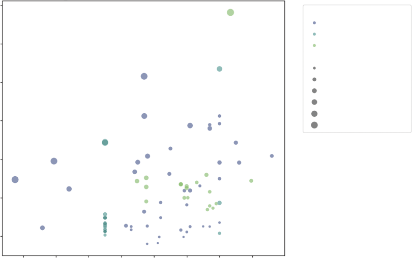
224 ❘ CHAPTER 10 IllusTRATIng CRoss-sECTIonAl DATA
parameter instructs Seaborn to inspect the Form column and automatically assign a distinct color to each category (Fresh, Canned, and Frozen). Simultaneously, the size='CupEquivalentPrice'
parameter maps the calculated serving cost to the physical area of the marker. The sizes=(20, 200) argument is a normalization tuple; it clamps the minimum dot size to 20 pixels and the maximum to 200 pixels, ensuring that cheap items are still visible while expensive items do not obscure the entire plot,
We also introduce the alpha=0.6 parameter. In scatterplots with high data density, points often stack on top of each other (called overplotting). By setting alpha (opacity) to 60%, overlapping points appear darker, revealing density clusters that would otherwise be hidden. Finally, bbox_to_anchor moves the legend outside the plot area, ensuring it doesn’t cover our data points. The resulting chart
rant than Canned items.
tionships between four different attributes of the vegetable dataset. The position of each point is determined by its yield on the x-axis (where 1.0 indicates 100% edible) and its retail price per pound on the y-axis. Furthermore, the chart uses color to distinguish between the vegetable’s form—fresh, canned, or frozen—and size to represent the CupEquivalentPrice, where larger bubbles indicate a higher cost per edible serving. This multi-dimensional view reveals distinct clusters: frozen vegetables Vegetable Prices: Retail Cost vs. Edible Yield
7
Form
Fresh
Canned
6
Frozen
CupEquivalentPrice
0.4
5
0.8
1.2
1.6
ound ($)
2.0
4
2.4
rice per P
ail P 3
etR
2
1
0.4
0.5
0.6
0.7
0.8
0.9
1.0
1.1
Yield (1.0 = 100% Edible)
FIGURE 10-6: Multivariate scatterplot.
Correlations in the Cross section ❘ 225
tend to be high-yield and lower-priced, while fresh vegetables show much greater variability across both yield and price, with several large bubbles indicating a high true cost to eat despite a moderate retail price.
Seaborn’s scatterplot function provides further customization attributes to handle complex data relationships. Beyond hue and size, you can utilize the style parameter to map a categorical variable to the shape of the markers (e.g., squares for one category, circles for another), which is particularly useful for printing in black and white. The markers argument works in tandem with style to define exactly which symbols to use. For aesthetic refinement, edgecolor and linewidth allow you to add borders to your points, helping them stand out against the background. Additionally, if you are plotting a very large dataset where overplotting makes points indistinguishable, you can switch from a scatterplot to a joint plot (using sns.jointplot), which adds histograms or density curves to the margins of the chart to visualize the distribution of each variable independently.
Correlation Heatmaps
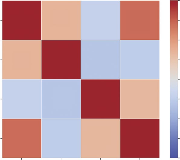
When you have a dataset with many numeric variables, plotting a dozen scatterplots to check for relationships is inefficient. You need a summary view, which provides a way to scan the entire dataset for connections at a single glance. For this, you can use a correlation heatmap.
A heatmap replaces numbers with colors. It visualizes the correlation matrix, a table where every variable is compared to every other variable using the Pearson correlation coefficient. This coefficient ranges from a perfect positive correlation to a perfect negative correlation, indicating no relationship.
In our vegetable data, we have RetailPrice, Yield, CupEquivalentSize, and CupEquivalentPrice. How do these metrics relate? Does a larger serving size imply a higher price?
We can investigate these questions using a heatmap in Listing 10-7.
LISTING 10-7: THE CORRELATION HEATMAP
# 1. Prepare the Data
# Select only numeric columns for correlation calculation
numeric_cols = ['RetailPrice', 'Yield', 'CupEquivalentSize', 'CupEquivalentPrice']
correlation_matrix = veg_prices[numeric_cols].corr()
# 2. Visualization
plt.figure(figsize=(8, 6))
# Create the Heatmap
sns.heatmap(
correlation_matrix,
annot=True, # Write the data value in each cell
fmt=".2f", # Format to 2 decimal places
cmap='coolwarm', # Blue (negative) to Red (positive)
vmin=-1, vmax=1, # Anchor the colormap range
linewidths=0.5, # Space between cells
square=True # Force cells to be square
)
226 ❘ CHAPTER 10 IllusTRATIng CRoss-sECTIonAl DATA
plt.title('Correlation Matrix of Vegetable Metrics', fontsize=14)
plt.show()
Listing 10-7 begins by filtering the DataFrame to strictly numeric columns; attempting to run a correlation on text data (like vegetable names) will result in an error. We then call the.corr() method on this subset. This is a pure statistical operation that returns a new DataFrame where the indices and columns are identical and the values represent the Pearson coefficient. The resulting visu-
The visualization is handled by sns.heatmap. The cmap='coolwarm' argument is crucial here. It utilizes a diverging colormap, where distinct colors represent the extremes (blue/light for −1 and red/
dark for +1). A neutral color (white or gray) represents the middle (0). This allows the analyst to instantly spot strong relationships. We set vmin=-1 and vmax=1 to anchor the color scale; without this, the colors would scale relative to the data (e.g., the darkest shade might only represent 0.5), Correlation Matrix of Vegetable Metrics
1.00
RetailPrice
1.00
0.35
–0.21
0.70
0.75
0.50
Yield
0.35
1.00
–0.31
–0.26
0.25
0.00
CupEquivalentSize
–0.21
–0.31
1.00
0.32
–0.25
–0.50
CupEquivalentPrice
0.70
–0.26
0.32
1.00
–0.75
–1.00
e
rice
ieldY
rice
ailPet
alentSiz
R
alentP
CupEquiv
CupEquiv
FIGURE 10-7: Stacked bar chart.
Correlations in the Cross section ❘ 227
which could be misleading. Finally, annot=True overlays the actual correlation coefficients onto the squares, combining the visual intuition of the colors with the statistical precision of the numbers.
The result allows you to instantly see, for example, if Yield has a negative correlation with RetailPrice. The color intensity serves as a signal of the strength and direction of the relationship—
dark squares indicate a positive correlation (as one number goes up, the other goes up), while light squares indicate a negative correlation. The strongest relationship, marked by the darkest square, is between RetailPrice and CupEquivalentPrice, confirming that vegetables with a higher price per pound generally translate to a higher cost per edible serving. Conversely, the light squares (such as Yield vs. CupEquivalentSize) highlight weak inverse relationships, suggesting that larger or more efficient vegetables do not necessarily correlate with higher prices.
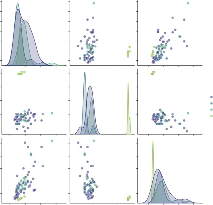
The Pair Plot
In the previous section, we used a heatmap to find correlations. However, a single number, like a correlation coefficient, can be misleading. It tells you two things are related, but it doesn’t tell you how. Is the relationship a straight line? Is it a curve? Is it driven entirely by three massive outliers?
To answer this, you need to see the raw data. Plotting every combination of variables manually (price vs. yield, price vs. size, and yield vs. size) is tedious. The pair plot automates this. It constructs a grid of charts where the diagonal shows the distribution of a single variable (histogram or kernel density estimate), and the off-diagonal cells show the relationship between two variables (scatterplot).
This visualization allows you to absorb the entire structure of your dataset in seconds.
Listing 10-8 utilizes sns.pairplot, one of the most powerful functions in the Seaborn library. By passing the hue='Form' argument, we instruct the function to not only plot the data but to segment it by category.
LISTING 10-8: GENERATING A SCATTER MATRIX WITH SEABORN
# 1. Prepare the Data
# We select the numeric metrics and one categorical column ('Form') for coloring cols_to_plot = ['RetailPrice', 'Yield', 'CupEquivalentPrice', 'Form']
subset = veg_prices[cols_to_plot]
# 2. Visualization
# sns.pairplot automatically detects numeric vs. categorical data
sns.pairplot(
subset,
hue='Form', # Color the dots/lines by the Vegetable Form
palette='viridis', # Use a distinct color scheme
height=2.5, # Size of each small subplot
plot_kws={'alpha': 0.6} # Make dots slightly transparent
)
plt.suptitle('Pairwise Relationships in Vegetable Data', y=1.02, fontsize=16) plt.show()
228 ❘ CHAPTER 10 IllusTRATIng CRoss-sECTIonAl DATA
These plots include:
➤
The diagonals: Instead of scatterplots, these show the distribution of each variable. We can instantly see that RetailPrice has a long tail (a few very expensive items), while Yield is bi-modal (items are either very efficient or very wasteful, with few in between).
➤
The scatterplots: We can spot the relationships. For example, looking at the intersection of Yield and RetailPrice, we might see that low-yield items (like corn on the cob) tend to have lower retail prices per pound, effectively balancing out the cost to the consumer.
➤
The clusters: The colors reveal if certain forms behave differently. We might see that frozen vegetables cluster tightly in a specific price/yield range, while fresh vegetables are scattered all over the map.
Pairwise Relationships in Vegetable Data
7
6
5
rice 4
ailPetR 3
2
1
2.5
2.0
Form
Fresh
ield 1.5
Y
Canned
Frozen
1.0
Dried
0.5
2.5
rice 2.0
alentP 1.5
1.0
CupEquiv 0.5
0.0
2.5
5.0
7.5
1
2
0
1
2
3
RetailPrice
Yield
CupEquivalentPrice
FIGURE 10-8: The pair plot.
summary ❘ 229
This one command effectively replaces a dozen individual chart queries, making it the ideal starting point for any cross-sectional analysis.
Beyond basic coloring with the hue parameter, sns.pairplot offers extensive control over its grid through specialized keyword arguments. While the plot_kws parameter applies styling (like transpar-ency or point size) to every scatterplot in the grid, you can use diag_kws to specifically modify the diagonal charts—for instance, by changing a kernel density estimate (KDE) to a histogram or adjusting the line thickness. For even more granularity, the vars parameter allows you to limit the plot to specific columns, preventing the grid from becoming overwhelming in large datasets. Furthermore, the kind parameter can transform the off-diagonal plots from standard scatterplots into regression plots (kind='reg'), which automatically adds a line of best fit to help visualize trends across vegetable forms.
T
TABLE 10-1: Pair Plot Customization Options
PARAMETER
FUNCTION
EXAMPLE
kind
Changes the off-diagonal
'reg' for regression lines;
plot type.
'hist' for 2D histograms.
diag_kind
Changes the diagonal
'kde' for smooth curves;
plot type.
'hist' for bars.
markers
Assigns different shapes to
markers=["o", "s", "D"]
categories.
for Fresh, Canned, Frozen.
corner
Removes the redundant
corner=True to create a
upper triangle.
cleaner, triangular grid.
diag_kws
Dictionary of properties for
{'fill': True} to color
diagonal plots.
under the KDE curve.
SUMMARY
This chapter shifted the analytical focus from the moving timeline of history to the static, high-resolution snapshot of cross-sectional analysis. It established that while time-series ask how did we get here, cross-sectional analysis indicates where we are right now. It does this by examining structure, rank, and relationship at a single distinct moment.
The chapter began by explaining the hierarchy of comparison using bar charts, noting that horizontal orientation and sorting are essential for readability when dealing with long category names or ranking tasks.
230 ❘ CHAPTER 10 IllusTRATIng CRoss-sECTIonAl DATA It then addressed the challenge of visualizing composition. While acknowledging the popularity of pie charts for showing part-to-whole relationships, it explored the cognitive difficulties of comparing angles versus lengths. The chapter introduced the donut chart as a clearer circular alternative and the stacked bar chart as a space-efficient, linear solution for comparing proportions.
Finally, this chapter explored techniques for revealing hidden patterns and distributions. It utilized multivariate scatterplots to map up to four dimensions of data—such as x, y, color, and size—onto a single plane. We then scaled this analysis up using correlation heatmaps to instantly scan for positive and negative relationships across all numeric variables, and pair plots to visualize the structure of those relationships. The chapter concluded by using boxplots to move beyond simple averages, allowing us to visualize volatility, spread, and outliers within our categorical groups.
CONTINUE YOUR LEARNING
Cross-sectional visualization is the most common form of business reporting. To master these charts, you must become comfortable with the specific arguments and formatting options within the Seaborn and Matplotlib libraries. The following resources and reference table will help you deepen your understanding of the tools introduced in this chapter:
➤
Seaborn Categorical Data: Detailed guides on bar charts, boxplots, and violin plots.
➤
Matplotlib Pie Charts: The official documentation for creating and customizing pie and donut charts.
➤
Seaborn Distribution Plots: Learn more about pair plots and complex distribution visualizations.
Essential Cross-sectional Functions
T
relationships in this chapter.
TABLE 10-2: Key Summary Statistics Functions
STATISTIC
FUNCTION
DESCRIPTION
.sort_values()
Pandas
Sorts the DataFrame. Essential before
plotting bar charts to create a readable
staircase effect.
sns.
Seaborn
Creates a bar chart. Using horizontal
barplot(orient='h')
orientation helps read long category
labels.
Continue Your learning ❘ 231
STATISTIC
FUNCTION
DESCRIPTION
plt.pie()
Matplotlib
Generates a circular composition chart.
Requires a single array of values rather
than X/Y coordinates.
plt.Circle()
Matplotlib
Used to draw a white circle over a pie
chart to create a donut chart aesthetic.
plt.barh(left=...)
Matplotlib
Creates horizontal bars. By calculating
the left parameter, we can chain bars
together to create stacked bar charts.
sns.
Seaborn
Plots relationships between two vari-
scatterplot(hue=,
ables, adding color (hue) and bubble
size=)
size (size) for extra dimensions.
.corr()
Pandas
Calculates the Pearson correlation
coefficient matrix for all numeric col-
umns in a DataFrame.
sns.heatmap()
Seaborn
Visualizes a correlation matrix using
color intensity to show relationship
strength.
sns.pairplot()
Seaborn
Generates a grid of scatterplots and
histograms to visualize every variable
against every other variable.
sns.boxplot()
Seaborn
Visualizes the distribution, median,
and outliers of data based on the
five-number summary.


11
Illustrating Alternative
Data Types
In traditional econometrics and financial analysis, data is almost exclusively structured. It arrives in neat, tabular formats, rows of observations and columns of variables, ready for immediate ingestion by statistical software. However, the proliferation of digital footprints has given rise to alternative data: information derived from non-traditional sources that acts as a proxy for economic or behavioral activity.
Alternative data includes satellite imagery tracking retail parking lots, credit card transaction logs, social media sentiment, web scraping of product prices, and blockchain ledgers. The defining characteristic of this data is that it is often unstructured or semi-structured. It does not fit naturally into an X-Y plane.
The challenge of illustrating alternative data is one of abstraction. We cannot simply plot the raw data; we must first transform qualitative signals (words, locations, links) into quantitative geometry. This chapter explores the distinct visualization grammars required for text, space, and networks.
TEXTUAL ANALYSIS
The previous chapters dealt with structured data. This is information that fits neatly into rows and columns, prices, dates, quantities, and coordinates. It is numerical, sortable, and ready for calculation.
Text, however, is the largest source of unstructured data available to the modern analyst. It is messy, subjective, and highly variable. A single sentiment (e.g., “This food is bad”) can be expressed in thousands of different ways (“gross,” “inedible,” “yuck,” “not my favorite”). A spreadsheet cannot natively sum these up.
To visualize text, we must first perform tokenization. This is the process of breaking a stream of natural language into measurable units, known as tokens (usually individual words). Once the
234 ❘ CHAPTER 11 IllusTRATIng AlTERnATIvE DATA TyPEs text is broken into tokens, we can count them, measure their sentiment, and map their relationships.
We essentially transform qualitative human language into quantitative data.
Before we visualize, we must understand our source material. In this chapter, we analyze a dataset titled Restaurant reviews.csv.
This dataset is a classic example of alternative data. While a restaurant’s financial ledger tells you how much money they made, it doesn’t tell you why. The review data—specifically the unstructured text written by customers—contains the answer. It holds the why behind the revenue.
This dataset contains three critical columns:
➤
Restaurant: The entity being reviewed.
➤
Review: The unstructured text we want to analyze.
➤
Time: The timestamp, allowing us to track changes over history.
The first step is always inspection. We never start analyzing data blindly. We must load the file and print the first few rows to verify that the data was read correctly, check for missing values, and understand the column names. The following code snippet will open and show the first few rows of data: import pandas as pd # Load the dataset
url = "https://github.com/bkrayfield/Applied-Math-With-Python/raw/refs/heads/
main/Data/Restaurant%20reviews.csv" df = pd.read_csv(url)
# Display the first few rows to understand the structure print(df.head()) Running this code reveals the tabular structure of our data. You will see a review column filled with sentences like “The chicken was dry” or “Great service!”
Crucially, you will notice the dataset contains reviews for multiple different restaurants. For our analysis, context is king. The vocabulary used to describe a good burger (“juicy,” “greasy”) is very different from the vocabulary used to describe good sushi (“fresh,” “light”). If we analyze all restaurants together, these signals will cancel each other out.
Therefore, our strategy is to filter the data and focus our analysis on a single restaurant: Chinese Pavilion. We do this by looking at a simple word cloud that highlights the most frequent words in the customer reviews.
The Word Cloud
The most recognizable visualization in textual analysis is the word cloud. In this chart, the font size of a word is directly proportional to its frequency in the corpus. While it is not a tool for precise statistical comparison, it is difficult for the human eye to judge if one word is 10% larger than another, it is unrivaled for generating a high-level view of the data. It answers the immediate question: What are the dominant themes in this text?
To create a meaningful word cloud, we cannot simply feed the raw dataset into the visualization engine. We must perform three distinct data preparation steps:
1.
Filtration: Isolate the specific entity we want to analyze to avoid context pollution.
2.
Aggregation: Combine all individual rows of text into a single, massive string (the corpus).
Textual Analysis ❘ 235
3.
Cleaning: Remove stop words (common grammatical fillers like “the,” “and,” “is”) that would otherwise dominate the image.
Listing 11-1 implements this workflow. The dataset is filtered to isolate reviews for Chinese Pavilion, aggregate the text, and generate the cloud. Note the use of the wordcloud library, which handles the complex task of tokenizing the text and calculating pixel sizes automatically.
LISTING 11-1: GENERATING A WORD CLOUD
import pandas as pd
import matplotlib.pyplot as plt
from wordcloud import WordCloud
# 1. Load the dataset
url = "https://github.com/bkrayfield/Applied-Math-With-Python/raw/refs/heads/main/
Data/Restaurant%20reviews.csv"
df = pd.read_csv(url)
# 2. Filter for the specific restaurant "Chinese Pavilion"
# Note: Adjust column names ('Restaurant', 'Review') if they differ in your specific CSV version
restaurant_name = "Chinese Pavilion"
subset = df[df['Restaurant'] == restaurant_name]
# 3. Combine all reviews into a single text string
# We cast to string to handle any potential missing values or non-string data text_corpus = " ".join(subset['Review'].astype(str).tolist())
# 4. Generate the word cloud
# We use 'stopwords' to automatically remove common words like "the", "and", "is"
cloud = WordCloud(width=800, height=400, background_color='white').
generate(text_corpus)
# 5. Display the image
plt.figure(figsize=(10, 5))
plt.imshow(cloud, interpolation='bilinear')
plt.axis("off")
plt.title(f"Most Frequent Words: {restaurant_name}")
plt.show()
The process begins by establishing the computational environment through the importation of Pandas for data manipulation, Matplotlib for graphical rendering, and wordcloud for the specific text-processing algorithm. With the libraries in place, the script ingests the raw data from a remote repository using pd.read_csv, loading the mixed collection of reviews into a structured DataFrame. To ensure the analysis reflects a specific entity rather than a generic aggregate, the code employs Boolean indexing to filter the dataset. By selecting only rows where the “Restaurant”
column matches “Chinese Pavilion,” the script isolates the relevant signal from the noise of unrelated establishments.
Since the word cloud algorithm requires a single continuous block of text rather than a column of disjointed entries, the script performs a critical aggregation step. It converts the filtered review column
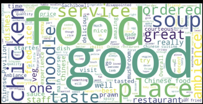
236 ❘ CHAPTER 11 IllusTRATIng AlTERnATIvE DATA TyPEs
into a list of strings and joins them together, separated by spaces, creating a unified text corpus ready for tokenization. The visualization is then constructed by instantiating a WordCloud object. During this generation phase, the library automatically tokenizes the corpus, removes standard stop words (such as “the” or “and”), and calculates the frequency distribution of the remaining vocabulary to determine the relative size of each term.
The code uses interpolation=‘bilinear’ in the final plotting step. This is a graphical smoothing technique. Since the generated word cloud is essentially a low-resolution image, this argument blurs the rough pixel edges, making the text appear sharper and more professional for publication.
When you generate this figure, the algorithm counts every unique word in the text corpus. The words that appear most frequently are rendered in the largest font size and placed near the center.
chicken, and food dominating the image.
When specific dishes (e.g., noodle or soup) appear large, they are the key drivers of the customer experience. However, if words like “wait,” “rude,” or “cold” appear in significant sizes, they act as early warning signals for operational failures.
N-grams
The primary limitation of the word cloud and simple word counts is the removal of context. The bag of words model treats every word as an independent entity. This concept fails to capture the relationship between adjacent words.
For example, in a restaurant review, the word “service” is neutral. It conveys the topic but not the quality. However, the sequence “quick service” is positive, while “slow service” is negative.
Furthermore, there is a negation problem, where “not good” is stripped of the word “not” during stop-word removal, leaving only “good.” This can clearly invert the analytical conclusion.
FIGURE 11-1: Word cloud.
Textual Analysis ❘ 237
To recover this semantic structure, we illustrate N-grams. An N-gram is a contiguous sequence of items from a given sample of text. Examples of various types of N-grams include:
➤
Unigram: Chicken
➤
Bigram: Spicy chicken
➤
Trigram: Thai spicy chicken
For most exploratory data analysis, the bigram is the sweet spot. It provides specific context (adjective + noun) without being so specific that it becomes unique to a single review (which often happens with trigrams or sentences).
To visualize bigrams, we must move beyond the standard string manipulation used for word clouds and employ a tokenizer. We utilize the CountVectorizer from the scikit-learn library. This tool converts a collection of text documents into a matrix of token counts, effectively turning unstructured text into a structured numerical grid.
Listing 11-2 configures the vectorizer with ngram_range=(2, 2), instructing it to ignore single words and strictly identify pairs. It also applies a stop word filter to ensure our pairs are not dominated by grammatical noise, such as “in the” or “of a.”
LISTING 11-2: EXTRACTING AND VISUALIZING TOP BIGRAMS
from sklearn.feature_extraction.text import CountVectorizer
import matplotlib.pyplot as plt
import pandas as pd
# 1. Prepare the Data
url = "https://github.com/bkrayfield/Applied-Math-With-Python/raw/refs/heads/main/
Data/Restaurant%20reviews.csv"
df = pd.read_csv(url)
df_pavilion = df[df['Restaurant'] == "Chinese Pavilion"].copy()
# We explicitly cast to string to handle any edge-case formatting issues.
text_data = df_pavilion['Review'].astype(str)
# 2. Initialize the Vectorizer
# ngram_range=(2, 2): Look ONLY for two-word sequences.
# stop_words='english': Removes pairs containing "the", "is", "a", etc.
vec = CountVectorizer(ngram_range=(2, 2), stop_words='english')
# 3. Fit and Transform
# This creates a Sparse Matrix where rows are reviews and columns are bigrams.
bag_of_words = vec.fit_transform(text_data)
# 4. Calculate Total Frequency
# We sum down the columns (axis=0) to get the total count of each bigram across all reviews.
sum_words = bag_of_words.sum(axis=0)
# 5. Map Vocabulary to Counts
# vec.vocabulary_.items() returns the mapping of 'word' -> column_index.
words_freq = [(word, sum_words[0, idx]) for word, idx in vec.vocabulary_.items()]
238 ❘ CHAPTER 11 IllusTRATIng AlTERnATIvE DATA TyPEs
# 6. Sort and Isolate Top 10
words_freq = sorted(words_freq, key=lambda x: x[1], reverse=True)
top_10_bigrams = words_freq[:10]
# 7. Convert to DataFrame for Plotting
df_bigrams = pd.DataFrame(top_10_bigrams, columns=['Bigram', 'Frequency'])
# 8. Visualizing with a Horizontal Bar Chart
plt.figure(figsize=(10, 6))
# We use a horizontal bar (barh) to ensure long bigram text is readable.
plt.barh(df_bigrams['Bigram'], df_bigrams['Frequency'], color='purple') plt.gca().invert_yaxis() # Invert y-axis to place the highest frequency at the top plt.title("Top 10 Most Common Phrases (Bigrams): Chinese Pavilion") plt.xlabel("Frequency Count")
plt.grid(axis='x', linestyle='--', alpha=0.5) # Add vertical grid lines for precision
plt.show()
Listing 11-2 transitions from simple string manipulation to matrix algebra. It begins by ensuring that the text data is in a uniform string format, preventing type errors during processing. The core of the analysis is the CountVectorizer from the scikit-learn library. This object is initialized with two specific parameters:
➤
ngram_range=(2, 2) forces the tokenizer to ignore single words and exclusively identify two-word sequences (bigrams).
➤
stop_words='english' filters out grammatical noise.
The fit_transform method then converts the raw text into a sparse grid where rows represent reviews and columns represent unique bigrams. By summing this matrix along the vertical axis (axis=0), the code calculates the global frequency of every phrase across the entire dataset.
To interpret these results, the script maps the numerical indices of the matrix back to their English counterparts using the vectorizer’s vocabulary. The resulting list of tuples is sorted in descending order to isolate the top ten most frequent pairs. Finally, the visualization is rendered as a horizontal bar chart (barh). This orientation is specifically chosen over a vertical chart to ensure that the longer text labels of the bigrams (e.g., “Authentic Chinese”) remain readable without overlapping.
We choose a bar chart over a word cloud here because comparative precision is paramount. We need to see exactly how much more frequent “fried rice” is compared to “pan fried.”
When analyzing the results for Chinese Pavilion, you are likely to see menu items (e.g., “sour soup,”
“fried rice”) and service descriptors (e.g., “good service,” “friendly staff”).
If a negative bigram, such as “long wait” or “tasted bad,” appears in the top ten, it indicates a systemic failure rather than an isolated incident. If specific dishes appear frequently in this list, they are the dishes driving the restaurant’s positive or negative identity.
This technique bridges the gap between qualitative reading and quantitative analysis, allowing the analyst to measure the themes of the text rather than just the vocabulary. The business benefit speaks for itself; we can now clearly see what our customers are talking about with regard to our food. And
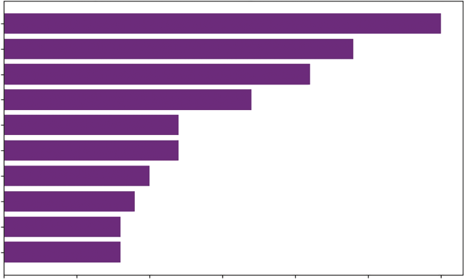
Textual Analysis ❘ 239
Top 10 Most Common Phrases (Bigrams) for Chinese Pavilion
fried rice
chinese food
chinese pavilion
main course
chinese cuisine
pan fried
authentic chinese
chinese restaurant
manchow soup
hakka noodles
0
5
10
15
20
25
30
Frequency Count
FIGURE 11-2: Bar chart with bigrams.
this is just the start of our analysis; we could do additional cleaning like removing the business name and spell checking, among others, to driver a more meaningful analysis.
Visualizing Customer Sentiment
While frequency tells us what people are saying, it doesn’t tell us how they feel about it. To understand customer satisfaction, we need sentiment analysis. We cannot simply plot raw text; we must convert qualitative opinions into quantitative numerical scores.
To achieve this, we will use the TextBlob library, a standard tool for Natural Language Processing (NLP). Unlike complex machine learning models that require training data, TextBlob relies on a rule-based lexicon. This is essentially a predefined dictionary where thousands of adjectives and adverbs have been rated by human researchers.
Polarity is computed as follows:
➤
TextBlob assigns a polarity score to a sentence, a float value ranging from −1.0 to +1.0.
➤
Polarity > 0: Positive sentiment (e.g., “Great,” “Delicious”)
➤
Polarity < 0: Negative sentiment (e.g., “Terrible,” “Disgusting”)
➤
Polarity = 0: Neutral sentiment
The calculation is not magic; it is arithmetic. The algorithm splits the text into words and looks up each word in its lexicon. It identifies sentiment-bearing words. For example, “good” might have a score of +0.5, while “excellent” is +0.8. It looks for modifiers. If the algorithm sees “not good,” it flips the polarity of “good” (multiplying by −0.5). If it sees “very good,” it applies an intensifier multiplier.
240 ❘ CHAPTER 11 IllusTRATIng AlTERnATIvE DATA TyPEs Finally, it calculates the average score of all sentiment words in the text to produce the final polarity for the review. Listing 11-3 defines a function to classify each review based on this polarity score.
LISTING 11-3: PLOTTING ROLLING SENTIMENT
from textblob import TextBlob
# Define a function to classify sentiment
def classify_sentiment(text):
# TextBlob calculates polarity: < 0 is Negative, > 0 is Positive analysis = TextBlob(str(text))
if analysis.sentiment.polarity > 0:
return 'Positive'
else:
return 'Negative'
# Apply the function to the 'Review' column
# We create a new column 'Sentiment_Type' to store the result
df_pavilion = df[df['Restaurant'] == "Chinese Pavilion"].copy() df_pavilion['Sentiment_Type'] = df_pavilion['Review'].apply(classify_sentiment)
# Preview the classification
print(df_pavilion[['Review', 'Sentiment_Type']].head())
Here, we apply the classify_sentiment function to every row in our DataFrame. The .apply() method is efficient because it works with the data like a vector. We now have a categorical variable (Sentiment_Type) that we can count and plot, transforming our unstructured text into structured categorical data. The result of running Listing 11-3 is a DataFrame of reviews, and a new column indicating if they are positive or negative:
Review Sentiment_Type
9999 Checked in here to try some delicious chinese ... Positive 9998 I personally love and prefer Chinese Food. Had... Positive 9997 Bad rating is mainly because of "Chicken Bone ... Positive 9996 This place has never disappointed us.. The foo... Positive 9995 Madhumathi Mahajan Well to start with nice cou... Positive Customer sentiment is rarely static; it fluctuates based on management changes, menu updates, and staffing issues. A static bar chart of total positive versus total negative hides this temporal story. To see the trend, we use a rolling window.
A rolling window (or moving average) calculates the sum of positive and negative reviews over a specific period (e.g., the last 20 reviews). This smooths out the noise of day-to-day variance and reveals the underlying trajectory of customer satisfaction. We implement this is Listing 11-4.
LISTING 11-4: PLOTTING THE ROLLING TREND
import matplotlib.pyplot as plt
# Listing 11-4 should be run after Listing 11-3
Textual Analysis ❘ 241
# 1. Preprocess Time
df_pavilion['Time'] = pd.to_datetime(df_pavilion['Time'])
df_pavilion = df_pavilion.sort_values('Time')
# 2. Convert Sentiment to Integers (Safer than get_dummies)
# This creates the column if it's missing, or overwrites it if it exists.
# It prevents the "duplicate column" error.
df_pavilion['Positive_Count'] = (df_pavilion['Sentiment_Type'] == 'Positive').
astype(int)
df_pavilion['Negative_Count'] = (df_pavilion['Sentiment_Type'] == 'Negative').
astype(int)
# 3. Calculate Rolling Sums
window_size = 20
df_pavilion['Rolling_Pos'] = df_pavilion['Positive_Count'].rolling(window=window_
size).sum()
df_pavilion['Rolling_Neg'] = df_pavilion['Negative_Count'].rolling(window=window_
size).sum()
# 4. Plotting
plt.figure(figsize=(12, 6))
plt.plot(df_pavilion['Time'], df_pavilion['Rolling_Pos'],
color='green', label='Positive Trend', linewidth=2)
plt.plot(df_pavilion['Time'], df_pavilion['Rolling_Neg'],
color='red', label='Negative Trend', linewidth=2)
plt.title(f"Sentiment Trend (Rolling Window of {window_size} Reviews)") plt.xlabel("Date")
plt.ylabel("Volume of Reviews")
plt.legend()
plt.grid(True, alpha=0.3)
plt.show()
Listing 11-4 begins by strictly defining the temporal order. Since rolling calculations depend on the sequence of events, the code converts the “Time” column into datetime objects and explicitly sorts the DataFrame chronologically. Without this step, the rolling window would calculate aggregates based on the arbitrary index order of the rows rather than the actual flow of time.
Next, the categorical labels are converted into quantifiable metrics. The script uses a direct Boolean mask, (df['Sentiment'] == 'Positive').astype(int)to create two parallel streams of binary data, zeros and ones, where a 1 represents the presence of a specific sentiment. This method is preferred for its precision. It’s better than creating dummy variables for every possible typo or variation in the text data.
The core analysis uses the.rolling(window=20).sum() function. This technique, known as a moving aggregate, slides a window of 20 observations across the timeline. For each step, it sums the binary counters. This effectively smooths out the volatility of individual reviews, revealing the underlying signal, the momentum of customer opinion, rather than the noise of daily variance. Finally, the visualization plots these two smoothed trends against each other using standard Matplotlib line charts, utilizing distinct colors to allow for immediate visual comparison of the competing volumes.
242 ❘ CHAPTER 11 IllusTRATIng AlTERnATIvE DATA TyPEs Sentiment Trend (Rolling Window of 20 Reviews)
20.0
17.5
15.0
ws 12.5
evie
Positive Trend
10.0
Negative Trend
olume of R
7.5
V
5.0
2.5
0.0
2016-10 2017-01 2017-04 2017-07 2017-10 2018-01 2018-04 2018-07 2018-10 2019-01 2019-04
Date
FIGURE 11-3: Sentiment over time.
The upper solid line represents the volume of positive feedback, and the lower dashed line represents negative feedback.
If the lower dashed line crosses above the upper solid line, it indicates a specific period where negative experiences outnumbered positive ones, a critical alert for management. If the solid line trends upward while the dashed line stays flat, the restaurant is successfully improving its reputation.
GEOSPATIAL DATA
The previous section analyzed what people were saying by examining the frequency and sentiment of their words. This section turns to examining where they are.
Geospatial data adds the dimension of physical location, specifically latitude and longitude, to our analysis. For the financial or data analyst, this is the realm of location intelligence. It transforms abstract rows of data into a physical reality, revealing clustering effects, regional biases, and logistics bottlenecks that are invisible in a standard spreadsheet. A table might tell you that sales are down in the Southeast, but a map instantly reveals that the drop is perfectly correlated with the path of a recent hurricane or a competitor’s new distribution center.
To illustrate these concepts, we move beyond static plotting libraries like Matplotlib and utilize Folium. Folium is a powerful Python library that acts as a bridge to Leaflet.js, the leading open-source JavaScript library for mobile-friendly interactive maps. If you are using Google Colab or Anaconda, Folium should be included. However, if needed you can install Folium using pip install folium.
Unlike a static image, a Folium map allows the user to zoom, pan, and click, making it the industry standard for exploring geospatial data.
geospatial Data ❘ 243
The Choropleth Map
The most fundamental geospatial visualization is the Choropleth map. Derived from the Greek choros (region) and plethos (multitude), this technique colors geographic regions, such as countries, states, counties, or ZIP codes, based on the magnitude of a variable.
It is the standard tool for visualizing aggregate data. When you see a map of the U.S. Election results (red states vs. blue states) or a map of unemployment rates by county, you are looking at a choropleth. It is most effective when your data is already aggregated to a specific boundary level.
Creating a choropleth requires joining two distinct types of data:
➤
Statistical data: A standard table (CSV/DataFrame) containing the values you want to map (e.g., Population) and an identifier (e.g., State Name).
➤
Geometric data: A file (typically GeoJSON or TopoJSON) that defines the physical polygon boundaries of those regions.
The challenge in geospatial coding is linking these two. You must tell the code, “Match the row Alabama in my CSV to the polygon shape Alabama in the JSON file.”
Listing 11-5 visualizes the population density of the United States. We load the population_data.
csv file (which contains state names and 2020 census counts) and map it onto a standard GeoJSON
definition of U.S. state boundaries.
LISTING 11-5: CREATING A U.S. POPULATION CHOROPLETH
import pandas as pd
import folium
# 1. Load the Statistical Data
# We read the CSV containing 'State_Name' and '2020_Pop'
df_pop = pd.read_csv(' https://raw.githubusercontent.com/bkrayfield/Applied-MathWith-Python/refs/heads/main/Data/population_data.csv')
# 2. Define the Map Object
# We initialize the map centered on the US (Lat: 37, Lon: -95) with a zoomed-out view
m = folium.Map(location=[37, -95], zoom_start=4)
# 3. Load Geometric Data (GeoJSON)
# We use a public URL for the US State boundaries.
# In a local project, this could be a file path like 'us-states.json'.
# 4. Create the Choropleth Layer
folium.Choropleth(
geo_data=state_geo, # The polygon shapes
name='choropleth',
data=df_pop, # The statistical data
columns=['State_Name', '2020_Pop'], # [Key Column, Value Column]
244 ❘ CHAPTER 11 IllusTRATIng AlTERnATIvE DATA TyPEs
key_on='feature.properties.name', # The link: Where is the State Name in the JSON?
fill_color='YlOrRd', # Palette: Yellow-Orange-Red
fill_opacity=0.7,
line_opacity=0.2,
legend_name='Population (2020)'
).add_to(m)
The most critical parameter in this listing is key_on. Your CSV might have a column named State_
Name, but the GeoJSON file might bury that information deep inside a structure like features -> properties -> name. The argument key_on='feature.properties.name' explicitly tells Folium how to navigate the JSON structure to find the matching string. If this key does not match your CSV column perfectly (e.g., “NY” vs. “New York”), those regions will appear gray (missing data) on the map.
We also select the YlOrRd (Yellow-Orange-Red) color scale. This is a sequential palette, which is best for continuous variables like population. Lighter colors intuitively suggest lower values (like Wyoming), while darker colors suggest high intensity (like California). The results can be seen in
The Marker Map
While Choropleths are excellent for aggregate regional data, they fail when we need to see specific points of interest, like individual retail stores, distribution centers, or ATM locations. For this, we use the marker map (see Listing 11-6).
A marker map places a pin at specific coordinates (latitude and longitude). While a simple dot is useful, Folium allows us to encode additional data into the marker using interactive aesthetics:
➤
Popups: Display detailed data (like revenue figures) when a user clicks the marker.
➤
Colors: Change the marker color based on status (e.g., Green for “Open,” Red for “Closed”).
FIGURE 11-4: Choropleth map.
geospatial Data ❘ 245
LISTING 11-6: CREATING AN INTERACTIVE MARKER MAP
import pandas as pd
import folium
# 1. Simulate Store Data
# In practice, this would come from your internal address database
data = {
'Store': ['Store A', 'Store B', 'Store C', 'Store D'],
'Lat': [34.0522, 40.7128, 41.8781, 29.7604], # LA, NYC, Chicago, Houston
'Lon': [-118.2437, -74.0060, -87.6298, -95.3698],
'Revenue': [1.2, 3.5, 2.1, 1.8], # Millions
'Status': ['High', 'High', 'Medium', 'Low']
}
df_stores = pd.DataFrame(data)
# 2. Initialize Map
m_markers = folium.Map(location=[37, -95], zoom_start=4)
# 3. Define a Color Helper Function
# This allows us to conditionally format markers based on data
def get_color(status):
if status == 'High': return 'green'
if status == 'Medium': return 'blue'
return 'orange'
# 4. Loop Through Data and Add Markers
for i, row in df_stores.iterrows():
folium.Marker(
location=[row['Lat'], row['Lon']],
popup=f"{row['Store']}: ${row['Revenue']}M", # Click to see Revenue tooltip=row['Store'], # Hover to see Name
icon=folium.Icon(color=get_color(row['Status']), icon="info-sign")
).add_to(m_markers)
m_markers
# You can uncomment this line to create the map outside of a notebook environment.
# m_markers.save("my_map.html")
Listing 11-6 visualizes discrete entities using point data. It begins by creating a Pandas DataFrame, df_stores, which simulates a proprietary internal database containing store names, exact GPS
coordinates (latitude/longitude), revenue figures, and a performance status.
To visualize this data, the code initializes a folium.Map centered on the continental United States.
A critical component of this script is the helper function get_color. This function acts as a conditional formatter, translating the categorical Status variable into specific marker colors. When plotting with color, we utilize a palette of green, blue, and orange. This selection is intentional; unlike the traditional red/green/yellow traffic-light scheme, this palette is distinguishable by individuals with red-green color blindness, ensuring the visualization remains accessible to a wider audience.
The visualization is constructed via a for loop that iterates through every row of the DataFrame.
Inside the loop, folium.Marker is called for each store. This method accepts arguments for location,
246 ❘ CHAPTER 11 IllusTRATIng AlTERnATIvE DATA TyPEs
FIGURE 11-5: Marker map.
interactivity (popup and tooltip), and aesthetics. The icon parameter utilizes the previously defined color function, dynamically styling each pin based on its data. Finally, the code object m_markers renders the interactive map within a notebook environment. For users working in standard Python scripts (outside of Jupyter), the commented line m_markers.save("my_map.html") demonstrates how to export the visualization as a standalone HTML file viewable in any web browser.
The resulting map, acts as a visual dashboard.
A regional manager can instantly scan the country and a marker on Houston. By clicking it, they access the specific revenue data. This combines the high-level overview of a chart with the granular detail of a table.
The Heatmap
There is a limit to the marker map. When the dataset grows from 50 stores to 50,000 user check-ins, markers inevitably overlap. The map becomes a chaotic “hairball” of pins, and the underlying patterns are obscured by the clutter.
To solve this, we use a geospatial heatmap. This visualization discards individual identity in favor of density. It applies a kernel density estimate (KDE) similar to the smoothing we use in histograms over the latitude/longitude grid.
The algorithm looks at every point and adds a small Gaussian distribution (bell curve) of intensity around it. Where points cluster together, these intensities stack up, turning the map red. This is the standard tool for analyzing high-volume alternative data like foot traffic, Uber pickup locations, or crime statistics. Running Listing 11-7 in a new cell will generate the heatmap.
geospatial Data ❘ 247
LISTING 11-7: GENERATING A DENSITY HEATMAP
import numpy as np
from folium.plugins import HeatMap
import folium
# 1. Simulate High-Density Data
# We generate 1,000 random points clustered around NYC coordinates
lat_center, lon_center = 40.7128, -74.0060
# np.random.normal creates a "blob" of points around the center lats = np.random.normal(lat_center, 0.05, 1000)
lons = np.random.normal(lon_center, 0.05, 1000)
# HeatMap expects a list of [lat, lon] pairs
heat_data = list(zip(lats, lons))
# 2. Initialize Map
m_heat = folium.Map(location=[lat_center, lon_center], zoom_start=10)
# 3. Add HeatMap Layer
# radius: Controls how wide the "glow" of each point is
# blur: Controls how smooth the transition between colors is
HeatMap(heat_data, radius=15, blur=20).add_to(m_heat)
m_heat
Listing 11-7 demonstrates how to visualize high-density geospatial data without relying on external files. It begins by utilizing NumPy to simulate a large dataset of 1,000 check-ins. The np.random.
normal function generates data points that follow a Gaussian distribution around a central coordinate (New York City). This creates a realistic “cluster” effect, mimicking how human activity naturally concentrates around city centers rather than being uniformly distributed.
Data preparation is a critical step in Folium. The library’s HeatMap plugin does not accept a Pandas DataFrame directly; it requires a list of coordinate pairs (e.g., [[lat, lon], [lat, lon]]). The code achieves this efficient transformation using Python’s built-in zip function, which pairs the latitude and longitude arrays into a single list of tuples.
Finally, the visualization is rendered. The HeatMap layer is added to the base map with two controlling parameters. The first, radius, determines the pixel size of each point. Larger radii cause points to overlap more easily, increasing the intensity and blur, which controls the smoothness of the color gradient. A higher blur value creates a continuous, weather-radar aesthetic, while a lower value makes the individual points more distinct.
The resulting visualization, looks like a weather radar. Dark zones indicate high intensity (e.g., a busy downtown district). Light zones indicate sparse activity.
By switching from markers to heatmaps, we change our analytical question. We are no longer asking where this specific entity is, but rather, where the market demand is located. This is crucial for site selection—identifying hot zones where demand exists but your physical presence (markers) does not.
248 ❘ CHAPTER 11 IllusTRATIng AlTERnATIvE DATA TyPEs
FIGURE 11-6: Density heatmap.
VISUALIZING NETWORKS
The previous sections analyzed individual entities, observing what they said (text analysis) and where they were located (geospatial analysis). In standard econometrics, these entities are often treated as independent observations (rows in a spreadsheet). However, in the world of alternative data, the primary unit of analysis is frequently not the entity itself, but the relationship between entities.
Consider the following datasets:
➤
Blockchain: A wallet is private, but we can visualize who a wallet interacts with.
➤
Social media: An influencer is defined by the structure of their follower graph.
➤
Supply chain: A factory’s risk profile is defined by its connections to upstream suppliers and downstream distributors.
This type of data cannot be visualized with cartesian (X-Y) plots. It requires network analysis (also known as graph theory). Instead of axes and coordinates, we visualize nodes (vertices) and edges (links).
To perform this analysis in Python, we utilize NetworkX. This is the industry-standard library for the creation, manipulation, and study of the structure, dynamics, and functions of complex networks.
While NetworkX handles the heavy mathematical lifting (calculating paths, centrality, and clusters), it relies on Matplotlib to render the actual visual output. The workflow typically involves defining
visualizing networks ❘ 249
the graph structure in NetworkX, calculating a layout (where the nodes should sit), and then passing those coordinates to Matplotlib for drawing.
Visualizing Structure
The most common challenge in visualizing networks is simple. When you have hundreds of connected nodes, how do you arrange them onscreen so the structure is readable?
The solution is the force-directed graph (specifically the Fruchterman-Reingold algorithm). This algorithm simulates a physical system:
➤
Nodes act like electrically charged particles that repel each other. This prevents nodes from overlapping and creates space.
➤
Edges act like elastic springs that pull connected nodes together.
When the simulation runs, the system seeks a state of equilibrium. The result is a layout where highly connected “communities” naturally cluster together, while isolated outliers drift to the periphery. This allows the analyst to instantly spot hubs (central influencers) and bridges (critical connectors between groups) without any manual sorting.
In Listing 11-8, a supply chain network is simulated to identify structural vulnerabilities. We manually define the nodes and edges, compute the force-directed layout, and render the graph.
LISTING 11-8: VISUALIZING A SUPPLY CHAIN NETWORK
import networkx as nx
import matplotlib.pyplot as plt
# 1. Initialize the Graph Object
G = nx.Graph()
# 2. Define Nodes
nodes = ["Supplier A", "Manufacturer", "Distributor X", "Distributor Y",
"Retailer Z", "Retailer W"]
G.add_nodes_from(nodes)
# 3. Define Edges
edges = [
("Supplier A", "Manufacturer"),
("Manufacturer", "Distributor X"),
("Manufacturer", "Distributor Y"),
("Distributor X", "Retailer Z"),
("Distributor Y", "Retailer Z"),
("Distributor Y", "Retailer W")
]
G.add_edges_from(edges)
# 4. Compute Layout
pos = nx.spring_layout(G, seed=42)
250 ❘ CHAPTER 11 IllusTRATIng AlTERnATIvE DATA TyPEs
# 5. Draw the Graph
plt.figure(figsize=(10, 6))
nx.draw_networkx_nodes(G, pos, node_size=4000, node_color='lightblue')
# Draw the edges
nx.draw_networkx_edges(G, pos, edge_color='gray', width=2)
# Add labels
nx.draw_networkx_labels(G, pos, font_size=10, font_family="sans-serif") plt.title("Supply Chain Network Structure")
plt.axis('off')
plt.show()
Listing 11-8 begins by initializing an empty graph object G using nx.Graph(). A graph object acts as the central data structure that stores the topological definition of the network, maintaining a registry of all nodes and the specific links that connect them, independent of how they might eventually be drawn on a screen. We then manually populate this container by defining a list of nodes (the entities) and a list of edges (tuples representing the connections between them).
The critical step occurs at nx.spring_layout(G). This function executes the Fruchterman-Reingold force-directed algorithm discussed previously, calculating the coordinates for every node based on simulated physical forces. We explicitly set a seed value to ensure that the “random” initial positions are identical every time the code is run, guaranteeing a reproducible figure rather than a layout that shifts with every execution.
The visualization is then constructed in layers using Matplotlib. First, draw_networkx_nodes renders the entities as large, light-blue circles (sized at 4,000 to ensure visibility). Next, draw_networkx_edges draws the connections as gray lines, and draw_networkx_labels overlays the text names. Finally, plt.axis('off') removes the standard Cartesian grid and tick marks, leaving only the abstract network structure visible.
When you view the output, notice the position of Retailer Z versus Retailer W.
Retailer Z is pulled toward the center because it is connected to two distributors (X and Y). The springs from both sides hold it in place, visually representing supply chain redundancy.
Retailer W, however, dangles at the edge. It has only one connection. This visual simplicity highlights a complex risk: if Distributor Y fails, Retailer W is cut off, whereas Retailer Z survives.
Network analysis is not limited to supply chains; it is a universal framework for analyzing any system where connections matter more than individual attributes. In business, this “relational” perspective unlocks insights that standard tabular analysis misses, including:
➤
Financial fraud detection: In anti-money laundering (AML), criminals often use smurfing, breaking large sums into small, inconspicuous transfers to evade detection. A standard histogram of transaction sizes would miss this. However, a network graph reveals the structure: A single source wallet dispersing funds to hundreds of intermediary wallets, which then reconverge at a single destination. This fan-out, fan-in pattern is instantly visible in a force-directed graph.
visualizing networks ❘ 251
➤
Organizational behavior: An org chart tells you who should have power, but a network graph of email or Slack traffic tells you who actually has influence. By mapping communication flows, HR can identify informal leaders, people who bridge disconnected departments. If these critical connectors leave the company, the organization risks becoming siloed. This metric is often called betweenness centrality.
➤
Marketing attribution: In digital marketing, a customer rarely buys a product after clicking a single ad. They might see a tweet, click a Google ad, read a blog post, and then buy. Network analysis can model the customer journey as a path through a graph, where nodes are touchpoints (Facebook, email, website). By visualizing these paths, marketers can identify the most common bridges that lead to conversion, rather than just crediting the last click.
➤
Systemic risk in portfolio management: Instead of viewing stocks as independent assets, network analysis views them as a correlated web. If stock A crashes, does it pull stock B
down with it? By building a graph where edges represent high correlation, risk managers can visualize the centrality of a specific asset. If a portfolio is heavily invested in a hub asset, the risk of contagion is far higher than standard variance models might predict.
By applying graph theory to these domains, analysts move from asking how much to asking how is this connected?
Supply Chain Network Structure
Retailer W
Supplier A
Distributor Y
Manufacturer
Retailer Z
Distributor X
FIGURE 11-7: Simple graph.
252 ❘ CHAPTER 11 IllusTRATIng AlTERnATIvE DATA TyPEs Weighted Graphs
Real-world networks are rarely binary (connected vs. not connected). They usually possess weights, a measure of the strength or capacity of the connection.
➤
In social media, Close Friend is greater than (>) Acquaintance.
➤
In finance, $1M Transaction is greater than (>) $10 Transaction.
To visualize this, we map the edge width to the transaction volume. This transforms the graph from a structural map into a flow map, allowing us to see not just where connections exist, but how much activity is moving through them.
Listing 11-9 enhances our supply chain model. We assign a numerical weight to each edge representing shipment volume and use that value to control the line thickness in the visualization.
LISTING 11-9: VISUALIZING WEIGHTED FLOWS
import networkx as nx
import matplotlib.pyplot as plt
# 1. Define Weighted Edges
weighted_edges = [
("Supplier A", "Manufacturer", 5),
("Manufacturer", "Distributor X", 2),
("Manufacturer", "Distributor Y", 3),
("Distributor X", "Retailer Z", 2),
("Distributor Y", "Retailer Z", 1),
("Distributor Y", "Retailer W", 2)
]
# 2. Create the Graph
G_weighted = nx.Graph()
for u, v, w in weighted_edges:
G_weighted.add_edge(u, v, weight=w)
# 3. Compute Layout
pos = nx.spring_layout(G_weighted, seed=42)
# 4. Extract Weights for Visualization
widths = [G_weighted[u][v]['weight'] * 2 for u, v in G_weighted.edges()]
# 5. Draw
plt.figure(figsize=(10, 6))
nx.draw(G_weighted, pos,
with_labels=True,
node_color='lightgreen',
node_size=6000,
width=widths, # Thickness corresponds to volume
edge_color='green')

visualizing networks ❘ 253
plt.title("Weighted Network: Thickness = Volume")
plt.axis('off')
plt.show()
Listing 11-9 focuses on translating numerical attributes into visual properties. After defining the data in Step 1, it creates the network structure (Steps 2 and 3) using a list of tuples, where each entry contains a source node, a target node, and an integer representing the weight (e.g., shipment volume).
A NetworkX graph object is instantiated, and the edges are added via a loop that explicitly assigns this weight as an attribute to every connection.
To visualize the varying intensities of these relationships, the code performs a critical mapping step before plotting. The list comprehension in Step 4 generates the widths variable by iterating through the graph’s edges, extracting the stored weight value, and multiplying it by a scaling factor of 2. This creates a vector of line thicknesses that is directly proportional to the volume of the flow.
Finally, nx.draw. The calculated widths list is passed to the width parameter, dynamically adjusting the stroke size of each link. Simultaneously, the node_size is set to 6,000 to ensure the entities are prominent, resulting in a visualization where the viewer’s eye is immediately drawn to the high-volume areas of the supply chain rather than the low-volume areas.
While the structure is the same, the thick line connecting Supplier A to Manufacturer immediately draws the eye, identifying Weighted Network: Thickness = Volume
Retailer W
Supplier A
Distributor Y
Manufacturer
Distributor X
Retailer Z
FIGURE 11-8: Weighted graph.
254 ❘ CHAPTER 11 IllusTRATIng AlTERnATIvE DATA TyPEs the critical path of the network. Conversely, the thin line between Distributor Y and Retailer Z suggests that while a connection exists, it is operationally insignificant. This technique is critical for bottleneck analysis, identifying pipes that are too small for the volume they are expected to carry.
SUMMARY
This chapter stepped beyond the rigid rows and columns of traditional structured data to explore the chaotic but rich world of alternative data. We defined this data not by its format, but by its source—
unstructured digital footprints like text, location pings, and relationship webs that serve as proxies for real-world behavior.
The chapter began by tackling textual analysis, the process of quantifying human language. You learned that while word clouds provide an immediate visual summary of dominant keywords, they often strip away context. To recover this meaning, we advanced to N-gram analysis (specifically bigrams) to capture phrases and sentiment analysis using TextBlob to track the emotional trajectory of customer feedback over time. It is worth noting that these foundational concepts of sequencing words—predicting what comes next based on what came before—are the conceptual ancestors of modern Large Language Models (LLMs), which rely on massive, sophisticated embeddings of such patterns to understand and generate human-like text.
Next, the chapter moved to geospatial analysis, transforming abstract coordinates into location intelligence. We utilized the Folium library to create three distinct map types: choropleth maps for regional aggregates, marker maps for specific points of interest, and density heatmaps to visualize high-volume activity where individual points overlap.
Finally, the chapter explored network analysis using NetworkX. We shifted our focus from analyzing entities to analyzing relationships. By employing force-directed graphs, we visualized the invisible structure of supply chains, identifying central hubs, critical bridges, and vulnerabilities through both simple connections and weighted flows.
Collectively, these techniques demonstrate that the challenge of illustrating alternative data is one of translation: converting qualitative signals, words, places, and links into, geometry.
CONTINUE YOUR LEARNING
Alternative data visualization is the frontier of modern analytics. To master these unstructured formats, you must become comfortable with the specialized libraries designed for text, geography, and networks. The following resources and links to official documentation will help you deepen your understanding of the tools introduced in this chapter:
➤
TextBlob documentation: A simplified guide for performing common NLP tasks like sentiment analysis and part-of-speech tagging.
Continue your learning ❘ 255
➤
Folium maps: The official documentation for creating interactive Leaflet maps in Python, including markers and choropleths.
➤
WordCloud for Python: A detailed reference for generating word clouds, including masking and coloring options.
➤
NetworkX tutorial: A comprehensive guide to creating, manipulating, and studying the structure of complex networks.
INDEX
Note: Page numbers in italics and bold refers to figures and tables respectively.
A
constrained vs. unconstrained optimization,
Anaconda Notebooks,
convex optimization,
apply() method,
cost function,
arrays and matrices
cross-sectional data
one-dimensional arrays,
bar charts,
two-dimensional arrays,
boxplots,
correlation heatmaps,
B
donut charts,
betweenness centrality,
functions,
business problems with math
pair plot,
constrained optimization,
pie chart,
dynamic loan amortization engine,
scatterplots,
logistic regression,
stacked bar charts,
quality control,
cumsum() function,
recommender system,
customer churn,
D
C
daily_new_subs array,
calculate_profit function,
DataFrame,
calculate_similarity() function,
data manipulation with Pandas
calculus
columns and rows,
differential equations,
creating new columns,
ecosystem in Python,
DataFrame construction,
marginal cost,
describe() method,
marginal profit,
filtering with Booleans,
marginal revenue,
grouping and aggregation,
numerical differentiation and integration,
head() method,
sensitivity analysis,
info() method,
classify_sentiment function,
joins and merges,
code cell,
melt function,
compound interest,
pivot function,
constrained optimum,
stack function,
257
data types-logistic regression
data types
t-value (t-statistic),
converting types,
z-value (z-statistic),
customer lifetime value (CLV),
float,
I
integer (int),
margin,
info() method,
missing/null values,
integrate.quad() function,
presence/absence signals,
interpolate() function,
string (str),
interquartile range (IQR),
true/false logic,
describe() method,
J
E
Jupyter Notebook,
eigenvalues and eigenvectors
K
long-term customer loyalty,
representation,
Kernel Density Estimate (KDE) line,
Stock Portfolio,
L
F
linear algebra
forecasting,
matrix,
vectors,
linear interpolation,
G
linear programming (LP)
geospatial data
constrained optimization,
choropleth map,
geometry of optimization,
heatmap,
infeasibility,
location intelligence,
objective function,
marker map,
scipy.optimize.linprog function,
Google Colab notebook,
unboundedness,
grouped bar chart,
linear regression
extrapolation,
financial risk factors,
H
imply causation,
marketing effectiveness,
head() method,
multicollinearity,
hypothesis testing
multivariate linear regression,
A/B test,
ordinary least squares (OLS),
alternative hypothesis,
regression analysis,
confidence intervals,
time variable,
null hypothesis,
linprog() function,
p-value,
loan payoff trajectory,
test statistics,
logistic regression,
258
Markdown cell-random variables and distributions
M
objective function,
profit maximization,
Markdown cell,
PuLP and Pyomo,
mathematical operations
real-world applications,
arithmetic,
scipy.optimize function,
arrays and matrices,
data manipulation,
data types,
P
math module,
Pandas,
variables,
merging methods,
Matplotlib,
panel data,
melt function,
pivot function,
model.predict () function,
Plotly,
Monte Carlo simulation,
polynomial/spline interpolation,
polytope,
N
portfolio allocation
bounds and initial guess,
NetworkX,
efficient frontier,
numerical differentiation and integration
interpret the result,
inflection point,
mock data,
integration,
objective and constraints,
mobile game downloads,
run the optimizer,
NumPy,
Principal Component Analysis (PCA),
algebra functions,
print statements,
asset returns from prices,
Python
comparing strategies,
Anaconda Distribution,
constant weights,
for business,
manipulation tools,
cloud-friendly alternatives,
np.cov function,
core operators,
numerical calculus,
ecosystem,
time-varying weights,
Jupyter Notebook,
nx.Graph() function,
libraries locally,
spreadsheets,
O
writing script,
objective_function,
optimization techniques
R
constrained vs. unconstrained optimization,
random variables and distributions
binomial distribution,
constraints,
discrete vs. continuous distributions,
CVXPY (convex optimization),
distribution of daily sales,
four-step formulation process,
normal distribution,
linear programming (LP),
Poisson distribution,
local vs. global optima issue,
uniform distribution,
259
real-world applications-viral marketing
real-world applications
sentiment analysis,
portfolio allocation,
word cloud,
supply chain and operations,
tidy data,
workforce scheduling,
time interpolation,
rolling average,
time-series and linear data
rolling.sum() function,
Consumer Price Index (CPI),
cross-sectional data,
S
functions,
panel data,
scikit-learn,
time-series data,
scipy.integrate module,
visualizing change over time,
SciPy, numerical methods,
visualizing panel data,
scipy.optimize.linprog function,
time-series diagnostics
scipy.optimize.minimize_scalar
aggregating and resampling,
function,
boxplots and histograms,
Seaborn,
detecting missing values,
seaborn’s relplot function,
handling missing values,
seasonal_decompose function,
total_profit function,
seasonality and autocorrelation
two-dimensional arrays
autocorrelation function (ACF),
aggregations by axis,
multiperiodicity,
broadcasting a vector,
partial autocorrelation (PACF),
matrix multiplication,
Personal Consumption Expenditures (PCE),
Monte Carlo simulation,
time-series decomposition,
random vectors,
sns.barplot() function,
slicing and Boolean masks,
sns.heatmap function,
solve_ivp function,
U
stacked bar chart,
stack function,
unconstrained nonlinear optimization,
statistics ecosystems,
unconstrained optimum,
statistics functions,
stats.ttest_1samp function,
V
stock_prices matrix,
supply chain and operations
vectors and matrices
mock data,
combining matrices,
objective and constraints,
dot product,
optimizing,
matrix multiplication,
SymPy, symbolic calculus,
norms (vector lengths),
with NumPy,
T
scalar multiplication,
slicing matrices,
textual analysis
transpose,
dataset,
working with,
rolling window,
viral marketing,
260
visualization-weighted graphs
visualization
smoothing trends,
business data communication,
static charts,
categories and segments,
visualizing networks
confidence intervals,
financial fraud detection,
dashboarding frameworks,
force-directed graph,
data visualization,
hubs and bridges,
highlighting seasonality,
marketing attribution,
interactive exploration,
organizational behavior,
jointplot function,
portfolio management,
libraries for,
long-term growth,
W
with Matplotlib,
plotting monthly revenue,
weighted graphs,
261
WILEY END USER LICENSE AGREEMENT
Go to www.wiley.com/go/eula to access Wiley’s ebook EULA.