What if you wanted to forecast a 10% increase in sales for next year across all product lines? This is where scalar multiplication comes in. A scalar is just a fancy word for a single number. Multiplying a vector by a scalar applies that number to every element in the vector. The following code applies the 10% to the 2024 numbers:
import numpy as np
# Scale 2024 sales by 10%
q_2024 = np.array([100, 200, 150])
scaled_q = 1.1 * q_2024
print(scaled_q)
The result, [110. 220. 165.], shows the effect of forecasting a 10% increase in all product sales.
Every entry in the vector grows proportionally.
The Dot Product
The dot product is one of the most important operations in all of linear algebra, especially in business. It works by multiplying the corresponding elements of two vectors and then summing the results.
p ⋅ q = p 1 q 1 + ⋯ + p n q n In plain language, the dot product measures how much two vectors “line up” with each other. In business, it often means combining prices and quantities to compute revenue, or portfolio weights and asset returns to compute overall return. In Python, the dot product is handled by NumPy’s np.dot function. In the following code snippet, you can compute total revenue by finding the dot product between the prices and the q_2024 vectors.
import numpy as np
# Total revenue in 2024
q_2024 = np.array([100, 200, 150])
prices = np.array([5, 10, 15])
revenue_2024 = np.dot(prices, q_2024)
print(revenue_2024)
The dot product executed the calculation (5 × 100) + (10 × 200) + (15 × 150) in a single, optimized step. The result, 4750, is the total revenue for 2024. This operation is fundamental for everything from calculating portfolio returns to machine learning.
64 ❘ CHAPTER 4 LinEAR ALgEBRA FoR BusinEss And FinAnCE
Norms (Vector Lengths)
The norm of a vector measures its size or magnitude. Think of it as the distance from the origin to the point represented by the vector. In business, norms can help measure total exposure, intensity of demand, or even compare the “scale” of different operations.
While there are several ways to calculate a vector’s “size,” the most common and intuitive method is the Euclidean norm, also known as the L2 norm. This is exactly what it sounds like: it calculates the straight-line distance from the origin (0, 0, 0) to the vector’s point in space. It’s a direct, multi-dimensional application of the Pythagorean theorem. To calculate this in Python, you use the norm function, which is located inside NumPy’s linear algebra submodule, linalg. This is a sub-package within the NumPy library in Python, providing a set of functions for performing linear algebra operations.
Using the simple helper function, you can compute the norm with the following code snippet: import numpy as np
# Calculate the magnitude of the 2024 sales vector
q_2024 = np.array([100, 200, 150])sales_norm_2024 =
np.linalg.norm(q_2024)print(sales_norm_2024)
The result of this code is 269.258. The np.linalg.norm function is performing a calculation you’re already familiar with from the dot product. It’s effectively squaring every element in the vector (100**2 + 200**2 + 150**2), summing them, and then taking the square root. This is similar to the Pythagorean theorem. In fact, this is directly related to the dot product: the dot product of a vector with itself (e.g., np.dot(q_2024, q_2024)) gives you the squared norm (72500). The result from this code snippet is the square root of that number. While this number is more abstract than total revenue, it gives you a single metric to summarize the vector’s size, which is incredibly useful for more advanced comparisons and algorithms.
Combining Matrices
So far, you’ve learned about vectors, but what if you have two years’ worth of sales data? You need a simple way to combine these into a single variable to make your analysis easier, allowing you to perform operations on multiple years at once. This is where matrices come in.
To build the sales matrix, you start, as always, with NumPy and the two sales vectors. You need a way to combine them, and the np.column_stack function is designed for exactly this. You give this function your list of vectors, [q_2024, q_2025], and it neatly stacks them side-by-side, turning each vector into a vertical column in the new 2D matrix, Total_Quantity. Consider the following example, which builds a sales matrix where each column is a year:
import numpy as np
# Sales quantities (vectors)
q_2024 = np.array([100, 200, 150])
q_2025 = np.array([120, 210, 160])
Total_Quantity= np.column_stack([q_2024, q_2025])
print(Q)
operations with Vectors and Matrices ❘ 65
Just like in the previous examples, you start with your toolkit, numpy, and the two vectors of sales quantities. You need a way to combine everything into one matrix. This is where np.column_stack comes in. You give this function your list of vectors, [q_2024, q_2025], and it neatly stacks them side-by-side, turning each vector into a vertical column in a new 2D matrix. The np.column_stack function can work with 1D vectors or 2D matrices. This new, combined table is stored in the variable Q. Finally, if you call print(Q), you see this result:
100 120
200 210
[150 160]
Now your data is in one place. You can clearly see that the rows represent the three products (at indices 0, 1, and 2), and the columns represent the years (2024 at index 0 and 2025 at index 1). This organized structure is much more powerful. You can now access all of 2024’s data by simply grabbing the first column or see the full history for the second product by grabbing the second row.
Slicing Matrices
A matrix is a fantastic way to store a complete dataset, such as the sales performance for all your products across all your regions. But in real-world analysis, you’ll rarely work with the entire matrix at once. More often, you’ll want to isolate a specific piece of it. For example, what if you want to retrieve only 2024 sales again? This process of grabbing specific parts of your matrix is called slicing.
NumPy uses a powerful and intuitive bracket notation, matrix[row_selector, column_selector], to select data. The key thing to remember is that, like all of Python, NumPy is zero-indexed, meaning the first row is at index 0, the second at index 1, and so on.
Let’s begin with the stacked sales_data matrix from the previous example. This contains the sales vectors from 2024 and 2025.
import numpy as np
# Sales quantities (vectors) for 3 products
q_2024 = np.array([100, 200, 150])
q_2025 = np.array([120, 210, 160])
# Stack the vectors as columns
Q = np.column_stack([q_2024, q_2025])
print("--- Sales Matrix (Q) ---")
print(Q)
Again, NumPy uses an intuitive bracket notation to select data.
matrix[row_selector, column_selector]
66 ❘ CHAPTER 4 LinEAR ALgEBRA FoR BusinEss And FinAnCE
To get a single value, you simply provide its coordinates. For example, to find the sales for “Product 1” (row 1) in “2025” (column 1), you would use Q[1, 1], which would return 210.
The real power comes from using the colon (:) as a wildcard, which means “select all.” If you want to get the entire sales history for “Product 0” (row 0), you ask for row 0 and all columns. The syntax for this is Q[0,:]. This returns the full vector [100, 120], which you can then analyze or plot.
This works the same way for columns. To isolate the sales for all products in just “2024” (column 0), you would use Q[:, 0]. This would give you the vector [100, 200, 150], which is the original q_2024
vector. This ability to instantly pull out a single year’s data or a single product’s history is a fundamental part of daily data analysis. Mastering this [row, column] slicing is the key to moving from looking at a whole dataset to surgically extracting the exact insights you need.
Matrix Multiplication
There are many cases where you want to multiply a matrix by another, or perform matrix multiplication. When you multiply a price vector by the sales matrix, you compute revenue for multiple years at once. The following example multiplies the prices vector by the Q sales matrix: import numpy as np
# Sales quantities (vectors)
q_2024 = np.array([100, 200, 150])
q_2025 = np.array([120, 210, 160])
Q = np.column_stack([q_2024, q_2025])
prices = np.array([5, 10, 15])
# Revenue for 2024 and 2025
revenues = prices @ Q
print(revenues)
Running this snippet produces the following result:
[4750 5100]
What did the @ operator actually do? It took the prices vector and performed a dot product against every single column of the Q matrix. With one simple operation, you calculated the total revenue for 2024 ($4,750) and 2025 ($5,020). Note the following:
➤
The first element (4750): This is the result of np.dot(prices, q_2024), which is (5 × 100)
+ (10 × 200) + (15 × 150).
➤
The second element (5020): This is the result of np.dot(prices, q_2025), which is (5 × 120) + (10 × 210) + (15 × 160).
This ability to perform operations on entire datasets at once is why linear algebra is the backbone of data science and analytics. Instead of writing a for loop to calculate revenue for each year, you can express your problem as a single matrix operation. This ability to perform batch operations on entire datasets at once makes the code faster, cleaner, and more powerful.
Creating and Manipulating Vectors (and Matrices) with numPy ❘ 67
Transpose
The transpose flips rows into columns and columns into rows. Sometimes you’ll want to change perspective: from “sales by product across years” to “sales by year across products.” That can be done by simply using the transpose attribute on a matrix, which is done by adding .T, as shown here: import numpy as np
# Sales quantities (vectors) for 3 products
q_2024 = np.array([100, 200, 150])
q_2025 = np.array([120, 210, 160])
# Stack the vectors as columns
Q = np.column_stack([q_2024, q_2025])
print(Q.T)
The result is as follows:
[
100 200 150
120 210 160]
Transposing a matrix is rotating the data, making it easier to view from different perspectives. But it can also be important for mathematical operations later.
Linear algebra is powerful because it mirrors the way businesses already think, but with the precision and efficiency of mathematics. With Python, these operations are not abstract ideas but real, computable processes that managers, analysts, and students can run instantly.
CREATING AND MANIPULATING VECTORS (AND MATRICES)
WITH NUMPY
Let’s put these linear algebra skills to the test with a classic finance problem: creating and tracking a stock portfolio. You’ll use NumPy to see how these concepts make complex financial analysis surprisingly straightforward.
The goal is to model a portfolio of three stocks over a six-day period. You will: 1.
Start with a matrix of historical prices.
2.
Calculate a matrix of daily stock returns from those prices.
3.
Test two different investment strategies by combining the returns with weight vectors.
68 ❘ CHAPTER 4 LinEAR ALgEBRA FoR BusinEss And FinAnCE
The two strategies you’ll compare are as follows:
➤
A constant-weight “set-it-and-forget-it” approach.
➤
A time-varying approach that actively rebalances the portfolio daily.
First, you need data to work with. This example creates a price matrix called stock_prices for three fictional stocks (“A”, “B”, and “C”) over six trading days. In this matrix, each row will represent a day, and each column will represent a stock. This arrangement, often described by its “shape”
(number of rows, number of columns), is a standard convention in financial analysis. Listing 4-l sets up all the initial data: the stock tickers, the dates, and the stock_prices matrix.
LISTING 4-1: SETTING UP THE DATA
import numpy as np
# Setup: tickers, dates, and a small price matrix
tickers = np.array(["A", "B", "C"])
dates = np.array(["2025-01-02","2025-01-03","2025-01-06","2025-01-07","2025-01-08","2025-01-09"])
# Price matrix: rows are dates, columns are assets
# A B C
stock_prices = np.array([
[100., 50., 25.],
[101., 49., 25.5],
[102., 48., 26.0],
[101., 48.5, 25.8],
[103., 49., 25.9],
[104., 50., 26.2]
])
# Get the dimensions of the matrix using the .shape attribute
# .shape returns a tuple: (number_of_rows, number_of_columns)
num_time_periods, num_assets = stock_prices.shape
print("Prices matrix shape:", stock_prices.shape)
print(f" (This means {num_time_periods} time periods and {num_assets} assets)") print("Assets:", tickers)
print("Dates:", dates)
The result of the setup is a matrix, P, of stock returns, with asset names and dates: Prices matrix shape: (6, 3)
Assets: ['A' 'B' 'C']
Dates: ['2025-01-02' '2025-01-03' '2025-01-06' '2025-01-07' '2025-01-08'
'2025-01-09']
Running this code block sets up your environment. The first output line, Prices matrix shape: (6, 3), confirms the dimensions of the stock_prices matrix. The .shape function gives you the dimensions of a matrix. This is a key check: as you can see from the new print statement, you have six rows (the num_time_periods) and three columns (the num_assets), just as designed.
Creating and Manipulating Vectors (and Matrices) with numPy ❘ 69
The subsequent lines print the asset tickers and the corresponding dates. With the raw price data now loaded into a clean NumPy matrix, you are ready to begin the analysis and calculate the daily returns.
Step 1: Compute Asset Returns from Prices
A stock’s price is just a number; its performance is measured by its return. For analysis, you’ll calculate the simple daily return, which answers the question, “What was the percentage change from yesterday to today?” The formula is as follows:
(today's price / yesterday's price) - 1
You could, of course, write a for loop to iterate over every day and every stock to calculate this, but NumPy gives you a much more powerful and elegant way to do this for all stocks and all days in a single line. This is done using a feature called broadcasting.
Broadcasting is NumPy’s function for performing arithmetic operations on arrays of different shapes.
It “stretches” the smaller array to match the shape of the larger one without the overhead of actually copying the data. You can use a bit of array slicing to make this work. If you want to divide today’s prices by yesterday’s prices, you can create two new matrices from the stock_prices matrix: one that represents today and one that represents yesterday. stock_prices[1:] is a slice of the price matrix stock_prices containing all rows from the second day to the end. This will be your today’s price matrix. stock_prices[:-1] is a slice containing all rows from the first day up to (but not including) the last day. This will be your yesterday’s price matrix.
Because these two new matrices have the exact same shape (five rows and three columns), NumPy can perform element-wise division on them instantly. As shown in Listing 4-2, you then subtract 1
to get the final return. The resulting matrix, named Returns, will naturally have one fewer row than your original stock_prices matrix, because returns only occur between days.
LISTING 4-2: PERFORMING ELEMENT-WISE DIVISION
import numpy as np
stock_prices = np.array([
[100., 50., 25.],
[101., 49., 25.5],
[102., 48., 26.0],
[101., 48.5, 25.8],
[103., 49., 25.9],
[104., 50., 26.2]
])
returns = stock_prices[1:] / stock_prices[:-1] - 1
Now, each row of R is a vector of asset returns for that period. This is exactly the “vectors of numbers” view you want: a period’s returns are just a return vector. Stack those vectors, and you have a return matrix.
To see how the three stocks performed, you can import the pyplot library from Matplotlib and create a simple visualization of your new returns matrix, returns. This is shown in Listing 4-3.
70 ❘ CHAPTER 4 LinEAR ALgEBRA FoR BusinEss And FinAnCE
LISTING 4-3: SEEING HOW THE THREE STOCKS PERFORMED
import matplotlib.pyplot as plt
import numpy as np
stock_prices = np.array([
[100., 50., 25.],
[101., 49., 25.5],
[102., 48., 26.0],
[101., 48.5, 25.8],
[103., 49., 25.9],
[104., 50., 26.2]
])
returns = stock_prices[1:] / stock_prices[:-1] - 1
plt.plot(R)
plt.show()
Step 2: Portfolio with Constant Weights
The first strategy for your financial problem is simple: you allocate your money at the start and never change it. This is the “set-it-and-forget-it” approach.
To model this, this example creates a weight vector called weight that assigns 50% of your portfolio to Stock A, 30% to B, and 20% to C. To find the portfolio’s total return on any given day, you just need to calculate the dot product of that day’s return vector (a row from returns) and your w vector.
0.020
0.015
0.010
0.005
0.000
–0.005
–0.010
–0.015
–0.020
0.0
0.5
1.0
1.5
2.0
2.5
3.0
3.5
4.0
FIGURE 4-1: A simple plot showing stock returns over time.
Creating and Manipulating Vectors (and Matrices) with numPy ❘ 71
Thanks to NumPy, you can calculate the entire time series of portfolio returns in one shot using matrix-vector multiplication, returns @ weights. Listing 4-4 shows the full listing of this solution.
LISTING 4-4: CALCULATING WITH MATRIX-VECTOR MULTIPLICATION
import numpy as np
stock_prices = np.array([
[100., 50., 25.],
[101., 49., 25.5],
[102., 48., 26.0],
[101., 48.5, 25.8],
[103., 49., 25.9],
[104., 50., 26.2]
])
returns = stock_prices[1:] / stock_prices[:-1] - 1
# Constant weights for our three stocks (must sum to 1)
weights = np.array([0.5, 0.3, 0.2])
# Calculate the portfolio's return for every single day
# This is matrix-vector multiplication: (5, 3) @ (3,) -> (5,)
r_p_const = returns @ weights
# Let's see how $1 invested at the start would have grown
# We need to calculate the cumulative product of the daily growth
portfolio_index_const = np.cumprod(1 + r_p_const)
print("Ending portfolio value (constant weights):", portfolio_index_const[-1]) The returns @ weights operation efficiently computes the portfolio’s performance over time. This is the same math as (weight_A × return_A) + (weight_B × return_B) + ⋯ , repeated for every day. The resulting portfolio value with constant weights is 1.029.
To track the growth of a $1 investment, you use the np.cumprod function. This is a powerful tool for calculating a cumulative product. It takes your series of daily returns (e.g., [1.003, 1.002, 0.999]) and calculates the compounding growth: [1.003, (1.003 × 1.002), (1.003 × 1.002 × 0.999)]. This gives the index value for each day. You can also visualize the portfolio value over time using the code in Listing 4-5.
LISTING 4-5: VISUALIZING THE PORTFOLIO VALUE OVER TIME
import numpy as np
import matplotlib.pyplot as plt
stock_prices = np.array([
[100., 50., 25.],
[101., 49., 25.5],
[102., 48., 26.0],
[101., 48.5, 25.8],
72 ❘ CHAPTER 4 LinEAR ALgEBRA FoR BusinEss And FinAnCE
[103., 49., 25.9],
[104., 50., 26.2]
])
returns = stock_prices[1:] / stock_prices[:-1] - 1
# Constant weights for our three stocks (must sum to 1)
weights = np.array([0.5, 0.3, 0.2])
# Calculate the portfolio's return for every single day
# This is matrix-vector multiplication: (5, 3) @ (3,) -> (5,)
r_p_const = returns @ weights
# Let's see how $1 invested at the start would have grown
# We need to calculate the cumulative product of the daily growth
portfolio_index_const = np.cumprod(1 + r_p_const)
plt.plot(portfolio_index_const)
plt.show()
Step 3: Portfolio with Time-varying Weights
Most serious strategies involve periodic rebalancing. The “set-it-and-forget-it” model was simple, but this step models a simple active strategy. Instead of a single weight vector, you will create a weight matrix (called WEIGHTS), where each row represents a different weight vector for each day.
1.030
1.025
1.020
1.015
1.010
1.005
0.0
0.5
1.0
1.5
2.0
2.5
3.0
3.5
4.0
FIGURE 4-2: A simple line plot showing portfolio value over time.
Creating and Manipulating Vectors (and Matrices) with numPy ❘ 73
The simple rule: each day, you’ll slightly increase your investment in whichever stock performed best the day before.
To set this up, you first create a 5 × 3 W matrix by “tiling” the constant weights vector. To do this, you use np.tile, which is a function that repeats an array. This function is a “tiling” utility: it takes an array and repeats it. You’re telling NumPy to take your weights vector and tile it five times vertically (returns.shape[0]) and one time horizontally, producing a 5 × 3 matrix of the starting weights.
Then, you’ll loop from the second day onward. Inside the loop, you use np.argmax to find the index (0, 1, or 2) of yesterday’s (t − 1) winning stock. You then nudge the weight for that winner up by 0.05
and re-normalize the row so all weights sum back to 1. This is all shown in Listing 4-6.
LISTING 4-6: USING A WEIGHT MATRIX
import numpy as np
import matplotlib.pyplot as plt
stock_prices = np.array([
[100., 50., 25.],
[101., 49., 25.5],
[102., 48., 26.0],
[101., 48.5, 25.8],
[103., 49., 25.9],
[104., 50., 26.2]
])
returns = stock_prices[1:] / stock_prices[:-1] - 1
# Constant weights for our three stocks (must sum to 1)
weights = np.array([0.5, 0.3, 0.2])
# Start with our constant weights as a baseline
WEIGHTS = np.tile(weights, (returns.shape[0], 1))
# A simple rebalancing rule:
for t in range(1, returns.shape[0]):
# Find the index of yesterday's winning stock
winner_idx = np.argmax(returns[t-1])
# Nudge the weight for today's portfolio toward that winner
WEIGHTS[t, winner_idx] += 0.05
# Re-normalize the row to ensure weights sum back to 1
WEIGHTS[t] = WEIGHTS[t] / WEIGHTS[t].sum()
# Calculate time-varying portfolio returns
# This is a row-by-row dot product: (Day 1 returns * Day 1 weights) + ...
r_p_timevary = np.sum(returns * WEIGHTS , axis=1)
portfolio_index_timevary = np.cumprod(1 + r_p_timevary)
print("Ending portfolio value (time-varying weights):", portfolio_index_timevary[-1])
74 ❘ CHAPTER 4 LinEAR ALgEBRA FoR BusinEss And FinAnCE
The for loop—for t in range(1, returns.shape[0]):—is where the new logic lives. Notice that it starts at 1 (the second day), not 0, because this rule depends on yesterday’s (t-1) performance.
Inside the loop, the first line is winner_idx = np.argmax(returns[t-1]). The np.argmax function is a new and incredibly useful tool. It doesn’t return the highest value from the array; instead, it returns the index (0, 1, or 2) of that highest value. This is exactly what you need. You’re asking it,
“For yesterday’s returns, which stock won?” This returns 0 (for Stock A), 1 (for Stock B), or 2 (for Stock C).
The next line, WEIGHTS[t, winner_idx] += 0.05, uses that index. It’s a precise update: “Go to the WEIGHTS matrix, find the row for today (t), and in that row, find the column for winner_idx and add 0.05 to its weight.”
Of course, this means your weights for that day no longer add up to 1. That’s why the final line in the loop, WEIGHTS[t] = WEIGHTS[t] / WEIGHTS[t].sum(), is so critical. It’s a “re-normalization”
step. It calculates the new sum of the row and then divides the entire row by that sum. This scales all weights back down, ensuring they once again add up to 1.
After the loop is finished, you have your WEIGHTS matrix, where each row is a slightly different portfolio allocation. The r_p_timevary = np.sum(returns * WEIGHTS, axis=1) line is the NumPy way of performing a row-by-row dot product. The returns * WEIGHTS operation performs an element-wise multiplication, and np.sum(..., axis=1) then sums those products horizontally, giving the total portfolio return for each specific day. Finally, you can use np.cumprod just as before to compute the compounded growth of 1.03. You can also visualize the results with a plot, as shown
1.030
1.025
1.020
1.015
1.010
1.005
0.0
0.5
1.0
1.5
2.0
2.5
3.0
3.5
4.0
FIGURE 4-3: A line plot showing the results of using time-varying weights.
Creating and Manipulating Vectors (and Matrices) with numPy ❘ 75
Comparing Strategies (Same Math, Different Inputs)
Because you used the same linear algebra framework for both the constant weights strategy as well as for time-varying weights strategy, the final results are two clean vectors that you can easily compare. Consider for example how an initial $1 investment would have performed with each strategy side-by-side.
Listing 4-7 uses extra print statements to display the results in a visual manner. You’ll use the enumerate function in the loop. enumerate is a helpful Python function that returns two things at once: the index number (i) and the item from the list (date). This enables you to use i to access your portfolio data while using date to print the corresponding date. Before running Listing 4-7, run the code from Listing 4-6 (it defines the data you will use for the visualization).
LISTING 4-7: EXTRA PRINT STATEMENT TO DISPLAY RESULTS VISUALLY
### Include Listing 4.6 code here ###
import numpy as np
import matplotlib.pyplot as plt
print("--- Performance Comparison (Index Value) ---")
print("Date | Constant | Time-Varying")
print("------------------------------------------")
for i, date in enumerate(dates[1:]):
const_val = portfolio_index_const[i]
timevary_val = portfolio_index_timevary[i]
print(f"{date} | {const_val:.4f} | {timevary_val:.4f}")
plt.plot(portfolio_index_const, label="Constant")
plt.plot(portfolio_index_timevary, label="Time-Varying")
plt.legend()
plt.show()
--- Performance Comparison (Index Value) ---
Date | Constant | Time-Varying
------------------------------------------
2025-01-03 | 1.0030 | 1.0030
2025-01-06 | 1.0058 | 1.0066
2025-01-07 | 1.0024 | 1.0030
2025-01-08 | 1.0162 | 1.0167
2025-01-09 | 1.0297 | 1.0300
Notice how the same core operations—dot products and matrix multiplications—allow you to model two distinct financial strategies. This is the beauty of linear algebra: it provides a powerful and efficient language for describing complex systems.
76 ❘ CHAPTER 4 LinEAR ALgEBRA FoR BusinEss And FinAnCE
1.030
Constant
Time-varying
1.025
1.020
1.015
1.010
1.005
0.0
0.5
1.0
1.5
2.0
2.5
3.0
3.5
4.0
FIGURE 4-4: Performance of both the constant and time-varying weights over time.
EIGENVALUES AND EIGENVECTORS: BUSINESS APPLICATIONS
Beyond day-to-day operations, every business system has dominant trends, stable states, and long-term tendencies. Eigenvalues and eigenvectors are the advanced tools that help you discover this hidden engine.
While the names sound complex, the idea is surprisingly intuitive. They help you answer critical questions like these:
➤
If current trends continue, where will our customer base be in a year?
➤
What is the single biggest risk factor driving our investment portfolio?
➤
Who are the most influential players in our supply chain network?
What Eigenvalues and Eigenvectors Represent
A matrix acts like a “wind machine,” applying a force that transforms vectors. When this “wind”
hits most vectors, it blows them in a completely new direction. But some special vectors, the eigenvectors, are perfectly aligned with the wind. When the wind hits them, they don’t change direction. They only get stretched, shrunk, or flipped. The factor by which they stretch or shrink is the eigenvalue.
In business, you can think of eigenvectors as the natural directions or stable trends of a system, and eigenvalues as the strength or magnitude of those trends.
Eigenvalues and Eigenvectors: Business Applications ❘ 77
Formally, for a matrix A and its eigenvector v, the relationship is as follows: A θ = λθ
Where λ (lambda) is the eigenvalue.
Why Eigenvalues Matter for Long-term Stability
Eigenvalues are crucial for understanding whether a system will grow, shrink, or stabilize over time.
Specifically, the value of the system’s dominant eigenvalue dictates its long-term behavior:
➤
If the dominant eigenvalue is greater than 1, the system grows exponentially. This could be viral marketing (good) or compounding portfolio risk (bad).
➤
If the dominant eigenvalue is less than 1, the system decays and fades away over time.
➤
If the dominant eigenvalue is exactly 1, the system converges to a stable, steady state, like a fixed market share or a predictable distribution of loyal customers.
To see this in action, you’ll see two powerful examples. First, you’ll see how an eigenvector can predict long-term customer loyalty and see if your business model has a “leaky bucket.” Second, you’ll use eigenvectors to analyze a stock portfolio and uncover the single biggest risk factor driving its volatility.
Predicting Long-term Customer Loyalty
Imagine you’re tracking your customers, who can be in one of three states: Active, Dormant, or Churned. You create a transition matrix that shows the probability of a customer moving from one state to another each month.
The business question: If you do nothing, where will all your customers eventually end up? The answer lies in the eigenvector associated with the eigenvalue of 1, which will give you the system’s steady state, which you can calculate in the code presented in Listing 4-8.
LISTING 4-8: USING AN EIGENVECTOR
import numpy as np
# A customer transition matrix
# Rows: Current State, Columns: Next State
# States: [Active, Dormant, Churned]
P = np.array([
[0.7, 0.2, 0.1],
[0.3, 0.5, 0.2],
[0.0, 0.0, 1.0]
])
78 ❘ CHAPTER 4 LinEAR ALgEBRA FoR BusinEss And FinAnCE
# To find the steady-state for this type of problem, we use the transpose P.T
eigenvalues, eigenvectors = np.linalg.eig(P.T)
# Find the eigenvector corresponding to the eigenvalue of 1
steady_state_vector = eigenvectors[:, np.isclose(eigenvalues, 1)]
steady_state_vector = steady_state_vector[:, 0].real
steady_state_vector = steady_state_vector / steady_state_vector.sum() print("Eigenvalues:", eigenvalues)
print("Steady-State Distribution (A, D, C):", steady_state_vector) Running this code will produce the following output:
Eigenvalues: [1. 0.33542487 0.86457513]
Steady-State Distribution (A, D, C): [0. 0. 1.]
The first thing to notice is that it’s analyzing np.linalg.eig(P.T), which is the eigenvector of the transpose of the matrix. For finding the steady state of a transition matrix, the math requires you to find the “left eigenvector,” which, for the purposes here, you can get by finding the regular eigenvector of the transposed matrix. The np.linalg.eig function gives two arrays: eigenvalues and eigenvectors. The raw eigenvalues are [1., 0.5, 0.2], which confirms the system has a stable end-state because the dominant eigenvalue is exactly 1.
The next step is to find the eigenvector that corresponds to that eigenvalue of 1. The np.
isclose(eigenvalues, 1) line creates a Boolean mask ([True, False, False]) that finds the index of the eigenvalue equal to 1. You use this mask with the slicing syntax eigenvectors[:, ...]
to pull out the correct column (the eigenvector) from the eigenvectors matrix. This raw vector isn’t clean; it might be [0., 0., 0.89442719]. To make it a proper probability, you use .real to get only its real part (ignoring any tiny complex numbers from computation) and then normalize it by dividing the vector by its own sum. This scales all the numbers so they add up to 1.
The final, normalized steady_state_vector tells a stark story: [0. 0. 1.]. This means that, eventually, 0% of customers will be Active, 0% will be Dormant, and 100% will be Churned. The results from the eigenvector analysis show that you customers are a leaky bucket, which means that every customer is destined to leave.
uncovering the Biggest Risk in a stock Portfolio
In finance, an asset’s risk is not just about its own volatility, but how it moves with other assets. A covariance matrix captures this interconnected risk, showing, for example, if Stock A tends to go up when Stock B goes down. NumPy provides a simple function, called np.cov, to calculate this for you. It takes a matrix of data (where each row is a variable and each column is an observation) and returns a new matrix showing the covariance between all the variables.
By finding the eigenvalues and eigenvectors of this matrix, you can perform a simplified version of Principal Component Analysis (PCA), as shown in Listing 4-9, to answer the question: What is the single biggest source of risk driving my entire portfolio? Let’s start with a simple matrix of daily returns for three stocks. This matrix will have days as rows and stocks as columns.
Eigenvalues and Eigenvectors: Business Applications ❘ 79
LISTING 4-9: A SIMPLIFIED VERSION OF PRINCIPAL COMPONENT ANALYSIS
import numpy as np
# A simple matrix of daily returns for three stocks
# Rows = days, Columns = stocks
returns = np.array([
[0.01, 0.02, 0.015],
[0.005, 0.018, 0.010],
[-0.002,-0.015, -0.008],
[0.012, 0.020, 0.017],
])
# 1. Compute the covariance matrix
cov_matrix = np.cov(returns.T)
# 2. Get eigenvalues and eigenvectors (eigh is best for symmetric matrices) eigvals, eigvecs = np.linalg.eigh(cov_matrix)
# 3. Find the principal component (the one with the largest eigenvalue) idx = np.argmax(eigvals)
principal_eigenvalue = eigvals[idx]
principal_eigenvector = eigvecs[:, idx]
print(f"Largest Eigenvalue (Magnitude of Risk): {principal_eigenvalue:.6f}") print(f"Principal Eigenvector (The 'Market Factor'): {principal_eigenvector}") Running this code will produce the following output:
Largest Eigenvalue (Magnitude of Risk): 0.000455
Principal Eigenvector (The 'Market Factor'): [-0.27500973 -0.80216434
-0.5300019 ]
First, it used np.cov(R.T). You need to provide the transpose of your returns matrix because np.cov expects each row to be a variable and each column to be an observation.
Next is np.linalg.eigh(cov_matrix). This function is similar to np.linalg.eig, but it’s specifically designed for symmetric matrices (where the matrix is a mirror image of itself across the diagonal). A covariance matrix is always symmetric, and using eigh is often faster and more numerically stable. The output shows three eigenvalues. The np.argmax(eigvals) function found the index of the largest one, 0.000455. This largest eigenvalue represents the variance (or “strength”) of the most dominant risk factor.
The corresponding principal eigenvector is [−0.27500973 −0.80216434 −0.5300019]. This is a recipe showing how each stock is exposed to this main risk driver. Because all three values are positive, it suggests this dominant factor is a broad market risk that tends to move all three stocks in the same direction. Analysts use this technique to distill the risk of thousands of assets down to a handful of key driving factors.
80 ❘ CHAPTER 4 LinEAR ALgEBRA FoR BusinEss And FinAnCE
SUMMARY
Throughout this chapter, you have journeyed from the fundamental building blocks of data, vectors and matrices, to the profound insights offered by eigenvectors. More than just a collection of mathematical rules, you’ve discovered that linear algebra provides a powerful new lens for viewing business problems. With Python and NumPy, this chapter bridged the gap between theory and practice, turning abstract concepts into concrete solutions, such as calculating revenues, modeling portfolio performance, and even predicting the long-term stability of a system. As you move forward, see these tools not as abstract requirements, but as a core part of your analytical toolkit. The ability to structure a problem in terms of vectors and matrices is the first step toward solving some of the most complex and rewarding challenges in business and data science.
CONTINUE YOUR LEARNING
This chapter used several powerful NumPy functions to bring the concepts of linear algebra to life.
T summarizing the key vector/matrix manipulation tools.
TABLE 4-1: NumPy’s Manipulation Tools
FUNCTION NAME
NUMPY FUNCTION
DESCRIPTION
Dot product
np.dot(a, b)
Calculates the dot product of two vec-
tors or the product of two matrices.
Matrix multiplication
A @ b
A shorthand operator for matrix multi-
(shortcut)
plication (np.matmul).
Transpose
np.transpose(a) or a.T
Flips a matrix over its diagonal,
turning its rows into columns and its
columns into rows.
Array (creation)
np.array([...])
The fundamental function to create a
NumPy array (vector or matrix) from
a list.
Column stack
np.column_stack([...])
Takes a list of 1D vectors and stacks
them together as columns to form a
2D matrix.
Covariance
np.cov(m)
Calculates the covariance matrix,
showing how variables move together.
Continue Your Learning ❘ 81
TABLE 4-2: NumPy’s Linear Algebra Functions
FUNCTION NAME
NUMPY FUNCTION
DESCRIPTION
Vector norm (magnitude)
np.linalg.norm(a)
Calculates the L2 norm (Euclidean
length or magnitude) of a vector.
Eigenvalues/eigenvectors
np.linalg.eig(a)
Computes the eigenvalues and
eigenvectors of a square matrix.
Eigenvalues/eigenvectors
np.linalg.eigh(a)
A specialized, more stable version
(symmetric)
of eig for symmetric matrices (like a
covariance matrix).
Solve linear system
np.linalg.solve(A, b)
Solves a system of linear equations
in the form Ax = b.
Matrix inverse
np.linalg.inv(a)
Calculates the inverse of a square
matrix.
Find max index (arg max)
np.argmax(a)
Returns the index (not the value) of
the maximum element in an array.
Tile array (repeat)
np.tile(A, reps)
“Tiles” or repeats an array A a speci-
fied number of times.
In addition, while NumPy contains hundreds of functions, a handful are essential for day-to-day data analysis and linear algebra. T, which are split between NumPy’s main library and its specialized linalg (linear algebra) submodule.


5Calculus for Business Problem
Solving
From just living your daily life, you are probably already an expert in the study of change. In business, we track whether sales are rising or falling, if customer growth is accelerating, and when costs are starting to creep up. This constant motion is the lifeblood of any enterprise. But what if you had a precise mathematical language to describe, measure, and even predict these dynamics? That language is calculus.
In the business world, calculus is a practical toolkit for understanding the momentum of your operations. It’s the difference between knowing your company’s yearly revenue and knowing the exact rate at which that revenue was growing on the day you launched a new marketing campaign. It allows you to pinpoint the exact moment when your marketing efforts hit the point of diminishing returns, and it gives you a framework for modeling the entire lifecycle of a new product, from launch to market saturation.
This chapter demystifies calculus by putting it to work on real-world business problems using Python. It starts with common business data, like daily sales figures, and uses numerical calculus to find rates of change, acceleration, and total accumulation. The Python ecosystem is rich with tools to do calculus and so you’ll take a brief tour of the Python calculus ecosystem, from the numerical power of NumPy and SciPy to the symbolic capabilities of SymPy. From there, the chapter moves into forecasting, using differential equations to model growth curves. You’ll even tackle multi-variable problems by visualizing a “profit landscape” and exploring how to measure the impact of individual decisions. Finally, the chapter brings all these concepts together in a case study that uses marginal analysis to understand the dynamics of profitability.
By the end of this chapter, you’ll be equipped to use these powerful mathematical ideas in your Python code. You will move from simply observing data to actively analyzing the dynamics behind it, laying the foundation for making smarter, more data-driven business decisions.
84 ❘ CHAPTER 5 CAlCuluS foR BuSinESS PRoBlEm Solving NUMERICAL DIFFERENTIATION AND INTEGRATION IN
BUSINESS ANALYTICS
In a perfect textbook world, business trends would follow smooth, predictable curves that we could define with elegant functions. In reality, data is usually sparse and noisy. For example, consider a series of discrete sales measurements taken day by day or month by month. This is where the power of numerical calculus comes in. You can apply the core ideas of differentiation and integration directly to your data to uncover powerful insights about rates of change, pinpoint the exact moment of diminishing returns, and calculate total accumulation, all without needing a perfect formula. The following sections explore each of these concepts in detail: using the derivative to find the rate of change, the second derivative to find the point of diminishing returns, and the integral to accumulate totals.
The Derivative: Finding the Rate of Change
The derivative is simply a measurement of how a value is changing at a specific point in time. Think of it as the speedometer for your business. Your car’s main odometer tells you the total distance you’ve traveled (your cumulative sales), but it’s the speedometer that tells you how fast you’re going right now (your sales growth rate). This instantaneous speed is crucial for making timely decisions.
Consider this business question: You just launched a new mobile game, and you’re tracking the total number of downloads. Is the excitement for your game speeding up or slowing down? The total download count will always go up, but the derivative (the rate of new downloads per day) tells you about the project’s momentum.
In Python, you don’t need complex formulas to answer this question. When working with a sequence of data points (like daily sales figures), you can use NumPy’s diff() function to find the rate of change between consecutive data points. This gives you a practical, powerful way to see how the data is changing over time.
Imagine your game’s download numbers over its first 10 days. As shown in Listing 5-1, you can store this data as a NumPy array. Then you can use NumPy’s .diff() function to compute the difference.
LISTING 5-1: ANALYZING MOBILE GAME DOWNLOADS
import numpy as np
import matplotlib.pyplot as plt
# Daily cumulative downloads for the first 10 days
cumulative_downloads = np.array([0, 150, 400, 800, 1300, 1850, 2400, 2900, 3300, 3600])
# Calculate the daily new downloads using np.diff()
daily_new_downloads = np.diff(cumulative_downloads)
# Print the results
print(f"Cumulative Downloads: {cumulative_downloads}")
print(f"Daily New Downloads: {daily_new_downloads}")
numerical Differentiation and integration in Business Analytics ❘ 85
# --- Visualization ---
fig, ax1 = plt.subplots(figsize=(10, 6))
# Plot cumulative downloads on the primary y-axis (ax1)
color = 'tab:blue'
ax1.set_xlabel('Day')
ax1.set_ylabel('Total Downloads', color=color)
ax1.plot(cumulative_downloads, color=color, marker='o', line-
style='-', label='Cumulative Downloads')
ax1.tick_params(axis='y', labelcolor=color)
ax1.grid(True)
# Create a secondary y-axis (ax2) for the daily rate
ax2 = ax1.twinx()
color = 'tab:green'
ax2.set_ylabel('New Downloads per Day', color=color)
# We plot from day 1, as the rate is between days
ax2.plot(range(1, len(daily_new_downloads) + 1), daily_new_down-
loads, color=color, marker='s', linestyle='--', label='Daily New Downloads') ax2.tick_params(axis='y', labelcolor=color)
fig.suptitle('Mobile Game Download Momentum', fontsize=16)
fig.tight_layout()
plt.show()
Listing 5-1 starts by creating an array, cumulative_downloads, that holds the daily cumulative download values. In a real-world program, this data could be read from a file rather than hardcoded.
This data array is then passed to the NumPy .diff() function. This function computes the difference for the full array. It effectively subtracts Day 1 from Day 2, Day 2 from Day 3, and so on, for every column simultaneously. The computed value provides a new array holding the daily new download values. The results of these lines are then printed to the screen:
Cumulative Downloads: [0 150 400 800 1300 1850 2400 2900 3300 3600]
Daily New Downloads: [150 250 400 500 550 550 500 400 300]
After printing the values, This is done using Matplotlib’s twinx() feature, which allows you to have two different y-axes sharing the same x-axis (days).
First, you set up the primary y-axis (ax1) to plot the cumulative_downloads. Use a solid line (linestyle='-') with circular markers (marker='o') to represent the steady, upward trend of total downloads.
Next, you create a secondary y-axis (ax2 = ax1.twinx()) for the daily rate. This is crucial because the scale of daily new downloads (hundreds) is much smaller than the scale of cumulative downloads (thousands). If you plotted them on the same axis, the daily rate line would look flat and insignificant at the bottom of the chart. By giving it its own axis on the right side, you can see its true shape clearly. You then plot this daily_new_downloads data using a dashed line (linestyle='--') with square markers (marker='s') to distinguish it from the cumulative total. Note that since this is plotting the difference in value between two days, it will start on Day 1 instead of Day 0.
The visualization tells a clear story that the raw cumulative numbers hide. As you can see, even though the solid line (Total Downloads) is always rising, the green line (Daily New Downloads)
86 ❘ CHAPTER 5 CAlCuluS foR BuSinESS PRoBlEm Solving
Mobile Game Download Momentum
550
3500
500
3000
450
2500
400
2000
350
1500
300
Total Downloads
1000
New Downloads per Day
250
500
200
0
150
0
2
4
6
8
Day
FIGURE 5-1: Total number of mobile game downloads over time.
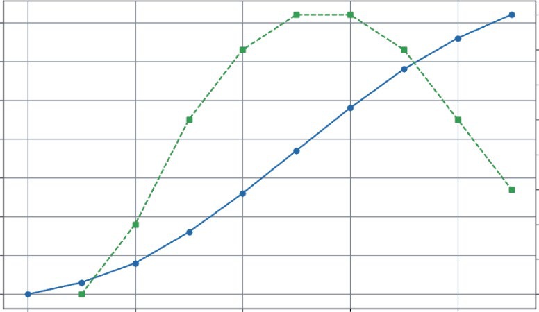
reveals the true momentum. The game’s growth accelerated rapidly for the first five days, peaked when daily downloads were growing at a rate of 550 downloads per day, and has been slowing down since Day 7. This is a critical insight. It tells you that your initial launch buzz is fading and now might be the perfect time for a new marketing push to reaccelerate growth.
The Second Derivative: Pinpointing the Point of Diminishing
Returns
The second derivative measures the rate of change of the rate of change. It’s not the speed, but the acceleration of your metric. Its most powerful use in business is to find the inflection point—the precise moment when a trend’s momentum shifts. For a growing metric, this is the point of diminishing returns: the moment the growth begins to slow down.
To calculate this, you simply take the derivative of the first derivative. In NumPy, this means applying np.diff() a second time. Listing 5-2 uses the daily_new_downloads array calculated in the previous section and passes it through np.diff() again. This gives you a new array, called download_
acceleration, which represents the day-to-day change in the growth rate. Combine the code from Listing 5-1 and Listing 5-2.
LISTING 5-2: FINDING THE INFLECTION POINT FOR GAME DOWNLOADS
# The first derivative is the daily new downloads
daily_new_downloads = np.array([150, 250, 400, 500, 550, 550, 500, 400, 300])
numerical Differentiation and integration in Business Analytics ❘ 87
# The second derivative is the "acceleration" of downloads
download_acceleration = np.diff(daily_new_downloads)
print(f"Download Acceleration: {download_acceleration}")
# --- Visualization ---
plt.figure(figsize=(10, 6))
# Plot the first derivative (daily rate)
plt.plot(range(1, len(daily_new_downloads) + 1), daily_new_downloads, 'g-s', label='Daily New Downloads (1st Derivative)')
# Plot the second derivative (acceleration)
plt.plot(range(2, len(download_acceleration) + 2), download_acceleration, 'b-^', label='Download Acceleration (2nd Derivative)')
plt.axhline(y=0, color='grey', linestyle='--')
plt.title('Finding the Point of Diminishing Returns')
plt.xlabel('Day')
plt.ylabel('Change in Downloads')
plt.legend()
plt.grid(True)
plt.show()
The result:
Download Acceleration: [100 150 100 50 0 -50 -100 -100]
The visualization makes the story clear, The daily rate (squares) and the acceleration (triangles) are plotted on the same graph. Notice that there is also a horizontal dashed line at zero (plt.axhline(y=0)). This simple addition is crucial because it acts as a visual boundary.
The lower line (acceleration) shows the momentum. It’s positive for the first few days, meaning growth is speeding up. It’s zero on Day 6, and then it turns negative. Day 7, where the acceleration first becomes negative (−50), is the inflection point. This is the point of diminishing returns. Even though you still gained 500 new users on Day 7, the growth engine had started to slow down. For a business, this is the signal that a strategy (like an initial marketing blast) has reached its peak effectiveness and it’s time to consider a new approach to reaccelerate growth.
The Integral: Accumulating the Totals
Integration is the reverse of differentiation. If the derivative acts as a speedometer by converting the position function into velocity, the integral is the odometer that converts the velocity function into total distance traveled. It allows you to “sum up” a series of small, incremental changes to understand their cumulative impact.
This is incredibly useful in business. Imagine you know the number of new subscribers your streaming service gets each day. How do you find your total subscriber count at the end of the month, by using integration?
For numerical data, this process is wonderfully simple. You can use NumPy’s cumsum() function, which calculates the cumulative sum of an array. It takes a stream of rate data and returns the total accumulation over time.
88 ❘ CHAPTER 5 CAlCuluS foR BuSinESS PRoBlEm Solving
Finding the Point of Diminishing Returns
500
400
300
200
Change in Downloads 100
0
Daily New Downloads (1st Derivative)
–100
Download Acceleration (2nd Derivative)
1
2
3
4
5
6
7
8
9
Day
FIGURE 5-2: Visualization of the second derivative.
Say you have the daily numbers for new subscribers over a week. As shown in Listing 5-3, you can use cumsum() to see how the total user base grows.
LISTING 5-3: TRACKING STREAMING SERVICE SUBSCRIBERS
import numpy as np
import matplotlib.pyplot as plt
# Number of new subscribers each day for a week
daily_new_subs = np.array([120, 135, 150, 160, 145, 110, 90])
days = ['Mon', 'Tue', 'Wed', 'Thu', 'Fri', 'Sat', 'Sun']
# Calculate the cumulative sum of subscribers
total_subs = np.cumsum(daily_new_subs)
# Print the results
print(f"Daily New Subscribers: {daily_new_subs}")
print(f"Total Subscribers: {total_subs}")
# --- Visualization ---
plt.figure(figsize=(10, 6))
plt.bar(days, daily_new_subs, color='skyblue', label='New Subscribers Each Day')
numerical Differentiation and integration in Business Analytics ❘ 89
plt.plot(days, total_subs, color='navy', marker='o', linestyle='-',
label='Total Subscriber Count')
plt.title('Streaming Service Growth Over One Week')
plt.ylabel('Number of Subscribers')
plt.xlabel('Day of the Week')
plt.legend()
plt.grid(axis='y', linestyle='--', alpha=0.7)
plt.show()
This code starts with the daily_new_subs array. The calculation happens in the single line total_subs = np.cumsum(daily_new_subs). This function iterates through the array, keeping a running total. The first element is just 120. The second element is 120 + 135 = 255. The third is 120 + 135 + 150 = 405, and so on.
The results confirm this:
Daily New Subscribers: [120 135 150 160 145 110 90]
Total Subscribers: [120 255 405 565 710 820 910]
The visualization code then combines these two views. It uses plt.bar to show the daily rate as a light blue bar chart and plt.plot to overlay the cumulative total as a dark navy line chart. The
It clearly shows how the daily rate (the bar chart) directly builds the Streaming Service Growth Over One Week
Total Subscriber Count
New Subscribers Each Day
800
600
400
Number of Subscribers
200
0
Mon
Tue
Wed
Thu
Fri
Sat
Sun
Day of the Week
FIGURE 5-3: Demonstration of integration using subscriber growth.
90 ❘ CHAPTER 5 CAlCuluS foR BuSinESS PRoBlEm Solving cumulative total (the line chart). You can see that the subscriber acquisition peaked mid-week on Thursday and slowed over the weekend. By the end of the week, those daily gains accumulated to a total of 910 new subscribers. This simple act of integration gives you a complete picture of the daily performance and its overall impact.
THE CALCULUS ECOSYSTEM IN PYTHON
So far, this chapter has focused on the numerical approach to calculus using NumPy, which is perfect when your starting point is a collection of data points. However, the Python ecosystem offers a rich set of tools for different kinds of calculus problems. There are several main approaches, which include numerical calculus, symbolic calculus, and advanced numerical methods.
The following subsections take a brief look at each of these approaches. The discussion starts with numerical calculus using NumPy for analyzing array data. Then, you’ll explore symbolic calculus with SymPy for working directly with mathematical formulas. Finally, you’ll learn a bit about advanced numerical methods using SciPy for high-precision tasks like integration.
Numerical Calculus with NumPy
Numerical calculus using NumPy is the method you’ve been using. It’s the best choice when you have data in an array and want to find the differences between points (np.diff) or the cumulative sum (np.cumsum). It’s fast, efficient, and direct for data analysis.
As an example, imagine a matrix where each row represents a day and each column represents a different product. The values are the cumulative sales for that product. As shown in Listing 5-4, you can use np.diff to find the daily new sales for all products at once.
LISTING 5-4: DIFFERENTIATING A SALES MATRIX
import numpy as np
# Cumulative sales matrix: 4 days, 3 products
# Product A, Product B, Product C
sales_matrix = np.array([
[100, 50, 200], # Day 1
[110, 55, 215], # Day 2
[125, 65, 235], # Day 3
[145, 80, 250] # Day 4
])
# Differentiate along the rows (axis=0) to get daily changes
daily_sales_growth = np.diff(sales_matrix, axis=0)
print("--- Daily Sales Growth ---")
print(daily_sales_growth)
The Calculus Ecosystem in Python ❘ 91
This example first defines a matrix (sales_matrix) that contains the sales for three products over four days. The key line is daily_sales_growth = np.diff(sales_matrix, axis=0). By specifying axis=0, you tell NumPy to perform the difference operation along the rows (vertically). The output matrix shows the new sales each day for each product:
--- Daily Sales Growth ---
[[10 5 15]
[15 10 20]
[20 15 15]]
For instance, on the second day (the first row of the output), Product A sold 10 new units (110 − 100), Product B sold 5 (55 − 50), and Product C sold 15 (215 − 200).
Symbolic Calculus with SymPy
What if you don’t have data, but a mathematical formula? For example, you might have a cost function C(x) = 0.01x2 + 50x + 5,000. If you want to find the derivative or integral of the formula itself, you need a symbolic math library.
SymPy is the standard for this in Python. It works with abstract symbols, not numbers, to give you exact analytical results. Listing 5-5 uses SymPy for a cost function.
LISTING 5-5: USING SYMPY FOR A COST FUNCTION
import sympy as sp
# 1. Define 'x' as a mathematical symbol
x = sp.symbols('x')
# 2. Create a symbolic expression for our cost function
cost_function = 0.01*x**2 + 50*x + 5000
# 3. Calculate the derivative (marginal cost function)
marginal_cost_function = sp.diff(cost_function, x)
# 4. Calculate the integral (if we wanted to reverse the process)
integral_of_cost = sp.integrate(cost_function, x)
print(f"Original Cost Function: {cost_function}")
print(f"Marginal Cost Function: {marginal_cost_function}")
print(f"Integral of Cost Function: {integral_of_cost}")
The code first defines x as an abstract symbol using sp.symbols('x'). This tells Python to treat x not as a variable holding a specific number, but as a mathematical placeholder, allowing you to build the cost_function as a symbolic expression.
Once you have this expression, you use SymPy’s core calculus functions. sp.diff(cost_function, x) takes the expression and calculates its exact derivative with respect to x, giving the marginal cost function.
92 ❘ CHAPTER 5 CAlCuluS foR BuSinESS PRoBlEm Solving Conversely, sp.integrate(cost_function, x) finds the indefinite integral of the expression, effectively reversing the differentiation process.
The output confirms that SymPy has performed these symbolic manipulations correctly: Original Cost Function: 0.01*x**2 + 50*x + 5000
Marginal Cost Function: 0.02*x + 50
Integral of Cost Function: 0.00333333333333333*x**3 + 25.0*x**2 + 5000.0*x The code determined the derivative of the cost function, which represents the marginal cost. It also found the indefinite integral, reversing the operation. Notice that the integral includes a term, showing how it recovered the original structure from the constant term in your cost function.
Advanced Numerical Methods with SciPy
While NumPy provides the basics, SciPy provides a library of more advanced, high-performance numerical routines. When it comes to calculus, its scipy.integrate module is essential. You will see how to use solve_ivp later in this chapter to solve differential equations. Another key function is quad, which can find the definite integral of any Python function with high precision.
Let’s say you have a Python function that represents your marginal revenue. You can use scipy.
integrate.quad to find the total revenue gained by selling a certain range of products for instance, from the 100th unit to the 500th unit. Listing 5-6 shows an example of using the quad function.
LISTING 5-6: USING SCIPY TO INTEGRATE A FUNCTION
from scipy import integrate
# Our marginal revenue function: MR = 100 - 0.1*q
def marginal_revenue(q):
return 100 - 0.1 * q
# Integrate the function from quantity=100 to quantity=500
# The 'quad' function returns the result and an estimate of the error total_revenue_gained, error = integrate.quad(marginal_revenue, 100, 500) print(f"Total revenue from selling units 100 to 500: ${total_revenue_gained:.2f}") print(f"Estimated error of the calculation: {error}")
The integrate.quad() function takes three main arguments: the function you want to integrate (marginal_revenue) and the start and end points of the integration interval (100 and 500). It returns two values: the calculated integral and an estimate of the absolute error.
The output from this listing is as follows:
Total revenue from selling units 100 to 500: $34000.00
Estimated error of the calculation: 3.774758283725532e-13
Solving Business growth and Pricing models with Differential Equations ❘ 93
The extremely small error value indicates that the total revenue figure of $34,000.00 is highly precise.
The quad function is the go-to tool when you need a precise numerical integral of a Python function.
Choosing the Right Tool
You can clearly see that Python can solve any problem. Which tool is the right one depends on your problem. The following can serve as a guide for what tool to use when:
➤
Starting with a spreadsheet or data array? Use NumPy.
➤
Starting with a mathematical formula? Use SymPy.
➤
Need to solve a differential equation or find a high-precision integral of a function? Use SciPy.
SOLVING BUSINESS GROWTH AND PRICING MODELS WITH
DIFFERENTIAL EQUATIONS
While analyzing historical data is essential, the ultimate goal for many businesses is to look into the future. Businesses need to build models that can forecast growth, predict market saturation, and understand how systems evolve over time. This is the domain of differential equations.
If you think of the previous examples as reading a ship’s log to see where it has been, think of differential equations as using the ship’s current speed and the ocean currents to chart its future course.
A differential equation is a powerful rule or “recipe” that describes how a system changes, where the rate of change depends on the current state of the system.
This concept is at the heart of many business dynamics:
➤
Viral marketing: The rate of new sign-ups is proportional to the number of existing users who can share the product. More users equals faster growth.
➤
Compound interest: The rate at which your investment grows is proportional to the current balance. More money equals faster earnings.
➤
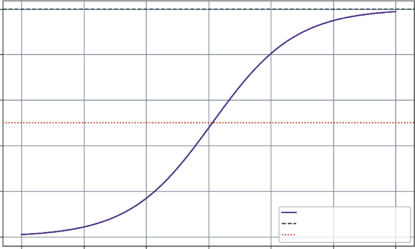
Product adoption: The rate of new customers often depends on how many potential customers are left in the market. As the market becomes saturated, growth naturally slows down.
The example of product adoption is famously modeled by the logistic growth curve (or S-curve), which describes the lifecycle of many products and services: a slow start, a period of rapid growth, and a final leveling-off as the market capacity is reached.
To solve these models and generate forecasts in Python, you can use a powerful tool from the SciPy library: solve_ivp (Solve Initial Value Problem). You simply provide the solve_ivp function with a starting point (your initial number of users), a function that defines your “recipe for growth,” and a time frame. It does the hard work of simulating the system’s evolution.
94 ❘ CHAPTER 5 CAlCuluS foR BuSinESS PRoBlEm Solving As an example, consider the growth of a new streaming service. You have 100 beta testers at launch.
Based on market research, your company believes the total potential market is 10,000 subscribers.
You want to project subscriber growth over the next three years.
The “recipe for growth” is the logistic model, which states that the growth rate is proportional to both the current number of users and the remaining market space. Listing 5-7 contains code for modeling this.
LISTING 5-7: MODELING A SUBSCRIPTION SERVICE’S GROWTH
import numpy as np
from scipy.integrate import solve_ivp
import matplotlib.pyplot as plt
# --- 1. Define the Model Parameters ---
P0 = 100 # Initial number of subscribers
K = 10000 # Market capacity (carrying capacity)
r = 1.5 # Intrinsic growth rate (e.g., 150% per year)
# --- 2. Define the Differential Equation (The "Recipe") ---
# This function describes the rate of change at any given time t and population P
def logistic_growth(t, P):
# The logistic equation: dP/dt = r * P * (1 - P/K)
return r * P * (1 - P / K)
# --- 3. Set up and Run the Solver ---
# Time span: 0 to 3 years
t_span = [0, 6]
# Points in time where we want the solution
t_eval = np.linspace(t_span[0], t_span[1], 100)
# Use solve_ivp to get the solution
sol = solve_ivp(
fun=logistic_growth,
t_span=t_span,
y0=[P0],
t_eval=t_eval
)
Let’s break down how solve_ivp works. It’s a sophisticated numerical solver that you set up by passing it four key arguments:
➤
fun, which is your recipe, the logistic_growth function you define to tell the solver how to calculate the rate of change at any given moment.
➤
t_span, the start and end times for your simulation, [0, 6] years.
➤
y0, the starting state of your system, which is the initial 100 subscribers ([P0]).
Solving Business growth and Pricing models with Differential Equations ❘ 95
➤
t_eval, an optional but useful argument that tells the solver exactly which points in time you want it to report back.
This example asks for 100 evenly spaced points over the six years to ensure you get a smooth curve for plotting.
Under the hood, solve_ivp starts at P0 and takes a tiny step forward in time. It uses the function to calculate the growth rate, estimates the new subscriber count, and then repeats this process thousands of times. By stitching together these incremental steps, it accurately simulates the continuous growth curve without having to solve the complex differential equation by hand.
To better see what is happening, you can plot the results to see a graph of the results. Combine the code presented in Listing 5-8 with the code in Listing 5-7.
LISTING 5-8: VISUALIZING THE RESULTS OF THE SUBSCRIPTION SERVICE’S GROWTH
# --- 4. Visualize the Results ---
plt.figure(figsize=(10, 6))
plt.plot(sol.t, sol.y[0], label='Projected Subscriber Growth', color='purple') plt.axhline(y=K, color='grey', linestyle='--', label=f'Market Capacity ({K})') plt.axhline(y=K/2, color='red', linestyle=':', label='Point of Max Growth') plt.title('Subscription Service Growth Projection (S-Curve)')
plt.xlabel('Years')
plt.ylabel('Number of Subscribers')
plt.legend()
plt.grid(True)
plt.show()
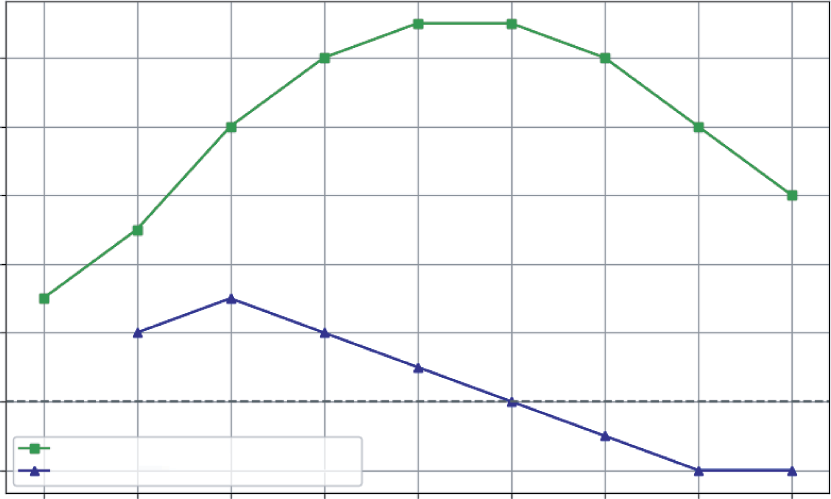
The output, is a classic S-curve that provides a rich, strategic forecast for the business. Looking at the figure, you can see the following:
➤
Slow start (Year 0–2): In the first year, growth is modest as the service finds its footing with early adopters.
➤
Rapid growth (Year 2–4): As word-of-mouth and marketing kick in, the service enters a period of exponential growth. The rate of new subscribers is at its highest when you have half the market (the dotted line), as there’s a perfect balance of existing users to spread the word and new customers to acquire.
➤
Saturation (Year 4–6): As the service captures a majority of the potential market, growth slows significantly. It becomes harder and more expensive to find new subscribers.
This single model, born from a simple differential equation, is a powerful strategic roadmap. It helps you anticipate when to ramp up server capacity, when to shift marketing from acquisition to retention, and how to set realistic growth targets for investors.
96 ❘ CHAPTER 5 CAlCuluS foR BuSinESS PRoBlEm Solving
Subscription Service Growth Projection (S-curve)
10000
8000
6000
4000
Number of Subscribers
2000
Projected Subscriber Growth
Market Capacity (10000)
0
Point of Max Growth
0
1
2
3
4
5
6
Years
FIGURE 5-4: Subscription service growth project figure.
SENSITIVITY ANALYSIS WITH PARTIAL DERIVATIVES
In business, decisions are rarely made in a vacuum. A product’s profit doesn’t just depend on its price; it’s also affected by your marketing budget, production costs, and competitor actions. This chapter has been looking at how one variable changes another, but the real world is a landscape of interconnected factors. Partial derivatives are the tool you use to navigate this landscape.
A partial derivative lets you measure the rate of change of a function with respect to one variable, while holding all other variables constant. It answers crucial “what-if” questions at the heart of business strategy:
➤
“If we keep our ad spend the same, how will a $1 price increase affect our profit?”
➤
“Holding our price steady, what is the exact return on the next dollar we put into marketing?”
This is like standing on a hillside—the slope depends on the direction you’re facing. The partial derivative tells you the steepness if you decide to walk only east, or only north.
This next example models the profit for an online course. The profit depends on two key levers you control: the price of the course and your monthly marketing spend. Listing 5-9 presents a model of this and visualizes it as a 3D “profit surface” to see how these decisions interact.
Sensitivity Analysis with Partial Derivatives ❘ 97
LISTING 5-9: VISUALIZING A PROFIT LANDSCAPE
import numpy as np
import matplotlib.pyplot as plt
# Define a profit function with two variables
def calculate_profit(price, marketing_spend):
# Model how price affects quantity sold (higher price -> fewer sales) quantity_sold = 1000 - 10 * price + 2 * np.sqrt(marketing_spend)
# Model revenue
revenue = quantity_sold * price
# Model cost
cost = 2000 + (0.5 * marketing_spend) # Fixed cost + marketing
return revenue - cost
# --- Create a Grid of Inputs ---
# Generate a range of possible prices and marketing spends
price_range = np.linspace(50, 150, 50)
marketing_range = np.linspace(500, 5000, 50)
# np.meshgrid creates a coordinate grid from our two arrays
P, M = np.meshgrid(price_range, marketing_range)
# --- Calculate Profit Across the Grid ---
Z_profit = calculate_profit(P, M)
# --- Visualize the Profit Surface ---
fig = plt.figure(figsize=(12, 8))
ax = fig.add_subplot(111, projection='3d')
surf = ax.plot_surface(P, M, Z_profit, cmap='viridis', edgecolor='none') ax.set_title('Profit Landscape')
ax.set_xlabel('Price ($)')
ax.set_ylabel('Marketing Spend ($)')
ax.set_zlabel('Profit ($)')
fig.colorbar(surf, shrink=0.5, aspect=5, label='Profit')
plt.show()
Listing 5-9 first defines a calculate_profit function that takes price and marketing_spend as inputs. It models a realistic scenario where higher prices reduce sales quantity, while higher marketing spend increases it (but with diminishing returns, modeled by np.sqrt).
To visualize this, you need to calculate profit for many different combinations of price and marketing. np.linspace is used to create ranges of 50 evenly spaced values for both price and marketing.
Then, np.meshgrid combines these two 1D arrays into a 2D grid of coordinates. This grid represents every possible combination of price and marketing spend to test.
You then pass these entire grids, P and M, to the profit function, which returns Z_profit, a matrix containing the profit for every point on that grid. Finally, you use Matplotlib’s 3D plotting capabilities to render this as a surface.
98 ❘ CHAPTER 5 CAlCuluS foR BuSinESS PRoBlEm Solving
Profit Landscape
20000
20000
0
0
–20000
Profit ($)
–40000
–20000
Profit
–60000
–40000
5000
–60000
4000
3000
60
80
2000
100
Price ($)
120
1000
Marketing Spend ($)
140
FIGURE 5-5: 3D plot of the profit landscape.
This plot shows an intuitive feel for the profit landscape. You can see there’s a “ridge” where profit is maximized. If you set the price too high or too low, your profit falls off. Similarly, there are diminishing returns to marketing spend. This visualization turns a complex, two-variable problem into an intuitive map. A partial derivative at any point on this surface would tell you the slope in the direction of either the “Price” axis or the “Marketing Spend” axis, giving you a precise measurement of that variable’s impact.
CASE STUDY: REVENUE, COST, AND PROFIT ANALYSIS
This case study brings everything together. You’ve seen how derivatives reveal rates of change and integrals accumulate totals. Now, you’ll see how to apply these concepts to one of the most fundamental tasks in business: analyzing profitability.
In this case study, you’ll act as an analyst for a company launching a new product. You have data on production costs and a model for market demand. The goal isn’t to find the single “best” price (I save that for the next chapter on optimization), but to understand the dynamics of profit. Where does it grow fastest? When does producing one more unit stop being as profitable?
Case Study: Revenue, Cost, and Profit Analysis ❘ 99
Step 1: Understanding Marginal Cost (the Derivative of Cost)
Your production team has given you a table of total costs for different production levels. As you produce more, you expect costs to rise, but due to economies of scale, they might not rise at a constant rate. The key metric you need to uncover is the marginal cost: the cost of producing one more unit. This is the derivative of the total cost. Using the code in Listing 5-10, you can uncover the margin cost.
LISTING 5-10: UNCOVERING THE MARGINAL COST
import numpy as np
import matplotlib.pyplot as plt
# Production levels from 0 to 1000 units, in steps of 100
quantity = np.arange(0, 1001, 100)
# Total cost to produce at each level (includes fixed costs + variable costs)
# Let's model this with a function for simplicity
fixed_cost = 5000
variable_cost_per_unit = 50
# Add a non-linear term to represent economies of scale
total_cost = fixed_cost + (variable_cost_per_unit * quantity) -
(0.01 * quantity**2)
# Calculate Marginal Cost using the derivative (np.diff)
# We divide by the change in quantity (100) to get the per-unit cost
marginal_cost = np.diff(total_cost) / np.diff(quantity)
# --- Visualization ---
fig, (ax1, ax2) = plt.subplots(1, 2, figsize=(14, 6))
# Plot Total Cost
ax1.plot(quantity, total_cost, 'b-o', label='Total Cost')
ax1.set_title('Total Production Cost')
ax1.set_xlabel('Quantity Produced')
ax1.set_ylabel('Cost ($)')
ax1.grid(True)
# Plot Marginal Cost
# We plot this at the midpoint of each interval
ax2.plot(quantity[1:], marginal_cost, 'g-s', label='Marginal Cost')
ax2.set_title('Marginal Cost per Unit')
ax2.set_xlabel('Quantity Produced')
ax2.set_ylabel('Cost per Additional Unit ($)')
ax2.grid(True)
plt.tight_layout()
plt.show()
This listing first creates the data. quantity is an array representing production levels from 0 to 1,000
in steps of 100. You then model total_cost using a formula that includes a fixed cost, a variable
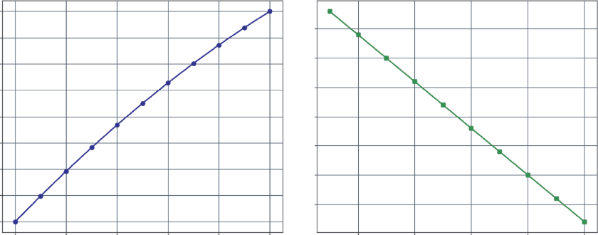
100 ❘ CHAPTER 5 CAlCuluS foR BuSinESS PRoBlEm Solving
Total Production Cost
Marginal Cost per Unit
45000
47.5
40000
45.0
35000
30000
42.5
25000
40.0
Cost ($)
20000
37.5
15000
Cost per Additional Unit ($) 35.0
10000
32.5
5000
0
200
400
600
800
1000
200
400
600
800
1000
Quantity Produced
Quantity Produced
FIGURE 5-6: Total production cost and marginal cost per unit.
cost, and a small negative quadratic term (-0.01 * quantity**2) to simulate economies of scale, where costs rise a bit slower as quantity increases.
The crucial step is calculating the marginal_cost. The code uses np.diff(total_cost) to find the change in cost between each production level. However, since the production levels change by 100
units at a time (not 1), you must divide this by np.diff(quantity) (which is 100) to get the true per-unit marginal cost.
The visualization code then creates two side-by-side charts (using plt.subplots(1, 2)) to compare two views of this data,
you can see that the left chart shows the total cost, which always goes up.
The right chart, however, provides a deeper insight. The marginal cost is decreasing. For the first 100
units, each additional item costs about $49 to make. By the time you’re producing 1,000 units, the cost for just one more has dropped to $31. This is a classic sign of economies of scale: production is getting more efficient at higher volumes.
Step 2: Understanding Marginal Revenue (the Derivative of
Revenue)
Next, your marketing team provides a demand curve. They estimate that to sell more units, you need to lower the price. Total revenue is simply price * quantity. But you’re interested in the marginal revenue: the extra revenue you get from selling one more unit. The marginal revenue is computed in Listing 5-11.
Case Study: Revenue, Cost, and Profit Analysis ❘ 101
LISTING 5-11: COMPUTING MARGINAL AND TOTAL REVENUE
# From our demand model, we know the price we must set to sell a certain quantity price = 100 - (0.05 * quantity)
# Calculate Total Revenue
total_revenue = price * quantity
# Calculate Marginal Revenue using the derivative
marginal_revenue = np.diff(total_revenue) / np.diff(quantity)
# --- Visualization ---
fig, (ax1, ax2) = plt.subplots(1, 2, figsize=(14, 6))
# Plot Total Revenue
ax1.plot(quantity, total_revenue, 'r-o', label='Total Revenue')
ax1.set_title('Total Revenue')
ax1.set_xlabel('Quantity Sold')
ax1.set_ylabel('Revenue ($)')
ax1.grid(True)
# Plot Marginal Revenue
ax2.plot(quantity[1:], marginal_revenue, 'm-s', label='Marginal Revenue') ax2.set_title('Marginal Revenue per Unit')
ax2.set_xlabel('Quantity Sold')
ax2.set_ylabel('Revenue from Additional Unit ($)')
ax2.grid(True)
plt.tight_layout()
plt.show()
This listing first defines the price based on the demand model: for every unit you want to sell, the price must drop by $0.05. It then calculates total_revenue by multiplying this price array by the quantity array.
Just as you did with cost, you calculate marginal_revenue by taking the derivative of total revenue using np.diff(total_revenue) and dividing it by the change in quantity (np.diff(quantity)).
The visualization code then generates two plots side-by-side,
which shows the graphs that are output from the listing, the total revenue curve on the left has an interesting shape. It peaks and then starts to decline. The marginal revenue chart on the right shows why. Initially, selling one more unit brings in about $95. But as you produce more, you have to lower the price on all units, so the extra revenue you get from each new sale decreases. Eventually, the marginal revenue becomes negative. This means that to sell one more unit, the price drop required is so large that your total revenue actually goes down.
102 ❘ CHAPTER 5 CAlCuluS foR BuSinESS PRoBlEm Solving
Total Revenue
Marginal Revenue per Unit
50000
80
40000
60
30000
Revenue ($) 20000
40
10000
Revenue from Additional Unit ($) 20
0
0
200
400
600
800
1000
200
400
600
800
1000
Quantity Sold
Quantity Sold
FIGURE 5-7: Total revenue and marginal revenue per unit.
Step 3: Finding the Sweet Spot with Marginal Profit
Now you need to combine the two. Profit is revenue minus cost. The most important analytical concept here is marginal profit, which is marginal revenue minus marginal cost. As long as the marginal profit is positive, producing one more unit adds to your total profit. The moment it turns negative, you start losing money on each new unit. Combine Listing 5-10, Listing 5-11 to calculate the profit margin for these products.
LISTING 5-12: CALCULATING MARGINAL PROFIT
# Calculate Total Profit
total_profit = total_revenue - total_cost
# Calculate Marginal Profit
marginal_profit = marginal_revenue - marginal_cost
# --- Final Visualization ---
plt.figure(figsize=(12, 7))
plt.plot(quantity[1:], marginal_revenue, 'm--', label='Marginal Revenue') plt.plot(quantity[1:], marginal_cost, 'g--', label='Marginal Cost')
plt.plot(quantity[1:], marginal_profit, 'k-o', label='Marginal Profit (MR - MC)') plt.axhline(y=0, color='grey', linestyle='-')
plt.title('Marginal Analysis of Profitability')
plt.xlabel('Quantity')
plt.ylabel('Dollars per Unit ($)')
plt.legend()
plt.grid(True)
plt.show()
Case Study: Revenue, Cost, and Profit Analysis ❘ 103
This code performs a simple element-wise subtraction on the NumPy arrays to calculate total_
profit and marginal_profit. The visualization then brings all three key marginal metrics onto a single chart for comparison. Distinct styles are used for each line—dashed for revenue, lighter dashed line for cost, and a solid black line with markers for profit—to make them easy to distinguish.
Crucially, a solid horizontal line is added at zero (plt.axhline(y=0)). This acts as the breakeven line for marginal profit, instantly showing you where adding another unit stops being profitable.
. The solid downward-sloping line, marginal profit, shows the profit from each additional unit.
➤
From 100 to 700 units: The marginal profit is positive. Each new unit you produce and sell adds to your bottom line.
➤
Around 700 units: The marginal revenue and marginal cost curves intersect. At this point, the marginal profit is zero. You’ve squeezed all the profit you can out of the next unit.
➤
Beyond 700 units: The marginal profit becomes negative. The cost to produce one more unit is now higher than the revenue it brings in. You are losing money on every additional sale.
This analysis, driven entirely by the concept of the derivative, has shown that the most profitable production level is right around 700 units. While a formal optimization algorithm could pinpoint the exact number, this calculus-based analysis provides a powerful, visual understanding of the dynamics at play.
Marginal Analysis of Profitability
100
Marginal Revenue
Marginal Cost
Marginal Profit (MR – MC)
80
60
40
20
Dollars per Unit ($)
0
–20
200
400
600
800
1000
Quantity
FIGURE 5-8: Marginal analysis of profitability line plot.
104 ❘ CHAPTER 5 CAlCuluS foR BuSinESS PRoBlEm Solving SUMMARY
Throughout this chapter, you have journeyed through the core concepts of calculus, transforming them from abstract mathematical ideas into practical tools for business analysis. The chapter began by using numerical derivatives and integrals to read the story hidden in data, uncovering the momentum of a product launch and the cumulative growth of a subscriber base. From there, you moved from analyzing the past to predicting the future, using differential equations to model the classic S-curve of product adoption. The chapter then embraced real-world complexity by using partial derivatives to explore the multi-dimensional “profit landscape,” showing how different strategic levers interact.
Finally, the case study on marginal analysis tied everything together, showing how the derivative can reveal the precise dynamics of profitability. That analysis led to a powerful conclusion: the sweet spot for production was around 700 units.
This insight is also a question. Around 700 is a fantastic analytical finding, but as business leaders, we need to make a specific decision. How do we find the exact point of maximum profit? To answer that, we must move from analyzing the landscape to finding its highest peak. That is the world of optimization, and it is where your journey takes you next.
CONTINUE YOUR LEARNING
If you want to dive deeper into the tools and concepts discussed in this chapter, the following official resources are highly recommended:
➤
NumPy documentation:
➤
The foundation of numerical computing in Python. The official documentation is the best place to learn more about the functions used in this chapter and discover new ones.
➤
numpy.diff:
For understanding how to calculate differences between array elements.
➤
numpy.cumsum:
For learning more about cumulative sums.
➤
SciPy documentation:
➤
SciPy builds on NumPy to provide a large collection of algorithms for scientific and technical computing.
➤
scipy.integrate.solve_ivp:
The definitive guide to the initial value problem solver used for the differential equation modeling.
Continue Your learning ❘ 105
➤
Matplotlib documentation:
➤
The primary library for creating static, animated, and interactive visualizations in Python.
➤
Official tutorials:
A great starting point for mastering plotting, from basic charts to complex 3D surfaces.


6Optimization Techniques for
Business Strategy
In the last chapter, analyzing the marginal cost and revenue led to a powerful insight: the sweet spot for the product’s profitability was around 700 units. The power of calculus gives you a deep, intuitive understanding of the dynamics at play. But as a business leader, “around 700”
isn’t a final decision. It’s a fantastic analytical finding, but it leaves you with one critical, actionable question: what is the exact number?
This chapter focuses on answering that question. You are now moving from analysis, understanding the landscape, to prescription. This is the world of optimization, the formal process of finding the best possible outcome from a set of choices.
Optimization is the engine behind countless strategic decisions, from an airline setting its ticket prices to a CPG company deciding how to stock a supermarket’s shelves. The good news is that every optimization problem, no matter how complex, is built from two simple pillars:
➤
Objective function: This is the single number you want to maximize or minimize. It’s your goal, defined in code. It could be maximize profit, minimize cost, or minimize portfolio risk.
➤
Constraints: These are the real-world rules, limitations, and budgets you must operate within. Examples include “We only have 40 labor hours per week,” “Our total marketing budget is $10,000,” or “All portfolio weights must sum to 1.”
This chapter shows you how to build a complete toolkit for making these optimal decisions using Python. You’ll start by solving the very problem you ended with, and then build up to solving complex, real-world problems in logistics, finance, and marketing.
108 ❘ CHAPTER 6 OPTimizATiOn TECHniquES fOR BuSinESS STRATEgy THE PYTHON OPTIMIZATION ECOSYSTEM
Before you jump into solving problems, it’s helpful to know what tools are available. When you face an optimization problem, you’re rarely starting from scratch. Your choice of tool depends on the nature of your problem. The Python ecosystem has a mature and powerful set of libraries designed to do the heavy lifting for you:
1.
scipy.optimize—This is the workhorse module used throughout this chapter. It’s part of the SciPy library and provides a fantastic toolkit for a wide range of optimization tasks. It’s the perfect place to start because it contains tools that can handle almost any optimization problem:
➤
minimize_scalar: The tool you’ll use for simple problems when you’re optimizing just one variable (like finding the optimal quantity of a single product).
➤
linprog: A high-performance solver specifically designed for Linear Programming (LP) problems, like the kind of allocation problems that form the bedrock of operations and logistics.
➤
minimize: The most powerful and general-purpose tool in the box. This is what you use for complex nonlinear constrained optimization, like building an optimal financial portfolio.
2.
PuLP and Pyomo—For very large-scale, complex linear or integer programming (where your variables must be whole numbers, like “5 trucks” or “27 employees”), specialized libraries like PuLP and Pyomo shine. Their main advantage is that they allow you to write your models in a more “algebraic” and human-readable way, which can be a lifesaver when you’re managing hundreds of constraints for a factory floor or supply chain. You won’t use these in this introductory chapter, but it’s important to know they exist. You can find more information about PuLP at
3.
CVXPY (convex optimization)—This is a more advanced library for a special class of problems known as convex optimization. These problems are common in finance, machine learning, and engineering, and they have a wonderful property: they are guaranteed to have a single, global “best” solution. CVXPY provides a powerful, high-level language to formulate and solve these specific types of problems. You can find more information about CVXPY in the “Continue Your Learning” section at the end of this chapter.
For the purposes here, scipy.optimize is the perfect tool. It’s powerful, it’s integrated directly with NumPy, and its functions map perfectly to the core concepts you need to learn—unconstrained, linear constrained, and nonlinear constrained optimization.
A framework for Solving most Optimization Problems ❘ 109
A FRAMEWORK FOR SOLVING MOST OPTIMIZATION
PROBLEMS
Knowing the tools is the first step. The second, more difficult step is learning how to think like an optimizer. The hardest part of optimizing business models is not the Python code, but the art of formulation—translating a messy, real-world business problem into the clean, mathematical structure that a solver can understand.
All of the examples in this chapter use a simple, four-step framework.
The Four-step Formulation Process
Step 1. Identify Your Objective Function This is the most critical step. You must be able to state your goal as a single function—is it minimize cost, maximize profit, or minimize risk? Then, ask if the function is linear (a straight line, like Profit = 50*T + 30*C) or nonlinear (a curve, like the total_
profit function from Chapter 5).
Step 2. Identify Your Constraints What are the rules? What limits your resources? This includes budgets, time, labor hours, or production capacity. Write them down as mathematical expressions. Are they equalities (=) or inequalities (<=, >=)?
Step 3. Choose Your Solver This is now a simple decision tree based on your answers to the questions in Step 2:
➤
One nonlinear variable and no constraints?
Use scipy.optimize.minimize_scalar.
➤
A linear objective and linear constraints?
Use scipy.optimize.linprog.
➤
A nonlinear objective with constraints?
Use scipy.optimize.minimize.
Step 4. Formulate and Solve Translate your objective and constraints into the specific format that your chosen solver requires.
This is the “translation” step, where you convert your business rules into Python objects. For linear problems, you will format your objective as a coefficient list c and your constraints as matrices A_ub (inequality) and b_ub (bounds). For nonlinear problems, you will define a Python function called fun for your objective and a list of dictionaries for your constraints. Once formatted, you simply pass these arguments to the solver, run the code, and interpret the results.
110 ❘ CHAPTER 6 OPTimizATiOn TECHniquES fOR BuSinESS STRATEgy Understanding the Local vs. Global Optima Issue
The most important trap with working with this framework centers on local versus global optima.
You’ll notice that some solvers need a starting or initial guess (which will call x0) and others don’t.
This is because of the single most important concept in nonlinear optimization: the difference between a local and a global optimum.
Linear problems like the product mix problem are simple in one sense. They are convex, meaning they have no hills or valleys, just a single solution. A solver like linprog is guaranteed to find this single global optimum every time, no matter where it starts.
Nonlinear problems like the profit curve can be non-convex. They can have multiple hills and valleys, like a rugged mountain range. Think of a curvy line on a plot.
These hills and valleys are called:
➤
A local minimum, which is a valley that is lower than all the points immediately around it.
➤
A global minimum, which is the absolute deepest valley in the entire landscape.
A solver (like scipy.optimize.minimize) can get stuck in a local minimum. Meaning, when following that valley, it can think it has reached the lowest point, when really the lowest point is over the next hill. The solver will find the bottom and report back that it’s found a solution, because as far as it can “see,” there’s no lower point nearby.
This is why the initial guess (x0) can be important. Starting the search at a different point on the mountain might lead the solver into a different, and hopefully deeper, valley. This is also why minimize_scalar’s bounds argument is so useful; it tells the solver to only search for the lowest valley within a specific, bounded section of the landscape.
Applying the Framework: Profit Maximization
With a framework in place, let’s re-examine the first problem from Chapter 5. Let’s start by answering the question from Chapter 5: what is the precise quantity that maximizes profit?
This is the simplest form of optimization, known as unconstrained nonlinear optimization. This is nonlinear because the profit curve (driven by revenue and cost models) is a curve, not a straight line.
It is unconstrained because for this first example, you can assume there are no constraints. You can produce any number of units you want.
The tool for this job is scipy.optimize.minimize_scalar. This function is a hill-climbing (or, more accurately, valley-finding) algorithm. You give it a function and a starting guess, and it intelligently searches for the single lowest point on that function.
To find a maximum (like profit), you just have to be a little clever: you ask the function to find the minimum of negative profit. By putting a negative sign in front of profit, you can use the minimize function to find the lowest point, which will actually be the highest (thanks to the negative). I call this the negative profit trick and it works for nearly any value.
First, let’s rebuild the total_profit function from the Chapter 5 case study. This is done in Listing 6-1, where functions are defined for revenue and cost, and then combined into a single total_profit function.
A framework for Solving most Optimization Problems ❘ 111
LISTING 6-1: PINPOINTING MAXIMUM PROFIT
import numpy as np
import matplotlib.pyplot as plt
from scipy.optimize import minimize_scalar
# --- Step 1: Re-create the functions from Chapter 5 ---
def calculate_total_revenue(quantity):
"""Calculates total revenue based on the demand curve."""
price = 100 - (0.05 * quantity)
return price * quantity
def calculate_total_cost(quantity):
"""Calculates total cost based on fixed and variable costs."""
fixed_cost = 5000
variable_cost_per_unit = 50
# Add nonlinear term for economies of scale
return fixed_cost + (variable_cost_per_unit * quantity) - (0.01 * quantity**2) def calculate_total_profit(quantity):
"""Calculates total profit (Revenue - Cost)."""
return calculate_total_revenue(quantity) - calculate_total_cost(quantity)
# --- Step 2: Create the Objective Function ---
# Our optimizer *minimizes*. To *maximize* profit, we
# create an objective function that returns the *negative* profit.
def objective_function(quantity):
return -calculate_total_profit(quantity)
# --- Step 3: Run the Optimizer ---
# 'minimize_scalar' finds the minimum of our objective_function.
# We give it a 'bracket' (a range [0, 2000]) to search within.
result = minimize_scalar(objective_function, bounds=(0, 2000), method='bounded')
# The optimal quantity is stored in 'result.x'
optimal_quantity = result.x
max_profit = calculate_total_profit(optimal_quantity)
print(f"--- Optimization Result ---")
print(f"Optimal Production Quantity: {optimal_quantity:.2f} units") print(f"Maximum Profit Achieved: ${max_profit:.2f}")
# --- Step 4: Visualize the Result ---
quantity_range = np.linspace(0, 1500, 400)
profit_range = calculate_total_profit(quantity_range)
plt.figure(figsize=(10, 6))
plt.plot(quantity_range, profit_range, label='Total Profit')
plt.axvline(x=optimal_quantity, color='red', linestyle='--',
label=f'Optimal Point ({optimal_quantity:.0f} units)')
plt.title('Finding the Exact Point of Maximum Profit')
plt.xlabel('Quantity Produced')
plt.ylabel('Total Profit ($)')
112 ❘ CHAPTER 6 OPTimizATiOn TECHniquES fOR BuSinESS STRATEgy plt.legend()
plt.grid(True)
plt.show()
Step 1 essentially translates the business logic into Python functions. calculate_total_revenue takes a quantity and returns the revenue based on the linear demand curve. calculate_total_cost does the same for the cost model, including the nonlinear term for economies of scale. calculate_
total_profit is simply the difference between the two. These are the fundamental building blocks of this model.
Step 2 adapts this model for the optimizer. A new function, objective_function, takes one input (quantity) and returns one output: the negative profit. This is the function you will pass to minimize_scalar.
Step 3 calls the solver. You can use minimize_scalar because you only have one variable to change (quantity). You pass it to the objective_function, and critically, also pass a bounds=(0, 2000) argument and set method=‘bounded’. This tells the solver not to waste time looking for negative production quantities or unrealistically high ones. It focuses the search on the relevant range.
The solver returns a result object. The most important attribute is result.x, which holds the optimal input value it found, in this case, the optimal production quantity.
The results of the optimization are printed to the screen:
--- Optimization Result ---
Optimal Production Quantity: 714.29 units
Maximum Profit Achieved: $10714.29
Finally, Step 4 creates a visualization to confirm the results, This step generates a range of quantity values, calculates the profit for each, and plots the curve. It then uses plt.axvline to draw a red dashed line at the optimal_quantity found by the solver.
the dashed line perfectly intersects the peak of the profit curve. You have successfully moved from knowing the peak was “around 700” to knowing it is exactly at 714.29 units.
LINEAR PROGRAMMING
This section turns your attention to one of the most powerful and widely used optimization techniques in the entire business world: linear programming (LP).
This is the quintessential tool for solving problems of allocation and logistics. Linear programming is used to determine the most efficient way to use limited resources. It’s the magic behind airline scheduling, factory production planning, and supply chain management.
A problem is linear if all of its relationships are straight lines:
➤
Linear objective: Each additional unit of a product adds a fixed amount of profit (e.g., $10
profit per chair).
➤
Linear constraints: Each additional unit consumes a fixed amount of a resource (e.g., 2.5
hours of labor per chair).
Linear Programming ❘ 113
Finding the Exact Point of Maximum Profit
Total Profit
10000
Optimal Point (625 units)
5000
0
it ($)rof –5000
al P
Tot
–10000
–15000
–20000
0
200
400
600
800
1000
1200
1400
Quantity Produced
FIGURE 6-1: Visualization of the maximum profit.
This introduces the second core concept: constrained optimization. Unlike with the first example, you now have to operate within a set of rules. You can’t just make infinite products; you’re limited by certain constraints (e.g., budget, time, raw materials). Without these boundaries, a non-constant linear objective function would simply continue indefinitely, meaning there would be no reachable maximum or minimum value to find.
The tool for this is scipy.optimize.linprog. This function is specifically designed to solve these linear problems at high speed.
Consider an example where you own a small workshop that makes two products:
➤
Tables: A table sells for a profit of $50.
➤
Chairs: A chair sells for a profit of $30.
You have two main constraints:
➤
Labor: You have a total of 120 labor hours available per week.
➤
Each table requires six hours of labor.
➤
Each chair requires three hours of labor.
114 ❘ CHAPTER 6 OPTimizATiOn TECHniquES fOR BuSinESS STRATEgy
➤
Materials: You have a total of 200 units of wood available per week.
➤
Each table requires eight units of wood.
➤
Each chair requires five units of wood.
What is the exact number of tables and chairs you should produce to maximize your total profit, without exceeding the resource constraints? Before you can write any code, you must translate this business problem into the formal language of optimization. This is the most critical step.
Step 1. Objective function: This is what you want to maximize. Let’s use T for the number of tables and C for the number of chairs. The total profit is the sum of the profit from tables and chairs. The function to use in order to make your profit as large as possible is as follows: Profit = 50*T + 30*C
Step 2. Constraints: These are the rules of the workshop, the real-world limits you cannot break.
Your constraints for this problem are as follows:
➤
Labor constraint: The total labor used must be less than or equal to 120 hours.
6*T + 3*C <= 120
➤
Wood constraint: The total wood used must be less than or equal to 200 units.
8*T + 5*C <= 200
➤
Non-negativity constraint: You can’t make a negative number of products.
T >= 0 and C >= 0
This complete formulation is your “blueprint.” Now you can prepare these components for the scipy.optimize.linprog function.
You can use linprog in Listing 6-2 to solve this. One important detail: linprog, like the previous tool, is a minimizer by default. To make it maximize the profit, you simply provide it with the negative of your profit coefficients (−$50, −$30). Minimizing this negative value is mathematically the same as maximizing a positive one.
LISTING 6-2: THE PRODUCT MIX PROBLEM
import numpy as np
from scipy.optimize import linprog
# --- Step 1: Define the Problem ---
# Objective function (to be minimized):
# We want to MAXIMIZE: 50*T + 30*C
# So we MINIMIZE: -50*T - 30*C
c = [-50, -30] # Coefficients for T (Table) and C (Chair)
# Constraints (Left-hand side):
# Ax_b <= b_b
# Constraint 1 (Labor): 6*T + 3*C <= 120
Linear Programming ❘ 115
# Constraint 2 (Wood): 8*T + 5*C <= 200
A = [
[6, 3], # Labor constraints
[8, 5] # Wood constraints
]
# Constraints (Right-hand side):
b = [
120, # Max labor hours
200 # Max units of wood
]
# --- Step 2: Define the Bounds ---
# We can't make negative products
T_bounds = (0, None) # (min_tables, max_tables)
C_bounds = (0, None) # (min_chairs, max_chairs)
# --- Step 3: Run the Optimizer ---
result = linprog(c, A_ub=A, b_ub=b, bounds=[T_bounds, C_bounds], method='highs')
# --- Step 4: Interpret the Results ---
optimal_tables = result.x[0]
optimal_chairs = result.x[1]
# Multiply by -1 to convert minimized negative profit back to max profit max_profit = -result.fun
print("--- Optimal Production Plan ---")
print(f"Optimal number of Tables to produce: {optimal_tables:.0f}") print(f"Optimal number of Chairs to produce: {optimal_chairs:.0f}") print(f"Maximum Profit Achieved: ${max_profit:.2f}")
Listing 6-2 translates the blueprint into Python lists. The objective function coefficients go into list c.
The constraints are split into two parts: the coefficients for the variables go into matrix A (the left side), and the limits go into list b (the right side). You then need to define bounds for each variable to ensure they are non-negative.
Finally, the code calls linprog, passing it all these pieces. The method=‘highs’ argument tells SciPy to use its most modern and efficient linear programming solver. The beauty of this setup is its flexibility. If you wanted to add a third product, such as a desk, you would simply add a third coefficient to c, a third column to A, and a third set of bounds. If you added a new constraint, such as an allot-ment for metal, you would just add a new row to A and a new value to b.
The result of our optimization is:--- Optimal Production Plan ---
Optimal number of Tables to produce: 0
Optimal number of Chairs to produce: 40
Maximum Profit Achieved: $1200.00
This is a fascinating and non-obvious result! A quick glance might suggest that you should make tables since they have a higher profit margin. However, the optimizer shows that tables are too resource-intensive. They consume a large amount of your most limited resource: labor.
116 ❘ CHAPTER 6 OPTimizATiOn TECHniquES fOR BuSinESS STRATEgy The optimizer’s solution is to focus all the production on chairs. By making 40 chairs, you use all 200 units of wood (40 × 5) and all 120 hours of labor (40 × 3), maximizing the profit at $1,200. This is the power of linear programming: it finds the truly optimal solution within real-world constraints, which is often counterintuitive.
Constrained Optimization
So far within this chapter, you have seen the two fundamental types of optimization: unconstrained and constrained. Understanding the difference between these is the most important part of framing a business problem. Let’s look at a summary of each.
Unconstrained Optimization: Finding the True Peak
Finding the true peak is the problem you solved in Listing 6-1. You had a single, nonlinear profit curve, and you wanted to find the absolute highest point on it. Let’s look at the details of this problem:
➤
Analogy: Finding the highest peak in an entire mountain range.
➤
Business question: “What is the absolute best price for our product to maximize profit, assuming we can make as many as we need and there are no other limits?”
➤
The tool: scipy.optimize.minimize_scalar was perfect for this. It’s designed to just search until it finds the peak.
Constrained Optimization: Finding the Best Possible Point
Finding the best possible point is the problem you solved in Listing 6-2. You had a profit “surface”
(defined by tables and chairs), but were fenced in by real-world limits (labor and wood). Let’s again look at the details of this problem:
➤
Analogy: Find the highest point, but don’t leave the boundaries of a fenced-in park. The highest point in the park might just be a small hill, not the highest peak in the whole mountain range.
➤
Business question: “What is the best product mix we can create given our limited $50,000
budget, 200 weekly labor hours, and 1,000 units of raw material?”
➤
The tool: scipy.optimize.linprog is designed to find the best possible solution within the constrained area, which is known as the feasible region.
Almost every real-world business problem is a constrained problem. You never have infinite money, infinite time, or infinite resources. The key to solving them is to correctly identify and define your constraints.
The Geometry of Optimization
Before you move on to complex real-world applications, it is valuable to pause and visualize exactly what these algorithms are doing. Optimization is essentially a search for the highest (or lowest) point on a surface. The shape of that surface dictates which tool you use and whether you will succeed.
Linear Programming ❘ 117
The first example optimized a simple profit curve. It had one clear peak. This is an ideal scenario known as a convex problem. But many real-world nonlinear problems are rugged. They have multiple hills and valleys.
Imagine a profit landscape where changing your price slightly moves you up a small hill, but a drastic price change might move you to a completely different, higher mountain range. A “hill-climbing”
algorithm is essentially blind; it only knows the slope of the ground immediately beneath its feet. If you start it at the bottom of the small hill, it will climb to the top, look around, see that every direction is down, and incorrectly report that it has found the global maximum.
Listing 6-3 generates a 3D wireframe plot of such a rugged landscape to illustrate this danger.
LISTING 6-3: VISUALIZING A RUGGED OPTIMIZATION LANDSCAPE
import numpy as np
import matplotlib.pyplot as plt
# 1. Define a "Rugged" Function
# This combines a large underlying curve with smaller sine wave ripples def rugged_profit(x, y):
base_structure = -(x**2 + y**2) # The main hill
ripples = 10 * (np.cos(x) + np.sin(y)) # The local peaks/valleys
return base_structure + ripples
# 2. Create the Grid
x = np.linspace(-5, 5, 50)
y = np.linspace(-5, 5, 50)
X, Y = np.meshgrid(x, y)
Z = rugged_profit(X, Y)
# 3. Visualize with Wireframe (Grayscale friendly)
fig = plt.figure(figsize=(10, 8))
ax = fig.add_subplot(111, projection='3d')
# Plot wireframe
ax.plot_wireframe(X, Y, Z, rstride=2, cstride=2, color='black', linewidth=0.5)
# Highlight Global Max vs Local Max
ax.scatter(0, 0, 20, color='black', s=100, label='Global Maxima (Goal)') ax.scatter(3, 3, -10, color='gray', s=100, label='Local Maxima (Trap)') ax.set_title('The Trap of Nonlinear Optimization: Local vs. Global')
ax.set_xlabel('Variable A')
ax.set_ylabel('Variable B')
ax.set_zlabel('Profit')
ax.legend()
plt.show()
Listing 6-3 intentionally constructs a difficult landscape. It starts with a base_structure, which is a simple inverted parabola (a smooth hill). Then, ripples are added using sine and cosine functions. This creates a surface that has a general shape but is covered in bumps and dips. np.meshgrid creates a grid
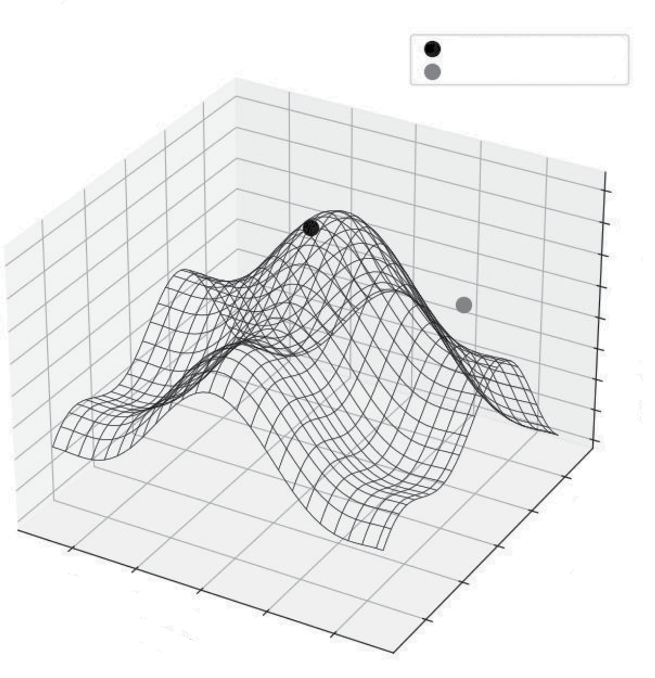
118 ❘ CHAPTER 6 OPTimizATiOn TECHniquES fOR BuSinESS STRATEgy
of coordinates and calculates the height Z for every point. Finally, ax.plot_wireframe draws lines connecting these points, creating a net-like visual that clearly shows the terrain without needing color gradients. I manually added two scatter points to highlight the key difference: a local maxima (a small peak) and the global maxima (the true highest point).
If the solver starts near the gray dot (the local maxima), it will climb to that peak and stop. It has no way of seeing the much higher, black dot (the global maxima) across the valley. This geometric reality is why choosing a good initial guess is critical in nonlinear optimization. It places the blind climber on the right mountain.
Contrast this with linear programming. A linear objective function (like Profit = 50*T + 30*C) is fundamentally different. It has no curves, no hills, and no valleys. It is a perfectly flat plane, tilted upward.
Because it is flat, a linear function has no critical points (peaks or valleys) in the middle. If you are standing on a tilted ramp, the “highest point” is never where you are standing; it is always farther up the ramp.
The Trap of Nonlinear Optimization: Local vs. Global
Global Maxima (Goal)
Local Maxima (Trap)
20
10
0
–10
–20
–30
–40
–50
–60
4
2
–4
0
le B
–2
iab
–2
Var
V
0
ariable
2
–4
A
4
FIGURE 6-2: Local vs. global optimization.
Linear Programming ❘ 119
This leads to two critical insights about linear programming:
➤
Unboundedness: Without constraints, a linear problem has no solution. The plane simply goes up forever toward infinity.
➤
The importance of vertices: When you add constraints (walls) to this infinite ramp, you create a geometric shape called a polytope (a multi-dimensional polygon). The optimal solution is guaranteed to lie at one of the vertices (or the corners) of this shape.
Imagine tilting a box. The lowest point will always be one of the corners. This is why the product mix solver returned exactly 40 chairs and 0 tables. It didn’t suggest a blend like 38 chairs and 1.2 tables because the mathematical peak of a linear function can only exist at the extreme boundaries of the feasible region.
With more knowledge of the underlying algorithms, you can understand when they fail. Even the best solvers can fail. Understanding the geometry helps you diagnose why an optimization run crashes or returns nonsense.
➤
Unboundedness: As discussed, if you forget a constraint (e.g., you forget to limit the labor hours), a linear solver will realize it can make infinite profit. It will return an “Unbounded”
error status, which essentially means: “You haven’t defined the limits of reality yet.”
➤
Infeasibility: This happens when your rules contradict each other. Imagine telling a solver,
“Production must be greater than 100 units” and “Production must be fewer than 50 units.”
Geometrically, the “feasible region” (the area where all rules are met) does not exist. It is empty. The solver will return an “Infeasible” status, telling you that your business requirements are impossible to satisfy simultaneously.
➤
No unique solution: Sometimes, the “tilt” of your profit objective is exactly parallel to one of your constraints. Imagine a flat ramp that aligns perfectly with a wall. In this case, any point along that wall is equally good. The solver will give you one answer, but it’s important to know that multiple valid strategies might exist.
Visualizing the Difference Between Constrained and
Unconstrained Optimization
Let’s imagine a new problem. A company’s profit is determined by two factors: ad_spend (x-axis) and product_quality_score (y-axis). The ideal, unconstrained, best profit is at the center of the contour
This is the true peak or the global maximum.
However, the company has two constraints:
➤
A budget constraint: They cannot spend more than $4,000 on ads. (A vertical line at x = 4,000.)
➤
A resource constraint: It’s difficult to increase the quality score, so it can’t go above 60.
(A horizontal line at y = 60.)
These two lines create a constrained area, or a feasible region. They are only allowed to choose a solution that is to the left of the dashed line and below the solid line (see Listing 6-4).
120 ❘ CHAPTER 6 OPTimizATiOn TECHniquES fOR BuSinESS STRATEgy LISTING 6-4: PROFIT MAXIMIZATION
import numpy as np
import matplotlib.pyplot as plt
# --- Setup for the visualization ---
def calculate_profit(x, y):
# A simple nonlinear function
# The "true peak" (unconstrained optimum) is at (6000, 80)
return -((x - 6000)**2 + (y - 80)**2) / 100000 + 50000
x = np.linspace(0, 10000, 200)
y = np.linspace(0, 120, 200)
X, Y = np.meshgrid(x, y)
Z = calculate_profit(X, Y)
# Unconstrained optimum
unconstrained_opt = (6000, 80)
# Constrained optimum
constrained_opt = (4000, 60)
# --- Plotting ---
plt.figure(figsize=(10, 8))
# Plot the profit contours
contours = plt.contour(X, Y, Z, levels=20, cmap='viridis')
plt.clabel(contours, inline=True, fontsize=8)
# --- Plot the Constraints ---
# 1. Budget Constraint (Vertical line at x=4000)
plt.axvline(x=4000, color='red', linestyle='--',
label='Budget Constraint (x <= 4000)')
# 2. Resource Constraint (Horizontal line at y=60)
plt.axhline(y=60, color='blue', linestyle='-',
label='Resource Constraint (y <= 60)')
# --- Plot the Optimums (Now with Diamonds 'D') ---
# Unconstrained (Red Diamond)
plt.plot(unconstrained_opt[0], unconstrained_opt[1], 'rD', marker-
size=10, label='Unconstrained Optimum (True Peak)')
# Constrained (Green Diamond)
plt.plot(constrained_opt[0], constrained_opt[1], 'go', marker-
size=10, label='Constrained Optimum (Best Possible)')
# --- Fill the Feasible Region ---
plt.fill_between(x, 0, 60, where=(x <= 4000), color='grey',
alpha=0.3, label='Feasible Region')
plt.title('Constrained vs. Unconstrained Optimization')
plt.xlabel('Ad Spend ($)')
plt.ylabel('Product Quality Score')
plt.legend()
plt.xlim(0, 10000)
plt.ylim(0, 120)
plt.grid(True)
plt.show()
Linear Programming ❘ 121
The unconstrained optimum (the diamond) is the true peak of the profit mountain. This is where the company wishes it could be, at an ad spend of $6,000 and a quality score of 80. The constraints (the lines) create a fence that represents the constraints. The company cannot go to the right of the dashed line or above the solid line. The feasible region (the shaded area) represents the feasible opportunity set for the company.
The constrained optimum (the dot) is the highest point inside the feasible region. The optimizer’s job is to find this exact point. In this case, the best possible solution is to spend the entire $4,000
budget and hit the maximum possible quality score of 60. This is the core challenge of real-world business optimization. It’s not about finding a theoretical “best,” but about finding the best possible outcome given the real-world rules you have to play by. Recognizing and defining these constraints is the first and most critical step. This is the skill you will build on as you tackle more complex problems.
Constrained vs. Unconstrained Optimization
120
Budget Constraint (x <= 4000)
Resource Constraint (y <= 60)
Unconstrained Optimum (True Peak)
49700
49820
49880
Constrained Optimum (Best Possible)
100
Feasible Region
60
49680
497
80
e
y Scor
60
49660
497
49800
49860
49920
49960
roduct Qualit
49880
P
40
40
49640
49720
49780
49840
49900
49940
49980
49960
49920
49860
20
49980
49940
49900
49840
0 0
2000
4000
6000
8000
10000
Ad Spend ($)
FIGURE 6-3: Constrained vs. unconstrained optimization plot.
122 ❘ CHAPTER 6 OPTimizATiOn TECHniquES fOR BuSinESS STRATEgy REAL-WORLD APPLICATIONS
You are now ready to tackle the most realistic and powerful category of optimization problems.
These often involve nonlinear relationships (curves, not straight lines) and strict constraints (rules you must follow). This section applies this optimization framework to three diverse real-world business challenges: minimizing risk in a stock portfolio subject to a required return, minimizing shipping costs in a complex supply chain network, and optimizing workforce scheduling when employees must work specific shifts. Each of these examples requires a slightly different approach and tool from the scipy.optimize toolkit, showcasing the versatility of the methods you’ve learned.
Portfolio Allocation
This section tackles a realistic and challenging type of constrained nonlinear optimization. Imagine you are a portfolio manager. You have four stocks to choose from, each with its own historical return and volatility. Your client has given you a very specific mandate: they want to achieve an expected annual return of at least 10%, while taking on the absolute minimum amount of risk. This is a perfect optimization problem for the framework. The first two steps are:
➤
Objective: Minimize risk. (Risk is measured by portfolio variance, a nonlinear function.)
➤
Constraints:
➤
The portfolio’s expected return must be greater than or equal to 10%.
➤
All the money must be invested. (All weights or percentages must sum to 100%.)
➤
You can’t short-sell (no negative weights).
To solve this, you need the most general-purpose optimizer, which is scipy.optimize.minimize.
This is a powerful black box solver. You simply give it an objective function, an initial guess, and a set of constraints, and it finds the best solution.
Let’s break down exactly how you should translate these requirements into the specific Python code that the minimize function expects. You need to start by setting up your data in Step 1.
Step 1: The Setup (mock Data)
Assume you have four stocks (A, B, C, and D). You need two things: their expected returns and their covariance matrix. As a reminder, the covariance matrix measures how the stocks move together, as discussed in Chapter 4, “Linear Algebra for Business Finance.”
Listing 6-5 creates these as the exp_returns and cov_matrix variables. Mock data is also assigned for four stocks across four years.
LISTING 6-5: SETTING THE ANNUAL RETURNS AND COVARIANCE MATRIX
import numpy as np
from scipy.optimize import minimize
Real-world Applications ❘ 123
# --- Asset Data (Mock Data) ---
# Expected annual returns for 4 assets
exp_returns = np.array([0.08, 0.12, 0.15, 0.07])
# Covariance matrix (how assets move together)
cov_matrix = np.array([
[0.012, 0.002, 0.005, 0.001],
[0.002, 0.025, 0.008, 0.003],
[0.005, 0.008, 0.040, 0.006],
[0.001, 0.003, 0.006, 0.010]
])
# Our target return
target_return = 0.10
Step 2: Define the Objective and Constraints
Now comes the crucial translation step. You need to express the investor’s goal (minimize risk) and the rules they must follow (sum of weights = 1, return >= target) in a language that scipy.optimize.minimize understands.
Listing 6-6 first defines the objective function, portfolio_variance. This Python function takes a list of potential weights (the decision variables) and uses the covariance matrix to calculate the portfolio’s total risk (the variance). The portfolio variance is the number the optimizer will try to make as small as possible. Next, you define a helper function, portfolio_return(), which calculates the expected return for a given set of weights.
You then need to define the constraints. Each constraint is represented as a dictionary. The first constraint, con_sum_to_one, ensures that all money is invested. The code uses ‘type’: ‘eq’ for an equality constraint, telling the optimizer that the sum of the weights minus one must equal zero. The lambda function is just a compact way to define this rule.
The second constraint, con_target_return, ensures that you meet the minimum return goal. The code uses ‘type’: ‘ineq’ for an inequality constraint, telling the optimizer that the calculated portfolio_return minus target_return must be greater than or equal to zero. Finally, the code bundles these constraint dictionaries into a list called constraints to pass to the solver.
LISTING 6-6: DEFINING THE OBJECTIVES AND CONSTRAINTS
# --- Step 2: Define Objective and Constraints ---
def portfolio_variance(weights):
"""Calculates portfolio variance (our objective to minimize)."""
return weights @ cov_matrix @ weights
def portfolio_return(weights):
"""Calculates the portfolio's expected return."""
return weights @ exp_returns
# Constraint 1: All weights must sum to 1
# We define it as sum(weights) - 1 = 0
con_sum_to_one = {'type': 'eq',
124 ❘ CHAPTER 6 OPTimizATiOn TECHniquES fOR BuSinESS STRATEgy
'fun': lambda weights: np.sum(weights) - 1}
# Constraint 2: Portfolio return must be >= target_return
# We define it as portfolio_return - target_return >= 0
con_target_return = {'type': 'ineq',
'fun': lambda weights: portfolio_return(weights) - target_return}
# Combine our constraints into a list
constraints = [con_sum_to_one, con_target_return]
Step 3: Define Bounds and initial guess
With the objective and constraints defined, the next step is to define two more pieces of setup. These are as follows:
➤
Bounds: You need to tell the optimizer the limits for each individual weight. Since you’re not allowing short-selling (negative weights) and can’t invest more than 100% in any single stock, each weight must be between 0 and 1. To accomplish this, the code in Listing 6-7 creates a tuple of (0, 1) pairs, one for each stock.
➤
Initial guess (x0): Remember the “local vs. global optima” problem? The minimize function needs a starting point for its search. A simple, unbiased starting point is an equal-weight portfolio, where you initially allocate the same percentage to each stock. The optimizer will then move from this guess toward the optimal solution.
Listing 6-7 includes the code for defining the bounds and applying the initial guess.
LISTING 6-7: DEFINING BOUNDS AND INITIAL GUESS
# --- Step 3: Define Bounds and Initial Guess ---
# Bounds: No short-selling (weights must be between 0 and 1)
bounds = tuple((0, 1) for _ in range(len(exp_returns)))
# Initial Guess: Start with an equal-weight portfolio
initial_guess = np.array([1/len(exp_returns)] * len(exp_returns))
Step 4: Run the Optimizer
The next step is where the magic happens! Listing 6-8 shows the call to the scipy.optimize.minimize function. You can see the function being fed all the pieces you’ve carefully prepared, which include:
➤
fun=portfolio_variance: The objective function you want to minimize.
➤
x0=initial_guess: The starting point for the search.
➤
method=‘SLSQP’: You specify the algorithm to use SLSQP (Sequential Least Squares Programming) because it is a robust choice for handling both equality and inequality constraints in nonlinear problems.
➤
bounds=bounds: The (0, 1) limits for each weight.
➤
constraints=constraints: The list containing the rules (sum to 1, meet target return).
Real-world Applications ❘ 125
LISTING 6-8: CALLING THE OPTIMIZER
# --- Step 4: Run the Optimizer (Single Point) ---
result = minimize(
fun=portfolio_variance, # Function to minimize
x0=initial_guess, # Initial guess
method='SLSQP', # A good method for constrained problems
bounds=bounds,
constraints=constraints
)
The solver now takes over, algorithmically exploring different weight combinations within the allowed boundaries and constraints, and seeking the set of weights that produces the absolute lowest portfolio_variance.
Step 5: interpret the Result
The optimizer returns its findings in a result object called result, as you can see in Listing 6-9. From this, you first check if result.success is true to ensure it found a valid solution. If it is true, you can assign a few variables based on the following:
➤
result.x: This array holds the optimal weights—the exact percentage to allocate to stock A, B, C, and D.
➤
result.fun: This holds the value of the objective function at the optimum—the minimum possible risk (variance) you can achieve.
You can then use the portfolio_return() function with the optimal_weights to double-check the portfolio’s expected return, confirming that it meets the target.
LISTING 6-9: INTERPRETING THE RESULTS FROM THE OPTIMIZER
# --- Step 5: Interpret the Single Result ---
if result.success:
optimal_weights = result.x
min_risk = result.fun
calc_return = portfolio_return(optimal_weights)
print("--- Optimal Portfolio Allocation (Single Target) ---") print(f"Target Return: {target_return*100:.1f}%")
print("\nOptimal Weights:")
for i, weight in enumerate(optimal_weights):
print(f" Stock {chr(65+i)}: {weight*100:.2f}%")
print(f"\nCalculated Portfolio Return: {calc_return*100:.2f}%") print(f"Calculated Portfolio Risk (Variance): {min_risk:.4f}")
# We will save this point to plot later
single_point_risk = min_risk
single_point_return = calc_return
else:
126 ❘ CHAPTER 6 OPTimizATiOn TECHniquES fOR BuSinESS STRATEgy print("Optimization failed.")
print(result.message)
You can then print the results clearly. This gives the investor their precise, actionable plan: exactly how much to invest in each stock to hit their 10% return goal while minimizing risk. I also save the calculated risk and return for this specific portfolio so we can plot it later.
Based on the test data, the results are the following:
--- Optimal Portfolio Allocation (Single Target) ---
Target Return: 10.0%
Optimal Weights:
Stock A: 30.96%
Stock B: 26.78%
Stock C: 16.89%
Stock D: 25.37%
Calculated Portfolio Return: 10.00%
Calculated Portfolio Risk (Variance): 0.0074
Step 6: generating the Efficient frontier
Finding the optimal portfolio for one target return is useful, but the real power comes from seeing the trade-off across all possible returns. This is called the efficient frontier.
As shown in Listing 6-10, to generate the efficient frontier, you need to repeat the optimization process many times within a loop. You define a range of potential target_returns spanning from the lowest-returning stock, exp_returns.min(), to the highest, exp_returns.max().
Inside the loop, for each target return, you do the following:
➤
Redefine the con_target_return constraint dictionary to use the current target return in the loop.
➤
Call minimize again with this updated constraint.
If the optimization is successful, you store the resulting minimum risk, frontier_result.fun, in the frontier_risks list.
After the loop finishes, frontier_risks and frontier_returns will contain pairs of risk/return values, each representing the single best portfolio for a given return level.
LISTING 6-10: GENERATING THE EFFICIENT FRONTIER
# --- Step 6: Generate the Efficient Frontier ---
# Now, we run the optimization many times for a range of targets
frontier_returns = np.linspace(exp_returns.min(), exp_returns.max(), 50) frontier_risks = []
for target in frontier_returns:
# Redefine the target return constraint for each loop
con_target_return = {'type': 'ineq',
Real-world Applications ❘ 127
'fun': lambda weights, t=target: portfolio_
return(weights) - t}
# Run the optimizer for the new target
frontier_result = minimize(
fun=portfolio_variance,
x0=initial_guess,
method='SLSQP',
bounds=bounds,
constraints=[con_sum_to_one, con_target_return]
)
if frontier_result.success:
frontier_risks.append(frontier_result.fun) # Add the risk (variance)
else:
frontier_risks.append(np.nan) # Mark as failed
Step 7: Plotting the Efficient frontier
With the efficient frontier generated, the next step is to visualize it. This is done using the code in
LISTING 6-11: VISUALIZING THE EFFICIENT FRONTIER
import matplotlib.pyplot as plt # --- Step 7: Visualize the Efficient Frontier ---
plt.figure(figsize=(10, 6))
plt.plot(frontier_risks, frontier_returns, 'g--', label='Efficient Frontier') plt.plot(single_point_risk, single_point_return, 'ro', markersize=8,
label=f'10% Target Portfolio')
plt.title('Efficient Frontier for Portfolio Optimization')
plt.xlabel('Portfolio Risk (Variance)')
plt.ylabel('Expected Return')
plt.legend()
plt.grid(True)
plt.show()
The optimizer first did its job for the single target: it found the exact allocation of funds to achieve the 10% return goal with the lowest possible risk. The printout in Step 5 gives you a precise, actionable investment plan.
The dashed line is the “efficient frontier,”
or a line representing the highest return and lowest risks for the different combinations of stocks. This is generated by running the optimization 50 times, each time asking for a different target return. Each point on that line represents the single best portfolio (the one with the lowest risk) for that level of return. Portfolios below the line are “inefficient.” You could get the same return for less risk, or more return for the same risk. Portfolios to the right of the line are “impossible” given the set of assets. The circle is the specific 10% target portfolio you calculated first. Notice how it sits perfectly on the frontier, just as it should.
The resulting graph visually demonstrates the fundamental trade-off between risk and return. It shows the investor, for any desired level of return, the absolute minimum risk they must accept, allowing them to make a much more informed strategic decision about their investment goals.
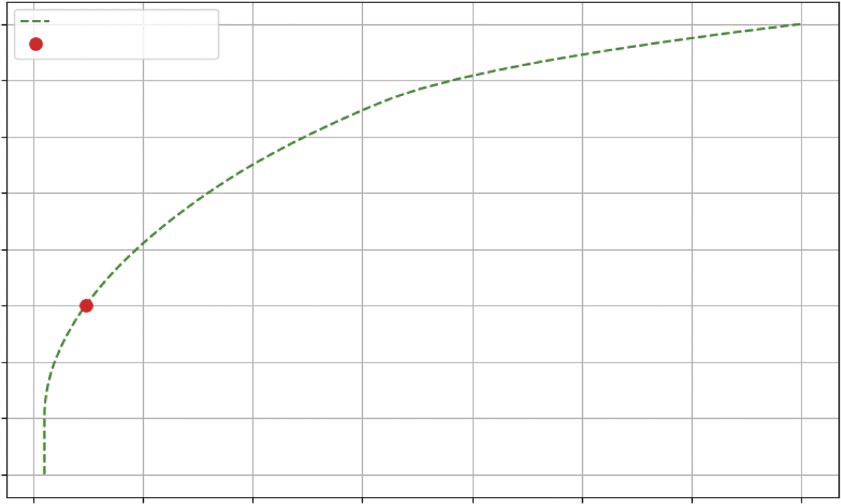
128 ❘ CHAPTER 6 OPTimizATiOn TECHniquES fOR BuSinESS STRATEgy
Efficient Frontier for Portfolio Optimization
0.15
Efficient Frontier
10% Target Portfolio
0.14
0.13
n 0.12
etur
0.11
ed R
Expect 0.10
0.09
0.08
0.07
0.005
0.010
0.015
0.020
0.025
0.030
0.035
0.040
Portfolio Risk (Variance)
FIGURE 6-4: The efficient frontier plot for the portfolio optimization.
Supply Chain and Operations
This section returns to the world of linear programming (linprog) to solve another classic business problem. The Product Mix example was about allocating resources at a single location. Now, you see how to solve a problem between locations. More specifically, this is a transportation problem, a cornerstone of supply chain and logistics management, minimizing shipping costs.
Imagine you run a company with two warehouses and three retail stores. Each warehouse has a limited supply, and each store has a specific demand. Your goal is to find the cheapest way to get products from warehouses to stores.
Step 1: The Setup (mock Data)
First, you need to lay out the data you have available.
➤
Supply:
➤