APPLIED MATH
WITH PYTHON

APPLIED MATH
WITH PYTHON
Solve Real-World Problems with
Python-Based Solutions
BLAKE RAYFIELD
Copyright © 2026 by John Wiley & Sons, Inc. All rights reserved, including rights for text and data mining and training of artificial intelligence technologies or similar technologies.
Published by John Wiley & Sons, Inc., Hoboken, New Jersey.
No part of this publication may be reproduced, stored in a retrieval system, or transmitted in any form or by any means, electronic, mechanical, photocopying, recording, scanning, or otherwise, except as permitted under Section 107 or 108 of the 1976 United States Copyright Act, without either the prior written permission of the Publisher, or authorization through payment of the appropriate per-copy fee to the Copyright Clearance Center, Inc., 222 Rosewood Drive, Danvers, MA 01923, (978) 750-8400, fax (978) 750-4470, Requests to the Publisher for permission should be addressed to the Permissions Department, John Wiley & Sons, Inc., 111 River Street, Hoboken, NJ 07030, (201) 748-6011, fax (201) 748-6008,
The manufacturer’s authorized representative according to the EU General Product Safety Regulation is Wiley-VCH GmbH, Boschstr. 12, 69469 Weinheim, Germany,
Trademarks: Wiley and the Wiley logo, and the Sybex logo, are trademarks or registered trademarks of John Wiley & Sons, Inc. and/or its affiliates in the United States and other countries and may not be used without written permission. All other trademarks are the property of their respective owners. John Wiley & Sons, Inc. is not associated with any product or vendor mentioned in this book.
Limit of Liability/Disclaimer of Warranty: While the publisher and the authors have used their best efforts in preparing this work, including a review of the content of the work, neither the publisher nor the authors make any representations or warranties with respect to the accuracy or completeness of the contents of this work and specifically disclaim all warranties, including without limitation any implied warranties of merchantability or fitness for a particular purpose. Certain AI systems have been used in the creation of this work. No warranty may be created or extended by sales representatives, written sales materials or promotional statements for this work. The fact that an organization, website, or product is referred to in this work as a citation and/or potential source of further information does not mean that the publisher and authors endorse the information or services the organization, website, or product may provide or recommendations it may make. This work is sold with the understanding that the publisher is not engaged in rendering professional services. The advice and strategies contained herein may not be suitable for your situation. You should consult with a specialist where appropriate. Further, readers should be aware that websites listed in this work may have changed or disappeared between when this work was written and when it is read. Neither the publisher nor authors shall be liable for any loss of profit or any other commercial damages, including but not limited to special, incidental, consequential, or other damages.
For general information on our other products and services or for technical support, please contact our Customer Care Department within the United States at (800) 762-2974, outside the United States at (317) 572-3993 or fax (317) 572-4002.
For product technical support,
Wiley also publishes its books in a variety of electronic formats. Some content that appears in print may not be available in electronic formats. For more information about Wiley products,
Library of Congress Control Number: 2026936342
Print ISBN: 9781394370757
ePDF ISBN: 9781394370771
ePub ISBN: 9781394370764
Obook ISBN: 9781394370788
Cover Design: Wiley
Cover Image: © CSA-Printstock/Getty Images
to Theodore and Emery
ACKNOWLEDGMENTS
I have been fortunate to work with a team of dedicated professionals to create this technical book.
A special thanks goes to my agent, Jess Haberman, for her representation and steadfast support in bringing this project to life.
Jim Minatel, acquisitions editor, and Pete Gaughan, managing editor, provided the essential leadership and vision required to bring this title to market. It was a pleasure to work with Brad Jones, project manager, who managed the complex process (and me) that got us from a rough outline to a finished manuscript. I also want to thank Dhilip Kumar Rajendran, the content refinement specialist, as well as Kezia Endsley for her expertise in copyediting.
I am especially grateful for Matthew Housley’s expertise as technical editor. In addition to catching my subtle and not-so-subtle errors, his close reading and technical insights regarding the code and mathematical concepts ensured the accuracy required for a book of this depth.
Finally, I must thank my family. My wife, Lois Rayfield, and our two children, Emery and Theodore, have supported me and provided the encouragement I needed to get this manuscript across the finish line.
—Blake Rayfield
ABOUT THE AUTHOR
Blake Rayfield is an assistant professor of Finance at the University of North Florida, with a strong background in higher education, research, and data science. He earned both his MS and PhD in Financial Economics from the University of New Orleans. His work has been published in several peer-reviewed journals, including the Journal of Financial Research, the Quarterly Review of Economics and Finance, and the Review of Behavioral Finance. His research interests focus on Corporate Finance and Investments, with particular emphasis on applying advanced data science methods to financial research.
ABOUT THE TECHNICAL EDITOR
Matt Housley holds a PhD in mathematics from the University of Utah and coauthored the book Fundamentals of Data Engineering (O’Reilly Media). With Tony Baer, he cohosts It’ s About Data, a podcast covering the latest developments in data, artificial intelligence, technology, and business. Matt enjoys training a new generation of data engineers and currently works as a freelance trainer and consultant.
CONTENTS
CONTENTS
xiv
CONTENTS
xv
CONTENTS
xvi
CONTENTS
xvii
CONTENTS
xviii
INTRODUCTION
In today’s data-driven economy, the ability to apply mathematical concepts to solve real-world business problems has become essential across industries. From finance and marketing to operations and strategic planning, organizations rely on data-driven insights to stay competitive. Python, with its powerful libraries and widespread adoption, has emerged as the go-to language for addressing these applied mathematics challenges. Readers will explore and apply a wide range of math topics, from optimization, probability, and statistics to linear algebra and calculus. Each chapter is structured around practical use with several examples, such as optimizing supply chains, forecasting financial performance, or uncovering insights from customer data, making it an essential resource for anyone looking to harness math for success.
WHAT DOES THIS BOOK COVER?
This book is designed to bridge the gap between abstract mathematical theory and practical business results using Python. By combining hands-on code with data-driven charts, you can move beyond simple programming to show you how to use math to solve business challenges. The following sections provide a roadmap of our journey, beginning with a streamlined setup and ending with advanced visualization techniques that drive decision-making.
Part 1: Getting Started Part 1 hits the ground running, designed to get you up to speed. It provides a streamlined setup of the essential Python toolkit and a concise refresher on the core operations needed to analyze business data immediately. You learn some general programming tricks as well as the libraries and initial visualizations that drive early business insights.
In Chapter 1, “Introduction to Python for Business Applications,” you are introduced to the core Python commands and why the language is essential for modern business analytics and automation. Chapter 2, “Basic Mathematical Operations in Python,” builds on this by reviewing essential math routines, variables, and data types using powerful libraries like NumPy and Pandas.
Chapter 3, “Visualization for Business Decision-making,” explores how to apply these foundations to present data in a relatable way that drives organizational decisions.
Part 2: Applying the Math In Part 2, the focus is on the specific mathematical concepts that solve real-world problems. It bridges the gap between theory and application, teaching you how to use Python to optimize operations, model financial risks, and forecast performance. By understanding the underlying math, you will be better equipped to apply calculus, linear algebra, and statistics to achieve concrete business goals.
INTRODUCTION
Chapter 4, “Linear Algebra for Business and Finance,” uses vectors and matrices to create a practical language for organizing information and modeling complex financial risks. Chapter 5, “Calculus for Business Problem Solving,” provides a toolkit for understanding operational momentum, such as identifying the exact point of diminishing returns in a marketing campaign. Chapter 6, “Optimization Techniques for Business Strategy,” and Chapter 7, “Probability and Statistics for Business Analytics,” introduce the necessary tools to maximize operational efficiency and manage the uncertainties inherent in business forecasting. This part concludes with Chapter 8, “Applied Business Problems with Math and Python,”
which synthesizes these tools through real-world case studies in logistics, finance, and operations management.
Part 3: Visualizing the Numbers Data has more value when it drives decisions.
Part 3 focuses on translating complex analysis into clear, compelling visuals that stakeholders can act on. It moves beyond basic charting to specific business use cases, tracking financial trends over time, comparing cross-sectional market performance, and handling alternative data types, ensuring your analysis tells a story that leads to actionable strategy.
Chapter 9, “Illustrating Time-series and Linear Data,” focuses on matching the right chart to your data structure and smoothing temporal data to reveal hidden trends. Chapter 10, “Illustrating Cross-sectional Data,” teaches you to analyze rank, distribution, and correlation at a single point in time through visual
“snapshots” like histograms and scatterplots. Finally, Chapter 11, “Illustrating Alternative Data Types,” explores how to visualize unstructured sources like text, geographic maps, and complex networks by converting qualitative signals into visualizations.
WHO SHOULD READ THIS BOOK
This book is for business professionals exploring AI, data science, finance, and business analytics who want a practical, hands-on approach to applying math through Python.
It’s designed for entrepreneurs, analysts, and managers who may have studied math in the past but need a clear, concise refresher to solve real-world business problems. For busy professionals with limited time, this book offers a streamlined approach, focusing on “just enough math” to drive data-driven decisions and achieve business goals without returning to the classroom.
Instead of overwhelming you with theory and proofs, you’ll find actionable examples and Python applications tailored for business leaders, financial analysts, and data-driven decision-makers. The information presented in this book bridges the gap between understanding mathematical concepts and applying them effectively in real-world business scenarios. Even though GenAI has greatly enhanced how businesses analyze data, you still need to bridge the knowledge gap to make the most of GenAI’s capabilities. You will learn to optimize operations, forecast financial performance, and uncover other insights from complex data.
xx
INTRODUCTION
READER SUPPORT FOR THIS BOOK
Companion Download Files
The book mentions some additional files, such as CSV files or spreadsheets. These
or at
.
How to Contact the Author
I appreciate your input and questions about this book! Email me at
or message me on LinkedIn at
.
xxi

PART 1
Getting Started
➤Chapter 1: Introduction to Python for Business Applications
➤Chapter 2: Basic Mathematical Operations in Python
➤Chapter 3: Visualization for Business Decision-making


1Introduction to Python for
Business Applications
This chapter introduces the role of Python in modern business contexts. By the end, you’ll understand why Python has become one of the most essential tools in business analytics, decision-making, and automation.
INTRODUCING PYTHON FOR BUSINESS
In today’s fast-paced business world, organizations face an increasing volume of data and shrinking timelines for decision-making. Business leaders are under constant pressure to move faster, forecast better, and justify decisions with hard evidence. Whether you’re in finance, marketing, operations, or product strategy, data-driven thinking has become non-negotiable. But turning data into insight requires more than dashboards; it requires math.
Python’s rise to prominence is no accident. It’s open-source (meaning everyone can see how it works), readable, and supported by a robust community of developers. What started as a language for scripting has evolved into a comprehensive ecosystem used across industries such as finance, logistics, retail, tech, and healthcare.
Unlike traditional business tools that are rigid or require expensive customization, Python is agile. With just a few lines of code, business users can:
➤
Automate tedious tasks like generating reports.
➤
Clean, transform, and analyze datasets.
➤
Visualize trends, patterns, and outliers.
➤
Apply predictive analytics and machine learning.
To see the difference in practice, picture a marketing analyst who wants to understand how different campaigns impacted sales across regions. In Excel, this might mean multiple sheets, pivot
4 ❘ CHAPTER 1 InTRoduCTIon To PyTHon foR BusInEss APPlICATIons tables, and manual steps. In Python, they can load the data, group it by region and campaign, visualize the trends, and even run a regression analysis to estimate campaign return on investment (ROI) in under 30 lines of code.
The same 30-line script can be scheduled to run every night, updated automatically when new data lands, and even emailed to stakeholders while you sleep. That’s “doing more” without adding hours to the day. And because the script is plain text, you can share it and improve it over time without breaking a single cell reference.
This book isn’t about theory. You won’t be asked to derive formulas or memorize rules. Instead, you’ll learn how to apply math through practical, hands-on examples using Python.
You’ll walk through business scenarios that look like these:
➤
You’re a marketing manager trying to segment your customers.
➤
You’re a finance analyst modeling revenue growth.
➤
You’re a product lead deciding how to allocate limited resources for maximum impact.
Each chapter covers a math concept (like probability, optimization, or linear algebra), walks through a real-world business use case, and shows how to implement it in Python. Just what you need to make smarter decisions, faster.
WHY PYTHON, NOT A SPREADSHEET?
Spreadsheets are everywhere in business, for good reason. They’re fast, familiar, and flexible. But as the questions get more complex, spreadsheets start to show their limitations:
➤
Have you ever tried to run a scenario analysis with 20 variables in Excel?
➤
Have you ever worked with a dataset that has millions of rows?
➤
Have you ever needed to visualize customer behavior in five dimensions?
Python scales where spreadsheets break. With just a few lines of Python code, you can simulate business scenarios, automate repetitive processes, or run robust statistical tests. You can pull data from APIs, merge it with internal tables, train a predictive model, and push the result straight into a dashboard, without ever opening a single workbook.
And here’s the best part: Python is modular. You don’t have to build from scratch. Need natural language processing? Import spaCy. Time-series forecasting? prophet or statsmodels has you covered.
Optimization? scipy.optimize or cvxpy is ready to go. This book covers these tools and more as you progress with learning. The ecosystem is your toolkit, and most of it is free.
Think of it like this: Excel is great when you’re dealing with tables and formulas. But what if you need to process 10,000 customer reviews? Or scrape real-time pricing data from competitor websites?
Or train a model to predict which clients are likely to churn? That’s where Python shines.
In the chapters to come, you see Python tackle problems that would bring even the most carefully crafted spreadsheet to its knees. You learn how to move from a proof-of-concept notebook to a reliable script, and you discover that a little code goes a long way.
setting up your Tools ❘ 5
SETTING UP YOUR TOOLS
Before we dive into applying math with Python, let’s make sure your environment is ready to go. The good news is that modern Python tools make this process relatively painless. Once you are set up, you will have everything you need to follow along with the examples and exercises in this book.
There are several ways to work with Python. The “best” route depends on your comfort with installing software or if you prefer running code on your own machine or in the cloud. The following sections outline a step-by-step path that works for almost everyone, followed by a few alternatives if you want something lighter or more portable.
Install Python with the Anaconda Distribution (Running Python
on Your Machine)
Anaconda is generally found to be the most straightforward path to installing Python on a machine.
Anaconda is a free, open-source Python distribution that bundles the language with nearly every library you’ll use—Pandas, NumPy, Matplotlib, SciPy, scikit-learn, Jupyter Notebook, and dozens more. Think of it as the “batteries-included” version of Python for applied math.
Why Anaconda makes life easier:
➤
It ships with hundreds of preinstalled packages used in data science and business analytics, so you’re not hunting and pecking with the Pip Installs Packages tool (pip) on day one.
➤
It includes Jupyter Notebook out of the box, giving you an interactive, browser-based coding workspace that’s perfect for step-by-step math exploration.
➤
It sidesteps most dependency headaches. Anaconda’s package manager (conda) keeps library versions compatible.
➤
It works the same on Windows, macOS, and Linux, which means fewer “but it runs on my machine” surprises.
To install Anaconda, do the following:
1.
Head to anaconda.com and download the latest free edition.
2.
Download the free installer for your operating system. Pick the Python 3.x version (whatever is labeled “Latest”). By choosing “Distribution Installer” you will be not only installing Python, but also an ecosystem of commonly used packages (Recommend). If you want to install a smaller version of Python with fewer preinstalled packages, choose Miniconda. You can install additional packages later as you need them.
3.
Run the installer.
4.
When the installer finishes, open Anaconda Navigator if you installed the full distribution (or the terminal if you installed Miniconda). The Navigator is a friendly hub that lets you launch Jupyter and Spyder or create new environments with a couple of clicks.
That’s it. Once installed you are ready to write code.
6 ❘ CHAPTER 1 InTRoduCTIon To PyTHon foR BusInEss APPlICATIons Launch Jupyter Notebook
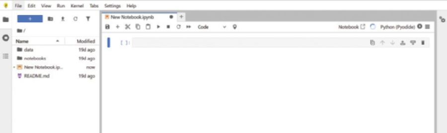
Once Anaconda is installed, you’re just a few clicks away from your first interactive workspace. Open Anaconda Navigator and click Launch under Jupyter Notebook. Your default browser will open a new tab showing the Jupyter file browser; choose or create a folder where you want to store your work. From there, select New > Python 3 and Jupyter will spin up a fresh notebook, an empty canvas made of code cells and narrative text blocks,
Notebooks shine because they let you run code one cell at a time, inspect the output immediately, tweak your logic, and rerun on the spot—a perfect loop for iterative math modeling. You can inter-leave Markdown notes, equations, and plots right beside the code that generates them, turning each notebook into a living, self-documenting analysis. And because everything happens inside your browser, what you see onscreen should match the screenshots in this book line for line.
Cloud-friendly Alternatives
If the security settings on your machine don’t allow installation of new software or you simply want a zero-setup option, a browser-based notebook is the fastest path forward.
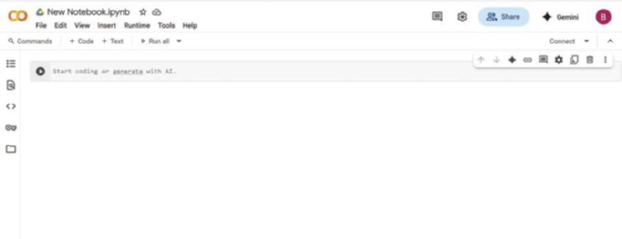
Sign in with any Google account and click New Notebook. You’ll instantly be coding on Google’s servers with free access to GPUs and most of the common data-science libraries preinstalled. Your work is saved to Google Drive, so you can pick up exactly where you left off from any device, and sharing a live notebook with a colleague is as easy as sending a link.
Another option is Anaconda Notebooks ( a cloud workspace maintained by the same team behind the desktop distribution. It provides the familiar Jupyter interface, complete with conda environments and the full Anaconda package catalog, without requiring anything on your local machine. Projects live in the cloud, updates happen behind the scenes, and collaborative editing feels no different from working in a shared document.
Both platforms free you from installation headaches and make collaboration painless: open a browser, open a notebook, and it just works. Jupyter Notebook, Google Colab, and Anaconda Notebooks all share the same familiar structure.
Now that you can work with Python, let’s dive deeper into the ecosystem.
FIGURE 1-1: Jupyter Notebook.
The Python Ecosystem ❘ 7
FIGURE 1-2: Google Colab Notebook.
THE PYTHON ECOSYSTEM
Python thrives because of its robust ecosystem of open-source libraries, collections of pre-written code created and maintained by the global Python community. These libraries make it easy to perform complex tasks without writing everything from scratch. At the time of writing in this book, the latest version of Python is 3.14.
For business applications, several libraries are especially important:
➤
Pandas: This is the go-to tool for manipulating tabular data (think Excel spreadsheets). It provides data structures like DataFrames that allow you to filter, group, join, and summarize datasets with ease.
➤
NumPy: Short for Numerical Python, NumPy enables efficient numerical computations. It is the foundational package for scientific computing in Python and underlies many other libraries like Pandas and scikit-learn.
➤
Matplotlib: One of the oldest and most widely used Python visualization libraries. It provides functions to create line plots, bar charts, histograms, and more. Great for producing publication-quality static graphics.
➤
Seaborn: Built on top of Matplotlib, Seaborn makes it easier to create complex statistical graphics with simpler syntax and more attractive defaults.
➤
scikit-learn: A powerful library for machine learning. With just a few lines of code, you can run clustering algorithms, build classification models, or perform regression analysis.
➤
Plotly: A library for creating interactive visualizations and dashboards. Often used for business presentations, it enables dynamic charts that users can explore in real time.
8 ❘ CHAPTER 1 InTRoduCTIon To PyTHon foR BusInEss APPlICATIons NOTE You’ll find the link to the package documentation in this chapter’s closing section, “Continue Your Learning.”
The modularity feature makes Python incredibly efficient for business tasks. Whether you’re building a financial model, cleaning customer data, or visualizing a product launch’s performance, Python’s ecosystem has you covered. New libraries appear almost weekly, and they’re battle-tested by thousands of practitioners before you even download them.
What Is a (Jupyter) Notebook?
A notebook is both scratch pad for your Python ideas and final presentation to distribute your final code. It makes Python friendly for anyone who needs transparent, reproducible analysis.
You begin by opening a Jupyter Notebook in your web browser. The notebook is a blank page made of “cells.” Each cell can be one of two types—code or Markdown cells. A code cell holds Python statements; press Shift+Enter and the code runs, with the result appearing directly underneath.
A Markdown cell holds notes, headings, or equations written in plain text. By alternating code and Markdown, you build a step-by-step narrative that records every assumption, calculation, and conclusion in the order they happen.
This structure has practical benefits. First, the immediate feedback loop lets you test an idea, see the outcome, and adjust it without leaving the page. Second, the finished notebook is self-documenting—
anyone can scroll top-to-bottom and understand what you did and why, without digging through hidden formulas. Third, sharing is easy. You can send the .ipynb file for colleagues to rerun or export it as HTML or PDF for a read-only report. Some notebooks even have the option to share a direct link for collaboration.
Installing Libraries Locally or in a Notebook
Most of the libraries discussed earlier and used in this book (Pandas, NumPy, and Matplotlib) come preloaded in either Anaconda or Google Colab, so you can jump straight into the examples without touching a package manager. Eventually, you will want something that is not in the starter pack (maybe yfinance for stock data or prophet for time-series forecasting). Adding a new library takes less than a minute, and you can do it in two ways.
If you’re working on your own machine with Anaconda, open an Anaconda prompt (Windows) or a terminal (macOS/Linux) and run the following:
conda install library-name
Conda will resolve dependencies, ask for confirmation, and wire everything up. If the package isn’t available through conda, fall back to Python’s built-in installer:
pip install library-name
The new code is immediately available the next time you start a notebook or script.
Writing your first Python script ❘ 9
When you’re inside a notebook (Jupyter or Google), you don’t even have to leave the page. Instead, you can prepend an exclamation point to the same command and run it in its own cell:
!pip install library-name – quiet
The notebook will stream the install log right in the output area. Once the prompt returns, you simply import the library into a new cell and keep going. If the kernel was already using that library in the background, a quick Kernel > Restart (Jupyter) or Runtime > Restart Runtime (Colab) command reloads the fresh version.
That’s all there is to it: one command in a terminal when you’re local, one command in a cell when you’re in the browser. No hunting for ZIP files, no admin privileges, and no wait time between deciding you need a tool and putting it to work.
WRITING YOUR FIRST PYTHON SCRIPT
If you’ve never run Python before, one of the quickest ways to see it interact with the real world is to display today’s date. Open a new notebook cell (in Jupyter or Google Colab), type the following three lines, and press Shift+Enter:
#Calculate margins and growth rates
from datetime import date
today = date.today()
print("Today is:", today)
Here’s what each line does:
➤
Line 1: from datetime import date
Python comes with a built-in standard library, a collection of ready-made tools. The datetime module is one of those tools, and inside it lives a helper class called date. By writing this import statement, you tell Python, “Please give me the date helper so I can use it.”
➤
Line 2: today = date.today()
Now that the helper is available, you call its today() method, which asks your computer (or Colab’s server) for the current calendar date. Whatever comes back (e.g., 2025-06-30) is stored in a variable named today. A variable is just a labeled box that keeps a value in memory so you can reuse it later.
➤
Line 3: print("Today is:", today)
Finally, you display the result. The print() function sends whatever you give it to the screen.
Here you pass two things: the text "Today is:" and the value stored in today. Python stitches them together and shows the message in the notebook output area.
Run the cell and you’ll see something like:
Today is: 2025-06-30
That’s your first working Python program. Three simple lines: import a tool, capture a value, and return the result.
10 ❘ CHAPTER 1 InTRoduCTIon To PyTHon foR BusInEss APPlICATIons SUMMARY
This chapter laid the groundwork for your journey into Python-powered business analytics. The chapter started by exploring why Python has evolved from a simple scripting language to an essential tool for modern business leaders. You learned that while spreadsheets are excellent for quick tasks, they often hit a wall with large datasets and complex scenarios. Python offers the scalability to handle millions of rows and the agility to automate tedious workflows, allowing you to move from manual reporting to automated insight.
This chapter also demystified the technical setup, ensuring you have a professional-grade environment ready to go. You learned how to install the Anaconda distribution for a robust local setup and how to utilize cloud-based alternatives like Google Colab for immediate access. I introduced the Jupyter Notebook as your primary workspace, a powerful interface that combines live code, visualizations, and narrative text into a single, shareable document. Finally, you wrote your first Python script, a simple but symbolic first step. You are now equipped with the tools, the environment, and the understanding needed to tackle the advanced mathematical and analytical challenges in the chapters ahead.
CONTINUE YOUR LEARNING
The following are some resources you may find useful when getting started with Python:
➤
W
➤
➤
Getting Started with
➤
➤
Python Official Tutorial:
In addition, the following are links to the documentation for the most commonly used math-related Python packages:
➤
Pandas
➤
NumPy
➤
Matplotlib:
➤
Seaborn
➤
scikit-learn: https://scikit-learn.org
➤
Plotly:


2Basic Mathematical Operations
in Python
Whether you are forecasting next quarter’s revenue, dissecting gross-margin trends, or experimenting with a new pricing curve, every business calculation rests on a bed of basic arithmetic and algebra. The stronger that foundation, the easier it is to adjust assumptions when markets shift, or you are presented with new data. This chapter explores how Python does math.
NUMBERS, VARIABLES, AND FUNCTIONS:
THE FOUNDATIONS OF BUSINESS LOGIC
Accurate math underpins almost every quantitative decision, from forecasting revenue and allocating budgets to setting prices or stress-testing assumptions. To perform those operations reliably in Python, two concepts must be clear at the outset: variables and data types.
A variable is simply a name that points to a value in memory. Assigning a number or string to a variable allows you to preform mathematical operations naturally. Unlike other programming languages, Python lets you reassign a variable, even if the new value has a different data type.
The assigned data type determines how arithmetic or comparisons in the code will behave.
When you treat everything as “just a number,” subtle errors creep in: add the text “3” to the integer 3 and you get string concatenation instead of arithmetic addition. If you have ever mixed a string and a number in Excel and been rewarded with #VALUE!, you have already seen why data types matter. Python enforces these distinctions more predictably than a spreadsheet, but only if you stay aware of what each variable contains.
This chapter explores how Python represents numbers, text, and logical values, and how to perform mathematical operations with them. It begins by examining variables and their underlying types. Gaining clarity on these basics now will help you avoid subtle but costly mistakes as the math becomes more complex.
12 ❘ CHAPTER 2 BAsiC MATHEMATiCAl OPERATiOns in PyTHOn Understanding Variables
Each variable has two parts: the name you choose and its corresponding value. That value can be a number, a string, or even the result of another calculation. In the following example, five different variables are assigned. Notice how well named labels transform code from a cryptic formula into a readable sentence:
unit_price = 25
units_sold = 1_000
total_sales = unit_price * units_sold
discount_rate = 0.1
net_sales = total_sales * (1 - discount_rate)
print(net_sales)
The output from running this code is as follows:
22500.0
What you name your variables is up to you, but a few conventions will keep the code readable:
➤
Choose descriptive names: units_sold is cleaner than x; discount_rate beats dr. The extra keystrokes pay for themselves when you return to the script six months later.
➤
Use snake_case: Lowercase words separated by underscores (gross_margin) are the de facto Python style and avoid the spaces Excel allows.
➤
Insert underscores in long numbers: 1_000_000 is far easier to scan than 1000000, and Python ignores the underscores at runtime.
➤
One concept, one variable: Resist the urge to recycle names. If profit later becomes adjusted profit, give it a fresh label such as adj_profit and keep both values side by side.
➤
Keep units obvious: Add a suffix if it prevents confusion: price_usd, weight_kg, rate_pct.
➤
Plural for collections, singular for scalars: regions = [...] signals a list, while region =
"North" signals a single value.
➤
Avoid Python keywords: Names like list, sum, and id are reserved for built-in Python functions and will cause subtle bugs.
Because variables are stored using plain text in your file, you can change the value stored in unit_
price once and every downstream calculation is updated, reducing the need for manual search-and-replace. This makes Python ideal for “what-if” modeling: tweak a single assumption, rerun, and see the impact instantly.
In short, numbers and variables in Python work the way you would expect. By following these naming conventions, your Python scripts will remain clear, readable, and maintainable, enhancing their value as reliable decision-making tools.
numbers, Variables, and Functions: The Foundations of Business logic ❘ 13
Arithmetic in Python
In Python, arithmetic works just like on a calculator. Any value you type without quotes becomes a number, and you can combine numbers with the six core operators.
# Example: Profit calculation
revenue = 150000
expenses = 95000
profit = revenue - expenses
profit_margin = profit / revenue
print(profit_margin)
In this example, two variables store the company’s revenue and expenses. Subtracting expenses from revenue gives the profit, which is then divided by revenue to calculate the profit margin. The output from running this code is as follows:
0.36666666666666664
This is Python’s exact decimal output; later you’ll learn how to format numbers for readability. You can take the same approach for any calculation you want to perform in Python. T
six core operators.
TABLE 2-1: The Core Operators in Python
OPERATOR
OPERATION
+
Addition
−
Subtraction
*
Multiplication
/
Division
**
Exponentiation*
%
Modulus
* It’s important to note: The use of * for exponentiation is different from either the ^ or the regular exponent key you may be used to. You may get back a result, but it won’t be a number raised to its exponent.
NOTE The modulus operator returns the remainder after division. For example: 3% 1 returns 0.
14 ❘ CHAPTER 2 BAsiC MATHEMATiCAl OPERATiOns in PyTHOn Most mathematical operations in Python work as you would expect them to. Exponentiation, however, is a little different: Python uses ** instead of the caret ^ symbol you may be used to from spreadsheets or calculators. Finally, Python observes the usual PEMDAS order of operations, so parentheses are essential for making a complex expression evaluate exactly as intended.
Working with the math Module
So far, we have relied on Python’s built-in arithmetic operators to add, subtract, multiply, and divide.
When you need functions beyond the basics (square roots, logarithms, trigonometry, precise rounding), the standard-library math module is a good starting point. It operates on single numbers (scalars), is available in every Python installation, and executes in efficient C under the hood. To include the math module in your Python programs, you use an import statement: import math
Once you have imported the math library, you can use additional functions such as, math.sqrt(x), math.exp(x), math.log(x, base), or even constants such as math.pi.
Most functions in the math module carry out one operation at a time. If you need to carry out calculations on thousands of numbers, calling math.sqrt in a loop will feel sluggish. In those cases, you should use the NumPy library, which performs the same operation on an entire array in one pass. You learn more about NumPy later in this chapter.
DATA TYPES IN PYTHON
While operators and math functions let you perform calculations, the way Python interprets those calculations depends on the type of data you’re working with. Every number, piece of text, or logical value in Python has a type. Because Python is dynamically typed, you don’t need to declare these types explicitly, but understanding them is key to avoiding unexpected results.
Core Data Types
This section introduces Python’s built-in data types, which sets a foundation for future mathematical calculations. It starts with numbers and then moves on to text, Booleans, and the special None value for missing data.
numbers: int and float
An integer ( int) is a whole number, ideal for anything you count rather than measure: units sold, headcount, invoice quantity, the number of weeks in a quarter. Python stores integers with arbitrary precision, which means you never risk overflow when totals climb into the millions or even billions.
In the following, 25 is interpreted as an int:
units_sold = 25
Data Types in Python ❘ 15
A float represents a real number with a fractional component, for example, prices, tax rates, interest percentages, or conversion factors:
unit_cost = 2.55
profit_margin = 0.33
Whenever a calculation involves at least one float, Python automatically “promotes” the other value to a float so that the result preserves the decimal information. Consider an example based on calculating profit. If you’re calculating profit based on units sold and unit cost, then your unit count is likely an int, but your unit cost is a float. If a coffee roaster sells 25 bags of beans at $2.55 each and wants to see the gross profit and margin, then the bag count is an int and the price is a float. Python mixes the two data types seamlessly:
units_sold = 25
unit_cost = 2.55
selling_price = 4.00
revenue = units_sold * selling_price
cost = units_sold * unit_cost
profit = revenue - cost
margin = profit / revenue
print(margin)
When running this listing, the resulting value of margin should be printed: 0.3625
The calculations return floats whenever a decimal is involved, ensuring precision. Although mix-ing the two types is effortless, it is worth remembering that they live on different footing. Integers are exact; floats are approximations held in binary form, which means some seemingly simple decimals (0.1 or the decimal form of 1/3) cannot be stored with perfect precision. This can lead to silly rounding errors. For example, try entering 1.1 + 2.2 in the Python terminal command line. For most reporting and analytic tasks, the resulting microscopic error is irrelevant, but not in workflows that settle money to the cent. Knowing which values are int versus float matters later when you format currency or round percentages for a report. As you would expect, the value $36.25 looks cleaner than 36.249999999.
Text: str
A string (str) is any ordered sequence of characters, whether letters, digits, punctuation, or spaces. In day-to-day analysis these sequences carry the labels that make numeric tables intelligible: customer names, product IDs, region codes, status flags. Each of the following is a string: customer_name = "Acme Corporation"
product_id = "SKU1234"
product_upc = "781118823774"
16 ❘ CHAPTER 2 BAsiC MATHEMATiCAl OPERATiOns in PyTHOn Because strings represent qualitative information, they often become the keys by which you group, join, or filter data— sales by region, returns by product ID, feedback by customer segment. Unlike numbers, strings preserve case and punctuation exactly as typed, so consistent spelling and capitaliza-tion matter when you expect two labels to match.
True/False logic: bool
Booleans capture binary states, a single bit of information: on/off, yes/no, pass/fail. They are the backbone of conditional logic and filtering operations. In Python, Booleans can be either True or False.
For example:
is_active = True
inventory_low = False
Booleans are case sensitive. That is, Python will recognize True, but not true as a Boolean. Using Booleans in a Pandas DataFrame lets you pull out only the rows that meet a criterion: orders over $10 000, customers who opted in, items flagged for restock. In control structures (if, while, and list comprehensions), a Boolean determines which branch of code runs, keeping decision rules explicit and easy to audit.
Missing or null Values: none
Real-world datasets rarely arrive complete. Python’s sentinel value None signals “no data here yet.”
The None keyword can be stored in a variable just like any other value: delivery_date = None
Setting values to None as a placeholder can be useful when a variable is used later in the codebase.
With Pandas, the None value is useful when there is a missing observation or missing data. Treating missing values explicitly prevents hard-to-trace errors when you later add, divide, or plot the data.
Why Data Types Matter
Imagine you’re calculating customer lifetime value (CLV), and one of your data sources stores customer tenure as text instead of numbers. A value like “3” (a string) won’t behave the same as 3 (an integer). If you try to do math with the wrong type, Python will warn you, or worse, silently give the wrong result, as the following code illustrates:
#Incorrect: Concatenates two strings
print("3" + "5")
# Correct: Adds the numbers
print(3 + 5)
When you run this code, you will see that the first print statement results in 35 being printed while the second results in the value of 8 being printed. Adding "3" to "5" results in strings being concatenated rather than numbers being added together. This type mismatch (mistaking strings for numbers) happens all the time when importing data from Excel, CSVs, databases, or APIs. Even if something
Data Types in Python ❘ 17
looks like a number, it may be stored as a string. As a result, this is a common source of subtle errors.
Ensuring you explicitly handle these conversions early prevents inaccurate calculations and costly mistakes. Being aware of this helps you write safer, more predictable code, and avoids countless hours of debugging.
Converting Between Types
Python gives you a small set of built-in functions that act like directors, telling a value to play a different role when the scene calls for it. These include int(), float(), str(), and bool(). Here are a few examples of what each one does and when you’ll reach for it:
➤
int(): Convert to a whole number
int("20") # 20
int(19.99) # 19 (truncates the decimal)
Notice how the int() function handles the floating-point number 19.99—it does not serve as a rounding function, but rather extracts the integer part of the number and discards the fractional part.
You can use this function with strings when a CSV delivers data such as “units_sold” as text.
➤
float(): Convert to a decimal
float("19.99") # 19.99
float(5) # 5.0
This function is helpful whenever percentages or currency arrive as integers and you need the fractional precision for calculations. Again, here, take note of the way 19.99 is now stored.
➤
str(): Convert to text
str(2024) # "2024"
str(9.5) # "9.5"
This function is ideal for labels such as "Q" + str(3), which results in "Q3", or for exporting numbers back to a text-based report.
➤
bool(): Convert to True/False
bool(1) # True
bool(0) # False
This function converts many “presence/absence” signals into a single binary column you can filter on.
Think of these functions like changing a cell’s format in Excel: the underlying information stays the same, but Python now knows how to treat it. Master these conversions early and you skip a whole class of sneaky bugs, leaving you free to focus on the insights that move the business.
TIP Being mindful of types from the outset keeps the focus on insight rather than troubleshooting.
18 ❘ CHAPTER 2 BAsiC MATHEMATiCAl OPERATiOns in PyTHOn BUSINESS DATA STRUCTURES: ARRAYS AND MATRICES
Business data often comes naturally organized as arrays and matrices—think financial projections, sales across multiple regions, or quarterly inventory levels. Using NumPy, Python provides efficient tools to represent and manipulate this structured data, significantly simplifying complex analyses.
Before you dive into the code, pause for the mathematics behind it. A vector is simply an ordered list of numbers. For example, the list can include revenue for each quarter, daily temperatures, or even three coordinates of a point in space. Stack several vectors side-by-side and you have a matrix, the workhorse of linear algebra. Matrices let you rotate a point, solve a system of equations, or encode every scenario of a cash-flow model in a single object. The beauty of treating data as vectors and matrices is that many business calculations can be expressed as compact algebraic rules rather than repetitive scalar arithmetic.
Python’s built-in lists can store these sequences, but they don’t understand the algebra. Simple addition using the plus operator (+) concatenates them; multiplying two lists raises an error. This is the problem solved by NumPy. NumPy can store numbers in a contiguous block of memory (much like a traditional vector in C or Fortran) and repurposes the arithmetic operators to perform element-wise or matrix operations that mirror the math you learned on paper. Write price * quantity when both are arrays and NumPy forms a new array of line-by-line products. Likewise, the @ operator carries out true matrix multiplication, by making expressions such as weights @ returns.
This vectorized style boosts productivity. NumPy runs in low-level, compiled code. Its native parallel-ism and avoids looping when possible. Speed matters when you escalate from five rows to five million, but clarity matters too. By learning to think in vectors and matrices, and by implementing that thinking in NumPy, you gain both mathematical precision and computational efficiency.
The next section explains how arrays and matrices work in more detail, starting with one-dimensional arrays and then expanding to matrices.
One-dimensional Arrays
A vector s = [ s 1 , s 2 , s 3 , s 4 ] can represent four quarters of sales s = [10000,12000,9500,11000 ] .
Multiplying that vector by a scalar 1.05 is the textbook definition of scalar-vector multiplication: every component grows by 5%. This is shown in the following code:
import numpy as np
sales = np.array([10_000, 12_000, 9_500, 11_000])
# apply 5 % increase
uplift = sales * 1.05
print(uplift)
#Result: [10500. 12600. 9975. 11550.]
Within this code, NumPy is imported and nicknamed np (for brevity). NumPy treats sales as a single object, which is assigned an array of four values, one for each quarter. These values are multiplied by 105% to produce another array called uplift that is of equal length. This is done without using an explicit loop. This can be seen by printing the values of uplift, which results in the following output:
[10500. 12600. 9975. 11550.]
Business Data structures: Arrays and Matrices ❘ 19
Common vector summaries map directly to statistical definitions:
print('Total Sales: ',sales.sum())
print('Average Sales: ',sales.mean())
print('Std. of Sales: ',sales.std())the vector
Each line prints the summary statistic of the sales array. When you run these lines, you should see the following results:
Total Sales: 42500
Average Sales: 10625.0
Std. of Sales: 960.143218483576
Not only can you set the values of an array, but you can generate them as well. Generated sequences are created as follows:
weeks = np.arange(1, 53)
rates = np.linspace(0.01, 0.12, 12)
In the code, the first line creates an array with 1 row and 52 columns (remember, in Python the columns stop at the number before the one you designate, like in the standard range). The second line creates an array with 12 columns from 0.01 to 0.12. These are not Python loops; NumPy creates the entire vector in one call.
Matrices: Two-dimensional Arrays
A matrix is a rectangular grid of numbers. NumPy stores it as a two-dimensional array whose shape is written “rows × columns.” The basic arithmetic (sums, means, element-wise addition) is straightforward, but two additional rules matter:
➤
Dot product (row · column) generates a single number.
➤
Matrix multiplication stacks many dot products so shapes must align: (m × n ) (n × p ) →
(m × p ) .
Imagine a retail chain tracking unit costs for multiple products across various regions to optimize pricing. Matrix operations effortlessly aggregate data by product or region, streamlining profitability analyses.
Aggregations by Axis
Let
Costs = [ 10 12
9
14 11 13]
represent unit costs for two products (rows) across three regions (columns).
20 ❘ CHAPTER 2 BAsiC MATHEMATiCAl OPERATiOns in PyTHOn import numpy as np
cost = np.array([[10, 12, 9],
[14, 11, 13]])
row_totals = cost.sum(axis=1)
col_means = cost.mean(axis=0)
axis=1 collapses each row, giving product-level totals; axis=0 collapses each column, giving region averages. A way to remember this is that zero moves vertically, or down the rows of each column, whereas one moves across or horizontally.
Matrix Multiplication
Suppose unit sales are
Sales = [ 120
150 90
100 130 110]
To obtain revenue, you need one dot product per product–region pair. NumPy handles this if you multiply Sales by the transpose of Costs, which flips its rows and columns so the inner dimensions match (2 × 3) · (3 × 2).
# Make sure to run the code under the heading "Aggregations by Axis"
before this snippet.
units = np.array([[120, 150, 90],
[100, 130, 110]])
revenue = units @ cost.T
print(revenue)
The resulting matrix is as follows:
[[3810 4500]
[3550 4260]]
Each entry in the resulting matrix is formed through standard matrix multiplication. For example, for the upper-left entry of the new matrix (index 1, 1), revenue is computed as revenue(1,1) = 120 × 10 + 150 × 12 + 90 × 9.
NumPy performs all four row–column dot products in compiled code and returns a 2 × 2 matrix: rows are products, columns are regions.
Business Data structures: Arrays and Matrices ❘ 21
Broadcasting a Vector
When two arrays do not line up dimension-for-dimension, NumPy virtually “stretches” any dimension of size 1 to match the other array. For example, imagine you have a vector of surcharges to apply across all unit costs (a 2 × 3 matrix).
σ = [0.5, 0.7, 0.4 ]
surcharge = np.array([0.5, 0.7, 0.4])
landed = cost + surcharge # same shape as cost
This code snippet adds the surcharge to every row of the matrix Costs. NumPy’s broadcasting automatically stretches the 1D array across the rows:
Element-wise operations require no loops; NumPy aligns shapes and applies the arithmetic to every entry.
selection: slicing and Boolean Masks
Vectors and matrices support slice notation, which lets you select specific rows, columns, or sub-arrays:
west = cost[:, 2]
product_b = cost[1, :]
In the first line, cost[:, 2] means “take all rows (:) from the third column (2 since indexing starts at 0).” The result is a one-dimensional vector containing the costs for the West region across all products. In the second line, cost[1, :] means “take the second row (1) across all columns (:).” The result is the full set of costs for product B across all regions.
Slicing gives you direct access to rows and columns, but sometimes you want data based on a condition, not a position. For that, you can use a mask.
Boolean masks act like algebraic indicator functions I(condition), marking which elements meet a condition. For example:
high = cost > 12
cost[high] # elements where cost_ij > 12
The first line creates a condition (or mask), where each entry is either True (if the corresponding element is greater than 12) or False (otherwise). The second line then uses that mask to return only the elements where the condition holds, effectively filtering the array down to the values above 12.
Booleans behave like ones and zeros in arithmetic. You can also use them to compute quick counts, for example, calling high.sum() will give you a quick count of the number of costs above 12.
22 ❘ CHAPTER 2 BAsiC MATHEMATiCAl OPERATiOns in PyTHOn Example: Random Vectors and Monte Carlo
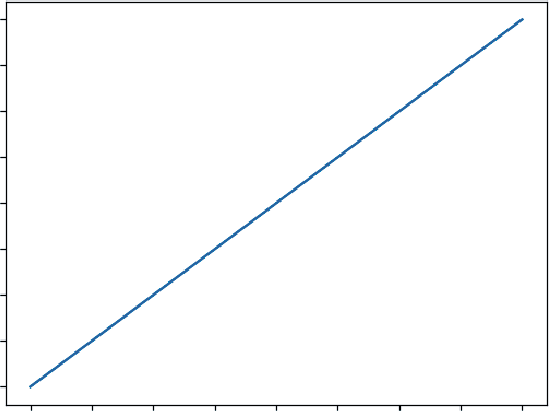
Deterministic models tell you what happens when the input is fixed. In practice, key drivers, demand, lead times, and FX rates bounce around. Monte Carlo simulation tackles that uncertainty by treating inputs as probability distributions rather than single values, then sampling from those distributions many times to form a cloud of possible futures.
Businesses frequently face uncertainty from fluctuating demand, changing interest rates, or uncertain supply-chain lead times. Monte Carlo simulation provides a structured way to assess such uncertainties, making it invaluable for risk management and strategic planning.
Suppose historical data suggests that monthly demand for a product is roughly bell-shaped with a mean of 500 units and a standard deviation of 35. In statistical notation that’s N (μ = 500, σ = 35 ) .
A single draw from this distribution represents one plausible month; 10,000 draws approximate the full range you might encounter in a year of day-to-day operations.
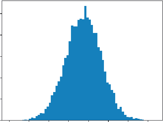
import numpy as np
rng = np.random.default_rng(2025)
demand = rng.normal(loc=500, scale=35, size=10_000)
The result, demand, is a NumPy vector of length 10,000. Because it is an array, you can apply arithmetic to all scenarios in one step. If the selling price is $12.75, revenue for every simulated month is as follows:
revenue = demand * 12.75
Now you have 10,000 revenue outcomes, an empirical distribution. Summaries are immediate: print("Mean: ",revenue.mean())
print("5th percentile: ", np.quantile(revenue, 0.05))
print("95th percentile: ", np.quantile(revenue, 0.95))
The result of running this code together is as follows:
Mean: 6376.773217565064
5th percentile: 5628.634343409629
95th percentile: 7107.219698663389
The following code helps visualize the code by using another popular library, matplotlib. The results
import matplotlib.pyplot as plt
plt.hist(revenue, bins='auto')
plt.title("Monte-Carlo Histogram")
plt.show()
Plotting a histogram shows the shape of potential results; computing the 5% tail quantile gives a back-of-the-envelope risk measure. All of this flows from straightforward code. Vectorization keeps the code short, and NumPy’s underlying C routines keep it fast, which is essential when you scale the simulation to multiple products, correlated drivers, or tens of thousands of scenarios.
Data Manipulation Basics with Pandas ❘ 23
Monte-Carlo Histogram
500
400
300
200
100
0 4500 5000 5500 6000 6500 7000 7500 8000
FIGURE 2-1: A histogram produced by matplotlib.
In summary, two-dimensional arrays let you express row/column summaries, dot products, and full matrix products with the same concise syntax you’d write on paper, executed at machine speed.
DATA MANIPULATION BASICS WITH PANDAS
A raw data file (CSV, Excel export, or database dump) rarely answers a question outright. Fields need renaming, totals need adding, and subsets need isolation before a single chart or model makes sense.
Pandas builds on the foundation of NumPy, but provides a more general data manipulation toolkit.
A DataFrame acts like an in-memory spreadsheet that you control entirely through code: you can slice rows, pick columns, compute new metrics, or reshape the grid for a different perspective, all without leaving the Python prompt. The next sections walk a typical path from loading data to producing a clean summary that can feed visualizations, dashboards, or downstream modeling.
Constructing a DataFrame
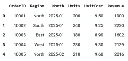
Data arrives in many forms but Pandas treats it all the same way: as rows and columns. That abstraction lets you build a table from a Python dictionary, a CSV file, or a SQL result set with just one call.
import pandas as pd
# From a dictionary -------------------------------------------------
sales = pd.DataFrame({
"Region": ["North", "South", "East", "West"],
"Month" : ["2025-01", "2025-01", "2025-01", "2025-01"],
"Revenue": [15_200, 18_100, 12_900, 17_600]
})
24 ❘ CHAPTER 2 BAsiC MATHEMATiCAl OPERATiOns in PyTHOn
# From a CSV file ---------------------------------------------------
orders = pd.read_csv("https://raw.githubusercontent.com/bkrayfield/
Applied-Math-With-Python/refs/heads/main/Data/orders_2025_Q1.csv") Helper functions like DataFrame.shape can report rows × columns, while dtypes shows each column’s type.
First Looks: head(), info(), describe()
Pandas gives you a simple way to investigate your data. These helper functions help you investigate your dataset:
➤
head() (similar to the UNIX head command) gives a sample of the first few rows of the DataFrame.
➤
info() lists dtypes and non-null counts: a structural sanity check.
➤
describe() computes column-wise reductions (mean, std, quartiles) in one call, using the same reduction kernels that NumPy applies to an ndarray.
For example, when you call .head(),
These functions are read-only; they leave the DataFrame unchanged. These three commands form a quick triage: Are there missing values? Do column types match expectations? Are any metrics wildly off?
Working with Columns and Rows
A column behaves like a named list; a row like a record.
# Column access
revenue_series = sales["Revenue"]
subset = sales[["Region", "Revenue"]]
The first line selects just the Revenue column from the sales DataFrame and stores it as a one-dimensional series. The second line selects two columns at once, Region and Revenue, returning a smaller DataFrame with only those fields.
FIGURE 2-2: Output from calling .head().
Data Manipulation Basics with Pandas ❘ 25
Rows can be selected by number (iloc) or by label (loc):
# Row labels vs. integer position
north_row = sales.loc[0] # label-based (index value)
second_row = sales.iloc[1] # position-based
Here, sales.loc[0] fetches the row with index label 0, while sales.iloc[1] fetches the second row in order. Using loc vs. iloc makes it explicit whether you’re referring to labels or numeric positions, which is helpful for avoiding the off-by-one mistakes common in spreadsheets.
Filtering with Booleans
The expression sales["Revenue"] > 17_000 broadcasts the comparison down the column, returning a series of True/False values, one for each row. That Boolean series can then be used as a filter.
high_rev = sales[sales["Revenue"] > 17_000]
january = sales[sales["Month"] == "2025-01"]
In the first line, only rows with Revenue greater than 17,000 are returned. In the second, only the rows where the Month equals 2025-01 are selected. Both create new filtered DataFrames, leaving the original untouched.
You can also combine multiple conditions using & (and), | (or), and parentheses: north_jan = sales[
(sales["Region"] == "North") &
(sales["Month"] == "2025-01")
]
Here, two conditions are combined: Region must equal North and Month must equal 2025-01. The result is a subset containing only January sales from the North region.
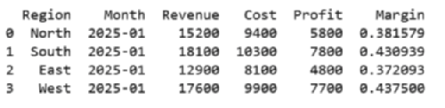
Creating New Columns
You can create new columns in a variety of ways, including providing a new list of values, or even providing a calculated function. Adding or subtracting a scalar from a column is the same element-wise vector operation that NumPy performs:
sales["Cost"] = [9_400, 10_300, 8_100, 9_900]
sales["Profit"] = sales["Revenue"] - sales["Cost"]
sales["Margin"] = sales["Profit"] / sales["Revenue"]
The first line creates a new column named Cost by assigning a list of four numbers, one for each row in the DataFrame. The second and third lines compute both profit and margin by creating new columns for intermediate calculations. The result indicates how much profit each row earns as a fraction of its revenue.
26 ❘ CHAPTER 2 BAsiC MATHEMATiCAl OPERATiOns in PyTHOn
Because these calculations are vectorized, every operation is applied to the full column without loops or manual formulas. This is one of the main advantages of using Pandas over spreadsheets: the logic is expressed once, and it applies everywhere automatically. After creating the new columns, you can immediately use them for further analysis. For example:
sales.sort_values("Margin", ascending=False).head()
print(sales.head())
The first line sorts the DataFrame by Margin in descending order, so the rows with the highest profit margins appear at the top. The result from calling .head()on the sorted DataFrame is shown in
Grouping and Aggregation
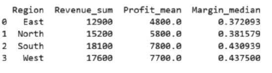
Grouping splits the data by a key, applies reductions, and recombines the pieces into a tidy summary.
If you’re familiar with SQL, the logic is very similar. Perfect for a regional roll-up: region_summary = (
sales
.groupby("Region", as_index=False)
.agg(
Revenue_sum = ("Revenue", "sum"),
Profit_mean = ("Profit", "mean"),
Margin_median = ("Margin", "median")
print(region_summary.head())
)
)
Now you have a readable four-row table, one row per region, ready for a bar chart or a bullet point in the deck.
FIGURE 2-3: Output from calling .head() on a sorted DataFrame.
FIGURE 2-4: Output from grouping.
Data Manipulation Basics with Pandas ❘ 27
Joins and Merges
Business data rarely lives in one table. Use merge to bring it together on a key field. Suppose your sales targets reside in one file, while actual revenue data resides in another. A quick merge in Pandas immediately reveals performance gaps, allowing management to act swiftly on underperforming regions.
targets = pd.read_csv("https://raw.githubusercontent.com/bkrayfield/
Applied-Math-With-Python/refs/heads/main/Data/sales_targets.csv") sales_with_target = sales.merge(targets, on="Region", how="left") sales_with_target["Gap"] = (
sales_with_target["Revenue"] - sales_with_target["Target"]
)
The first line reads the targets file into a DataFrame. The merge statement then joins sales and targets on the Region column, keeping all rows from the left table (sales). Finally, the new Gap column calculates how far revenue is above or below target.
The how argument controls whether unmatched keys are kept (left, right, outer) or discarded (inner). T Any gaps show up as NaN, which you can address explicitly.
TABLE 2-2: Pandas Merging Methods
MERGE TYPE
DESCRIPTION
ROWS KEPT
EXAMPLE USE
inner
Keeps only rows where the
Matches only
Comparing data where both
key appears in both tables.
sources must overlap (e.g.,
customers with both orders
and payments).
left
Keeps all rows from the left
All from left
Preserving all sales data even
table; fills gaps from the right
if some regions don’t have
with NaN.
targets.
right
Keeps all rows from the right
All from right
Preserving all target values
table; fills gaps from the left
even if some regions have no
with NaN.
sales.
outer
Keeps all rows from both ta-
All from both
Auditing to see every region
bles; unmatched rows are
in either dataset, whether or
filled with NaN.
not a match exists.
28 ❘ CHAPTER 2 BAsiC MATHEMATiCAl OPERATiOns in PyTHOn Reshaping: Pivot, Melt, Stack
Sometimes your data needs to change shape before you can analyze it effectively. Columns may need to become rows or rows may need to become columns. This could happen when preparing a heatmap, building a crosstab, or feeding data into another tool.
pivot = sales.pivot(index="Month", columns="Region", values="Revenue") Here, the DataFrame is pivoted so that months run down the rows, regions spread across the columns, and revenue values fill the grid. This wide format makes side-by-side comparisons straightforward.
long = pivot.reset_index().melt(id_vars="Month",
var_name="Region",
value_name="Revenue")
The melt function reverses the transformation, taking the wide table and collapsing it back into a tall, tidy format. Each row now represents a single observation: the month, the region, and its revenue.
With just a handful of verbs—select, filter, compute, group, join, and reshape—Pandas transforms raw tables into concise views tailored to the question at hand. Because each step is expressed directly in code, the path from data to insight is reproducible, reviewable, and easy to automate.
SUMMARY
This chapter established the foundational skills you need to perform accurate and reliable business calculations in Python. You started by mastering variables, learning that clear, descriptive names are key to writing code that users of your code can understand. You then explored Python's core data types (integers, floats, strings, and Booleans) and learned why distinguishing between them is critical for avoiding costly errors in financial models.
From there, the chapter moved beyond scalar math to the powerful world of vectorization. You learned how NumPy arrays allow you to perform operations on entire datasets instantly, replacing slow loops with lightning-fast algebraic syntax. You then saw how to extend this to matrices, enabling you to calculate revenue across multiple products and regions in a single line of code.
Finally, the chapter introduced Pandas, the ultimate tool for structured data. You learned to load, filter, group, and reshape complex datasets, turning raw files into clean, actionable insights.
CONTINUE YOUR LEARNING
To further solidify your understanding of mathematical operations, data manipulation, and their applications in Python for business analytics, consider exploring these additional resources.
➤
NumPy documentation:
➤
Pandas documentation:
➤
Python data types:
➤
Math functions of the math module:


3Visualization for Business
Decision-making
Decision-makers respond not just to raw data but to the way that data is communicated, and visualization is the bridge that transforms tables of figures into actionable insight.
A well-crafted chart can highlight seasonality in sales, reveal inefficiencies across departments, or show how close the business is to hitting annual targets. Just as importantly, an effective visual saves time: executives can grasp a story in seconds that might take pages of spreadsheets to explain.
This chapter explores how Python turns business data into visuals that clarify, persuade, and inform. It begins with the foundations in Matplotlib, where you learn how plots are structured and how to build simple line and bar charts. These basic skills mirror the kinds of graphs you can create in Excel, but with the flexibility to customize every element.
THE LANDSCAPE OF VISUALIZATION TOOLS IN PYTHON
Python has become one of the dominant languages for math and data analysis. One reason for its popularity is its rich ecosystem of visualization libraries. Each tool is designed with a different philosophy in mind. Some libraries prioritize publication-ready static charts, some emphasize interactive exploration, and others make it possible to build fully functional dashboards for decision-making. Understanding the strengths of each library helps a user choose the right tool for the task.
At a high level, most visualization falls into three categories:
➤
Static charts for reports, publications, or presentations.
➤
Interactive exploration to quickly identify patterns and anomalies.
➤
Dashboarding and applications for real-time decision-making and stakeholder engagement.
30 ❘ CHAPTER 3 VisuAlizATion foR BusinEss DECision-mAking TABLE 3-1: Libraries for Visualization in Python
LIBRARY
MOST SUITABLE FOR
OUTPUT STYLE
Matplotlib
Static plots, fine-grained
Publication-quality images
customization
Plotly
Interactive charts, web
Web-based (HTML/JS)
dashboards
HoloViz
App-like data tools,
Web apps, notebooks
dashboards
What you hope to achieve should dictate the Python visualization library you choose. By choosing the proper library, you can avoid headaches when adapting your code to the proper output format later.
T
When you begin visualizing data in Python, your journey almost always starts with Matplotlib. It is the foundational library of the entire Python visualization ecosystem, and its concepts influence nearly every other tool. Matplotlib’s primary strength is its power to produce high-quality, static, publication-ready charts. It gives you granular control over every single element, from axis scales and line thickness to color palettes and font choices, making it the perfect tool for creating a polished, static report.
When you need your audience to explore the data, you’ll turn to an interactive library. Plotly is a library designed to bring data to life with interactivity. Instead of static images, Plotly charts allow users to hover over data points, zoom into regions of interest, and toggle variables on and off. This makes it invaluable for exploratory analysis and for presenting data to stakeholders in an engaging way.
Another powerful approach to interactivity comes from hvPlot, a key part of the HoloViz ecosystem.
The power of hvPlot lies in its simplicity; it provides a high-level API that feels just like the familiar.plot() method on a pandas DataFrame. With minimal code, hvPlot generates fully interactive charts (using other libraries like Bokeh or Plotly as a backend) that are immediately ready for exploration.
Visualization Applications: Dashboarding Frameworks
Sometimes, a single chart isn’t enough. You need to build a complete, app-like dashboard with drop-down menus, sliders, and multiple visualizations that update in response to user input. This is where dashboarding frameworks, which are distinct from the charting libraries, come in.
Both of these interactive libraries has a powerful dashboarding partner:
➤
Plotly is paired with Dash. While Plotly creates the individual interactive charts, Dash is the companion framework used to assemble those charts into a complete, sophisticated web application. You use Plotly to design the “what” (the chart) and Dash to build the “how” (the surrounding app and its controls).
The landscape of Visualization Tools in Python ❘ 31
➤
hvPlot (and the wider HoloViz ecosystem) is paired with Panel. Panel is the dashboarding framework designed to assemble the interactive charts you create with hvPlot into a coherent application. Furthermore, Panel is “visualization-agnostic,” meaning it can also build dashboards using charts from Matplotlib, Plotly, Bokeh, and others. This makes it a uniquely flexible integration tool.
Choosing the Right Visualization Tool for Your Work
The choice of library often comes down to audience and context, as well as the required output format for your data visualization. Here are some tips for selecting the correct library:
➤
If your goal is to produce a static, print-ready report with full control over the final look, Matplotlib is usually the best choice.
➤
If you love the simplicity of the .plot() API but want instantly interactive charts for exploration, hvPlot is an excellent choice.
➤
If you need to deliver an engaging and exploratory experience for non-technical users, the Plotly (for charts) and Dash (for the application) stack offers the richest experience.
➤
If you want to prototype interactive business apps quickly, especially by combining charts from different libraries, Panel is a powerful and flexible option.
In practice, many organizations use a combination of these tools: Matplotlib for internal analytics and publication-ready visuals, Plotly for interactive stakeholder meetings, and Panel for deploying lightweight decision-support tools.
The remainder of this chapter focuses on Matplotlib for creating visualizations. However, there are many other tools beyond the three mentioned here for supporting data visualizations in Python.
T
TABLE 3-2: Additional Plotting Libraries in Python
LIBRARY
DESCRIPTION
DOCUMENTATION
Seaborn
Built on top of Matplotlib; specializes
in statistical visualization with attractive
defaults and simple syntax for common
analyses.
Altair
Declarative statistical visualization
library based on Vega-Lite grammar of
graphics; concise syntax; best for clean
statistical charts.
Pygal
SVG-based charting library; creates
interactive, lightweight visuals for
embedding in web apps.
(Continued)
32 ❘ CHAPTER 3 VisuAlizATion foR BusinEss DECision-mAking TABLE 3-2: (Continued)
LIBRARY
DESCRIPTION
DOCUMENTATION
VisPy
High-performance interactive visual-
ization powered by OpenGL; best for
large or complex datasets.
plotnine
Grammar-of-graphics–inspired plotting
library for Python, modeled after R’s
ggplot2.
Cartopy
Geospatial plotting library for creating
maps and visualizations of spatial data
(often with Matplotlib).
GRAPHING BASICS WITH MATPLOTLIB
Matplotlib is the cornerstone of data visualization in Python. It provides the flexibility to create almost any chart you can imagine, from simple line graphs to highly customized multi-panel figures.
While newer libraries have emerged to make plotting more convenient, Matplotlib remains essential because it offers complete control over every visual element and serves as the foundation for many other visualization libraries (Seaborn, pandas plotting, etc.).
Just like most libraries in Python, if Matplotlib is not already installed in your Python environment, you can add it simply with pip, conda, or with any package manager of your choice. For example, you can run this command:
pip install matplotlib
With this command, you are instructing pip to connect to the Python Package Index (PyPI), which is the official online repository for Python software. pip then locates the package named matplotlib, downloads its files, automatically figures out and downloads any other libraries that Matplotlib depends on, and finally installs all of them into your active Python environment so you can use them in your code.
Understanding the Structure of a Plot
To use Matplotlib effectively, it helps to understand how it organizes a chart. At its core, Matplotlib follows a figure, axes, elements hierarchy. This design may feel abstract at first, but once you see how it works, it becomes intuitive and powerful.
➤
Figure: The overall canvas or window that contains everything. Think of it as a sheet of paper. A figure may contain one or many charts.
➤
Axes: A specific area inside the figure where the data is actually drawn. Despite the name,
“axes” refers to the plot region as a whole, not just the x-axis or y-axis. A figure can contain multiple axes, allowing you to place several plots side by side or stacked on top of each other.
graphing Basics with matplotlib ❘ 33
➤
Elements: The building blocks that bring a chart to life—titles, x-axis and y-axis labels, tick marks, legends, and gridlines. These are layered on top of the axes to provide meaning and clarity.
An easy way to understand this hierarchy is to think of preparing a business report: the figure is like the entire page, the axes is the specific chart you place in the middle of that page, and the elements are the annotations (headings, captions, and labels) that explain the chart to your audience.
Creating and Working with Plots
The simplest way to create a chart in Matplotlib is to call a plotting function directly. The following
import matplotlib.pyplot as plt
plt.plot([1, 2, 3], [4, 5, 6])
plt.show()
This code first imports Matplotlib’s plotting module with the common shorthand plt. The plt.
plot([1, 2, 3], [4, 5, 6]) command then creates a line chart. Finally, the plt.show() function displays the chart in a window or notebook output. Although this produces only a very simple line, it illustrates the basic workflow of Matplotlib: supply data, plot it, and then render the visualization.
The code uses Matplotlib’s “state-based” interface, which automatically creates a default figure and axes behind the scenes. It’s convenient for quick plots, but when building more complex visuals, it’s better to work explicitly with the object-oriented interface. For example: 6.00
5.75
5.50
5.25
5.00
4.75
4.50
4.25
4.00
1.00
1.25
1.50
1.75
2.00
2.25
2.50
2.75
3.00
FIGURE 3-1: A simple plot produced by Matplotlib.
34 ❘ CHAPTER 3 VisuAlizATion foR BusinEss DECision-mAking fig, ax = plt.subplots()
ax.plot([1, 2, 3], [4, 5, 6])
plt.show()
In this example, the code uses Matplotlib’s object-oriented interface, which provides greater control over plots. The line fig, ax = plt.subplots() explicitly creates a figure as the overall canvas and an axes (ax) as the specific plotting area. Next, ax.plot([1, 2, 3], [4, 5, 6]) draws a line chart on that axes, connecting the points (1,4), (2,5), and (3,6).
Running this code will produce, to the naked eye, However, while the output looks similar to the previous example, this style is more flexible and is the recommended approach when you need to add multiple plots, customize chart elements, or manage complex figures.
The example in Listing 3-1 begins to take real advantage of the subplot method. The results of
LISTING 3-1: PLOTTING LINES
import matplotlib.pyplot as plt
months = ["Jan", "Feb", "Mar", "Apr", "May"]
revenue = [40000, 45000, 47000, 52000, 55000]
expenses = [30000, 32000, 35000, 37000, 39000]
fig, (ax1, ax2) = plt.subplots(1, 2, figsize=(10, 4))
ax1.plot(months, revenue, marker="o", color="green") ax1.set_title("Monthly Revenue")
ax1.set_xlabel("Month")
ax1.set_ylabel("Revenue ($)")
ax2.plot(months, expenses, marker="o", color="red") ax2.set_title("Monthly Expenses")
ax2.set_xlabel("Month")
ax2.set_ylabel("Expenses ($)")
plt.tight_layout()
plt.show()
This code snippet has a lot going on. The code begins by setting up the data to be used in the plots.
The line fig, (ax1, ax2) = plt.subplots(1, 2, figsize=(10, 4)) creates a figure and a grid of subplots (which Matplotlib calls axes). Let’s break down its parameters:
➤
The first two parameters, 1 and 2, define the grid’s dimensions. The code is asking for one row and two columns, which will result in two plots arranged side-by-side.
➤
The figsize=(10, 4) parameter is a keyword argument that sets the dimensions of the entire figure (the “page” holding the plots) to be 10 inches wide by 4 inches tall.
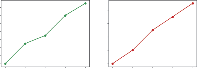
graphing Basics with matplotlib ❘ 35
Monthly Revenue
Monthly Expenses
54000
38000
52000
50000
36000
48000
34000
46000
Revenue ($)
Expenses ($)
44000
32000
42000
40000
30000
Jan
Feb
Mar
Apr
May
Jan
Feb
Mar
Apr
May
Month
Month
FIGURE 3-2: A 1 × 2 grid of line plots produced using the subplots feature of Matplotlib.
➤
This function returns two types of objects that are “unpacked” into variables. The fig variable holds a reference to the overall figure. The tuple (ax1, ax2) holds the individual axes objects—ax1 is the first plot (left) and ax2 is the second plot (right).
Once the figure and axes are created, you can “draw” on each axes individually. For the first plot, ax1.plot(months, revenue, marker=“o,” color=“green”) plots the data on the first subplot.
Again, let’s take a closer look at the parameters used in this line.
➤
The first two arguments, months and revenue, provide the x-data and y-data, respectively.
➤
The marker=“o” parameter instructs Matplotlib to place a solid circle marker at each data point on the line.
➤
The color=“green” parameter sets the color of the line itself.
You then add context to this first plot using ax1.set_title(), ax1.set_xlabel(), and ax1.set_
ylabel() to provide a clear title and axis labels. The exact same process is repeated for the second axes, ax2, but this time the expenses data is passed to its plot() method and the color is set to red.
Finally, plt.tight_layout() is called to automatically adjust the padding between the plots to prevent their titles and labels from overlapping, and plt.show() displays the fully rendered figure. On a single “page,” you get a clear picture of financial performance from multiple angles.
Customizing Visualizations to Enhance Understanding
Once you have your axes, you can enrich the visualization with elements. Using the data from the previous example, you can add features to your plots like line markers, axis labels, and titles.
Listing 3-2 shows multiple data series being combined into a single chart to highlight relationships and comparisons. It also shows how to combine multiple data series in a single chart to highlight relationships and comparisons. Combine the code of Listing 3-1 and Listing 3-2 to create a line plot.
36 ❘ CHAPTER 3 VisuAlizATion foR BusinEss DECision-mAking LISTING 3-2: COMBINING ELEMENTS IN CHARTS
fig, ax = plt.subplots()
ax.plot(months, revenue, marker="o", label="Revenue") ax.plot(months, expenses, marker="s", label="Expenses") ax.set_title("Revenue vs. Expenses Over Time")
ax.set_xlabel("Month")
ax.set_ylabel("Amount ($)")
ax.grid(True, linestyle="--", alpha=0.6)
ax.legend()
The code starts by creating a figure and axes with fig, ax = plt.subplots(), establishing the canvas and plotting area. On that axes, two line plots are drawn: the first shows monthly revenue in a line with circular markers, while the second shows monthly expenses using square markers. By placing both series on the same chart, it becomes easy to see how revenue consistently stays above expenses and how both measures trend upward over time. To improve readability, the chart is enhanced with several elements: a title, axis labels for months and dollar amounts, dashed gridlines that make it easier to trace values across the plot, and a legend that distinguishes revenue from expenses. Together, these features turn a basic plot into a professional visualization that communicates clearly.
Plotting Options
Once you’ve selected the right type of plot for your data, your next step is to make it clear, readable, and professional. A “naked” chart without labels is often meaningless. Matplotlib gives you simple, powerful functions to add these crucial context-providing elements. Customizing your plot is how you guide your audience’s eye and ensure your data’s story is understood correctly. These first few tweaks are the most important, turning raw output into a finished visual. The most critical additions are the contextual labels and titles, which are introduced in T
TABLE 3-3: Basic Chart Customization Options
OPTION
PARAMETERS
DESCRIPTION
Plot title
ax.set_title()
Adds a main title to the top of the individual
subplot (axes).
X-axis label
ax.set_xlabel()
Sets the descriptive label for the horizontal
(X) axis.
Y-axis label
ax.set_ylabel()
Sets the descriptive label for the vertical
(Y) axis.
Legend
ax.legend()
Adds a key (legend) to the plot, which is
essential if you have multiple datasets (e.g.,
several lines) on the same chart.
Creating Effective Visuals to Communicate Business Data ❘ 37
TABLE 3-4: Basic Chart Customization Elements
OPTION/CHART ELEMENT
PARAMETERS
DESCRIPTION
Color
color=
A common parameter in most
plot functions (like ax.plot(...,
color=‘red’)) that changes the color
of the plot’s elements.
Linestyle
linestyle=
A parameter used in line plots to
change the line’s style (e.g., solid,
dashed, or dotted).
Marker
marker=
A parameter used in line and scat-
terplots to change the style of the
data points themselves (e.g., circles,
squares, or x).
Figure size
plt.
Sets the overall width and height of
subplots(figsize=(...))
the entire figure (the “canvas” holding
your plots) when you first create it.
After adding clear chart labels, you can further refine your plot’s appearance by styling the visual elements themselves, such as their color, shape, and size. These options, shown in T help distinguish different data series and improve the overall aesthetic of the figure.
This selection only scratches the surface but mastering the eight options shown in Tables 3-3 and 3-4 will dramatically improve the quality and clarity of your visualizations. Think of these as the fundamental grammar of chart design. Later chapters move beyond these basics to explore deeper customizations, such as adjusting axis limits, changing tick marks, adding annotations, and applying advanced styles. For now, simply adding a title and labels is the single best thing you can do to make your plots effective.
CREATING EFFECTIVE VISUALS TO COMMUNICATE
BUSINESS DATA
Data visualization is not just about making charts; it is about communicating a message clearly and persuasively. In business contexts, a well-designed chart can highlight opportunities, expose risks, and support decisions that affect millions of dollars. A poorly chosen or poorly designed chart, on the other hand, can obscure the truth, confuse stakeholders, or even lead to the wrong conclusion.
It is important to choose the right chart for a given message. This includes determining the principles of effective design, and practical steps for building visuals that resonate.
38 ❘ CHAPTER 3 VisuAlizATion foR BusinEss DECision-mAking The first step in creating an effective visualization is to understand the type of data you are working with. Business data often falls into one of three categories:
➤
Time-series data
➤
Cross-sectional data
➤
Relational data
Each type lends itself to certain chart types, and recognizing this relationship ensures your visuals match the story you want to tell. Using the wrong chart can mislead or distract, while using the right one makes the data’s meaning obvious at a glance.
Time-series Data and Line Charts
Time-series data tracks values across a sequence of time periods such as days, months, quarters, or years. Because the main question with this type of data is usually about trends and changes over time, line charts are the most effective choice. They are best used for showing measures like revenue growth, website traffic, stock prices, or sales over months. The strength of a line chart is its ability to clearly show direction and continuity, allowing audiences to easily spot upward or downward movement, seasonal cycles, or volatility. Its limitation is that it is less useful when the goal is to compare multiple categories at a single point in time.
The previous examples, show line charts. You can refer to those examples for how to create and customize line charts.
Cross-sectional Data and Bar or Pie Charts
Cross-sectional data, on the other hand, represents a snapshot across different categories at one point in time. Examples include revenue by product line in a given quarter or customer counts across regions. In this case, the focus is usually on comparison or proportion, which makes bar charts or pie charts the most effective tools.
Bar charts work best for comparing categories such as sales by region or expenses by department.
Their strength is that differences stand out clearly and are easy to interpret, although they can become cluttered when too many categories are included.
Pie charts, by contrast, are designed to show proportions of a whole, such as budget allocation or market share. They are intuitive at a glance when there are only a few slices, but they quickly become hard to read as categories increase and are generally less precise than bar charts. The code in Listing 3-3 is an example of a bar chart,
LISTING 3-3: A BAR CHART EXAMPLE
import matplotlib.pyplot as plt
regions = ["North", "South", "East", "West"]
q2_sales = [180000, 150000, 210000, 160000]
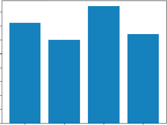
Creating Effective Visuals to Communicate Business Data ❘ 39
fig, ax = plt.subplots()
ax.bar(regions, q2_sales)
ax.set_title("Q2 Sales by Region")
ax.set_xlabel("Region")
ax.set_ylabel("Sales ($)")
plt.show()
The adjustment in code from a line to a bar chart is simple, using .bar() rather than.plot(). Here the data is cross-sectional: one quarter, multiple regions. A bar chart emphasizes differences across categories, which is exactly the decision task—who’s leading, who’s lagging, and by how much. The uniform baseline and bar lengths make comparisons effortless, avoiding the precision problems of pies when categories multiply.
Relational Data and Scatterplots
Finally, relational data examines how two variables interact, such as the relationship between advertising spend and sales or between employee training hours and productivity. Scatterplots are particularly well suited for this type of data because they reveal patterns, clusters, and outliers that may indicate correlation or even causation. They are best for helping analysts and decision-makers see whether two metrics move together, identifying unusual values, and spotting natural group-ings. Their strength is the ability to make relationships visible, including nonlinear ones, but they require some statistical literacy to interpret and may not feel intuitive to executives unfamiliar with scatterplots.
Q2 Sales by Region
200000
175000
150000
125000
100000
Sales ($)
75000
50000
25000
0
North
South
East
West
Region
FIGURE 3-3: A bar chart created by Matplotlib.
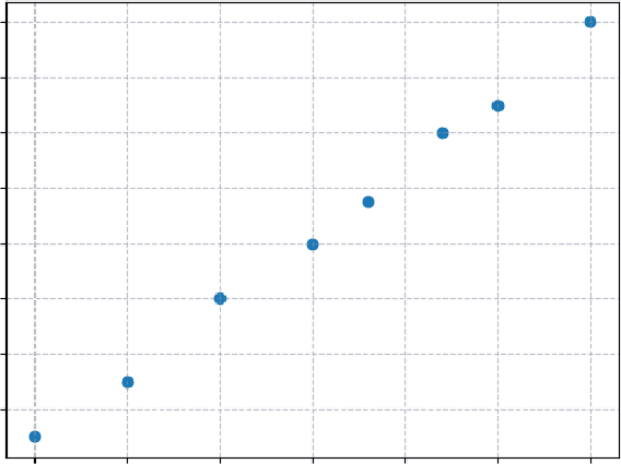
40 ❘ CHAPTER 3 VisuAlizATion foR BusinEss DECision-mAking
LISTING 3-4: A SCATTERPLOT CHART
import matplotlib.pyplot as plt
ad_spend = [20, 25, 30, 35, 38, 42, 45, 50] # in $K
monthly_sales = [210, 230, 260, 280, 295, 320, 330, 360] # in $K
fig, ax = plt.subplots()
ax.scatter(ad_spend, monthly_sales)
ax.set_title("Advertising Spend vs. Monthly Sales")
ax.set_xlabel("Advertising Spend ($K)")
ax.set_ylabel("Sales ($K)")
ax.grid(True, linestyle="--", alpha=0.6)
plt.show()
Similar to the previous example, creating a scatterplot requires using the.scatter() function of Matplotlib. This code answers the question, “How does one variable move with another?” The scatterplot reveals the pattern: as advertising spend increases, sales tend to rise. Clusters and outliers become visible, helping you assess correlation and potential diminishing returns. Unlike a line or bar, the scatter focuses on the relationship rather than a time trend or category comparison.
When the dataset is indexed by time, use a line to communicate direction and tempo. When the dataset is a single snapshot across categories, use a bar for comparisons or a pie for simple proportions.
When the goal is to study how two variables move together, use a scatter to expose relationships, clusters, and outliers. Matching chart to data type ensures that the visual aligns with the question and keeps your audience focused on the decision-critical message.
Advertising Spend vs. Monthly Sales
360
340
320
300
280
Sales ($K)
260
240
220
20
25
30
35
40
45
50
Advertising Spend ($K)
FIGURE 3-4: A scatterplot produced by Matplotlib.
Creating Effective Visuals to Communicate Business Data ❘ 41
Other Charts You Can Create
When it comes to creating visuals, Matplotlib has so many different options to explore, and choosing the right one is the first step to telling a clear story with your data. Whether you need to show a trend, compare categories, or understand a distribution, there’s a specific function designed for the task. A later chapter dives deeper into the customization options. T
different plot types available, including the ones discussed here.
TABLE 3-5: Matplotlib Chart Types
PLOT TYPE
MATPLOTLIB FUNCTION
DESCRIPTION
Line plot
plt.plot()
Shows trends over time or another continuous
sequence (e.g., a stock’s price over one year).
Scatterplot
plt.scatter()
Shows the relationship between two different
numerical variables (e.g., plotting a person’s
height vs. their weight).
Bar chart
plt.bar()
Compares a numerical value across different
distinct categories (e.g., total sales for differ-
ent store locations).
Horizontal bar chart
plt.barh()
Same as a bar chart, but better when category
names are long (e.g., movie ticket sales by
movie title).
Histogram
plt.hist()
Shows the distribution (frequency) of a single
numerical variable (e.g., showing how many
students scored in the 70s, 80s, 90s, etc., on
a test).
Boxplot
plt.boxplot()
Visualizes the summary (median, quartiles,
outliers) of one or more datasets (e.g., com-
paring salary ranges across different job
departments).
Pie chart
plt.pie()
Shows the proportions (percentages) of cate-
gories that make up a whole (e.g., what per-
centage of a budget goes to rent, food, and
transport).
Heat map
plt.imshow()
Visualizes 2D data (a matrix) using color to
show value (e.g., a correlation matrix showing
how strongly different variables are related).
42 ❘ CHAPTER 3 VisuAlizATion foR BusinEss DECision-mAking As you can see, each function is specialized for a different kind of data story. Don’t worry about memorizing every single one right now; you’ll quickly build an intuition for which plot to use as you work with different datasets. The key takeaway is that these plots are just the building blocks. The real power of Matplotlib, which is explored in the upcoming chapter on customization, comes from your ability to take these basic charts and refine every single element, from colors and labels to sizes and styles, or even combine multiple plot types into one sophisticated figure.
VISUALIZING TRENDS AND PATTERNS FOR BUSINESS INSIGHTS
Now that you are more familiar with Matplotlib, you can begin to look at more practical and advanced applications. A well-chosen chart can bring out seasonality, uncover anomalies, clarify category comparisons, or highlight cumulative effects that drive strategic decisions. This section explores common approaches to spotting these patterns and provides practical examples of how to implement them in Python.
Highlighting Seasonality and Long-term Growth
When you’re working with time-series data, such as monthly revenue, customer sign-ups, or stock prices, line charts are invaluable for showing both short-term fluctuations and long-term growth.
Seasonality is especially important in industries like retail, travel, and consumer goods, where demand naturally rises and falls across the year.
For example, plotting monthly revenue for three consecutive years, as in Listing 3-5, can reveal holiday spikes in December or summer slowdowns. A line chart makes these repeating cycles obvious, while also showing whether the overall trend is upward, downward, or flat.
LISTING 3-5: PLOTTING MONTHLY REVENUE
import matplotlib.pyplot as plt
# Sample monthly revenue data for 3 years
months = ["Jan", "Feb", "Mar", "Apr", "May", "Jun",
"Jul", "Aug", "Sep", "Oct", "Nov", "Dec"]
revenue_2020 = [40000, 42000, 43000, 45000, 44000, 46000,
47000, 48000, 49000, 51000, 60000, 75000]
revenue_2021 = [42000, 43000, 44000, 46000, 45000, 47000,
49000, 50000, 52000, 54000, 62000, 77000]
revenue_2022 = [45000, 46000, 47000, 49000, 48000, 50000,
52000, 53000, 55000, 57000, 65000, 80000]
# Create the figure and axis
fig, ax = plt.subplots(figsize=(9, 5))
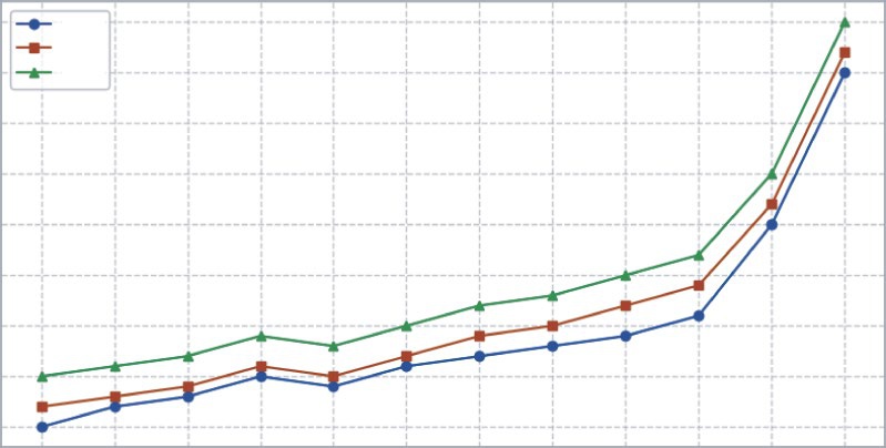
Visualizing Trends and Patterns for Business insights ❘ 43
# Plot each year’s data
ax.plot(months, revenue_2020, marker="o", label="2020") ax.plot(months, revenue_2021, marker="s", label="2021") ax.plot(months, revenue_2022, marker="^", label="2022")
# Add titles and labels
ax.set_title("Monthly Revenue Across Three Years")
ax.set_xlabel("Month")
ax.set_ylabel("Revenue ($)")
ax.grid(True, linestyle="--", alpha=0.6)
ax.legend()
plt.tight_layout()
plt.show()
This code creates a line chart that shows monthly revenue across three years. It begins by listing the months and then defining revenue numbers for 2020, 2021, and 2022. The plt.subplots() command sets up the chart, and ax.plot() is used three times to draw one line for each year, with different markers so they are easy to tell apart. Titles and axis labels are added to explain what the chart shows, and ax.grid() creates faint gridlines to make the numbers easier to read. Finally, ax.legend() adds a small box that labels each line. When you run the code, plt.show() displays the finished chart.
Monthly Revenue Across Three Years
80000
2020
2021
75000
2022
70000
65000
60000
Revenue ($) 55000
50000
45000
40000
Jan
Feb
Mar
Apr
May
Jun
Jul
Aug
Sep
Oct
Nov
Dec
Month
FIGURE 3-5: A line chart showing seasonal revenues increasing in December.
44 ❘ CHAPTER 3 VisuAlizATion foR BusinEss DECision-mAking Comparing Categories and Segments
It is often not enough to simply track overall performance. Decision-makers want to know how different categories or segments contribute to results and how they compare across time periods or markets. Bar charts are the natural choice for this type of analysis, but when more detail is required, stacked bar charts and grouped bar charts provide richer views of the data.
A stacked bar chart shows both the total and the contribution of each category within that total. This makes it ideal for understanding composition. For example, if a company’s quarterly revenue comes from four product lines, stacking them in a single bar lets managers quickly see the overall revenue per quarter while also understanding which products are driving growth. If one product line consistently takes up most of the bar, it signals dependence on that product.
In contrast, a grouped bar chart places categories side by side, making it easier to directly compare their magnitudes. Using the same example, a grouped bar chart would plot the four product lines next to each other within each quarter. This layout emphasizes differences between categories, helping managers identify which products are outperforming others in any given quarter.
The key distinction is simple: stacked bars highlight contributions to a whole, while grouped bars highlight comparisons between categories. Both perspectives are useful, but they tell different stories.
Listing 3-6 shows how the same dataset can be visualized with both a stacked bar chart and a grouped bar chart. This listing is an example of tracking quarterly revenue by product line.
LISTING 3-6: USING STACKED AND GROUPED BAR CHARTS
import matplotlib.pyplot as plt
import numpy as np
quarters = ["Q1", "Q2", "Q3", "Q4"]
electronics = [20000, 22000, 25000, 27000]
clothing = [15000, 16000, 18000, 19000]
groceries = [30000, 31000, 32000, 33000]
# Stacked Bar Chart
fig, ax = plt.subplots(figsize=(8, 5))
ax.bar(quarters, electronics, label="Electronics")
ax.bar(quarters, clothing, bottom=electronics, label="Clothing")
# stacking groceries on top of electronics+clothing
bottom_stack = np.array(electronics) + np.array(clothing)
ax.bar(quarters, groceries, bottom=bottom_stack, label="Groceries") ax.set_title("Quarterly Revenue by Product Line (Stacked)") ax.set_ylabel("Revenue ($)")
ax.legend()
plt.show()
# Grouped Bar Chart
x = np.arange(len(quarters)) # numeric positions for quarters
width = 0.25 # width of each bar
Visualizing Trends and Patterns for Business insights ❘ 45
fig, ax = plt.subplots(figsize=(8, 5))
ax.bar(x - width, electronics, width, label="Electronics")
ax.bar(x, clothing, width, label="Clothing")
ax.bar(x + width, groceries, width, label="Groceries")
ax.set_xticks(x)
ax.set_xticklabels(quarters)
ax.set_title("Quarterly Revenue by Product Line (Grouped)") ax.set_ylabel("Revenue ($)")
ax.legend()
plt.show()
each quarter is represented by a single bar, but the bar is divided into segments for Electronics, Clothing, and Groceries. This makes it easy to see both the total revenue per quarter and the composition of that revenue. For instance, if Groceries consistently takes up the largest portion of each bar, it signals that the company relies heavily on grocery sales to sustain its revenue base. The stacked format also reveals whether the mix of products is changing, for example, if Electronics begins to grow faster and occupies a larger share of the bar over time.
the three product lines are placed side by side within each quarter. This makes direct comparison between categories more straightforward. If Electronics Quarterly Revenue by Product Line (Stacked)
80000
Electronics
Clothing
70000
Groceries
60000
50000
40000
Revenue ($) 30000
20000
10000
0
Q1
Q2
Q3
Q4
FIGURE 3-6: A stacked bar chart produced by Matplotlib.
46 ❘ CHAPTER 3 VisuAlizATion foR BusinEss DECision-mAking Quarterly Revenue by Product Line (Grouped)
Electronics
Clothing
30000
Groceries
25000
20000
15000
Revenue ($)
10000
5000
0
Q1
Q2
Q3
Q4
FIGURE 3-7: A grouped bar chart produced by Matplotlib.
and Clothing are plotted next to each other, managers can immediately see that Electronics outperforms Clothing in every quarter, while Groceries dominate overall. Grouped bars are especially useful when the main question is, “Which category is bigger? ” rather than “What proportion does each category contribute to the whole?”
Together, these two visualization styles provide complementary perspectives. The stacked chart emphasizes the total picture and contributions, which is important when managing overall revenue or market share. The grouped chart emphasizes head-to-head comparisons, which helps identify winners and laggards. By applying both, analysts can provide management with a more complete understanding of category performance.
Visualizing Cumulative Effects
Outcomes often build over time. Investors track cumulative returns to see how a stock has performed from the beginning of an investment, while managers may track cumulative sales to see whether annual goals are on pace to be met.
Cumulative plots are powerful because they emphasize momentum and progress. A chart of cumulative sales, for instance, can show whether the company is ahead or behind target as the year unfolds.
Unlike monthly snapshots, cumulative curves provide a running total, reinforcing the importance of sustained performance.
Visualizing Trends and Patterns for Business insights ❘ 47
As a practical example, let’s visualize a company’s monthly revenue for a single year. Listing 3-7
provides a hands-on example of visualizing this time series.
LISTING 3-7: VISUALIZING A SERIES WITH PYTHON
import matplotlib.pyplot as plt
import numpy as np
months = ["Jan", "Feb", "Mar", "Apr", "May", "Jun",
"Jul", "Aug", "Sep", "Oct", "Nov", "Dec"]
revenue = [42000, 43000, 45000, 48000, 47000, 49000,
52000, 51000, 53000, 55000, 60000, 75000]
# Calculate cumulative revenue
cumulative_revenue = np.cumsum(revenue)
fig, ax = plt.subplots()
# Plot cumulative revenue instead of monthly
ax.plot(months, cumulative_revenue, marker="o", color="blue") ax.set_title("Cumulative Revenue (2022)")
ax.set_xlabel("Month")
ax.set_ylabel("Cumulative Revenue ($)")
ax.grid(True, linestyle="--", alpha=0.6)
plt.show()
This example demonstrates how a simple line chart can be used to track how revenue accumulates over the course of a year. The code begins by defining the months of the year along with the monthly revenue values, then applies the cumsum function from NumPy to calculate a running total. Using fig, ax = plt.subplots(), the chart is set up, and the cumulative revenue is plotted against the months with a blue line and circular markers to highlight each point. Titles and axis labels clearly explain what the chart represents, while gridlines make it easier to follow the progression across months.
The resulting chart tells a different kind of business story: instead of showing individual monthly fluctuations, it emphasizes the total revenue that builds month after month. By December, the cumulative line makes the dramatic end-of-year surge even clearer, showing how much of the company’s annual results depend on holiday demand. This view is especially useful for managers and executives who want to measure progress toward goals and understand how each month contributes to the yearly total.
Smoothing Trends with Rolling Averages
While line charts are excellent for showing raw performance over time, real-world business data often fluctuates from month to month due to seasonality, promotions, or random noise. These ups and downs can make it difficult to see the underlying trend. One-way analysts address this is by using a rolling average (also called a moving average), which smooths short-term volatility by averaging performance across a fixed window of time.

48 ❘ CHAPTER 3 VisuAlizATion foR BusinEss DECision-mAking
Cumulative Revenue (2022)
600000
500000
400000
300000
200000
Cumulative Revenue ($)
100000
Jan Feb Mar Apr May Jun
Jul Aug Sep Oct Nov Dec
Month
FIGURE 3-8: A cumulative line chart produced by Matplotlib.
For example, consider a retailer analyzing monthly revenue. Instead of focusing only on the raw month-to-month values, they might calculate a three-month rolling average, which takes each month’s revenue and averages it with the two preceding months. This approach, as shown in Listing 3-8, filters out temporary spikes or dips and highlights the longer-term trajectory.
LISTING 3-8: SMOOTHING TRENDS
import matplotlib.pyplot as plt
import pandas as pd
# Monthly revenue data
months = ["Jan", "Feb", "Mar", "Apr", "May", "Jun", "Jul",
"Aug", "Sep", "Oct", "Nov", "Dec"]
revenue = [42000, 43000, 45000, 48000, 47000, 49000,
52000, 51000, 53000, 55000, 60000, 75000]
# Put into a pandas Series for rolling calculation
revenue_series = pd.Series(revenue, index=months)
# 3-month rolling average
rolling_avg = revenue_series.rolling(window=3).mean()
fig, ax = plt.subplots(figsize=(8, 5))
# Plot raw revenue
ax.plot(months, revenue, marker="o", color="blue", label="Monthly Revenue")
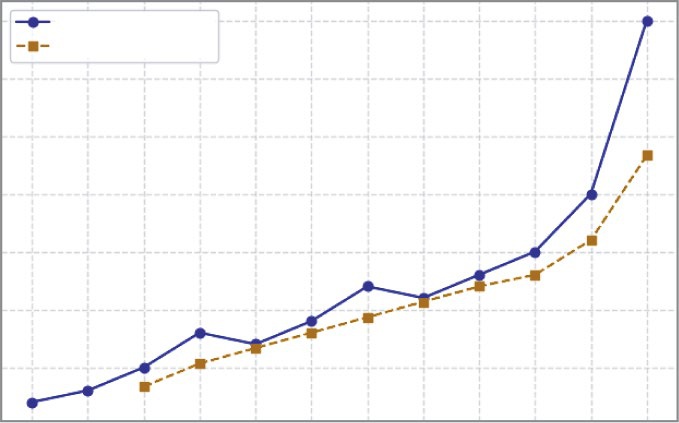
Visualizing Trends and Patterns for Business insights ❘ 49
# Plot rolling average
ax.plot(months, rolling_avg, marker="s", color="orange", linestyle="--", label="3-Month Rolling Avg")
ax.set_title("Monthly Revenue with Rolling Average (2022)") ax.set_xlabel("Month")
ax.set_ylabel("Revenue ($)")
ax.grid(True, linestyle="--", alpha=0.6)
ax.legend()
plt.show()
smoothed three-month rolling average (the dashed line). The raw line shows natural ups and downs (like the dip in May and the spike in December), but the rolling average reveals a smoother trajectory that highlights the overall growth trend. A sales manager, for instance, might use the rolling average to report consistent progress to leadership, while also using the raw data to plan around short-term demand cycles.
Line Charts with Confidence Intervals Using Seaborn
In real business datasets, such as dozens of stores reporting revenue each month or hundreds of SKUs contributing to sales, it is rarely enough to show just one raw series. A manager or executive often wants to know not only what the average performance looks like, but also how much uncertainty there is Monthly Revenue with Rolling Average (2022)
75000
Monthly Revenue
3-Month Rolling Avg
70000
65000
60000
55000
Revenue ($)
50000
45000
Jan
Feb
Mar
Apr
May
Jun
Jul
Aug
Sep
Oct
Nov
Dec
Month
FIGURE 3-9: A line chart with a three-month rolling average.
50 ❘ CHAPTER 3 VisuAlizATion foR BusinEss DECision-mAking around that average. This is where confidence intervals come in, as shown in Listing 3-9. Instead of presenting a single line, a confidence interval wraps the line with a shaded band, giving the audience a sense of how stable the trend is. If the band is narrow, it suggests consistency across stores or products; if the band is wide, it signals variability and risk.
LISTING 3-9: USING CONFIDENCE INTERVALS
import numpy as np
import pandas as pd
import matplotlib.pyplot as plt
import seaborn as sns
# 1) Simulate tidy business data: multiple stores reporting monthly revenue rng = np.random.default_rng(7)
months = pd.Index(
["Jan","Feb","Mar","Apr","May","Jun","Jul","Aug","Sep","Oct","Nov","Dec"], name="month"
)
n_stores = 40
# Base seasonal pattern: gentle climb + December spike
seasonal = np.array([42, 43, 45, 48, 47, 49, 52, 51, 53, 55, 60, 75]) * 1000
# Store-level deviations + random noise
records = []
for store in range(n_stores):
store_effect = rng.normal(0, 2500)
noise = rng.normal(0, 2000, size=len(months))
rev = seasonal + store_effect + noise
for m, r in zip(months, rev):
records.append({"store_id": store, "month": m, "revenue": r}) df = pd.DataFrame(records)
# 2) Plot with seaborn: mean revenue per month + 95% confidence interval sns.set_theme(style="whitegrid")
fig, ax = plt.subplots(figsize=(9, 5))
sns.lineplot(
data=df,
x="month",
y="revenue",
errorbar=("ci", 95),
estimator="mean",
n_boot=1000,
ax=ax
)
ax.set_title("Average Monthly Revenue with 95% Confidence Interval") ax.set_xlabel("Month")
ax.set_ylabel("Revenue ($)")
plt.tight_layout()
plt.show()
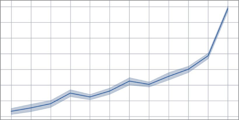
Visualizing Trends and Patterns for Business insights ❘ 51
Average Monthly Revenue with 95% Confidence Interval
75000
70000
65000
60000
55000
Revenue ($)
50000
45000
40000
Jan
Feb
Mar
Apr
May
Jun
Jul
Aug
Sep
Oct
Nov
Dec
Month
FIGURE 3-10: A line chart with confidence intervals made with Seaborn.
Unlike earlier examples that relied solely on Matplotlib, Seaborn is designed for tidy datasets and can automatically compute averages, bootstrap confidence intervals, and display them in a polished way.
As noted, Seaborn is a separate Python library built on top of Matplotlib. This means it needs to be installed before it can be used. You can typically install it using pip from your terminal: pip install seaborn.
The primary advantage of Seaborn is its deep integration with pandas DataFrames. Where Matplotlib often requires you to manually pull out columns or data series, Seaborn’s plotting functions are designed to work directly with DataFrame columns, letting you specify variable names as strings.
This, combined with its statistical power, is what allows it to create complex plots with very little code.
Seaborn’s specialty is statistical storytelling with “tidy” data (like pandas DataFrames). Instead of asking you to draw lines and boxes, Seaborn asks, “What’s the story you want to tell about your data?” For example:
➤
When you use Matplotlib, you say: “Draw a red line using these X points and these Y
points.”
➤
When you use Seaborn, you say: “Here is my entire dataset. I want to see the relationship between the Price column and the Time column, and please group everything by the Asset Class column.”
52 ❘ CHAPTER 3 VisuAlizATion foR BusinEss DECision-mAking In the example, monthly revenue is simulated across 40 stores. Seaborn’s lineplot function calculates the mean revenue for each month and surrounds it with a shaded 95% confidence band. The result is a clean, smooth line that shows the average pattern of revenue, along with a ribbon that reflects how consistent or inconsistent stores are around that average. December’s spike is still visible, but now the audience also learns how reliable that surge is across different stores, a nuance that is essential for planning and risk management.
Confidence intervals are not limited to time series. They can also be used when exploring relationships between variables. A scatterplot of advertising spend and sales, for instance, shows individual observations but does not quantify the overall trend. By using Seaborn’s regplot, you can add a fitted regression line with a confidence band around it. The line suggests the general direction of the relationship—higher advertising spend is associated with higher sales—while the band reveals the uncertainty in that estimate. A narrow band signals a stable relationship, while a wide band warns that sales vary considerably even at similar spending levels.
This type of visualization is more advanced than the earlier line charts, bar charts, and scatterplots because it goes beyond description. Rather than just showing raw values, it introduces estimation and uncertainty, offering the audience both the likely pattern and the degree of confidence in that pattern.
For executives, this shift is critical. A single line might encourage overconfidence, but a line with a confidence band communicates both opportunity and risk. In decision-making settings, that balance is far more powerful than the illusion of certainty.
Analyzing Relationships and Distributions with jointplot
The previous example explored a time-series trend. Another common business task is to understand the relationship between two continuous variables. For example, how does a fund’s volatility relate to its annual return? A simple Matplotlib scatterplot can show the data points, but it’s a very limited view. It doesn’t quantify the trend, nor does it show the distribution of each variable on its own. Are most funds low-volatility? Are the returns normally distributed? Answering these questions requires a more advanced visualization.
This is where Seaborn’s jointplot function excels. As shown in Listing 3-10, jointplot is a compound or figure-level function. It automatically creates a figure that combines three plots into one—a central scatterplot to show the relationship, and two histograms (one on the top margin and one on the right margin) to show the individual distributions of the x-axis and y-axis variables.
LISTING 3-10: USING JOINTPLOT TO SHOW RELATIONSHIPS AND DISTRIBUTIONS
import numpy as np
import pandas as pd
import matplotlib.pyplot as plt
import seaborn as sns
# 1) Simulate tidy financial data: volatility vs. return for 150 funds rng = np.random.default_rng(42)
n_funds = 150
# Create correlated data: higher volatility tends to mean higher returns,
Visualizing Trends and Patterns for Business insights ❘ 53
# but with a lot of variance.
volatility = rng.normal(loc=18, scale=4, size=n_funds)
# Make returns dependent on volatility + random noise
returns = (volatility * 0.5) + rng.normal(loc=2, scale=3, size=n_funds)
# Put into a DataFrame
funds_df = pd.DataFrame({
"annual_volatility_pct": volatility,
"annual_return_pct": returns
})
# 2) Plot with seaborn: show relationship AND individual distributions
# This is a "figure-level" plot, so we don't create a plt.subplots() first.
# Seaborn handles the figure creation.
g = sns.jointplot(
data=funds_df,
x="annual_volatility_pct",
y="annual_return_pct",
kind="reg",
height=7,
color="royalblue",
# --- Customization Dictionaries ---
joint_kws={
"scatter_kws": { 's': 40, 'alpha': 0.6 }
},
marginal_kws={
'bins': 20, 'kde': True, 'color': 'gray'
}
)
# 3) Add titles and labels (syntax is slightly different)
g.set_axis_labels("Annual Volatility (%)", "Annual Return (%)") g.fig.suptitle("Relationship Between Fund Volatility and Return", y=1.02) plt.show()
This example shows how Seaborn combines statistical power with deep customization. Unlike the lineplot function (an “axes-level” function), jointplot is a “figure-level” function, meaning it creates and manages its own Matplotlib figure.
Let’s break down the customization in Listing 3-10:
➤
kind=“reg”: This is the most important parameter. By default, jointplot just shows a scatterplot. By setting kind=“reg,” it instructs Seaborn to automatically run a linear regression on the data and—just like in the lineplot example—draw the resulting trend line along with its 95% confidence interval band.
➤
height=7: Since Seaborn is creating the figure, you can control the size (in inches) with this parameter.
➤
joint_kws={...}: This is a powerful customization feature. It’s a dictionary of “keyword arguments” that are passed directly to the underlying plot function in the central panel. Since
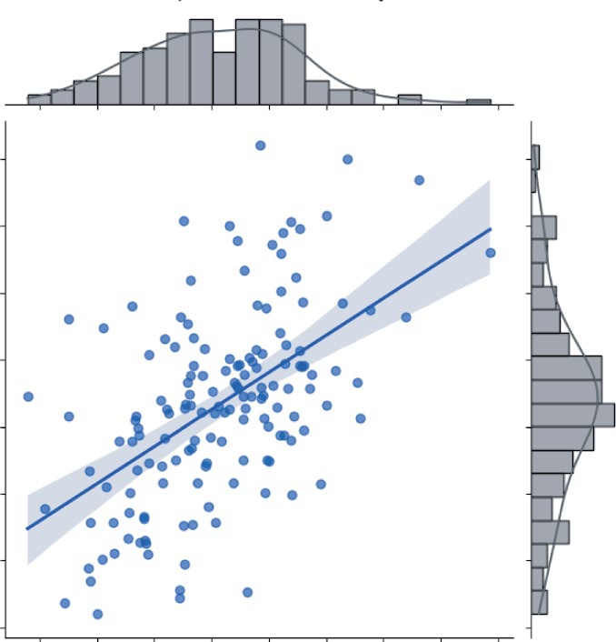
54 ❘ CHAPTER 3 VisuAlizATion foR BusinEss DECision-mAking
the kind=“reg” plot has scatter points, you can pass a scatter_kws dictionary inside it to make the points semi-transparent (alpha=0.6) and smaller (s=40).
➤
marginal_kws={...}: Similarly, this dictionary passes arguments to the two marginal histograms. This code tells Seaborn to use 20 bins for the histograms, to set their color to gray, and to overlay a smooth Kernel Density Estimate (KDE) line (kde=True) on both.
, offering far more insight than a simple scatterplot ever could. A risk manager or investor can immediately see the trend from the central regression line, which confirms the expected positive relationship: higher volatility is generally associated with higher returns. But just as quickly, their eye is drawn to the uncertainty. The wide, shaded confidence band reveals that this relationship isn’t very precise and that there’s a great deal of variance; you can’t simply assume volatility guarantees a specific return.
20.0
17.5
15.0
12.5
10.0
Annual Return (%)
7.5
5.0
2.5
10.0
12.5
15.0
17.5
20.0
22.5
25.0
27.5
30.0
Annual Volatility (%)
FIGURE 3-11: A joint plot with regression line, confidence interval, and marginal KDEs.
Continue Your learning ❘ 55
At the same time, the marginal plots provide crucial context that a simple scatterplot omits. The top histogram shows the X-distribution, revealing that most funds cluster in the 15–20% volatility range, with very few existing in the high-risk, high-volatility space. The right histogram shows the Y-distribution, illustrating the spread of returns, which appear centered around 8–10%. In one glance, the analyst gets the trend, the risk (uncertainty), and the shape of the data. This ability to automatically compute statistics (like the regression line, CI, and KDEs) and combine multiple plot types into one cohesive view, all while offering deep customization via _kws dictionaries, is what makes Seaborn an indispensable tool for rapid data exploration.
SUMMARY
In this chapter, you learned how visualization turns numbers into stories. You first learned about the basics of Matplotlib, discovering how figures and axes create the canvas for plotting. You saw how to produce simple line and bar charts, the fundamental tools for any analysis.
From there, the chapter explored how different chart types map to specific financial data: line charts for tracking time-series data like stock prices, bar charts for comparing cross-sectional data like portfolio sector weights, and scatterplots for understanding relational data, such as the correlation between two different assets. I stressed that clarity is always more important than decoration; choosing the right chart is essential to avoid misinterpreting a market signal.
As the chapter progressed, the discussion moved beyond simple plots to uncover deeper quantitative insights. Line charts reveal market trends and seasonality, while scatterplots and boxplots help identify outliers like volatility spikes or anomalous trades. Stacked and grouped bars were used to compare the performance of different strategies or asset classes.
I also introduced plots crucial to finance, like cumulative return (P&L) curves to track strategy performance, rolling averages to smooth price volatility, and year-over-year comparisons to contextualize quarterly earnings. Finally, the chapter stepped into more advanced territory with Seaborn, adding confidence intervals to these plots, showing not just a central trend, but the statistical uncertainty and risk surrounding it.
Taken together, this chapter highlighted that visualization isn’t about making data look pretty; it’s about making data actionable. The right chart helps a quant or portfolio manager see risks before they materialize, highlight alpha opportunities that raw numbers would bury, and build narratives that guide investment strategy. Whether it’s a simple line chart for a pitch or an advanced plot for forecasting risk, the principles are the same—choose the chart that fits the data, design for clarity, and use the design to communicate insights that support smarter, data-driven financial decisions.
CONTINUE YOUR LEARNING
The following are some resources you may find useful:
➤
Matplotlib cheat sheets: These cheat sheets help you create and customize visualizations. You
56 ❘ CHAPTER 3 VisuAlizATion foR BusinEss DECision-mAking
➤
Matplotlib gallery: Numerous examples of charts from time-series data to choropleth maps.
You can find the gallery of charts at:
➤
HvPlot gallery: Examples of figures and charts made using the HvPlot library. You can find
➤
Seaborn example gallery: More examples of figures created using the Seaborn library. You can find these examples at:

PART 2
Applying the Math
➤Chapter 4: Linear Algebra for Business and Finance
➤Chapter 5: Calculus for Business Problem Solving
➤Chapter 6: Optimization Techniques for Business Strategy
➤Chapter 7: Probability and Statistics for Business Analytics
➤Chapter 8: Applied Business Problems with Math and Python


4Linear Algebra for Business and
Finance
Linear algebra may sound like a topic reserved for an advanced math class, but it’s the engine behind many of the most powerful algorithms and solutions to business problems. This chapter breaks down this essential subject by introducing its core building blocks: vectors and matrices.
The chapter then moves beyond abstract theory to show how these concepts provide a practical language for organizing information. You’ll see how a simple vector can represent anything from regional sales to an investment portfolio, while a matrix can capture the complex dynamics of customer transitions or the interconnected risks within the stock market. The goal is to translate these mathematical structures into a concrete framework for making smarter, data-driven decisions.
Of course, understanding the concepts is just the first step; the real magic happens when you apply them. You’ll see how to use Python’s NumPy library to bring these ideas to life, starting with basic operations and building toward a complete, real-world financial analysis. This journey will take you from calculating revenue with a simple dot product to modeling and comparing entire investment strategies. Finally, this chapter explores one of linear algebra’s most profound concepts, eigenvectors, to uncover the hidden, long-term trends in your data.
WORKING WITH VECTORS AND MATRICES
At its heart, linear algebra is a powerful language that helps people solve and see many common challenges in a new light. Think of it as a toolkit for organizing and working with numeric information. This chapter starts with two of the most important tools in that kit: vectors and matrices.
A vector is perfect for representing simple lists of related numbers. Imagine you want to track your company’s sales in different cities, the cash flow you expect each month for the next year, or how you’ve divided up your investment portfolio. A vector can hold all that information in a clean, organized way.
60 ❘ CHAPTER 4 LinEAR ALgEBRA FoR BusinEss And FinAnCE
A matrix, on the other hand, helps you tackle more complex situations where multiple factors are at play. You can use a matrix to map out how different parts of the economy rely on each other, to predict how customers might switch between different products, or to understand how the returns of different stocks move together.
While vectors and matrices might seem like two completely different things at first, you will soon see that they’re closely related. In fact, the best way to think of a matrix is simply as a collection of vectors working together.
Understanding Vectors
As I touched on in a previous chapter, a vector is just an ordered list of numbers. You’ll usually see it written as a column of numbers, but it can also be a row.
Vectors are incredibly useful because they give structure to data. They allow you to group related numbers together so you can work with them as a single unit. This is a lot more efficient than juggling several individual figures.
Some examples of vectors in practice include:
➤
A revenue vector: Imagine your company sells five different products. You could create a revenue vector where each entry represents the total sales for one of those products. This gives you a quick snapshot of your entire product line’s performance.
➤
A portfolio weight vector: If you’re an investor, you could use a vector to represent how your money is split between different assets like stocks, bonds, and real estate. Each entry in the vector would be the percentage of your total capital allocated to that asset.
Let’s look at a simple sales example. Suppose you have a vector that represents the number of units sold for three different product lines:
100
Q =
[200
150]
The vector (here named Q for quantity) tells you, in a very neat and tidy way, that you sold 100 units of the first product, 200 units of the second, and 150 units of the third.
The real power of vectors comes from the fact that you can perform mathematical operations on the entire list of numbers at once. Instead of having to work with each product’s sales figures individually, you can use the tools of linear algebra to analyze and manipulate all of the sales data in one go. This saves time, reduces the chance of errors, and allows you to uncover insights that would be difficult to see otherwise.
Working with Vectors and Matrices ❘ 61
Understanding Matrix
You’ve seen how a vector can neatly organize sales figures for the three product lines for a single year.
But what happens when the data gains another layer of complexity? For instance, imagine you want to track sales not just for one year, but for several.
You could create a separate vector for 2024, another for 2025, and so on. But this quickly becomes a bookkeeping nightmare. Imagine trying to compare sales across 50 years—you’d be juggling 50
different variables and it would become a mess, quickly. So, what about the other idea: just dumping all the data into one “very, very long” vector? This is even worse. You’d lose all the structure. How would you know where 2024’s data ends and 2025’s begins? You’d have no easy way to ask, “What was the data for 2026?” or “Show me the sales for every year.” You’d just have a meaningless sea of numbers.
This is where the matrix comes in. Instead of juggling multiple vectors, you can combine them into a single, more powerful structure, a matrix. It combines all the data into a single structure, so you’re not juggling dozens of variables, and it preserves the grouping of each vector (e.g., as a row), so you instantly know that “row 0” is 2024, “row 1” is 2025, and so on.
Think of a matrix as a grid or a spreadsheet, a two-dimensional arrangement of numbers with both rows and columns. Following the sales example, you can take the sales vectors for 2024 and 2025
and stack them side-by-side.
100 120
M =
200
[
210
150 160]
Here, each column is a vector of sales for a particular year. The first column corresponds to 2024, the second to 2025. This simple example reveals the true nature of a matrix: it’s just a collection of related vectors, organized in a way that provides much richer view of the data. Now you can analyze trends over time and across products all at once.
The real magic of matrices is their ability to represent and analyze complex, multi-faceted relationships. Here are a few examples:
➤
Shipping and logistics: A cost matrix can map shipping costs from various warehouses (the rows) to every retail store (the columns). Each number in the matrix shows the exact cost for one specific route, helping businesses instantly find the cheapest options and optimize their supply chain.
➤
Customer behavior: A transition matrix models how customers move between different states (e.g., Active, Inactive, Churned) over time. By showing the probability of a customer moving from a starting state to an ending state, it helps companies predict future revenue and design effective retention campaigns.
62 ❘ CHAPTER 4 LinEAR ALgEBRA FoR BusinEss And FinAnCE
➤
Financial risk management: In finance, a covariance matrix is essential for managing portfolio risk. It captures how different investments, like stocks and bonds, tend to move in relation to each other. This insight allows investors to build diversified portfolios where the risk of one asset is offset by another, aiming for more stable returns.
OPERATIONS WITH VECTORS AND MATRICES
The best way to truly appreciate the power of vectors and matrices is to see them in action. This example uses Python’s most popular library for numerical computing, NumPy, which is specifically designed to make working with these structures fast and intuitive.
Let’s start by setting up a simple scenario. Imagine your company sells three core products, and you have the sales data for the last two years:
import numpy as np
# Sales quantities (vectors)
q_2024 = np.array([100, 200, 150])
q_2025 = np.array([120, 210, 160])
# Prices per unit
prices = np.array([5, 10, 15])
Here, q_2024 and q_2025 are vectors holding the number of units sold for each of the three products in those years. The prices vector holds the corresponding price for each product. In NumPy, these are just simple arrays.
One of the most straightforward operations is also one of the most useful: comparing two vectors. As can be seen by using the following code snippet, if you subtract the 2024 sales vector from the 2025
vector, you can see the growth (or decline) for each product line, element by element.
import numpy as np
# Change in sales from 2024 to 2025
diff = q_2025 - q_2024
print(diff)
The result of running this code snippet is [20 10 10].
This tells you that between 2024 and 2025, sales grew by 20 units for product 1, 10 units for product 2, and 10 units for product 3. The math directly mirrors the business question you wanted to answer.
Using this same data, you can perform other operations on your vectors and matrices. These include fundamental calculations like scalar multiplication and the dot product, measuring vector lengths with norms, and performing advanced matrix operations such as multiplication and transposi-tion. You can also use slicing to surgically access specific rows or columns of your data for targeted analysis.
operations with Vectors and Matrices ❘ 63
Scalar Multiplication