Color Models
The colors that we know like green, red, or violet are only a small portion of what exists in the world. Color is a small portion of the entire light spectrum. Light itself is a portion of a larger system called an electromagnetic system.
Only a small portion of this system can be seen by humans. The portions that can be seen are what we know as colors. This is why a sun setting can make different colors appear as it moves across the sky. As the light waves become longer, the color changes.

In terms of creating art, we only care about the visible portions of light. This is where the idea of color spaces, or color models, comes from. There are many different models that are used to define and show color. Do we need to know them all? Not really.
Color Models for the Artist
When we create artwork on the computer, it will be printed out or viewed on a computer monitor. There are two color models that we need to worry about.
RGB (Red, Green, Blue) is what a computer monitor uses. The RGB color model has a larger gamut, or range, of colors than CMYK. This means there is more data stored. Most artists tend to work in RGB first, then convert the image to CMYK if needed.
CMYK (Cyan, Magenta, Yellow, Black) is what printers use. If you decide to print your artwork, you will switch the color model to CMYK. Printers usually have four separate ink cartridges that store these colors. When you convert an image from RGB to CMYK, you destroy some of the color information.
Chromacity
Chromacity comes up in discussions when people are comparing color models like RGB and CMYK. When the word chromacity is discussed, it is usually along with a chromacity diagram.
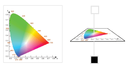
The diagram is commonly used to show how many colors exist in a color model. It has the name chromacity because it shows colors relative to gray. It does not show lightness.
The chromacity diagram shows a visual representation of all of the colors that are visible to humans. Don’t worry about all of the numbers on the chart above. They are rarely referenced when artists talk about color models. The diagram is a representation of all colors that exist, so the exact colors cannot be shown.
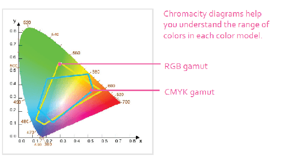
When people compare color models, they put different shapes inside the chromacity diagram. This helps show how many colors a model like CMYK includes.
The following example shows the CMYK and RGB color spaces in a chromacity diagram. The RGB color model has more colors included than CMYK. Many colors do not exist in either of the color models. It also brings up an interesting question of what happens to colors when you start converting them to different color models.
Note that there is no black, or darker colors, in the chromacity diagram. There are many different properties of light and color such as chroma, intensity, and luminance. The darkness of color is measured differently than what the chromacity diagram shows. While these advanced properties are nice to know, they won’t serve much of a purpose with normal painting.
If you are interested in learning more about this subject, a quick Internet search can get you good information. While it is nice to have an in-depth knowledge about this, it ends up having little practical use when creating artwork.
Other Color Models to Know About
Krita additionally comes with more colors models besides RGB and CMYK. You can get by without ever using these, but I will provide a quick overview if you are interested.
- Grayscale – This will force your artwork to only contain grayscale color data, which is useful if you want to work in only black and white. Your color selectors might still show colors, but your canvas will only show the grayscale value.
- L*a*b* – A transformation color model that is used when converting between color spaces. It includes imaginary numbers that cannot be seen. Some artists like working in this color model because it includes all colors in CMYK and RGB.
- XYZ – A transformation color model that is used when converting between color spaces. It includes imaginary numbers that cannot be seen. It is safe to ignore this.
- YCbCr – This color model was used more in the past when cathode ray tube (CRT) monitors were used. It is rarely seen in images now.
The reason why Krita includes these extra color models is more of a developer reason than an artistic reason. The developers use an outside color management system called Little Color Management System (Little CMS) that they try not to alter.