Common Adjustments
Color Adjustment Curve
Change the overall distribution of light and dark values. You might want to make the darks darker or the lights lighter. This increased contrast can make your artwork appear to stand out more.
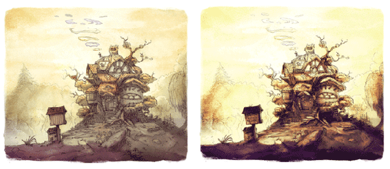
For this example, let’s say that we like the overall image but want the highlights to be brighter and the shadows to be darker. Adding more contrast between the light and dark areas can force the depth more. This adjustment can be accessed through the main menu Filter > Adjust > Color Adjustment curves.
Artwork by David Revoy
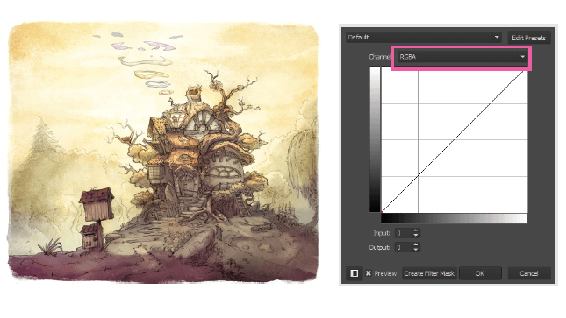
You can modify individual channels to control the color.
The left side of the graph has the amount of black that is in the image. The right side of the graph has the amount of white. Everything between are the levels of gray. The diagonal line shown is the output. The line is diagonal because the values for light have a range from 0-255 (an 8-bit image). The value on the bottom left is mapped to 0, and the value on the top right is mapped to 255. You can see these mappings numerically by looking at the Input and Output numbers below the graph. Selecting different points on the graph will update the Input and Output values.
If we want the lights lighter and the darks darker, we will need to update the diagonal line to modify the color values. A common way to do this is to create an "S curve".
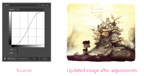
You can see above why it is called an S curve. We added two points to the output line. You can do this by clicking inside of the white box. A point will be added wherever you click. You don’t have to click directly on the line. As you drag, the curve will be updated. To remove a point, you can either select a point (it will turn red) and press Delete, or drag a point so it is outside of the white box. The second way is faster since you don’t need to press any keys.
As you make your curve modifications, you will notice the canvas will show you a preview. Make sure the Preview checkbox is enabled to see the result. The effect is only applied to one layer, so your entire image might not be updated. If you want all of your layers to be altered, you will need to add a filter layer and place it on top of the layer stack.
Let’s go back to explaining the S curve. Bending the dark points down in the bottom of the "S" will allow the darks to be even darker. If you look closely, you will notice that the start of the left side is a few notches to the right. You can modify the points as needed like the image above. By moving the left bottom point over, you are making sure the darkest part of the image will be even darker by setting it as the new black. This is the same logic that is used for the whites.
If you are having a hard time grasping this, play around with the curve. It is one of those concepts that is better understood by doing. Watching your image update as you change values is the best way for this idea to sink in.
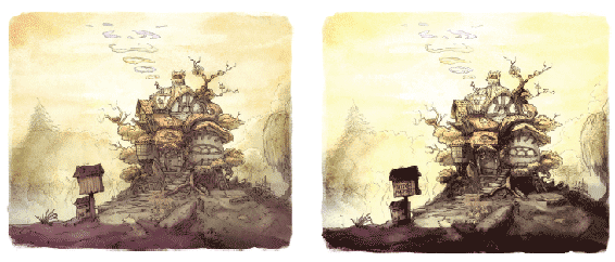
There were already a lot of light values in the image above, so you won’t see much change in that. You will see a noticeable change in the dark values. The image becomes slightly more 3-D looking as the shadows force the volumes of the house and landscape.
Like most adjustments, these changes are artistic decisions. Play around with the curves until you feel good about the final result.

Tip
A great way to see the change in an adjustment is to toggle the Preview option on and off.
If we want to use this filter nondestructively, we can use the Filter Mask in the Layers docker’s "+" drop-down. This will create a new filter mask to your layer with the applied changes. The Layers chapter has more information on filter masks.
Color Balancing
Color is great for setting the mood for your artwork. Saturated reds communicate a different mood than desaturated blues. While this play of colors can be subjective, it does add visual interest. It is common that after painting an image, you find that your shadows are a bit too similar in hue to your midtones. You would like to play around with the hues but don’t want to repaint the areas. You can use color balancing to pinpoint different light values and shift their colors accordingly.
For our example, say I want to add more color to separate the highlights and shadows. We will add more blue to the shadows to help them recede in the background. Then add a touch of red to the midtones to help them pop. Finally, add some yellow to the highlights to make the sun appear warmer. The color balance filter can be accessed from the main menu Filter > Adjust > Color Balance. Shortcut: Ctrl + B.
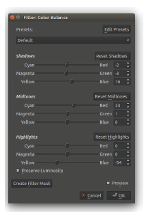
Color Balance options: You can modify the shadows, midtones, and highlight colors. The Create Filter Mask option will apply the effect nondestructively on a new layer.
The shadows are bolder and darker with the color balance change. Like the other adjustments, this is best to do on the fly. Make some edits and see what the result will be on the canvas. When you think you have a good balance, you can switch the Preview on and off to compare.
Hue/Saturation/Value
Another common adjustment is the hue/saturation/value (HSV). It can quickly desaturate everything in your image. It can also breathe life into your line work by adding a splash of color.
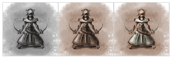
In the progression above, the illustration started as a value painting. The middle image added an HSV adjustment. If you are trying to add color to a gray image like the left example, you will need to check the Colorize option. If you do not, the saturation and hue properties will do nothing. By adding color, it can make organizing your other colors easier. The initial color helps dictate the final color palette, as seen on the right. Access through the main menu Filter > Adjust > HSV Adjustment. Shortcut: Ctrl + U.