Chapter 5: Texture Nodes (T)
Texture nodes are used for objects that are supposed to have more than one color, dependent only on the location of a shading point and not on effects like the Fresnel or backfacing. All texture nodes have a blue input labeled vector. This vector is generally provided by a input node. If this is left unconnected in an image texture node, it will automatically set to UV for meshes and generated for object types like metaballs that cannot be UV unwrapped. Procedural textures will default to generated.
Image Texture (I)
It uses an image or Video as a color map. Once you have provided an image, you can select whether you want to use color information or not. This means whether your image should be gamma corrected or not. Some cases in which you don't want to use the color information are: You want to use the image as a factor, meaning connecting it to a gray socket. Or you plan to use an image as a normal or bump map, you should also set the node to non-color data.
If you change the flat option to box the image will be projected onto the object from six sides. This option is useful to seamlessly texture objects that are not UV unwrapped with an image texture. Once you select this option a blend factor field appears. It determines the transition between two adjacent sides of the box and smoothes out hard visible edges.
You can also use an image sequence or a video file as well. If you use a video file, blender will usually realize this automatically and set the start frame to 1 and the number of frames to be the last frame of the video. If you set the start frame to something bigger than 1, the movie will be frozen before you reach this frame in the timeline.
If your input animation is supposed to be looped, check cyclic. That option will repeat the specified frames infinitely. The same options apply for an image sequence, but if you want to use one, you will have to specify that yourself by choosing image sequence from the dropdown menu. If you select several images when loading, the node will automatically select image sequence .
There is one more input option: generated. It will generate a UV test grid, which is usually used for testing the seams and stretch of your unwrap.
The auto refresh checkbox on the bottom of the node updates the sequence when you advance to another frame.
If your image has an alpha channel you can use its information as a grayscale map using the Alpha output.
The most common supported formats are: .tif, .jpg, .jpg, tga, .exr, .mov, .avi, .mp4, .mpg and any video format supported by FFMPEG.
If you scale an image above its original size, you will start seeing artifacts. For example if you scale an image to six times its size it will also contain of six times as many pixels per axis. You can imagine this as five new pixels appearing between two existing ones. Of course these new pixels also need a color and there are several methods of interpolating between two existing pixels to color the new ones in between.
The same effect applies to – but much less visible – scaling down images. If you do not drastically zoom in on an object with a small image texture, you will not see that much of a difference, except for the closest method, see below.
Linear
The new pixels will get an even mix between their neighbors. Let's say there is a white pixel to the left and a black one to the right of the ones, that were created when scaling up the image. Then the new pixels will form a linear gradient from white to black.
Cubic
With this method the new pixels will form a gradient with a cubic (eased) gradient between the old pixels. It will therefore produce smoother results, but also blur out your texture a bit.
Smart
Cycles will decide which interpolation method to use.
Closest
Let's say there is a white pixel to the left and a black one to the right of the new ones. Then the leftmost two pixels of the new ones will be white and the right ones will be black, since that's what the color of their closest original neighbor is. This is most commonly used to preserve hard edges when scaling an image, but it will make round edges appear more choppy and aliased. It can also be used to achieve the blocky minecraft effect, see Fig. 5.1).
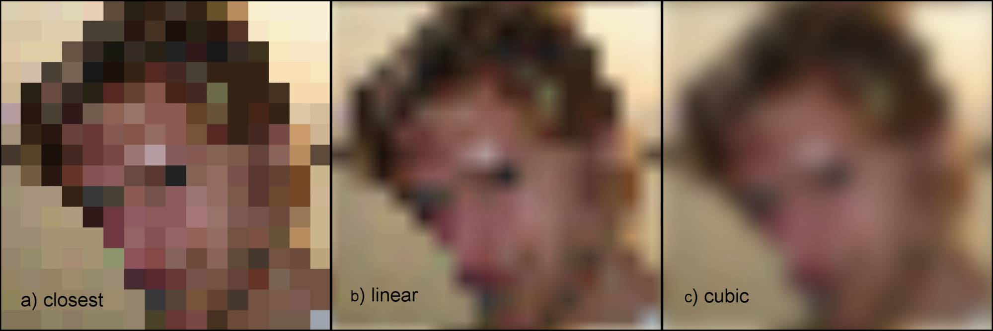
Fig. 5.1) Interpolation modes for images. a) closest, b) linear, c) cubic
Here are the in- and outputs of the image texture node:
Vector
Input for texture coordinates. Determines the method of how to project your texture onto your object. By default this is set to UV coordinates in meshes.
Input slot
Specify the image to be used
Color / Non-Color Data
Should Cycles do a gamma correction on the image or read the data directly (linear)? For the usual textures, color is the right choice. It will gamma correct them. For factors, bump or normal maps you should chose non-color data , because those should be read in their raw format.
Flat
Flat will project the image flat onto the surface by the input specified in the vector, as you would expect. The best choice when you have a UV layout. When used with generated or object coordinates, this can cause severe stretching of the texture.
Sphere
P rojects the image onto the object from a virtual sphere. For seamless results, use an image with equirectangular projection.
Tube
Wraps the image around the object as if it were a tube. Perfect for adding labels to cans and bottles. For seamless projection only the left and right part of the texture have to match.
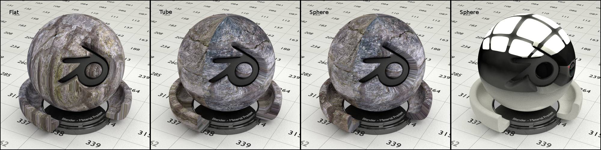
Fig. 5.2) A non-tileable texture projected onto the test object using . From left to right:
Flat: notice how the texture gets projected from the top, with massive stretching on the sides.
Tube: The stretching is now prominent on the top but no longer on the sides. The cut-out gets stretched massively, but notice the parallel lines.
Sphere: similar to tube, but the stretched lines now all point towards the center.
The rightmost shows the sphere projection again, but with an texture, which maps perfectly onto the spherical part of the model without the need for unwrapping.
Box
Will project the image onto your object from six sides, it enables the option blend .
Blend
This creates a soft transition (bleed) between the six sides to avoid seems. A value of 0.1 is already resulting in a nice and smooth transition. Values above 0.5 will result in so much blending that the texture starts to average out and loses detail, see fig. 5.3.
Blending is happening according to the direction of the , see fig. 5.4.
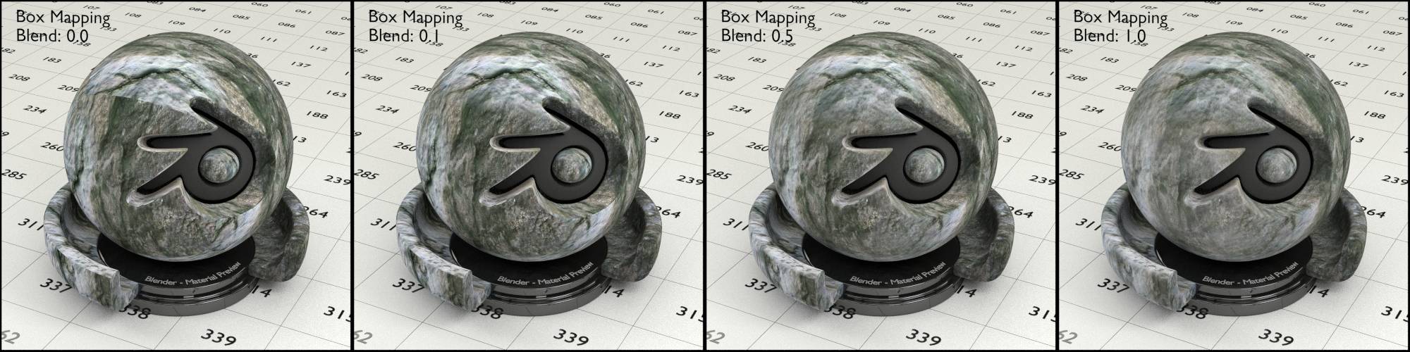
Fig. 5.3) A texture mapped to the test object using box mapping. A blend value of 0.1 (left) is already enough for the roundish parts of the object, but there are still seams in the areas with sharp edges. A blend value of 0.5 smoothes out even those parts. A blend value of 1.0 (right) will reduce detail in the texture as it gets averaged out.
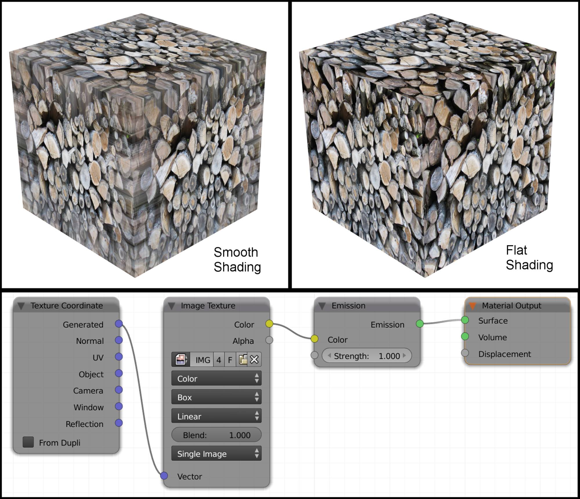
Fig. 5.4) A cube with emission shader and texture set to box mapping with 1.0 blend factor. On the top left with smooth shading, on the top right with flat shading. This shows that blending in box mapping happens according to the direction of the , which get interpolated when using smooth shading.
Repeat
The texture gets repeated horizontally and vertically.
Extend
The pixels at the edges of the texture are repeated infinitely.
Clip
Pixels outside of the texture are set to transparent.
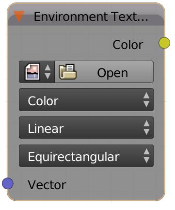
Environment Texture (E)
The environment texture uses an image as an input. For using movies or image sequences, please see above.
There are two types of environment textures Cycles can use properly: Equirectangular and Mirror Ball.
Using a texture for environment lighting has several advantages. For one, if there are reflecting objects in your scene, you would have to model the entire scene, to make sure there are no blank parts in the reflections. The even bigger advantage is: The lighting is much more subtle and fits the lighting of the scene where the image was taken exactly, making it a lot easier to composite rendered objects into a shot from that particular scene.
If you want to light your scene with an environment texture, it is best to use a high dynamic range image (HDRI), because this way it can store lightness values greater than 1.0, keeping the correct color and lightness information when e.g. reflected in a darker object. Whereas 8 bit images will get clipped. Sloppy: white is white.
Hint: You can also use this texture type to map an image onto a perfect sphere. This is very handy, since properly UV unwrapping a sphere can turn out to be pretty difficult.
Color / Non-Color Data
Should Cycles do a gamma correction on the image or read the data directly (linear)?
Linear
The new pixels will get an even mix between their neighbors. Let's say there is a white pixel to the left and a black one to the right of the ones, that were created when scaling up the image. Then the new pixels will form a linear gradient from white to black.
Cubic
With this method the new pixels will form a gradient with a cubic (eased) gradient between the old pixels. It will therefore produce smoother results, but also blur out your texture a bit.
Smart
Cycles will decide which interpolation method to use.
Closest
Let's say there is a white pixel to the left and a black one to the right of the new ones. Then the leftmost two pixels of the new ones will be white and the right ones will be black, since that's what the color of their closest original neighbor is. This is most commonly used to preserve hard edges when scaling an image, but it will make round edges appear more choppy and aliased.
Equirectangular
Those are the types of images you can spot when straight lines become very round and the top and bottom seem very stretched. They are taken in a 360° angle around the photographer and then mapped onto a 2D image. This would be the opposite of unwrapping a sphere. These images must have an x : y ratio of 2 : 1.
Mirror Ball:
If you bring a light probe to the set, it greatly facilitates recreating the lighting situation in CG, making it a lot easier to make objects seem integrated into the scene, because similar light shines onto them. The light probe is a reflecting ball of which you only need to take as many images as you need stops in your HDRI, saving you the hustle of shooting all sorts of angles like you would have to for an equirectangular map. Cycles is still able to reproduce almost the entire surroundings from that one image, using the mirror ball option. Of course whatever was behind the mirror ball when taking the pictures will not be displayed correctly, which is usually not a problem, unless you are placing placing objects with sharp reflections in the scene.
Vector
Determines the method of how to project your texture onto your object. By default this is generated , which works fine for world background and spherical objects.
Input slot
Specify the image to be used.
Procedural Textures
The other textures you can choose from are of the type procedural textures. They use mathematical functions to generate an endless, seamless color field. This offers the great advantage that you can zoom in on those textures as close as you like and they will not lose detail, like an image texture would. Also they are distributed in 3D space, which means they can easily be mapped without UV coordinates and used for volume shaders.
If you choose to use one of these textures, the default Input for the vector will be generated texture coordinates. I will describe here not how they generated mathematically, but rather the way they look like in general. For simplicity I will only describe what happens if you map them to a plane because I think this is the best way to check out what they do.
They all have a scale input. Increasing the scale will make the texture seem smaller on your object. That is because you are scaling the texture itself, not the projection. Projecting a bigger image onto the same surface will make the make the image on the surface seem smaller.
Hint: If you want to make your procedural texture evolve, you will have to animate their input coordinates towards the camera.
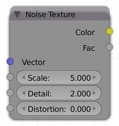
Noise Texture (N)
This texture creates a cloudy pattern. It’s equivalent in Blender Internal is called clouds . It is an implementation of perlin noise. It has three options:
Vector
Determines the method of how to project your texture onto your object. By default this is generated .
Scale
Adjusts the size of your texture. Increasing the scale will make the texture seem smaller on your object.
Detail
Adds additional fine-grained noise.
Distortion
This value will smear the noise resulting in a more wavy and curly style than an undistorted noise
Color
The color socket of the noise texture node will output three different noise textures, one for each color channel. The texture for the red channel is identical to the factor output. Due to the three channels being mixed together, the look ranges between Cyan and Magenta.
Fac
The Factor generates the same pattern as the red channel of the color output.
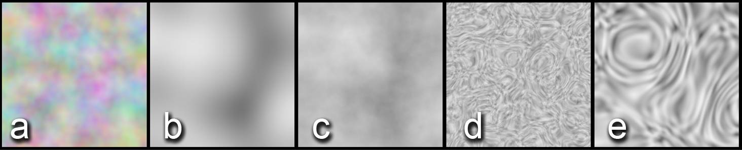
Fig. 5.5) Renderings of a noise texture.
a) color output with default settings
b) scale lowered to 2 and detail reduced to 0.1
c) scale 2, detail: 16
d) distortion raised to 15
e) scale) 2, detail: 0 and distortion set to -15.
Note how increasing the detail introduced more noise, making it overall look more contrasted.
Wave Texture (W)
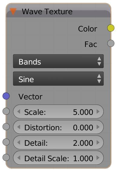
The standard option for the wave texture is bands, but you can also choose rings. Bands will produce parallel lines across your object, while rings will generate concentric rings on your object.
The options for the two are the same and they also react very similar.
Bands
Creates lines going diagonally across a surface.
Rings
Creates concentric rings.
The two options from the second drop down menu determine the interpolation between two stripes or rings.
Sine
Creates a sine transition meaning it oscillates between black and white in smooth gradients (see fig. 5.6)
Saw
Creates linear transitions between 2 bands or rings. Each stripe starts with black and transitions into white, after which it starts over, leaving a distinct edge where the line of white pixels meets the nex line, that starts with black pixels (see fig. 5.7)
Vector
Determines the method of how to project your texture onto your object. By default this is generated .
Scale
Controls the width of the bands, not their length, since the length is infinite. Increasing this will make the bands more narrow and also bring them closer together.
Distortion
Distorted waves will look more like water. If you use lower values, the waves will be displaced and become curvy. Also the softness of the transition between two bands becomes softer in some areas.
Very high values (> 50) will make it look as if the bands wrap around certain areas, a bit like a 70s psychedelic effect.
Unless distortion is set to a value higher than 0, the next two options have no effect on your texture.
Detail
Increasing the detail value will make your texture seem noisy, since the distortion effects will cause more calculations per length unit.
Detail Scale
This value is multiplied by the detail value. This means just increasing it will do something very similar to just increasing the detail value, however if you use a texture as an input here, the detail factor will be different for different parts of your object. Connecting a noise texture to this socket will for example result in a flame-like pattern.
Fig. 5.6) Wave texture.
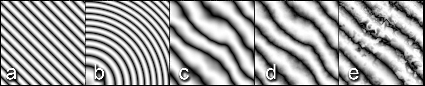
a) Bands
b) Rings
c) Bands with distortion set to 10
d) Distortion: 10, detail: 16
e) Distortion 10 and a noise texture as input for the detail scale.
Note that detail scale increased the contrast and using a texture for detail scale allows you to control additional distortions. For c) to e) the scale was decreased to 2.
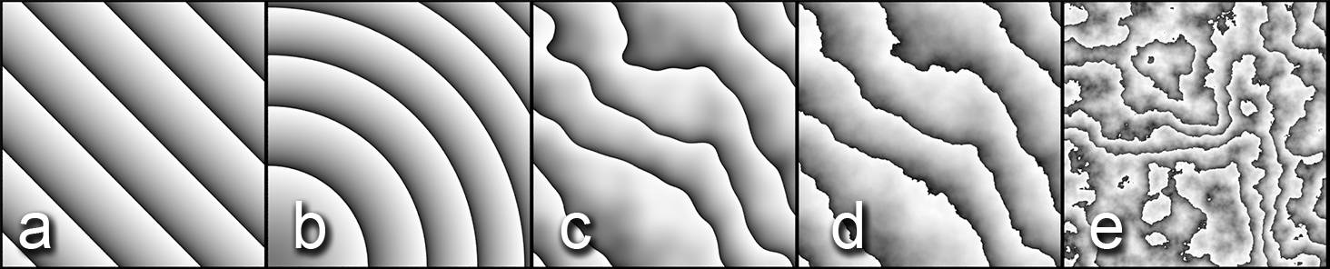
Fig. 5.7) Renderings of the wave texture set to saw . The scale was set to 2 for all examples.
a) Default settings.
b) Default settings with type set to rings.
c) Bands with distortion set to 16.
d) Bands with distortion set to 16 and detail set to 10.
e) Rings with distortion set 80, detail to 16, note that the higher the distortion is, the less you can tell whether the setup is bands or rings.
Voronoi Texture (V)
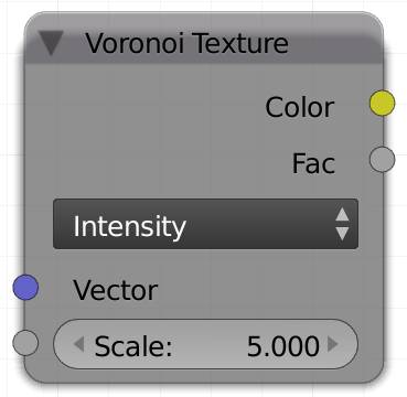
Voronoi is a method to produce a cell pattern. You can use two different types to set the interpolation between the cells, Intensity and Cell.
Intensity will fill the created cells with a gradient, which you can then control with a converter color ramp node. So it produces a soft dot inside each cell. It looks a little like an organic tissue surface.
Cell will return the cells without interpolation, but instead color them randomly.
Vector
Determines the method of how to project your texture onto your object. By default this is generated .
Scale
Adjusts the size of your texture. Increasing the scale will make the texture seem smaller on your object.
Intensity
This produces a gradient from the center of the cell to its rim. The result looks like a bunch of bubbles, sometimes being squished together. This pattern has no color information.
Cell
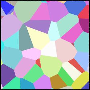
This produces irregular polygons with random shapes. There is no transition between them they all have solid edges. If you use the color output, you will see that every cell has different a color.
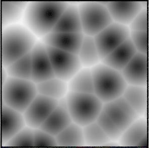
Musgrave Texture (M)
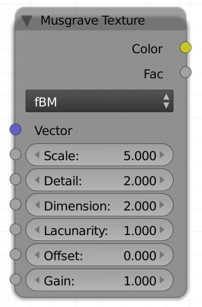
The Musgrave texture was named after F. Kenton Musgrave, who developed the algorithm. He called it “unstable”, by which he wanted to stress that many combinations of the values produce pure white or pure black results. The offset seems to be the most sensitive value in this regard. Values between -0.8 and 0.8 seem to yield the best results.
With the default settings t he Musgrave algorithm produces smooth white blobs. They look a bit like white blots swimming in a black ocean. Their center is brighter than the rim so they resemble the height map for mountains in an ocean. At first it seems like that’s about it and there are not that many uses for it. But changing its mode from fBM there are actually quite some variations you can produce with this algorithm. Changing the type to something else opens up a whole world of creative possibilities for this texture. Going into detail about the algorithm and all possible combinations would well fill a book by itself. So we tried to explain the parameters as well as possible without stating the math. We also rendered a couple of thousand images for each mode with random parameters and obtained very distinguished results, see below.
Vector and scale work for all types of this texture so we will not repeat what they do for every single one.
This texture was originally designed to create terrain, so often values above 1 and below 0 occur, to allow the terrain to be raised infinitely and lowered below sea-level. Allowing values outside the 0-1 interval provides a wider range of values, so more detail can be added to the landscape.
Often times sliders will not make the texture look different except when other values are above or below a certain threshold. For example increasing the lacunarity in fBM does not show any effect unless the detail is smaller than 1.
Vector
Determines the method of how to project your texture onto your object. By default this is generated .
Scale
Adjusts the size of your texture. Increasing the scale will make the texture seem smaller on your object.
Detail
You might be familiar with the term octaves from wiggle effects. Detail is the Blender term for octaves in this case. The more detail, the more often the algorithm gets repeated, often resulting in more heterogenous, or - well - detailed appearance.
Lacunarity
F. K. Musgrave describes this as “the gap between successive frequencies”. Generally it kind of subdivides the texture, so all the islands get little fjords. With even higher values, a lot of noise can appear.
fBM
This is the base function of the Musgrave algorithm. It creates a bunch of white blobs on an otherwise black surface.
Detail :
Brightens the center of the blob, so with a high detail the gradient from the rim to the center. It also allows more small blobs to appear with increased lacunarity. Note that with a lacunarity of 1 the values get multiplied by a factor proportional to the detail value, shifting some values above 1.
Lacunarity
Increasing this value creates more and smaller blobs. It only works when the detail is set to 2 or above.
Decreasing the value creates much larger islands, but in order to see the effect, the detail needs to be larger than 1 and the dimension needs to smaller than 1.
fBM ignores offset and gain .
For fig. 5.8 the The values for scale was set to 5 and offset and gain were left at the default value of 0.
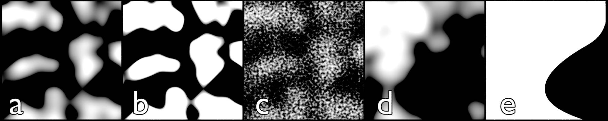
Fig. 5.8) Renderings of the musgrave texture set to fBM.
a) default values, detail: 2.2, dimension: 2, lacunarity 1.
b) detail: 16, dimension: 2, lacunarity 1.
c) detail: 16, dimension: 0.5, lacunarity 10.
d) detail: 5, dimension: 0, lacunarity 0.7.
e) detail: 5, dimension: 10, lacunarity 0.7.
In fig. 5.8 a) and b) you can see that the detail seems to increase the contrast. However that is not true. In the case of fBM the detail brightens the texture so more parts appear white in the viewport. If you use the musgrave on an emission shader and lower the strength, you can see the contrast stays the same, but more areas have values greater than 1 which gets displayed white with the default strength. c), d) and e) detail influences the size of individual white islands, where a higher value correlates with more noise. The dimension value also plays a major role in the contrast. Increasing it can even lead to the elimination of gray pixels, leaving only black and white. This creates some aliasing and very hard edges (e).
Hetero Terrain
As the name suggests this method is intended to simulate heterogeneous terrains. The black parts represent sea-level and the white parts are islands in that sea.
Lacunarity
Values higher than 1 Introduce grain, meaning many small bumps are distributed across the islands. As opposed to the other methods the noise is restricted to areas above sea-level. In order to achieve a visible effect, the detail should be above 4 and the dimension below 1.
Offset
Lowers the sea-level. Its effect is not just a simple addition, but rather influences values closer to black (sea-level) a lot more than values greater than 1 (mountain peaks).
This mode Ignores gain.
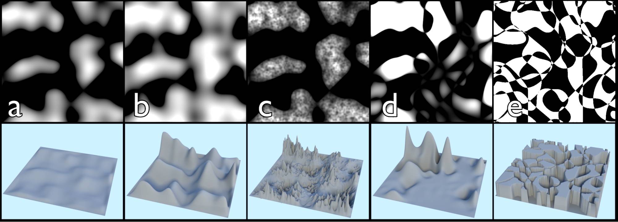
Fig. 5.9) Musgrave texture set to hetero terrain, upper row: texture used for the color of an emission shader, lower row: texture with the same settings used as the displace factor of a diffuse material , see fig. 5.10 for the node setup.
a) default values, detail: 2.2, dimension: 2, lacunarity: 1, offset: 0.
b) offset raised to 0.2. Note how more white parts occur as the sea-level falls.
c) detail: 4, dimension: 0, lacunarity: 2.2, offset: 0. Note how the noise of the lacunarity stays inside the islands.
d) detail: 5, dimension: 2, lacunarity: 0.7, offset: 0
e) detail: 5, dimension: 10, lacunarity: 0.8, offset: 0. Since this setup created pixels between -600 and 11,000 intensity, the result for the displacement was clipped using a color ramp, instead of the math node, with the default settings.
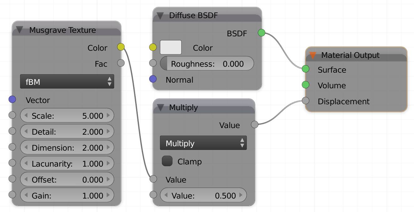
Fig. 5.10) Node setup for the displacement. Note that you have to switch the Feature set to experimental and enable true displacement in the data panel (see , section data ). Since the values generated by the Musgrave texture can be pretty high, we used a math multiply node to adjust the general height if necessary. The plane was subdivided 10 times, to allow the necessary detail in the geometry.
In fig. 5.9 you can see how the hetero terrain mode can be used to create landscapes. From b) you can tell that not all pixels rendered white have the same value. There are pure white areas, but all the mountains are pointy, instead of occurring plateaus. In d) You can see that some areas are below sea-level, indicating that there are values smaller than 0 in the black areas. In e) we clipped the range, which is why there are only the values 0 and 1 are present, since all generated pixels were either below 0 or above 1. This caused a terrain with only vertical steepness and plateaus either at sea level or maximum height.
Multifractal
With the default settings this method looks like a brighter version of the fBM. However altering the values quickly shows how much more complex this method is.
Detail
In this mode the texture usually gets brighter the more often the calculation is repeated - which is what higher detail values will do. Thus it leaves the ocean unchanged, while raising the plateaus. At least when the lacunarity equals 1. If the lacunarity is below 1 increasing the detail actually darkens the texture. And if it is above 1, the detail needs to be greater than 1 in order to produce more holes.
Dimension
The effect of this slider does something similar to the detail, it brightens the islands as well as deforming them a bit. With higher values the contrast increases a lot, leaving an aliased edge at some point (see fig. 5.11 d) and e).
This slider has no effect if the lacunarity equals 1.
Lacunarity
It will introduce holes or noise if the detail is greater than 1.
Multifractal ignores offset and gain .
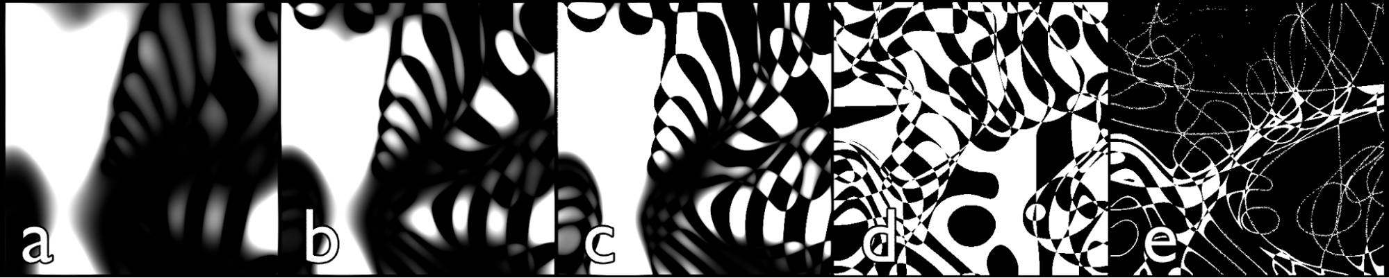
Fig. 5.11) Renderings of the Musgrave texture set to multifractal.
a) detail: 11, dimension: 1.5, lacunarity: 0.9.
b detail: 11, dimension: 2.1 lacunarity: 0.9.
c) detail: 13, dimension: 2.2 lacunarity: 0.9.
d) detail: 10, dimension: 17.5 lacunarity: 0.9.
e) detail: 13.4, dimension: 8.5 lacunarity: 0.86.
Hybrid Multifractal
Even though the hybrid multifractal sounds more interesting, the results of our test renders were less interesting than those of the plain multifractal.
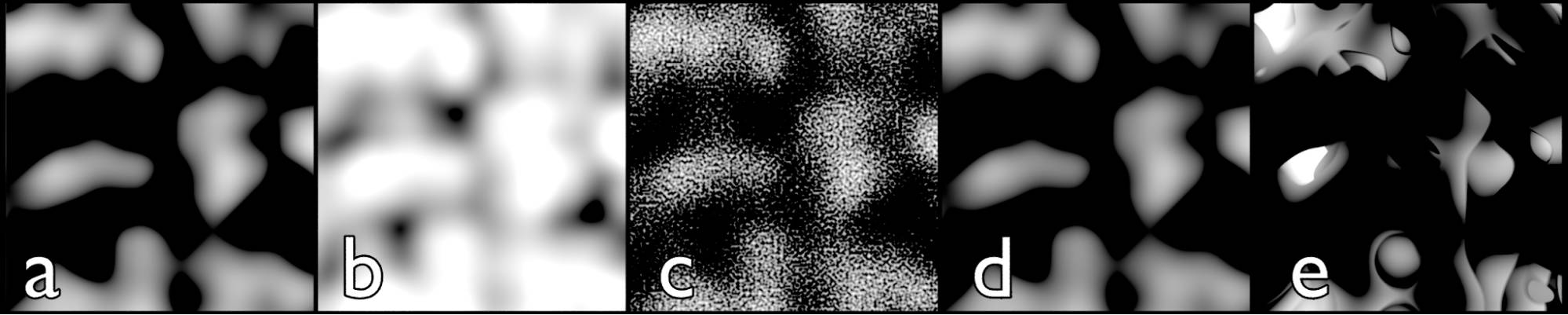
Fig. 5.12) Musgrave texture set to hybrid multifractal.
a) default values, detail: 2.2, dimension: 2, lacunarity: 1.
b) offset increased to 0.6. Note how more white parts occur as the sea-level falls.
c) detail: 0.9, dimension: 0 lacunarity: 20. The noise only works if the detail value behind the decimal is high (in this case 9 - Note: 0.19 is not greater than 0.3)
d) detail: 15.0, dimension: 0 lacunarity: 20. If the detail value behind the decimal is too low (0 in this case), the lacunarity has no effect.
e) detail: 7, dimension: 2.4 lacunarity: 0.56.
Detail
In this mode there is a bigger difference between detail 0.9 and 1 than between 1 and 15. It mostly ignores the whole number and only computes what’s behind the decimal.
Dimension
Produces bigger and brighter blobs.
Lacunarity
It will introduce holes or noise if the detail is greater than 1.
Ignores offset and gain
Ridged Multifractal
In our opinion this mode is the most interesting. It is probably a little less suited for terrains, because the offset does not alter the sea-level and the lacunarity does not just create smaller islands. It is somewhat unpredictive what the values will do depending on their combination.
Detail
Increases the complexity of the texture. It only takes whole values, so anything behind the decimal is going to be ignored (see fig. 5.12, c) and d)
Dimension
Also influences the complexity of the texture, the lower the value the more influence the lacunarity slider has. Values above 2 don’t seem to alter the texture.
Lacunarity
Introduces more detail “under” the snaky lines, the latter will not be distorted by this value. With increasing values it looks like the lines get repeated as a smaller version inside the islands.
Offset
The offset does not brighten the darker areas more than it does with the whiter parts. It rather acts like a phase shift, meaning the overall shapes stay the same, but the brightness of the individual parts get shifted. An offset of 0.5, for example, makes the texture (almost) look inverted (see fig. 5.12). Values outside the range of -1.5 to 1.5 often result in pure white textures.
Gain
The gain generally brightens your texture, but it does more than that. It can reveal detail that would otherwise be hidden in the black parts. If you are expecting a rather detailed result, but only get the default snaky lines, try increasing this value.
This value only has an effect if the lacunarity is greater than 0.
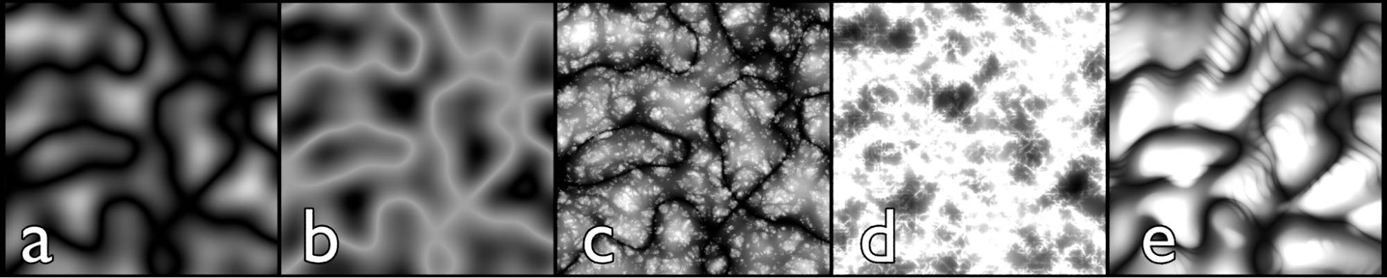
Fig. 5.13) Musgrave texture set to ridged multifractal.
a) default values, detail: 2.2, dimension: 2, lacunarity: 1, offset: 0, gain: 1.
b) offset increased to 0.6. Note how it does not raise the sea-level, but offsets the phase (not mathematically), so it somewhat inverts the texture.
c) detail 10, dimension 0.2, lacunarity: 1.7, offset: 0, gain: 25.
d) detail: 9, dimension: 0, lacunarity: 2, offset: 0.7, gain: 3.
e) detail 10, dimension 1.5, lacunarity: 1.05, offset -0.05, gain 14.
Fig. 5.13 shows how diverse the ridged multifractal can be. Since a lot of the combinations turn out to be pure black or white, testing while just pushing around the sliders often does not do too much good. Also predicting what will happen when altering one specific value proved to be rather hard. That’s why we rendered a couple of thousand images with random values.
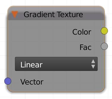
Gradient Texture (G)
This texture will create a gradient along your mesh, originating from the origin point of the texture coordinate used as input. By default this is generated, which has it’s origin point in the bottom left corner of the object’s bounding box.
There are several types of gradients to chose from:
Linear
Produces a linear gradient from black to white.
Quadratic
Eases the gradient. You can imagine this as a parable, the middle being the Y axis (x = 0) and left of it the distance from the Y axis will determine the darkness and on the right the X values will increase the brightness.
Easing
The transition between black and white is smoother.
Diagonal
Creates a linear gradient from the bottom left corner to the upper right.
Spherical
It creates an actual sphere in 3D space. Since a surface can only intersect the sphere and not wrap around it, mapped onto an object the sphere will be visible as a circle. Unless you are using it with a volume material.
Quadratic Sphere
Produces a combination of the spherical and the quadratic option. Meaning it will result in a circle with a quadratic (smoother) gradient.
Radial
This option will create a clockwise transition from white to black. If you map it onto a plane, you will barely be able to see it, because the center of the clock will be in the bottom left corner, so you will only see a quarter of the gradient. If you use a mapping node (see below), you can shift it, so its origin will be moved to the center to see the full effect. It is a wipe that starts at the 9 o'clock position.
Vector
Determines the method of how to project your texture onto your object. By default this is generated .
Fig. 5.14) Gradient texture. a) linear, b) quadratic, c) diagonal, d) quadratic sphere, e) radial.
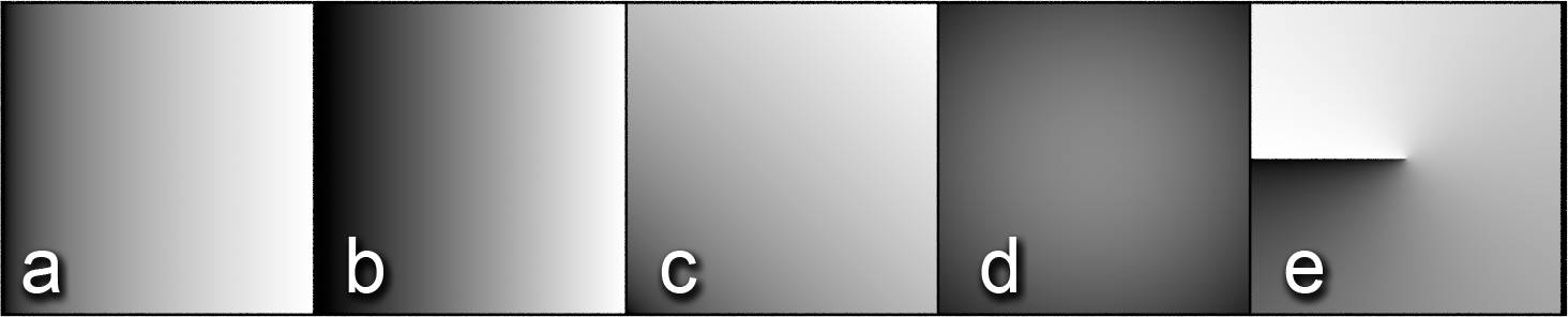
Note the difference between linear and quadratic, the latter made the transition smoother. For d) and e) a mapping node was used to shift the center of the gradient to the center of the plane.
Magic Texture (T)
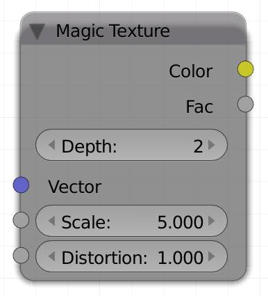
The magic texture does not have many options, but can create very different looking results nonetheless. It will produce a color field with dots and stripes by default, including the look of white zig-zag lines snaking through the dots.
Internally it works by layering sine and cosine waves among the three different axis and distorting single axis by the waves of the other axis.
Depth:
The number of layers of waves.
Distortion:
This seemingly randomly distorts the color field and the dots. If you keep increasing the value, you'll get:
- An outline around your dots
- More outlines and diagonal stripes appear more dominant.
- More and more outlines and smaller dots, creating four-asterous stars where the round outlines meet.
Note: This texture is known to cause eye cancer.
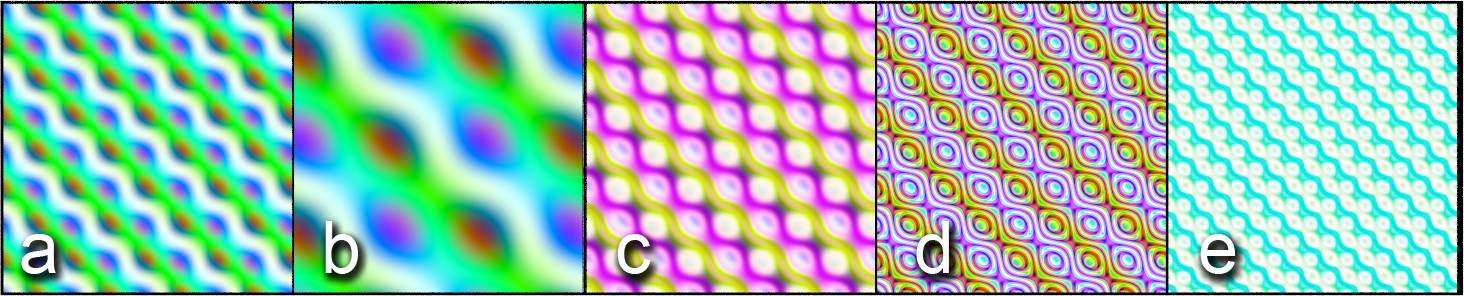
Fig. 5.15) Magic texture. a) default settings, b) scale lowered to 2, c) depth increased to 5, d) scale and distortion increased to 5, e) depth: 8, scale: 10.
Checker Texture (R)
This node will create a checkerboard texture from the two colors you can specify in the two color fields. You can also use another texture as input for these colors.
Vector
Determines the method of how to project your texture onto your object. By default this is generated .
Scale
Increasing the scale will make the checkers smaller.
Color1
Color for even fields.
Color2
Color for odd fields.
Fig. 5.16) Checker Texture.
Brick Texture (B)
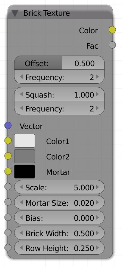
This sounded like one of the most simple nodes to me, since it just produces a couple of bricks. However it is the procedural texture with the most inputs:
Vector
Determines the method of how to project your texture onto your object. By default this is generated .
Offset
This offsets every other row from its neighbor. The default is 50% which means exactly in the middle of a brick in one row, the separation between two bricks in the next row will be, 0% or 100% will make the bricks perfectly even.
Frequency
This value refers to how often a row will be offset. By default it is 2, so every row will be offset by the factor specified above. If you choose a higher value, let's say 3, there will be two identically distributed rows and the third one will be offset.
Squash
If you choose to squash your bricks, their width will become larger or smaller. Just like with the scale, the more you squash your bricks, the larger they will appear, because once again, you are squashing the texture and smaller texture on the same sized surface will appear larger.
Frequency
You can limit the squashing to rows with this option. If you use a value of 1 each row will get squashed by the same amount. If you choose 2, only every other row gets squashed and so on.
Color1 and Color2
Each brick will get one color picked randomly from the range between those two colors.
Mortar
The color of the mortar (gaps) between two bricks.
Mortar Size
You can control the size of the mortar (gaps) between two bricks, a value of 0 will look like a mosaic effect, higher values will make the bricks smaller and the rims thicker.
This value is very sensitive normally even values greater than 0.15 can make your bricks disappear entirely.
Bias
This value can be used to drive the color picking towards one side of the range specified by the color 1 and 2 input. A value of -1 will only allow bricks in the color specified in Color1 and +1 vice versa. So if you imagine the two colors as a ramp, a value of 0.5 will make the node pick only colors that are halfway towards the second color or more.
Brick Width
This slider controls the width of all the bricks, so it is a bit like the squash option, but without a frequency setting.
Row Height
The row height controls the height of the bricks.
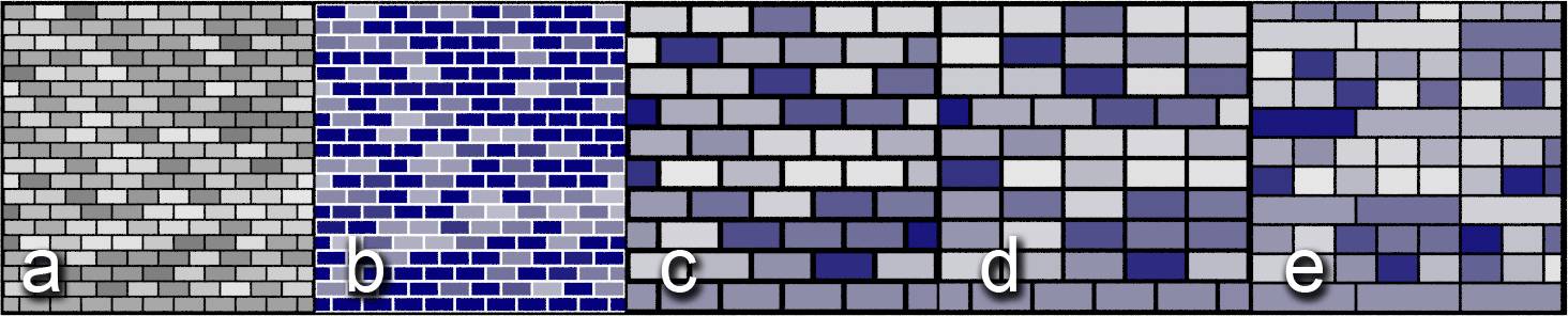
Fig. 5.17) Bricks texture. a) default settings, b) mortar color set to white, c) scale decreased to 2.5 and mortar size 0.25, d) offset frequency: 6, e) squash: 3, squash frequency: 3. b) - e) color2 changed to dark blue. All unmentioned settings were left at the default value. Note how an offset frequency of 6 produced 5 aligned rows of bricks, offsetting every 6 th . Increasing the squash size stretched the bricks, and again the frequency determined how often the effect was used.
Sky Texture (S)
You will probably use this texture on a world (background) shader only.
With the standard setting this node acts like 3D clear sky with a greenish ground and a brighter spot in the zenith. This is commonly known as a skydome. It also takes into account a silver lining at the horizon, where the sky appears to be brighter in images, so it is a bit more than just a linear gradient from floor to zenith.
You can choose between two different methods (types) to create a sky texture, named after the authors who came up with the model.
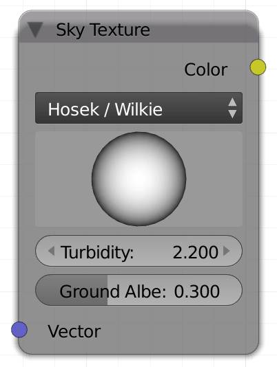
Hosek / Wilkie
Generally this model is meant to create earth-like atmospheric effects on any planet. It is considered more realistic than Preetham and might become the only available model for Blender 2.8. The silver lining at the horizon is more visible with this method.
Preetham
Calculates a skylight based on the viewer's position relative to the sun. It will take into account the angle of the parallel rays of the sun (daytime), as well as the humidity. The bright spot around the place where the sun should be will appear to be a much brighter area with this type.
Preetham is considered deprecated and might be removed in Blender 2.8.
Big Sphere
You can click and drag the sphere in the node to change the position of the sun. You can imagine the sphere as an object in the middle of your scene the illumination represents the angle of the sun shining onto it. If you lower the height of the sun, the colors will be more reddish, just like you would expect in a sunset. If you turn the sphere so the sun is behind it, your skydome will be tinted blue, like it would be at night, see fig. 5.18.
Vector
Determines the method of how to project your texture onto your object. By default this is generated .
Turbidity
It can be regarded as the humidity in the atmosphere. If the humidity rises, the sunlight appears more diffuse. Both models assume a value of 2 is a clear arctic sky, so they don't intent to use values lower than that. In Hosek/Wilkie turbidity values below 2 don't make much of a difference, whereas in the Preetham method, they lead to very strange behavior, even tinting everything black. This is due to the calculations Preetham uses, where the absence of haze leads to no scattering of the light in the atmosphere at all, and the skylight does not contain an actual sun, it is only illuminated by the scattered light.
Examples:
- 2: Arctic sky, almost no humidity, very clear
- 3: Clear sky, little humidity
- 6: Moist day, average humidity for temperate climate
- 10: Hazy day, overcast like just after a rain, maximum humidity, very diffuse lighting only
Ground Albedo (only available with the Hosek / Wilkie method)
Albedo is the factor of how much light a somewhat diffuse object reflects. In a sky texture, this value will make the indirect light coming from the ground brighter. If you are using an actual ground plane or other floor, this effect will do little more than brighten your scene. Since the fake diffuse reflections from the ground of the skydome will not pass it. It also does not affect the amount of light reflected from glossy surfaces.
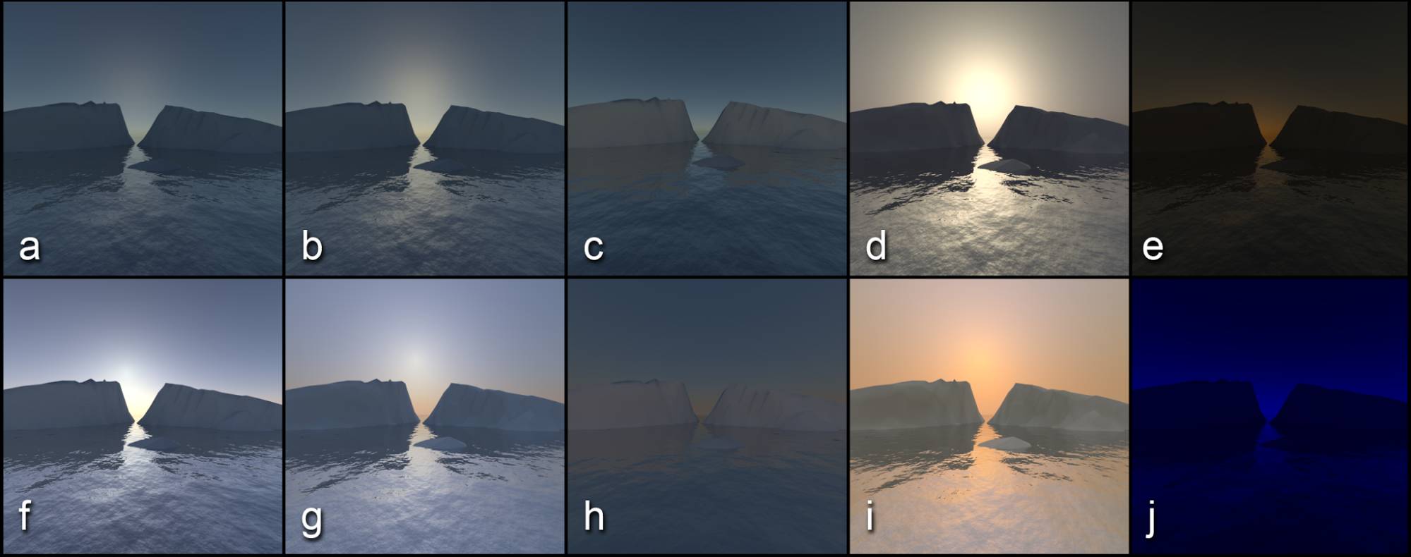
Fig. 5.18) Sky textures
a) - e) Hosek and Wilkie
f) - j) Preetham
a) - d) and f) - i) used the same angle for the sun, while e) and j) were set to nighttime with a turbidity of 3. The turbidity from left to right was: 1.8, 3, 3, 10, 3. For c) and h) the scene was rotated 180° so the hypothetical sun was behind the camera. Since Preetham delivers much brighter results, the strength of the background shader was decreased to 0.2 in the lower row.
Note how Hosek Wilkie looks more like a planet similar to earth, but with a different atmosphere, whereas Preetham looks like a very bright day in the desert.
In fig. 5.18 we rotated the sphere in the sky texture node so the simulated time of day would not be too far from the sunset. With the default settings the hypothetical sun is in the zenith and everything is evenly lit. The models do include an actual sun and only show the effects of atmospheric scattering. Yet those effects can be pretty strong. You can see that in images c) and h, where the its location is behind the camera. There the mountains are brighter, but the sky is not.
As the sun goes down the blue light gets scattered less than the red, thereby the blue part of the light passes earth, while the red remains, coloring a sunset red. This effect is far weaker if there are less particles in the atmosphere, as you can see in image f) and g).
Comparing e) and j), the Preetham model is somewhat more realistic in a night scenario, as Hosek/Wilkie only tints the scene red, when the sun has already set and there is no nighttime. When comparing c) to h), you can see that it creates a silver lining at the horizon which many might find preferable. All in all Preetham is much brighter and the scattered light from the sun is more dominant, while Hosek/Wilkie takes indirect lighting more into account.
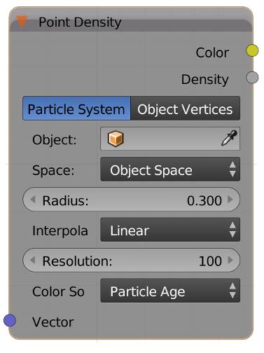
Point Density (P)
Point density textures allow you to visualize points from object vertices or particles as volumetric spheres. Use cases include clouds, cool looking motion graphics and visualization of scientific data. It was developed for the Gooseberry open movie project.
This texture should be used in conjunction with a volumetric shader like volume absorption, volume scatter or emission.
Vector
Input for texture coordinates. By default it will use object coordinates. Use this input to distort the texture, for example when you want to use it to create clouds.
Color
Output of color information in 3D space. Only works with particle systems at the moment. Output depends on the selection of Color Source .
Density
Output of density in 3D space. Similar to the density of a smoke simulation
Particle System / Object Vertices
Here you can select whether you want to visualize particles or the vertices of an object.
Object
The object that contains the particle system or vertices to visualize. Only one object per point density node is supported.
Particle System (only available when Particle System was chosen above)
The particle system to be visualized. Only one particle system per point Density node is supported.
Space
Here you can chose between Object Space and World Space . Object space will stretch the input to the bounding box of the object that has the point density texture. You can even use an input from objects far away. World space will visualize the source points where they are located in your scene.
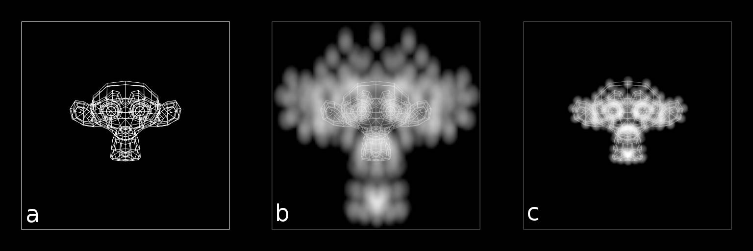
Fig. 5.19) Object space vs. world space in point density textures. Suzanne inside a cube, which has the point density texture applied. Source are the vertices of the mesh, the rendering is done in orthographic mode.
a) The render setup in OpenGL. It has been superimposed over b) and c).
b) Object space. The points are stretched to fit the cube.
c) World space. The points are located exactly at the position of the vertices.
Radius
The radius of the volumetric spheres around each point in Blender Units.
Interpolation
How the voxel grid is rendered. Internally, Cycles uses a voxel grid to store the density information gathered from the points, similar to data from smoke simulations. When rendering, the voxels are interpolated using different methods. Closest is the fastest, but looks blocky. Linear is the default. It renders quickly, but you can still see the underlying voxel grid. Cubic takes roughly 30% longer than linear and yields the smoothest result.
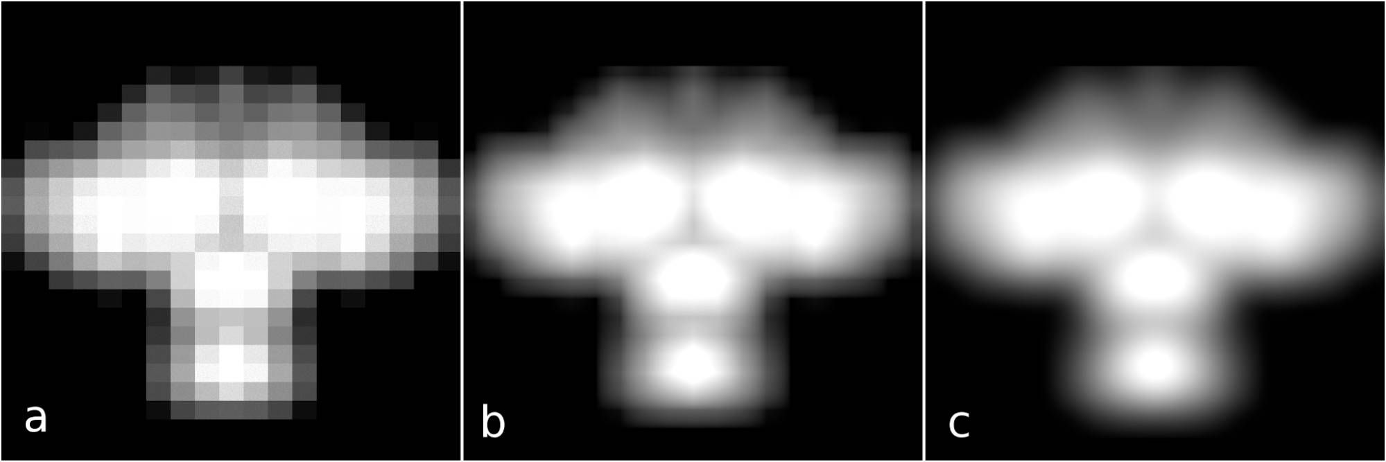
Fig. 5.20) Low resolution point density rendering of the vertices of the Suzanne model with different interpolation modes.
a) Closest
b) Linear
c) Cubic
Resolution
How fine or coarse the voxel grid is. Higher values result in smaller voxels. The voxel grid is based on the bounding box of the object whose vertices are visualized or on a virtual bounding box of the particle system, not on the bounding box of the object that has the point density texture in it's shader tree.
High resolutions can take a very long time to initialize and will require huge amounts of RAM.
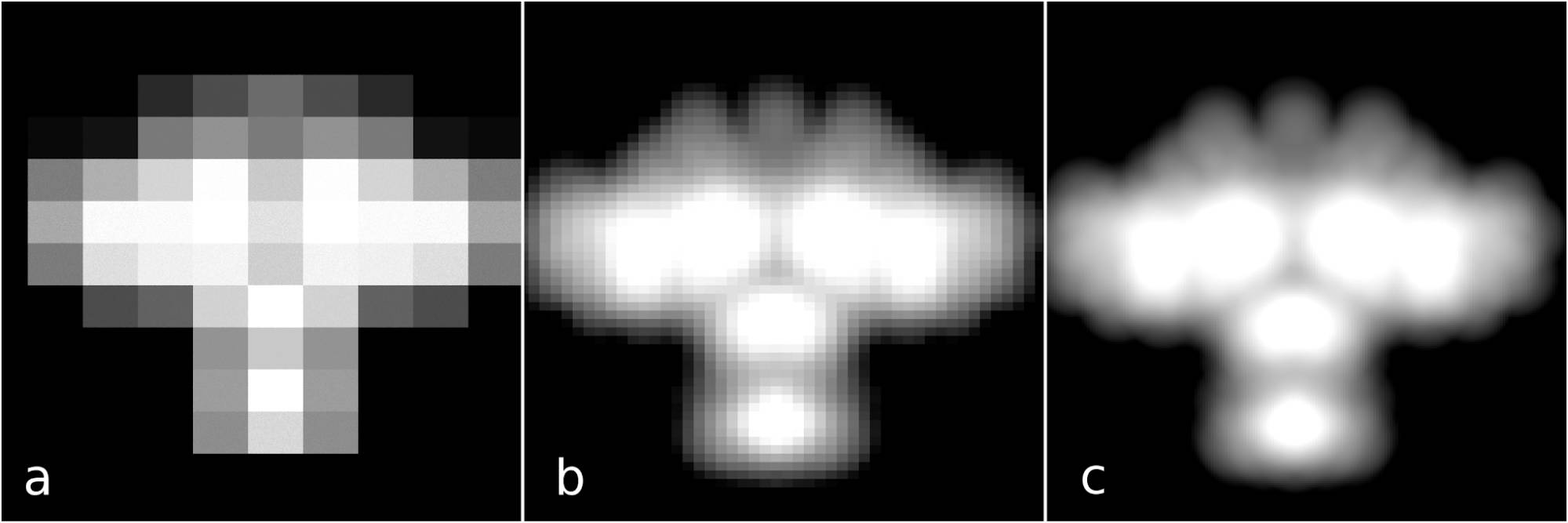
Fig. 15.21) Point density rendering of the vertices of the Suzanne model with closest interpolation and varying resolutions.
a) Resolution: 10
b) Resolution: 50
c) Resolution: 200
Color Source (only available when Particle System was chosen)
Sets the particle property that affects the Color output:
Particle Age
The age of the particle relative to its lifetime mapped from black to white or 0 to 1 respectively.
Particle Speed
The speed of the particles mapped from black to white or 0 to 1 respectively. The speed is clamped at 1, so the effect only works for particles that are moving very slowly.
Particle Velocity
The speed of the particles separated by axis, XYZ → RGB. The output is not clamped and can output negative values.
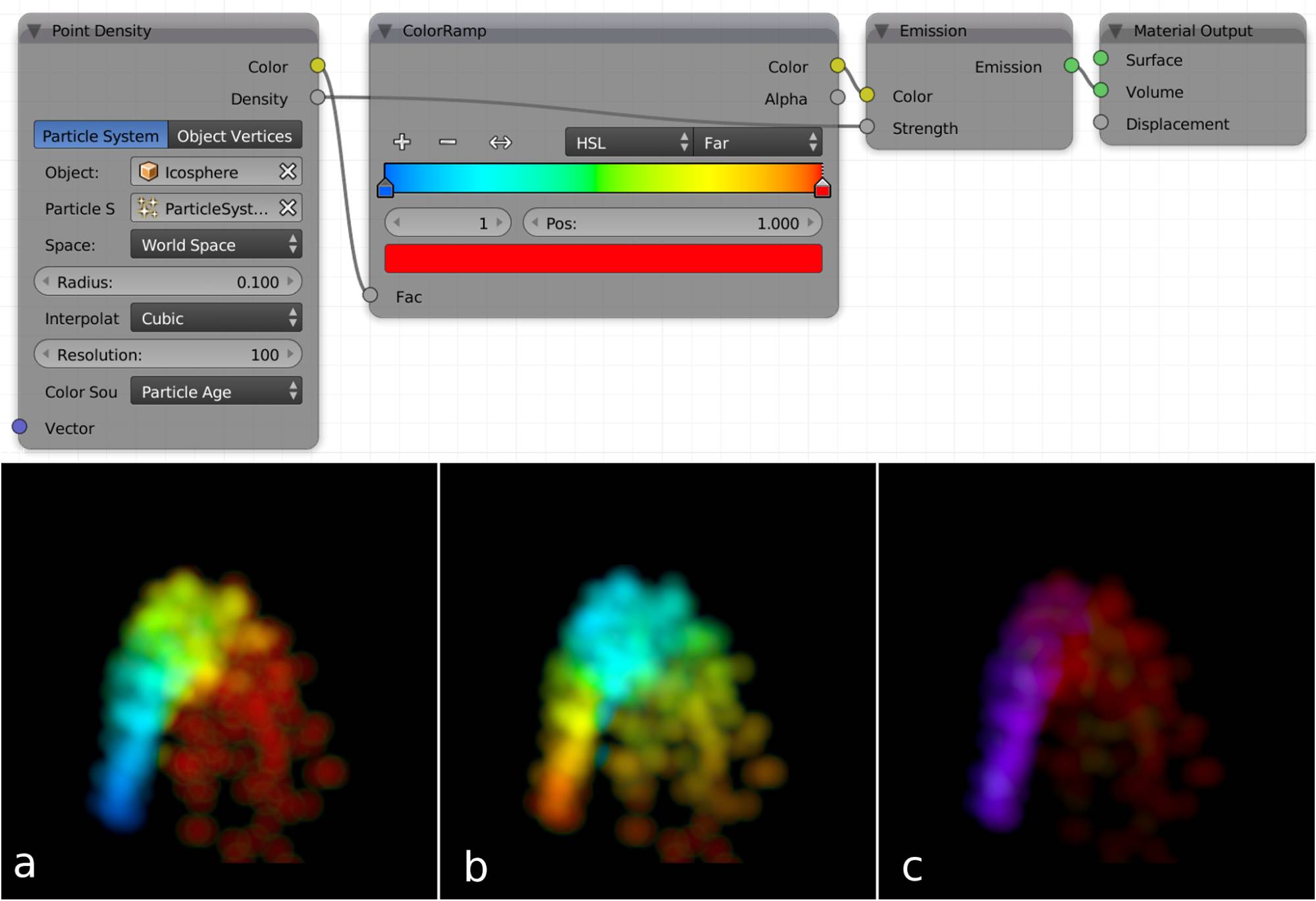
Fig. 5.22) A point density particle fountain with particle starting speed X and Z direction and a little gravity. For age and speed a color ramp was used (top) while velocity shows the direct output of the color socket. The colors mix when particles of different age or speed are close to each other.
a) Particle age. The colors change from blue (birth) to red (death).
b) Particle speed. The particles start at a high speed (red), get slower (blue) and then faster again.
c) Particle velocity. The colors correspond to the speed along the X-, Y- and Z-axis. In this example the particles get a starting speed along Z-axis (blue) and X-axis (red). Due to gravity the particles lose momentum along the Z-axis and thus they are colored purely red once they have reached the highest point of the arc.
Some internals about point density textures in Cycles
Point density textures in Cycles work differently from what you might be familiar with in Blender Internal. That is because the common way of computing point densities at render time is not very suitable for path tracing engines like Cycles. That's why the developers created a kind of hack. Instead of computing the density for every volume step, a voxel grid like in smoke simulations is used. In a first step, every cell in the grid computes a density based on the points inside it and around it. This grid is loaded into the RAM and then used by Cycles for rendering the volumetric effects.
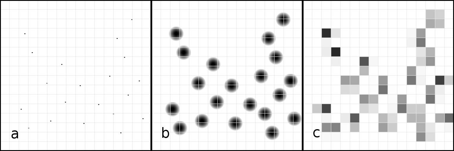
Fig. 5.23) The process of computing point densities in a 16x16 grid.
a) The position of a set of points with grid overlay.
b) The radius of each point with grid overlay.
c) The resulting densities of the grid cells.
This approach has the effect that a larger radius of the points results in a longer setup time for the grid because each cell has to search for points in the surrounding cells up to the radius of the points.
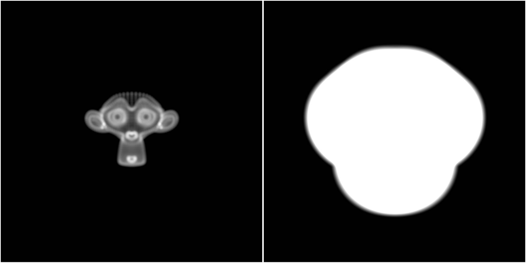
Fig. 5.24) Rendering of point densities with a resolution of 200 and two different radii.
Left: Radius: 0.025 - render time: 00:26.24
Right: Radius: 0.5 - render time: 03:56.52
The right one took a lot more time to render, because of the larger search volume around each cell.
The voxel grid always converts the entire object or particle system selected, even in world space mode. It is not based on the size of the “domain”. For object vertices, it uses the texture space of the object. For particle systems it uses a virtual bounding box covering all of the particles.
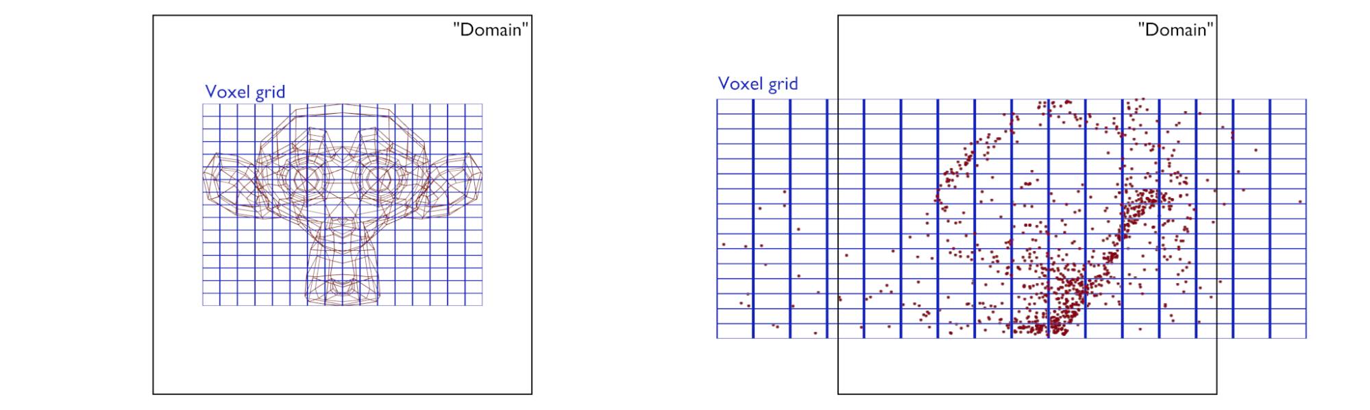
Fig. 5.25) The voxel grid is based on the object or particle system selected, not on the object used as a “Domain”, i.e. not on the object that has the point density texture in it’s material. This applies to both world space and object space.
Since the voxel grid is based on the object visualized, the point density texture can suffer from smearing artifacts. In that case simply increase the resolution:
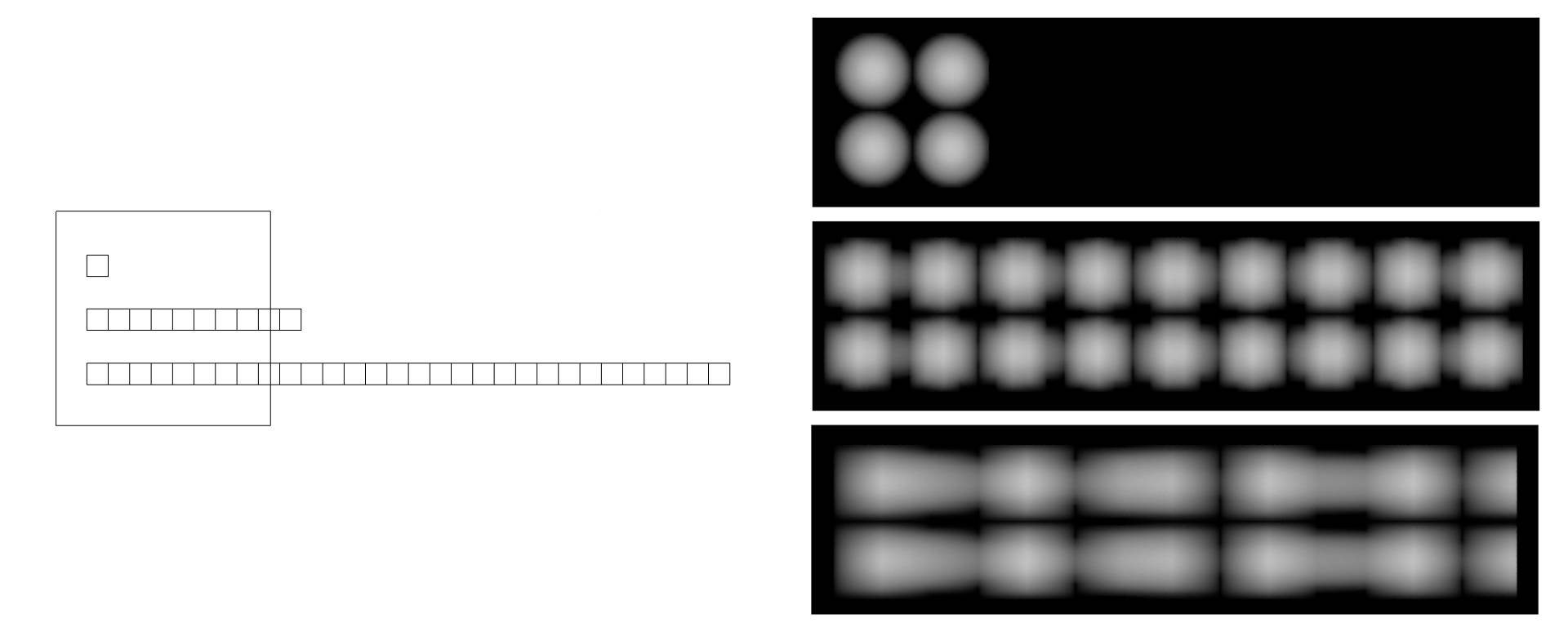
Fig. 5.26) Point density render comparison of objects of different widths at the same voxel resolution.
Left: OpenGL view of the domain and the three objects from the top.
Right: The voxel grid gets more and more stretched the more non-uniform the object is. This can even lead to smearing. A remedy would be to use a higher voxel resolution.
Point density textures are currently generated in texture space . That is the bounding box of an object without modifiers applied. That means if you use modifiers that deform the geometry, it can happen that the objects span across the border of texture space, resulting in a cut-off effect. This is something the Blender developers plan to fix in future releases:
Fig. 5.27) Point density textures are generated in texture space, which can lead to trouble with deform modifiers.
Top row: Object without modifiers, renders perfectly.
Bottom row: The same object with a simple deform modifier. It now protrudes it's texture space, resulting in a cut-off point density render.