Chapter 2: Shader Nodes (H)
Since the main focus of this book is on the nodes for Cycles materials, we are not starting from the top of the list you get when you press SHIFT + A in the node editor, but with the essentials. A Cycles material needs at least one shader input and a material output node. The entity of nodes used make up a material.
Almost all shader nodes, except add, mix and holdout have a color and most of them also have a normal input along with several other options. Emission and transparent nodes do not have a normal input, since displacing their surface would not show in render anyways.
The color either needs an RGB value, meaning a plain color, a texture or vertex color information.
The normal input is almost exclusively used by normal maps which are used to make a plain surface look more detailed, see . For even more details on normals see .
Btw.: BSDF stands for bidirectional scattering distribution function. In Cycles it is a mathematical function that describes how light is treated when it hits a surface.
Diffuse BSDF (D)
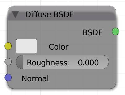
When you create a new material, the two nodes you will see are a diffuse shader node connected to a material output node. Most materials have a diffuse component, which is why this shader is default for new materials, however it tends to look a bit dull without a bit of a or similar component mixed into it.
Aside from the normal input, the diffuse node has two inputs, color and roughness.
Roughness could also be labeled softness, so the higher the value the softer your surface will appear. In general the roughness controls how much light hitting the surface gets scattered. You can either use the value slider or a grayscale map to control its strength. Technically speaking a roughness greater than 0 switches the shading method from Lambert to the Oren-Nayar method. Lambert's law assumes an ideal diffuse surface, which does not exist in the real world, where a surface looks diffuse due to bumps on microscopic scale. Those bumps don’t just scatter the light, they also shadow it a little bit. Oren-Nayar takes this effect into account.
Trivia :
Johann Heinrich Lambert stated in 1760 that a diffuse surface will look equally bright from all viewing directions and this model is still the most commonly used model in computer rendering. But it does not take into account the roughness of a surface. 230 years later Michael Oren and Shree K. Nayar developed a shader that actually does. So it is actually more accurate for surfaces that reflect very soft (diffuse) light, like concrete or plaster.
Color :
Input for an RGB or a texture.
Roughness
Higher Values make the material seem smoother.
Normal
Lets you use a , to displace the surface of each shader of your material individually.
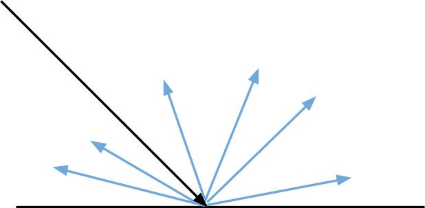
Fig. 2.1) Light ray hitting a diffuse surface. On a diffuse surface reflected rays will get scattered in random directions.
Since there is a random factor involved, each ray hitting a diffuse surface will bounce in a different direction. This means, sometimes it will hit a light source, sometimes it will hit a brighter object, sometimes a darker one afterwards. One might think that diffuse shaders thus need a lot of samples to clear up, but due to , the opposite is true, because diffuse shaders work perfectly with shadow rays.
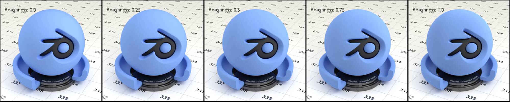
Fig. 2.2) Renderings of a diffuse shader with different roughness settings, from left to right: 0.0, 0.25, 0.5, 0.75 and 1.0. Note how the material looks both smoother and darker with increased roughness
Glossy BSDF (G)
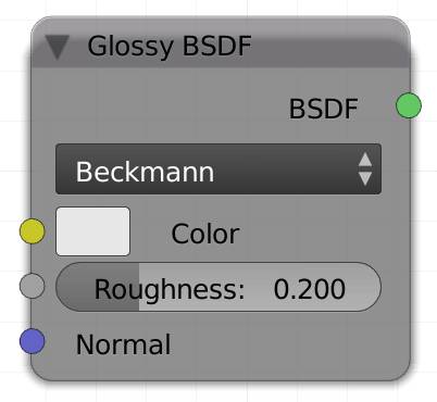
The glossy shader is most commonly used for metallic surfaces or mirrors. In addition to the normal, the glossy node has two inputs, color and roughness. The brightness of the color will influence the minimum brightness an object needs to have, in order for it to be seen in the reflection, or in other words, the reflectivity. This means you cannot get dark shiny objects with only a glossy shader, you will have to mix a dark diffuse shader with a bright glossy shader to achieve this effect.
Roughness determines how strongly rays hitting the surface are getting scattered. Similar to Oren-Nayar for the diffuse shader the glossy shader treats roughness as microscopic structures (microfacets) on the surface which don’t just scatter light but also create self-shadowing.
The more roughness, the more blurred the reflections will appear. It also indirectly influences the maximum distance of objects that can still be seen in the reflections. You can either use the value slider or a grayscale map to control its strength.
There are four different modes, called distribution, to use this node in. They only make a difference when roughness is used.
Beckmann
Standard method for calculating glossy surfaces in computer graphics.
GGX
More realistic than Beckmann in terms of self-shadowing. The differences between Beckmann and GGX are fairly small. We found that GGX produces a bit more noisy and less detailed reflections.
Ashikmin-Shirley
This is the latest addition to the Cycles glossy shader. It is more accurate in regard to energy conservation than the other distributions and thus more realistic. It also causes less problems with dark edges in certain light conditions. With low roughness it behaves pretty much like a median of Beckmann and GGX. Darker areas are not as dark as with Beckman and not as bright as in GGX. Only with roughness above 0.7 it starts to appear darker than the other two.
Sharp
In this mode the roughness slider will not make any difference, however if you know you are going to use a perfectly reflective surface, this mode will compute faster than the other three. Rays originating from the camera and hitting a surface with a sharp glossy shader keep the attribute singular ray .
Color
Input for an RGB or a texture.
Roughness
Higher Values make the reflections seem more blurry.
Normal
Lets you use a , to displace the surface of each shader of your material individually.
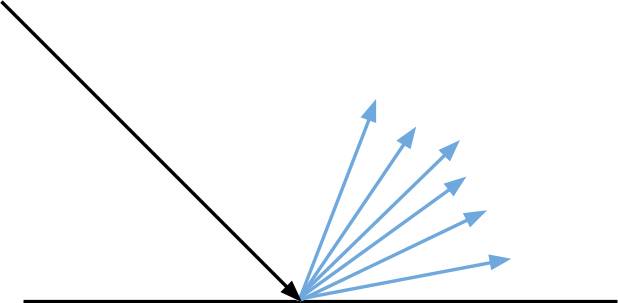
Fig. 2.3) Light rays hitting a glossy surface. On a glossy surface scattering of the reflected rays is relative to the angle of the incident ray. The spread is determined by the roughness setting.
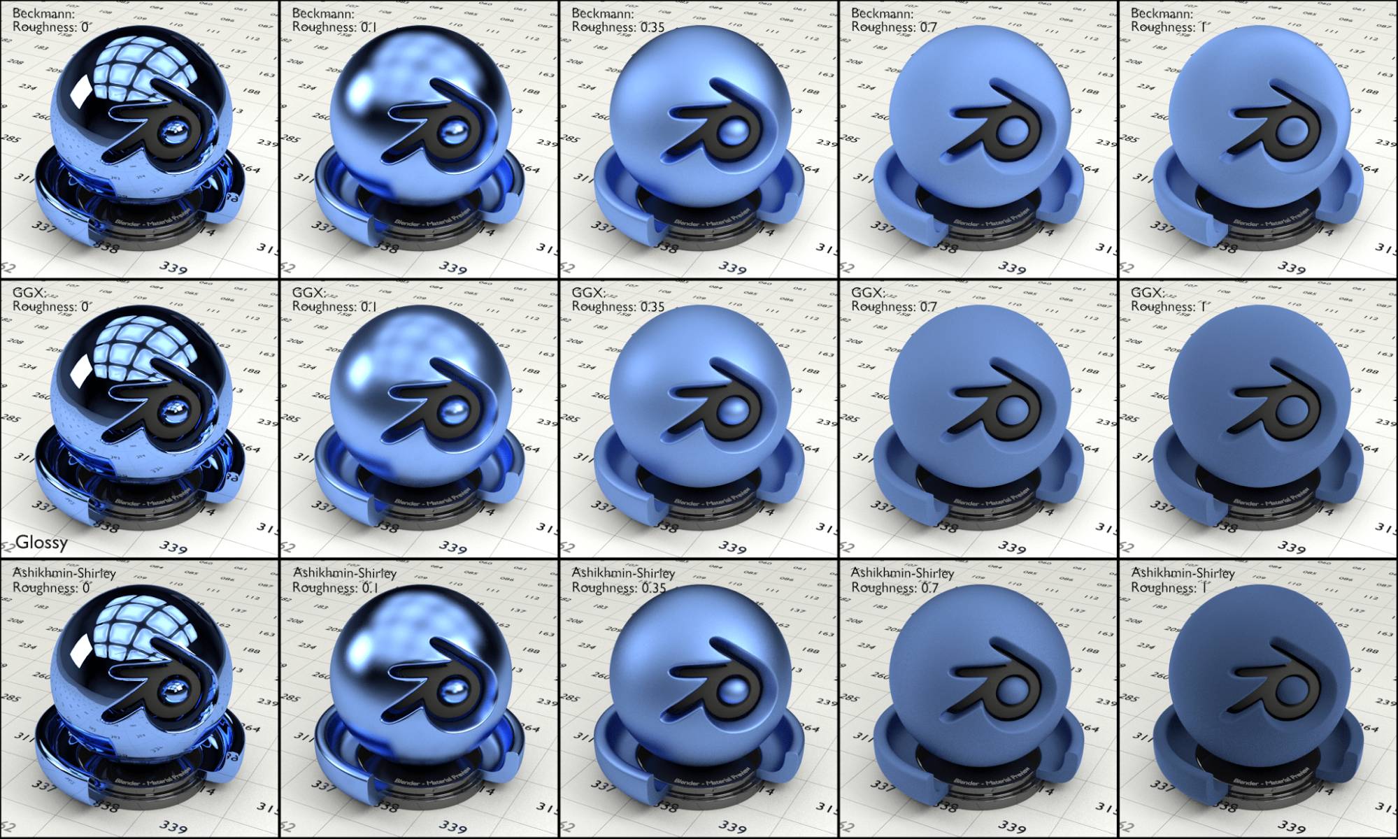
Fig. 2.4) Renderings of glossy materials. 1. row: Beckmann distribution type, 2. row: GGX distribution type, 3. row Ashikmin-Shirley. The values for roughness were the same for all rows, from left to right: 0, 0.1, 0.35, 0.7, 1. Note how the reflections were getting more and more blurry with increased roughness, until the material looked almost like a diffuse material. Sharp distribution was skipped in this test, because there is no visible difference between sharp and the other three with a roughness of 0. However sharp renders faster than the other 2, so consider it, when using perfect reflections. Note that - compared to GGX - with increased roughness Beckmann distribution resulted in brighter highlights, while Ashikmin-Shirley became considerably darker.
Transparent BSDF (T)
The transparent shader can make your object invisible in rendering. It only has one input: Color. An RGB value of 1,1,1, pure white, will make it 100% transparent, all values in between true white and pitch black will be influencing the material in terms of transparency (brightness) and color modulation (hue / saturation).
The transparent shader is not physically correct, so in photo realistic renderings it will usually be mixed into the material by a factor. One example would be a leaf texture. Nobody will examine every single leaf on a tree, so it’s worth cheating a bit to save computing power. You can use a texture where there is a leaf on a transparent background, use the image’s alpha output as a factor for a shader mix node, to cut out the leaf of a single face, instead of modelling the geometry.
It also works great to make hair look more fluffy, if mixed into the shader along the strand, see node .
Hint: If you don't need any caustics, refractions or reflections in your transparent material, use this shader instead of glass as it renders significantly faster and produces less noise.
Hint: Transparent shaders are the only shaders that do not block shadow rays.
Hint: A glass shader with IOR 1.0 will look like a transparent BSDF but a ray passing through it will become a transmission ray while a ray passing through a transparent BSDF will become a transparent ray (to be used with the transparent depth o ption of the .)
Color
Input for an RGB or a texture. The lightness of the color will determine the transparency, the hue saturation will influence the tint.
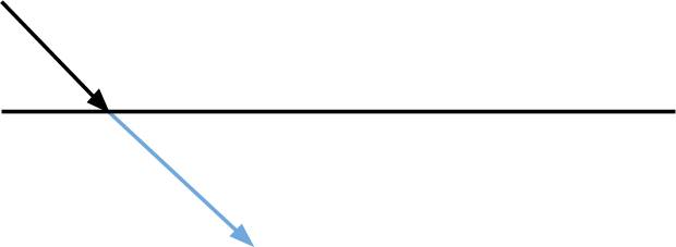
Fig. 2.5) Ray hitting a transparent shader. It will not change its direction, but color absorption might happen and its transparent depth value will be increased by 1.
Fig. 2.6) Renderings with a transparent shader. In the first row the color is neutral and the lightness values varied, the values from left to right were: 0, 0.25, 0.5, 0.75 and 1.
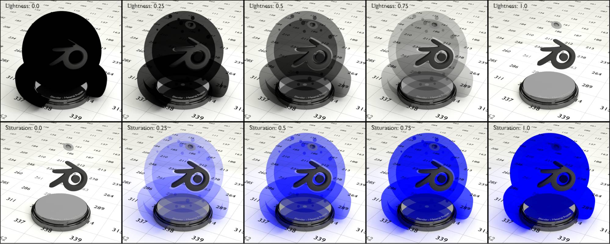
In the second row the saturation values were altered. The values were 0, 0.25, 0.5, 0.75 and 1.
As you can see in fig. 2.6, the resulting transparency of an object with the transparent shader is dependent on the lightness as well as the saturation of the color. In the lower row, you can see that each time a ray passes through a colored transparent surface it gets tinted a little more. If we start with a saturation value of 1, there is no way to saturate the pixels more, so the entire objects looks like one shadeless shape, even though it is hollow.
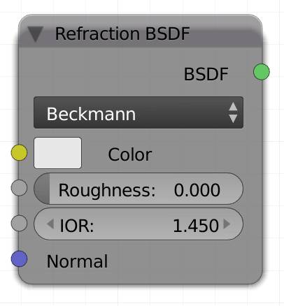
Refraction BSDF (R)
A refraction shader acts like glass but without the reflections. Light passing through it will get tinted, bent and scattered. The transparency of the shader is dependent on the color value (lightness) and the modulation (hue / saturation) will influence the tint of light passing through the object.
Hint: A refraction shader with IOR 1.0 will look like a transparent BSDF but rays passing through it are actually transmission rays.
Note: The refraction shader should be mixed with a with a value for the factor for best results. This way you get a glass material, where you can influence the glossy and the transmission values separately, see fig. 2.12 in the chapter.
This material comes in three modes:
Beckmann
Standard method for calculating glossy or refractive surfaces in computer graphics. It comes with a rough slider to control how blurry transmissions will appear.
GGX
The differences between Beckmann and GGX are fairly small. We found that GGX produces a bit more noisy and less detailed blurs, while render times are almost identical. Also this mode seems to brighten surfaces with normals pointing further away from the camera.
Sharp
In this mode the roughness slider will not make any difference, however if you know you are going to use a transparent material that does bend light, this mode will compute faster than Beckmann or GGX.
Color
Input for an RGB or a texture.
Roughness
This is the amount of scattering for transmitting light. Higher values will make the image behind the object appear more blurred, an effect you can see in milky glass
IOR
The index of refraction will determine how much a light ray entering the object will get bent.
Normal
Lets you use a , to displace the surface of each shader of your material individually.
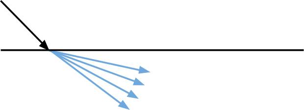
Fig. 2.7) Ray passing through a refractive surface. A refraction BSDF changes the direction of the ray depending on the IOR. Roughness determines how much the rays get scattered .
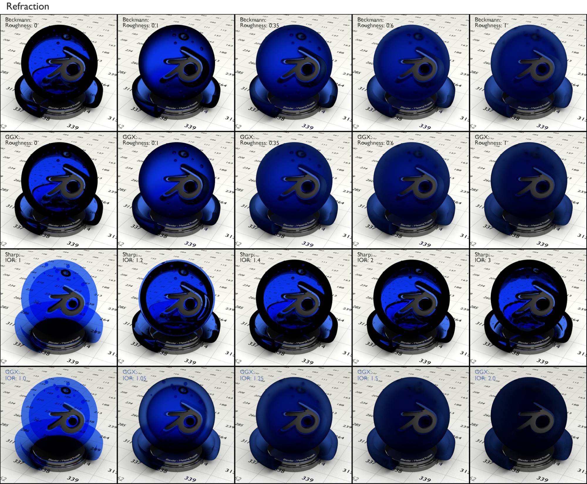
Fig. 2.8 Renderings with a refraction shader. Rows 1 and 2 show the same values with different distribution types. Row 1: Beckmann distribution, row 2: GGX distribution, from left to right the settings for the roughness were: 0, 0.1, 0.25, 0.6 and 1.
Note how this material had the same refracting attributes as glass, but did not show any reflections. With increased roughness the image behind the sphere got more and more blurred.
Row 3 shows the sharp distribution, here the IOR values differed, from left to right: 1, 1.2, 1.4, 2, 3. Note how the refraction increased, thereby distorting the image behind the sphere with increasing IOR value.
Row 4 shows a roughness of 1.0, but with different IORs, from left to right: 1.0, 1.05, 1.25, 1.5, 2.0. Note how the perceived roughness increases with IOR even though it is always at 1.0. This nicely shows how roughness and IOR are tied together in the refraction shader.
Glass BSDF (B)
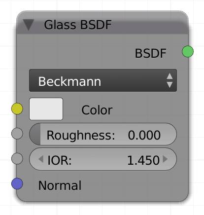
The glass shader is mainly used for – you guessed it – glass. Of course it can also be used with any material with refractive and reflective attributes, like water. An RGB value of 1,1,1 - pure white will make it 100% transparent, all values in between true white and pitch black will be influencing the material in terms of transparency and reflection (brightness), as well as color modulation of the two (hue / saturation).
Hint: You can re-build the glass shader by mixing a shader and a shader based on a input to get a setup with finer control (fig. 2.12).
Beckmann
Standard method for calculating glossy or refractive surfaces in computer graphics. It comes with a rough slider to control how blurry transmissions will appear.
GGX
The differences between Beckmann and GGX are minute. We found that GGX produces a bit more noisy and less detailed reflections and refractions if the roughness is increased, render times are almost identical. Also this mode seems to brighten surfaces with normals pointing further away from the camera.
Sharp
In this mode the roughness slider will not make any difference, however if you know you are going to use a clear glass material, this mode will compute faster than Beckmann or GGX.
Color
Input for an RGB or a texture. The lightness controls the transparency and the hue/saturation the tint of transmission and reflections.
Roughness
The roughness controls how much light hitting the glass gets scattered. The more roughness, the more your object will look like frosted glass, the reflections and the transmissions will seem increasingly blurry.
IOR:
The Index of refraction determines how much a light beam traveling through the glass object gets bent. Its default value, 1.45, is the value for light glass.
Normal
Lets you use a normal map, to displace the surface of each shader of your material individually.
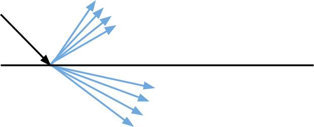
Fig. 2.9) Ray hitting a glass surface. If rays hit a glass surface, some of them will travel through the material and get bent by the factor indicated by the IOR settings. After leaving the object, the ray will get bent again this time in the opposite direction. The rest will get reflected. If you increase the roughness, the rays will not be reflected and refracted uniformly, but scattered (blue arrows). This results in both blurry reflections and transmissions. The ratio between reflection and refraction is determined by the angle of the incident ray (see ).
Here are some examples for the index of refraction of different materials.
Air: 1.000
Ice: 1.310
Water: 1.333
Clear plastic: 1.400
Light glass: 1.45
Acrylic glass: 1.491
Benzene: 1.501
Standard glass: 1.520
Amber: 1.550
Diamond: 2.417 - 2.541
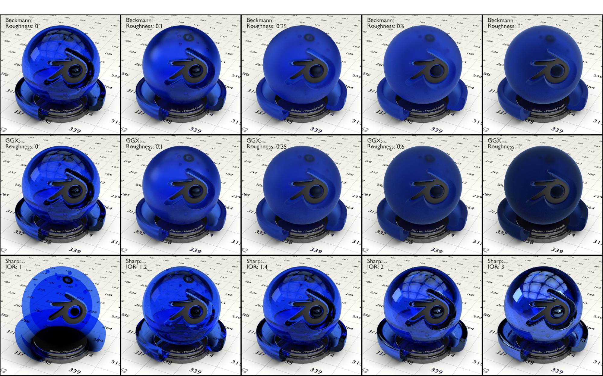
Fig. 2.10) Renderings with a glass shader. Rows 1 and 2 show the same values of IOR with different distribution types. Row 1: Beckmann distribution, row 2: GGX distribution, from left to right the settings for the roughness were: 0, 0.1, 0.25, 0.6 and 1.
Note how the increase in roughness blurred the image behind the sphere as well as the reflections.
Row 3 shows the sharp distribution, here the IOR values differed, from left to right: 1, 1.2, 1.4, 2, 3.
Note how the refraction increased, thereby distorting the image behind the sphere with increasing IOR values. At the same time the Fresnel effect was more visible, resulting in stronger reflections.
Correct setup for colored glass
As you see from the example renderings in fig. 2.10, the glass shader is not very realistic once color comes into play. The reflections get tinted, a phenomenon not found in real colored glass. Thicker parts get the same brightness and tint as thinner ones. It is way more saturated than the color you actually set in the shader because for two surfaces the ray gets tinted two times, and even more when the ray enters a surface, leaves and enters another one and leaves again.
To set up the glass node physically correct for colored glass, water, plastic etc. it needs to be combined with a shader with the color of the glass shader set to pure white (1.0, 1.0, 1.0). See fig. 2.11):
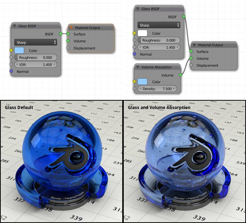
Fig. 2.11) Colored glass using only the glass shader (left) and a glass shader with purely white color and a volume absorption node for the actual color (right). The version on the right is way more realistic because reflections don’t get tinted and the saturation is based on the thickness of the glass or more accurately on the length a ray travels through the glass, not on how many surfaces it touches. You can see the difference most clearly on the bottom right of the object, where rays entering the edge will travel very far due to reflections occurring on the inside, thus making the edge very pronounced compared to the part where the ray just enters and leaves again.
Re-creating the glass shader from refraction and glossy shaders
The Cycles glass shader can actually be re-created 1:1 from refraction and glossy shaders. The key is to mix refraction and glossy by a Fresnel factor equal to the refraction IOR, see fig. 2.12. The result is a glass material that offers finer control because reflection and refraction become separate properties.
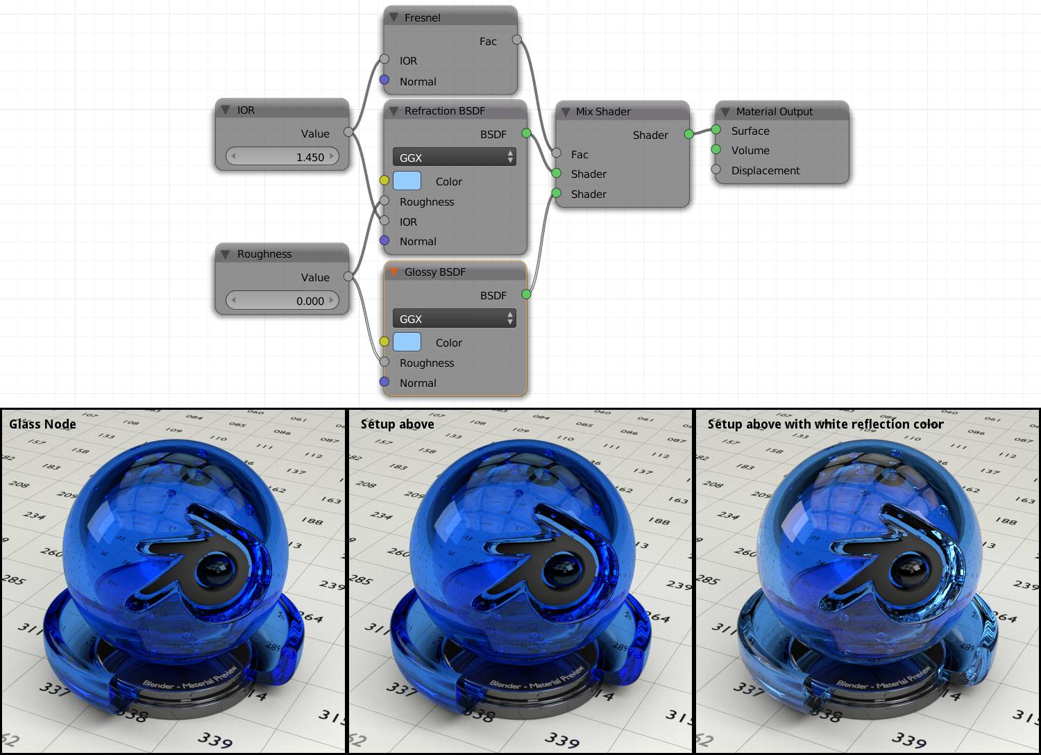
Fig. 2.12) Left: The Cycles glass shader. Middle: The setup shown above. The results are identical. Right: The setup above, but with purely white color for the glossy shader. The result is still not physically accurate like in fig. 2.11, but it adds some nice highlights where otherwise darker spots would be.
As a final note for the glass shader: If your objects are turning out to be black, even though you would expect them to be transparent, try enabling refractive caustics. For more detail, .
Translucent BSDF (N)
A lot of objects allow light to pass through them. If light passing through an object gets scattered a lot, you cannot see a clear image through your object. You will however, see differences in light and shadow as well as blurred forms through your object. This effect is called translucency and can be achieved with this shader. The thinner your object and the lighter your color input the brighter a backlight behind your object will appear, whereas the hue/saturation will determine the tint of your material. The thinner the object, the faster the translucent shader will clear up.
Technically, the translucent shader works like the , but the rays get scattered on the opposite side of the face. The random factor of the scattering is responsible for the noise translucent and diffuse materials produce, since for every sample the rays get scattered in a different direction and it takes many calculations until the correct mean value is reached.
Color
Input for an RGB or a texture.
Normal
Lets you use a normal map, to displace the surface of each shader of your material individually.
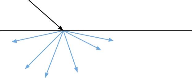
Fig. 2.13) Ray passing through a translucent surface. A translucent shader works like a diffuse one, but the rays get scattered on the opposite side of the surface.
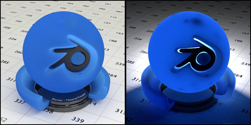
Fig. 2.14) Rendering of a translucent shader. Left: Using the default b.p.m.s. light setup. Right: A single lamp was placed behind the object, all other lights turned off. The blue tint of the area in shadow is not a caustic because the translucent shader counts as diffuse.
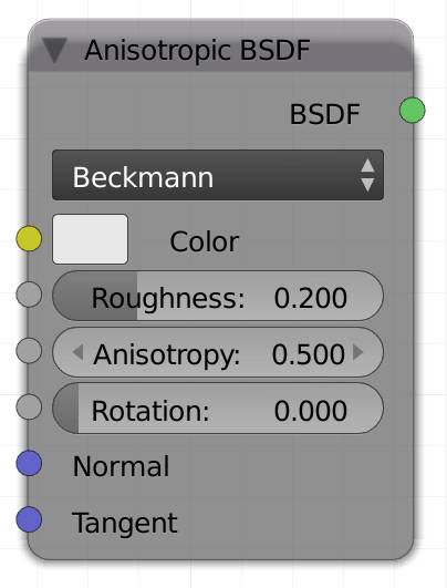
Anisotropic BSDF (S)
Brushed metal has a lot of tiny grooves. Unscientifically speaking these grooves sort of trap the light ray, directing it along them. can produce a similar effect as well.
The anisotropic shader simulates this effect and results in a surface that looks like brushed metal.
This way bright reflections will look as if they had been stretched along the tangents of the object's faces.
For a more detailed explanation of tangents see the .
Color
Input for an RGB or a texture.
Roughness
How much reflections get blurred. Lower values will make the lines along the surface caused by the reflections sharper by increasing their contrast.
A value of 0 will make the material look more like a .
Anisotropy
This value determines how much reflections get stretched along the tangents.
Rotation
Rotates the direction of the stretched reflections.
Normal
Lets you use a normal map to displace the surface of each shader of your material individually.
Tangent
Tangents are usually following a hypothetical cylinder around your object that is oriented along the local z axis of your object. In an anisotropic shader, reflections will be stretched along these tangents, you can alter their direction by using a custom input in this socket.
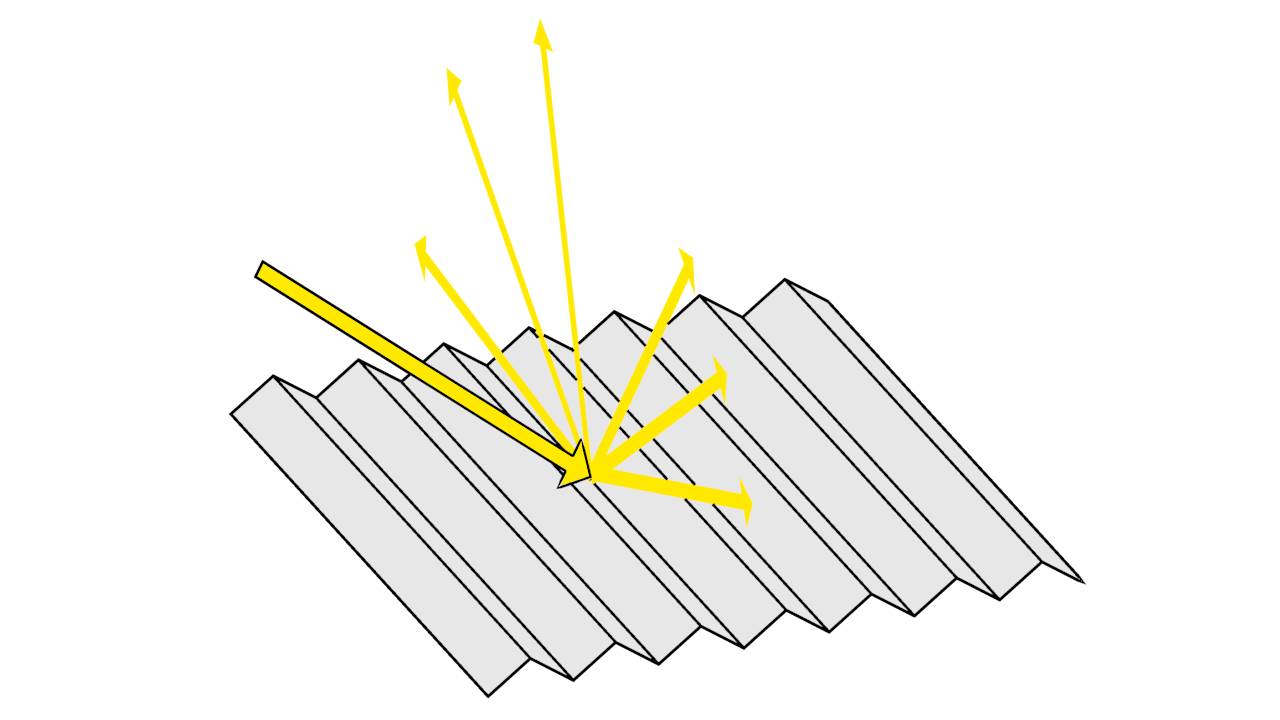
Fig. 2.15): Ray hitting an anisotropic surface. Anisotropic shading simulates tiny grooves on a surface, trapping the light rays and thereby stretching the reflections.
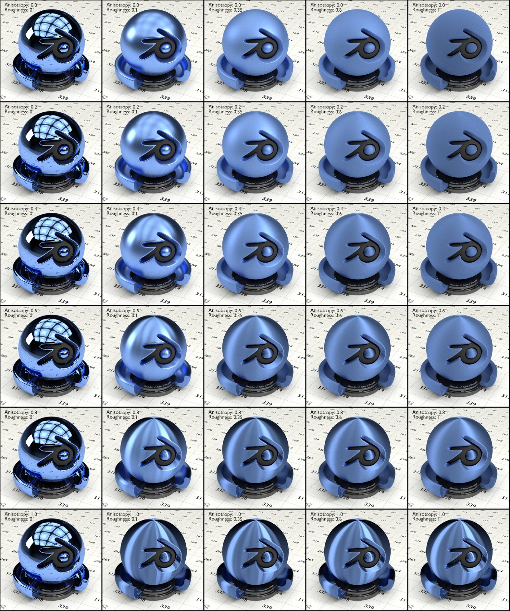
Fig. 2.16) Renderings with the anisotropic shader. From left to right the roughness and top down the anisotropy was increased. The values for roughness were: 0, 0.1, 0.35, 0.6 and 1, whereas the values for the anisotropy were: 0, 0.2, 0.4, 0.6, 0.8 and 1. The higher the roughness, the more the reflections were getting blurred. the higher the anisotropy value, the longer the reflections were getting stretched, in fact with an anisotropy of 1, there was only 0 or full roughness.
Note that there is little difference between the glossy shader and this one if either roughness or anisotropy is set to 0.
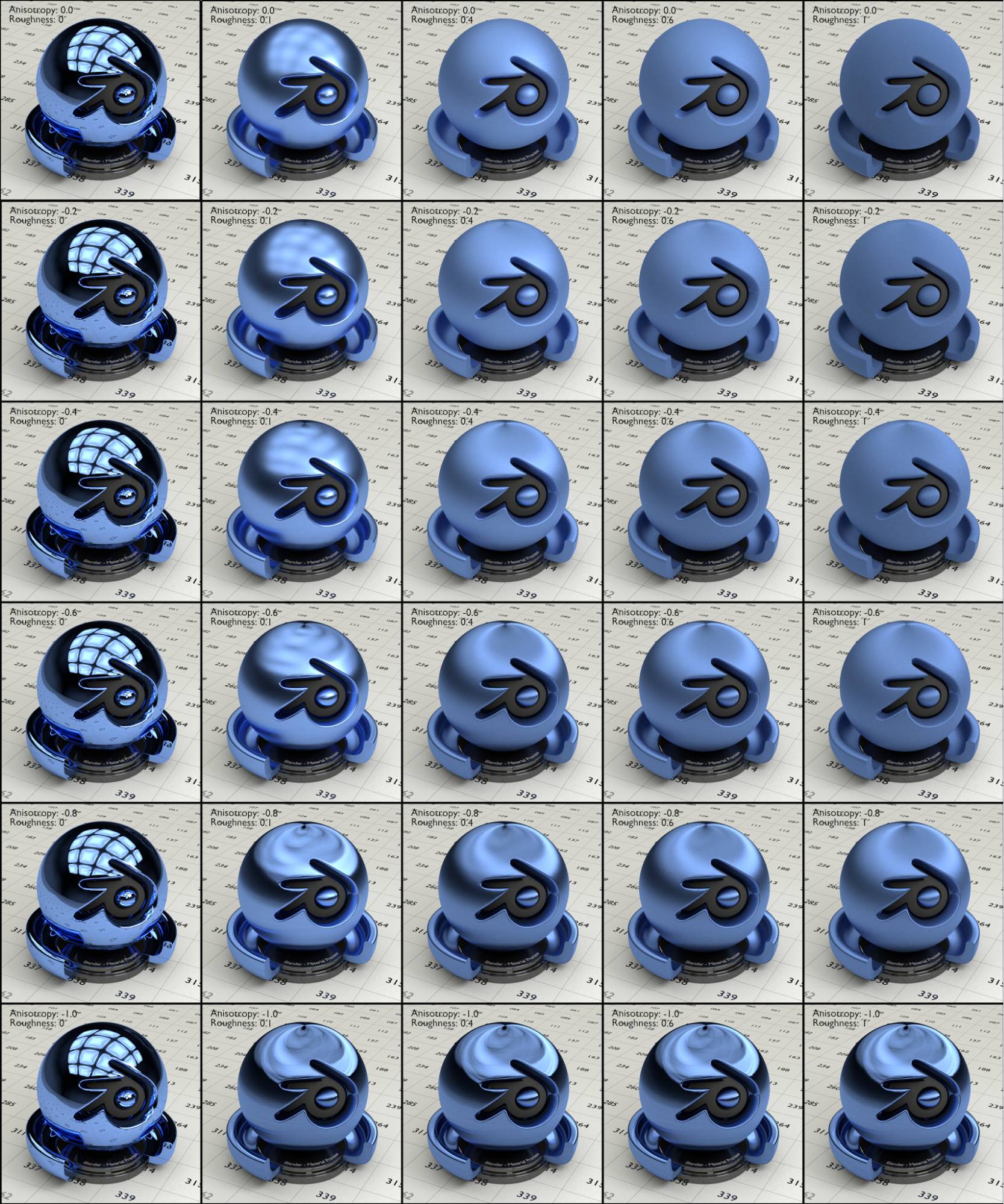
Fig. 2.17) Renderings with the anisotropic shader, this time with negative anisotropy. From left to right the roughness and top down the anisotropy was increased. The values for roughness were: 0, 0.1, 0.35, 0.6 and 1, whereas the values for the anisotropy were: 0, -0.2, -0.4, -0.6, -0.8 and -1. The higher the roughness, the more the reflections were getting blurred. The lower the anisotropy, the more the reflections were getting stretched. For a roughness of 0 no stretching occurred and with an anisotropy of -1, there was only 0 or full roughness.
Velvet BSDF (V)
The velvet BSDF scatters (reflects) more light for flat angles and has a higher absorption for steep angles. Thereby it simulates the attributes of satin, silk or - well - velvet.
The sigma value will control the variance of the normal distribution, thereby determining the sharpness of the peak. In layman's terms it determines how dark a spot will appear on the polygons facing the camera. The higher the value the smaller and less pronounced the spot will be.
You can think of it as a similar function to the roughness value of other shaders.
Hint: Mixing the velvet with a diffuse shader will produce smoother results.
Color
Input for an RGB or a texture.
Sigma
Higher values will make the dark spot smaller and less pronounced.
Normal
Lets you use a normal map to displace the surface of each shader of your material individually.
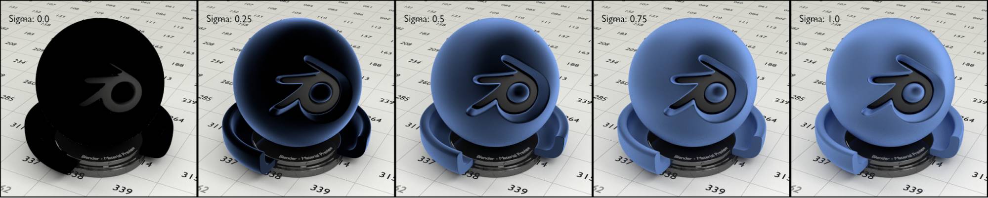
Fig. 2.18) Renderings with the velvet shader. From left to right the sigma value was increased: 0, 0.25, 0.5, 0.75 and 1. With increasing sigma the dark area in the middle got less visible. With a sigma value of 0 the velvet shader is of little use. In addition, it is meant to be combined with other shaders by a mix or add shader node.
Toon BSDF (F)
This shader will produce cartoon-like results. The main characteristic of a cartoon object is, that a surface usually only consists of one color with a maximum of two levels of brightness, usually only when simulating a round surface. The size input sets the angle of reflection between 0° and 90°. More commonly speaking, it will determine the size of the brighter one of the two areas. The smooth value influences the sharpness of the border between the two.
The position of the brighter area in relation to a light source can be set by using either the diffuse or glossy mode. In diffuse the brighter part will be around the spot where a diffuse object would be brightest. With glossy calculations that part will be where a light source would appear as a reflection. In both modes blurry reflections will appear as well.
The brightness of a light source will only influence the brightness of the peak , not the rest of the object, which will be controlled by the brightness of the chosen color.
Note: With a value of 1 for the size, there will only be two states for the smoothness, 0 and greater than 0. For example there will be no difference between 0.01 and 1.
Hint: Lamps with a small size will produce sharp transitions for both diffuse and glossy.
There are two modes:
Diffuse
Makes the toon shader react more like a diffuse material, with a fairly even brightness spread over your object.
Hint: To counter this effect use point lights only and uncheck glossy in the of your objects.
Glossy
In a well lit scene it produces a different kind of reflection than the other shaders that include a glossy component. They appear to be more stretched and with a smoothness of 1, only very brightest light sources get reflected, producing a specular effect.
Color
Input for an RGB or a texture.
Size
Higher values increase the area of the brighter one of the two colors.
Smooth
Smoothes the transition between the brighter color and the darker color.
Normal
Lets you use a normal map to displace the surface of each shader of your material individually.
Hint: If the smooth value plus the size value is greater than 1 choppy areas can occur (see below).
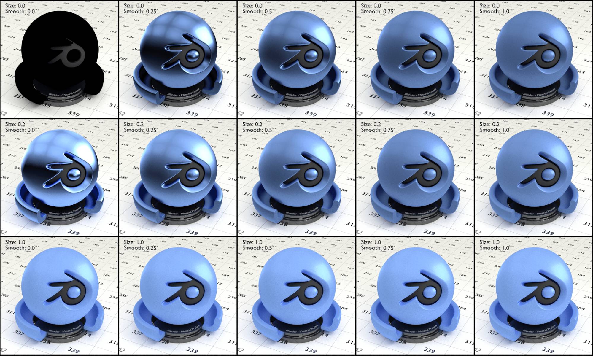
Fig. 2.19) Renderings with the toon shader set to diffuse. From left to right the smoothness was increased, the values were: 0, 0.25, 0.5, 0.75 and 1. Top down the size was increased, the values were: 0, 0.2 and 1. Note how in a well lit scene even the toon shader set to diffuse appeared like a glossy shader where the smoothness correlated with the roughness of a glossy shader. With a value of 0 for the size and 0.25 for the smoothness, you can see light sources being “reflected” in the test object.
Note that both the size and the smoothness affected the blurriness of the of those areas.
It is noteworthy that the glossy areas in fig. 2.19 are not true reflections. The “reflected” objects would illuminate a diffuse shader as well, but since we can set the smoothness of a toon shader to be very low, it creates a rather glossy looking effect, because the shapes of the light sources are rather well preserved in the illuminated areas. The illumination from below is also not the ground being reflected but the global illumination bouncing onto the toon object. To see how to counter this effect and make the material look “cartoony”, see fig. 2.21 below.
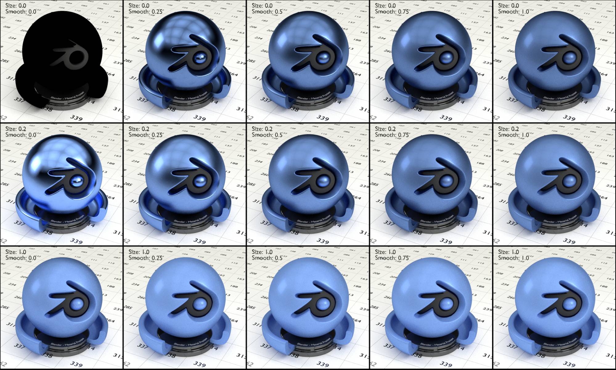
Fig. 2.20) Renderings with the toon shader set to glossy. From left to right the smoothness was increased, the values were: 0, 0.25, 0.5, 0.75 and 1. Top to down the size was increased, the values were: 0, 0.2 and 1. In a well lit scene the toon glossy shader did not look very cartoony, with low values for smooth and size it was much closer to an actual glossy shader. Note how the reflection of the mesh light on the left stayed clearly visible even with values of 1 for both smooth and size. In this lighting this is the key difference between the glossy and the diffuse setting for the toon shader. With a size of 1 any value greater than 0 for the smoothness looked the same.
For the following renderings we changed the lighting of the scene. The environment texture was replaced by a plain middle gray color, all the lamps were replaced by a single sun lamp. The toon shader interacts with both direct and indirect light, just the like the regular diffuse or glossy shader would. Therefore objects that are not a light source themselves will effect the lighting, which is usually something you do not want in a purely cartoon style. Therefore it is a good idea to disable the diffuse and glossy visibility of all objects in the scene except for the lamps. Also you usually want to use only one lamp or at least very few. To compare the ray visibility options see fig. 2.21.
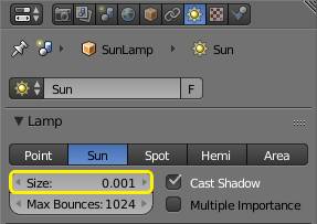
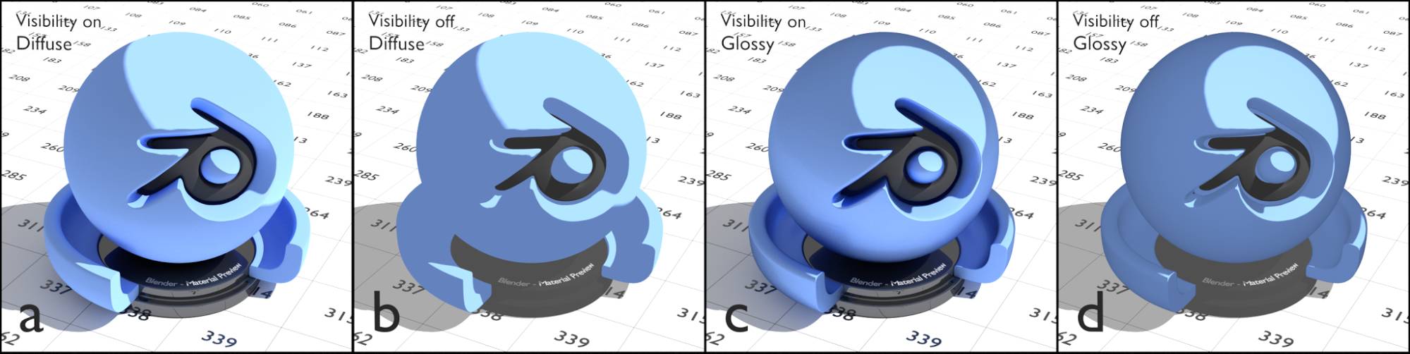
Fig. 2.21) a) + c) diffuse and glossy ray visibility of all objects turned on, b) + d) visibility turned off. The sun’ s ray visibility was always enabled for all ray types. Note how the material in b) has the shadeless areas which are typical for cartoon drawings, while the glossy version (d) remains hints of the overall topology, by creating a subtle gradient.
For the following renderings the ray visibility for glossy and diffuse was disabled for all meshes. If not stated otherwise the values for size was 0.5, smooth: 0, lamp size: 0.001 and and sun strength 3.
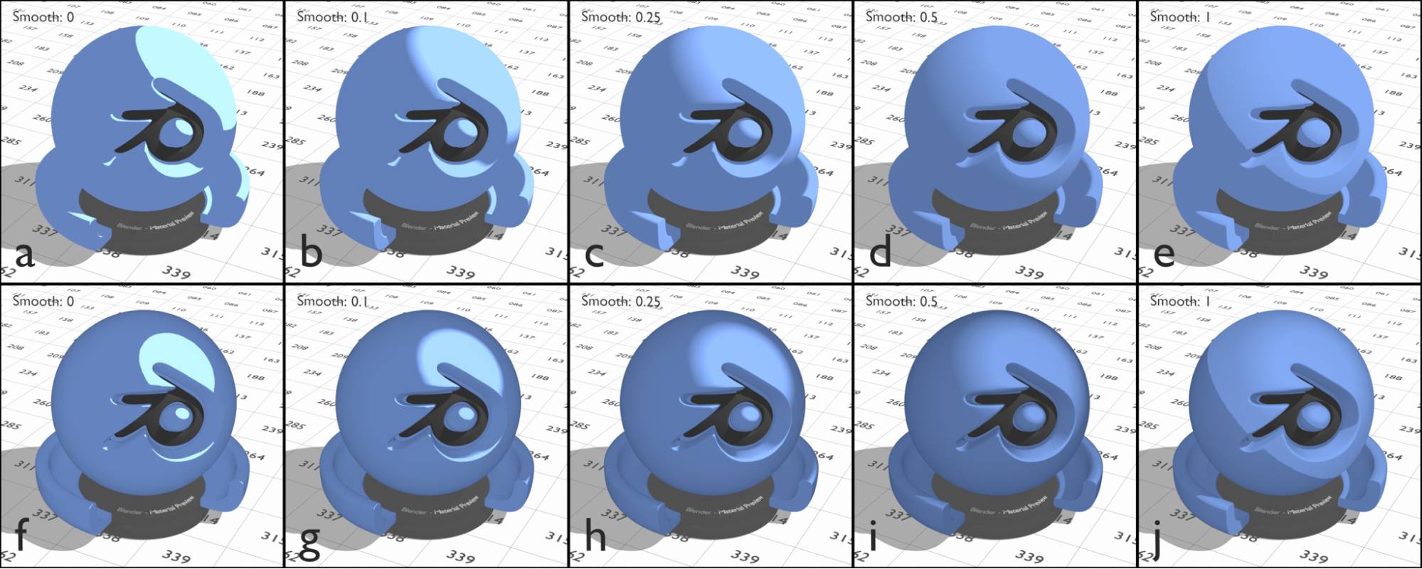
Fig. 2.22) Renderings of the toon shader with varying smooth size. In the upper row, the mode was diffuse, in the lower row it was set to glossy. a) + f) 0, b) + g) 0.1, c) + h) 0.15, d) + i) 0.5, e) + j) 1. Setting the size to 1 usually produces some unwanted effects: Note that e) and j) have a higher smoothness than the rest of the examples, but a sharp line occurs between the specular and the shaded area. This is due to the sum of the size and the smooth value being > 0, see below.
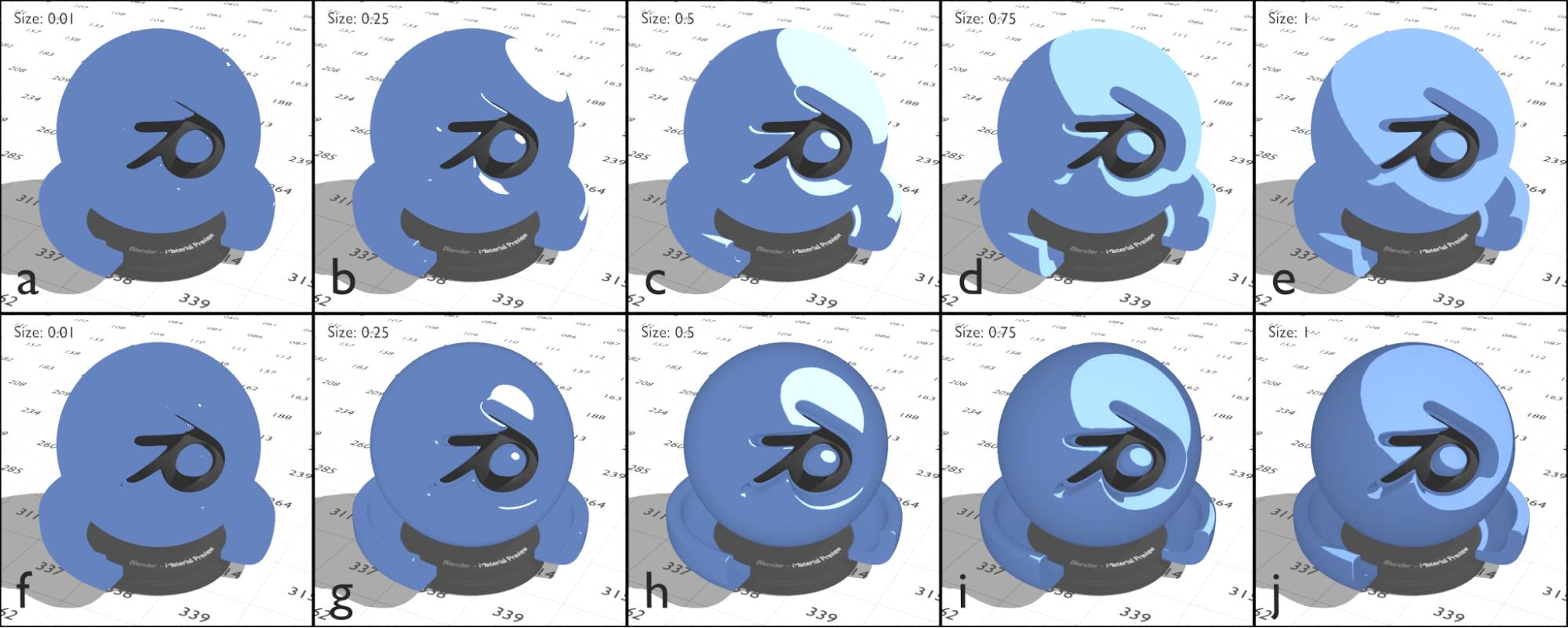
Fig. 2.23) Renderings of the toon shader with varying size factor. In the upper row, the mode was set to diffuse, lower row it was set to glossy. a) + f) 0.01, b) + g) 0.25, c) + h) 0.5, d) + i) 0.75, e) + j) 1. Note how the specular gets darker the bigger the area is. Note that the specular of the glossy version is much smaller.
When decreasing the shader’s size value, the specular region gets smaller and brighter. This indicates that the energy received by the specular is constant and gets divided by the area it illuminates. The shaded area hast almost the same color in all 10 examples, however it is slightly darker the smaller the size is. This effect is more noticeable at sizes below 0.3.
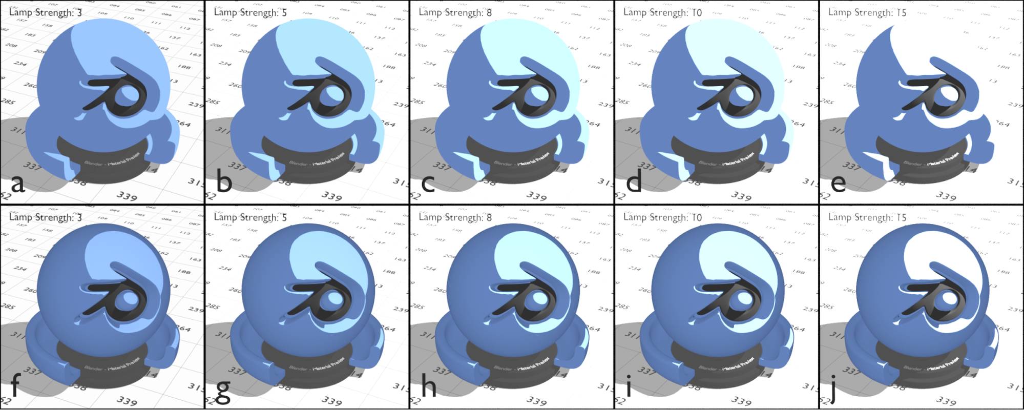
Fig. 2.24) Renderings of the toon shader with varying lamp strength. In the upper row, the mode was set to diffuse, in the lower row it was set to glossy. a) + f) 3, b) + g) 5, c) + h) 8, d) + i) 10, e) + j) 15. The size of the lamp size was not altered. Note how only the bright area of the toon shader gets influenced by the lamp, the brightness of the darker areas depends only on the environment light and is the same in a) - j).
Increasing the lamp intensity does not influence the darker area of the shader. With this light setup the brightness of that area only depends on the color you chose and the brightness of the environment light.
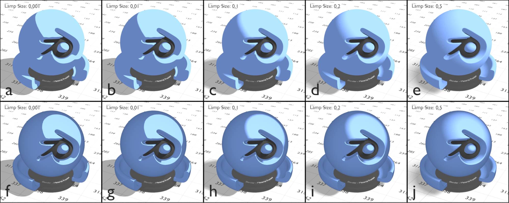
Fig. 2.25) Renderings of the toon shader with varying lamp size. In the upper row, the mode was set to diffuse, in the lower row it was set to glossy. a) + f) 0.001, b) + g) 0.01, c) + h): 0.1, d) + i) 0.2, e) + j) 0.5. The size (not scale) of a lamp determines how soft the shadows cast by this lamp are, as well as its reflections. In the case of the toon shader it influences the smoothness of the transition between the bright and the darker part of the object.
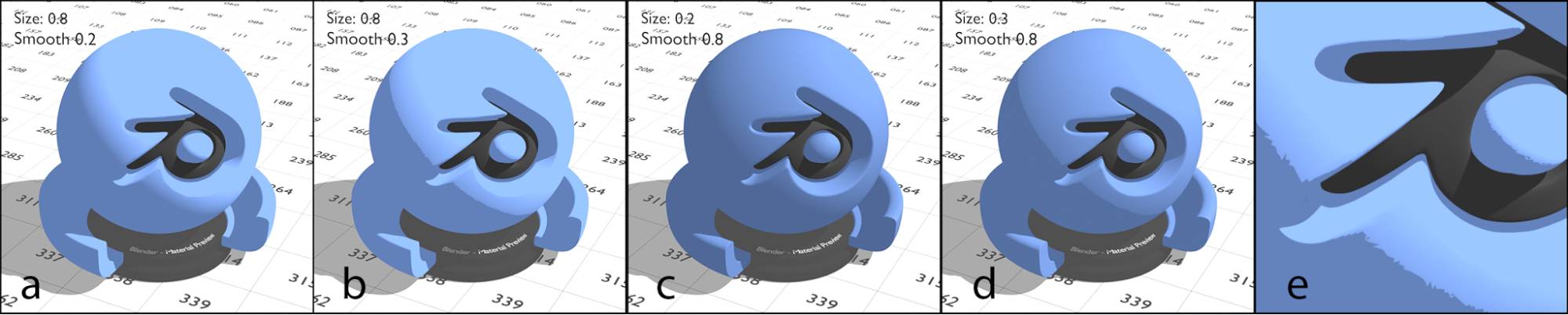
Fig. 2.26) Renderings of the toon shader. a) size 0.8, smooth 0.2, b) size 0.8, smooth 0.3, c) size 0.3, smooth 0.8, d) size: 0.3, smooth 0.8. e) enlarged section of the jagged area. Note that in b), d) and e), where a jagged line appeared the sum of the size and the smooth value was greater than 1.
As you can see in fig. 2.26 even with a smooth value larger than 0.2 a sharp border can appear between the specular and the shaded area. This is only the case where lamps illuminate your object. Environment light as well as mesh lights do not cause this effect. Since it is usually prefered to use point or sun lamps you probably want to avoid this. The effect occurs when the size value plus the smooth value is greater than 1.
In conclusion:
The toon shader offers a great possibility to use Blender for 2D-ish cartoons, but its setup is not too easy.
We found that the glossy method has a much smaller specular area, where the border follows the topology more than the diffuse version does. Additionally it shows the topology more than the diffuse method, which only leaves two shadeless areas of different brightness, with an eventual gradient between the two.
As a rule of thumb:
- Keep the sum of the size and the smooth value below 1.
- If you want a very large size, combined with a smooth transition, set the size to 0.99 and increase the size of your lamp(s).
- Use as few lights as possible.
- Turn off ray visibility glossy and diffuse for all meshes in the scene.
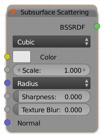
Subsurface Scattering (S)
This is probably one of the shaders with the biggest fuzz about it. Even just correctly using it can be a science for itself. It is invaluable for creating realistic skin shaders and most organic materials. It is important to note that this shader does not simulate realistic light behavior, but is rather an approximation that measures the thickness of an object and changes the colors accordingly. If it were a true translucency effect, placing meshes inside the object with the SSS applied to it would be visible, however they are not (see fig. 2.27).
Here is how it works: The color input determines the base color that gets reflected without any scattering.
Note: Without any backlighting the SSS can look somewhat similar to a diffuse shader, but without very dark shadows. Keep that in mind if you are not getting the results you are looking for.
Note: Don't judge the result in the preview too quickly, it usually takes about 50 samples until the material is starting to look like the final result.
There are three modes to calculate the light falloff:
Christensen-Burley
This option provides the highest quality for details preservation and is the default option since Blender 2.77. It preserves small details (for example wrinkles) better than than the other options.
Cubic
This light falloff mode produces sharper edges than the Gaussian. The formula for the decrease in light intensity is  where x is the thickness of the object where the light ray hits it. It also has an additional option: sharpness.
Gaussian
This mode will produce a smoother falloff of the light traveling through an object. Sometimes you may get access to measures for natural SSS materials, these usually refer to a Gaussian normal distribution method.
The formula for the falloff is:  .
.
If a standard variation v is also supplied in the measurements, you should set the radius to  .
.
Color
Input for an RGB or a texture.
Scale
A multiplier for the radius, use this if you are happy with your settings, but you realize that you need to alter the size of your object. Dividing all values of the radius, you choose does the same thing as setting the scale to 0.1.
This value is independent from the scale value of the object’s transforms.
Radius
The three values represent red, green and blue scattering in that order. Smaller values will make the corresponding color more dominant in thin areas, whereas higher values will sort of tint the thicker areas, if you have a backlighting situation.
Hint: The radius for human skin is R: 3.67, G: 1.76 and B:0.6, use these values and match them to your object by using the scale value.
Sharpness
This option is only available if you use the cubic falloff model. Increasing the sharpness leaves more detail in the surface, while decreasing it makes an object look more smooth and like it was made out of soft wax (see fig. 2.32).
Texture Blur
This value can be used to counter harsh edges from textures with a high contrast. If you are using multiple SSS layers, the deeper the layer is under the skin, the less detail it will show. If you want to use a shader for deeper scattering layers, you probably don’t want as much detail on it, so texture blur saves you the trouble of pre-blurring your map in an image manipulator.
Normal
Lets you use a normal map to displace the surface of each shader of your material individually.
If a camera ray hits a surface with an SSS Shader, Cycles picks whether it traces the R, G or B component at random. Around this shading point you can imagine a sphere with the radius you chose, corresponding to the color it picked. The ray enters the surface, bounces around and leaves it again. All bouncing is happening inside the radius of the sphere. If the object at the place is thin enough, it can also bounce through it and find an eventual light source behind it, thus illuminating the shading point. This means if red has the highest radius, red rays have the biggest chance to travel through the object and therefore in our examples the thinnest parts of the object are red, see fig. 2.28. By determining the behavior of the ray in this manner, Cycles ignores all objects inside a mesh with an SSS shader, see fig. 27. Due to the scattered light travelling through the surface, in a normal light situation there will b e no black shadows on an SSS surface, because some light will always shine through to the shading points in the dark.
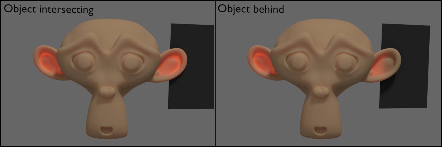
Fig. 2.27) Rendering of an SSS material with a backlighting effect. On the left a plane was placed inside the ear of the monkey, while on the right the plane was behind the ear, not intersecting with the monkey at all. Note that the Plane does not block any light, even though it light should not travel through a diffuse plane.
In fig. 2.27 you can see that the SSS shader is not truly volumetric. Instead of actually tracing lig ht rays travelling through an object, the scattering is approximated. Actually calculating the light path beneath the surface of an object is not practical (Blender Wiki on SSS).
The shader relies very much on the absolute size of an object. E.g. if you scale your object to be twice the size, in a simple material setup it will basically look the same. Not if it there is SSS shader involved, though, because how the light travels through an object and gets scattered is highly dependent on the thickness of the object where the ray hits, see fig. 2.28. So if you want to scale an SSS shaded object you will have to adjust the scale, value of the shader, which is very handy because you don't have to change every single value in the radius input.
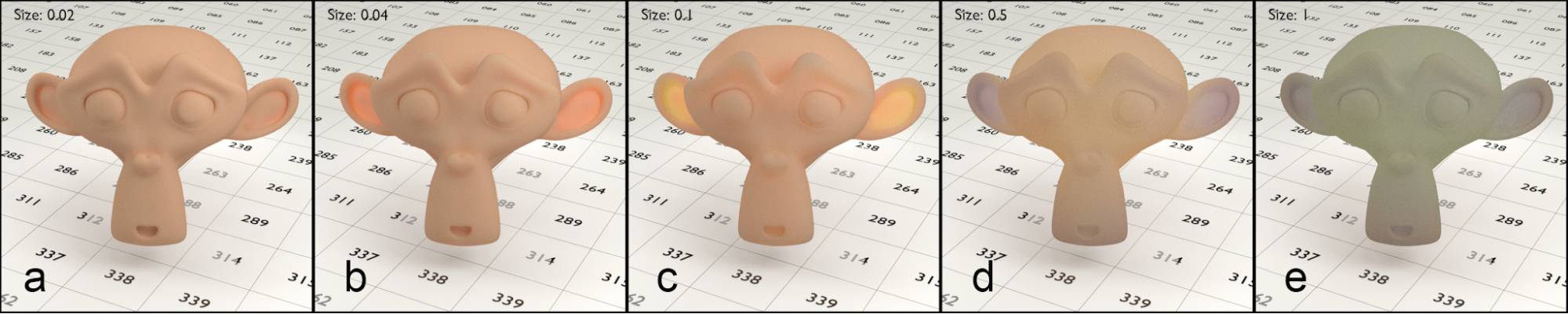
Fig. 2.28) The size factor of the SSS shader was increased from left to right, a) 0.02, b) 0.04, c) 0.1, d) 0.5, e) 1. The thinner parts of the ears had a thickness of 0.06 BU and the region around the mouth was 0.24 BU thick.
In fig. 2.28. you can see how the translucent effect of the shader increases as the size increases. The material in this particular situation looks most natural with a size of 0.02 (b). The radius of red, 3.7 multiplied by the scale of 0.02 equals 0.073, the ears are 0.06 BU thick, so the scatter of the light hitting the backside of the ear drastically influences the front side, resulting in that nice translucency effect, SSS is famous for. For the node setup see fig. 2.29.
As the size increases further, the ears become more yellow. Red scatters to a radius of almost 3.7, while green with 1.8 covers a much smaller part. As the size increases, so does the green part, because it can shine through more dominantly, causing the transmission to shift towards yellow. Also the area of the mouth is starting to become translucent, giving the shader a waxy feel.
With a size of 0.5 (d), the reds and the greens are sort of scattered more than the ears are thick, therefore their influence decreases and the color with the smallest radius, blue with 0.6 tints the thinner regions.
The scale in e) is obviously far too big for an object of these dimensions. Red gets completely scattered out of the object, green fills the thicker part, while the thinner parts remain blue. Further increasing the scale tints the entire object blue, canceling out all translucency effects.
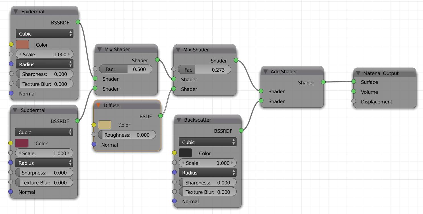
Fig. 2.29) Approximation of a skin shader. The material consisted of an epidermal (pale orange), subdermal (dark red) SSS shader, mixed 50%, then a pale yellow diffuse shader was mixed in 27% and finally a backscatter of a very dark gray was added. The radii were the same for all SSS shaders, R: 3.67, G: 1.76, B: 0.6 We used different shader nodes for the different layers, because this way you can modify the textures for each layer individually.
Now that we have established the shader is not 100% accurate nothing keeps us from cheating a bit more. We did a lot of research on this and checked how other renderers like V-Ray and Arnold handle the SSS layers, and they do use shader adding, which again is not physically correct, but we’re down the rabbit hole anyways. We found that mixing the three SSS layers with an add node can give an object a more natural feeling. This is especially noticeable when you are using textures on an SSS material. You probably want to darken the textures for each layer (multiply it with a dark color), to be sure no shading point can reflect more light than it receives due to the addition. This is also the reason why the node setup in fig. 2.29 consists of Shaders with different colors but otherwise equal values. These are roughly the colors you can multiply your textures with in order to manipulate them individually for each skin layer.
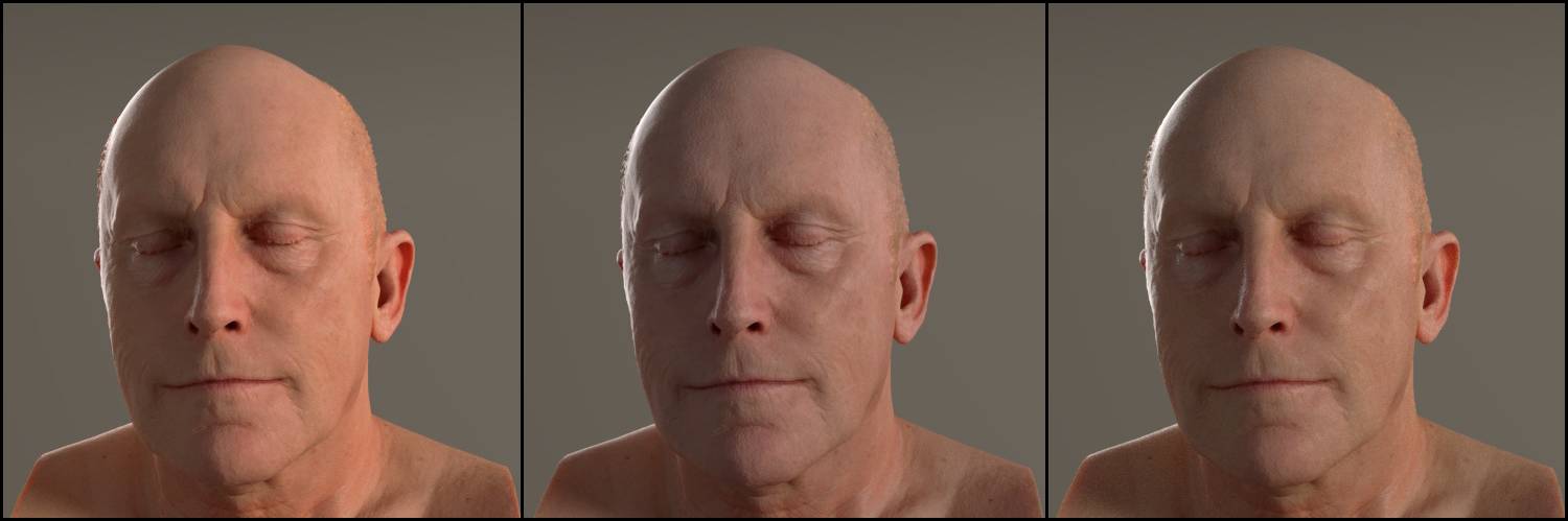
Fig. 2.30) Renderings of a scanned head with diffuse, glossy, normal and bump map. All heads were rendered with 3 SSS layers with the distribution algorithm by Christensen and Burley. Left and middle used the RGB scatter values from the BI preset Skin1, R: 3.67, G: 1.76 and B: 0.6, the right one uses BI preset Skin2 with R: 4.826, G: 1.696, B: 1.091. For the left one the Layers were combined with mix nodes, the other 2 were combined by add shaders.
(The model and textures are courtesy of )
Fig. 2.30 shows that it is ok to use add shaders in an SSS setup. However you need to be very careful with the scale values because the skin may look like wax very quickly. A direct comparison of the two approaches proves to be rather difficult, because using the same scale and colors in either of the two approaches led to very different results. Also the add shaders seem to be a lot less sensitive to the light’s color.
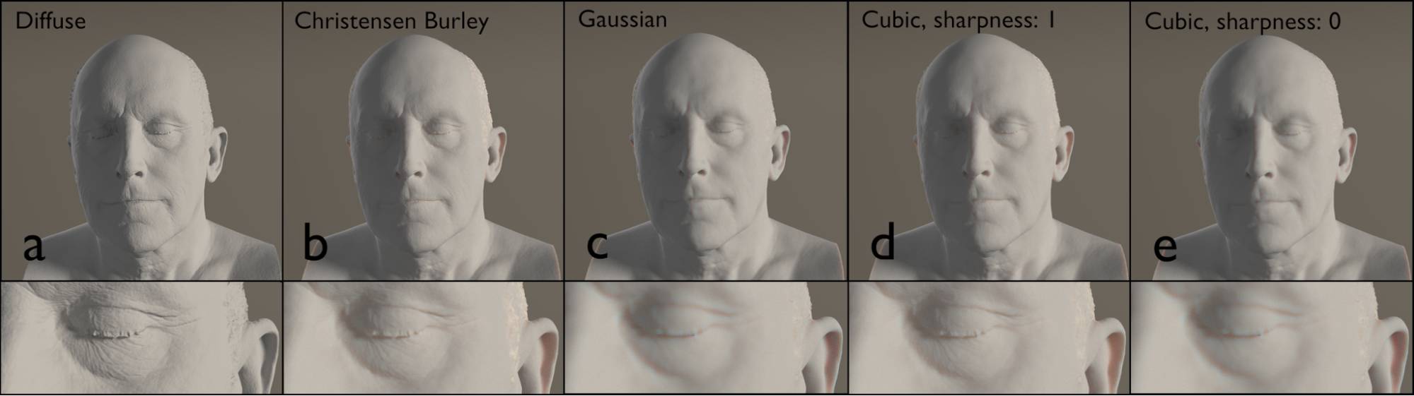
Fig. 2.31) Renderings of a head model with different shader models. a) diffuse, b) - d) SSS. b) scattering method: Christensen Burley, c) scattering mode: Gaussian, d) + e) cubic. In e) the sharpness was decreased to 0. The row below is a n enlarged section with the same settings as the row below. Here the differences in the surface detail are more obvious.
Fig. 2.31 a) shows the bump map on a diffuse shader for maximum detail. If you compare b, you will see that Christensen-Burley’s method preserves almost all the detail, while still allowing for those translucency effects. Gaussian and cubic do not that to this extend. In e) the sharpness was reduced to 0, which resulted in a significant loss of detail, which is handy for deeper scatter layers.
The texture blur input lets you pre-blur a texture. If you use a photograph or a painted texture it will usually already be smooth enough. But consider a texture with hard edges, if light travels through it from behind, it usually will not show sharp edges, but rather blurry ones, because of the scattering. This effect can be enhanced with the texture blur option. It is also usually set to a higher value if you are using procedural textures, or deeper scatter layers. Texture blur does not influence normal or bump maps.
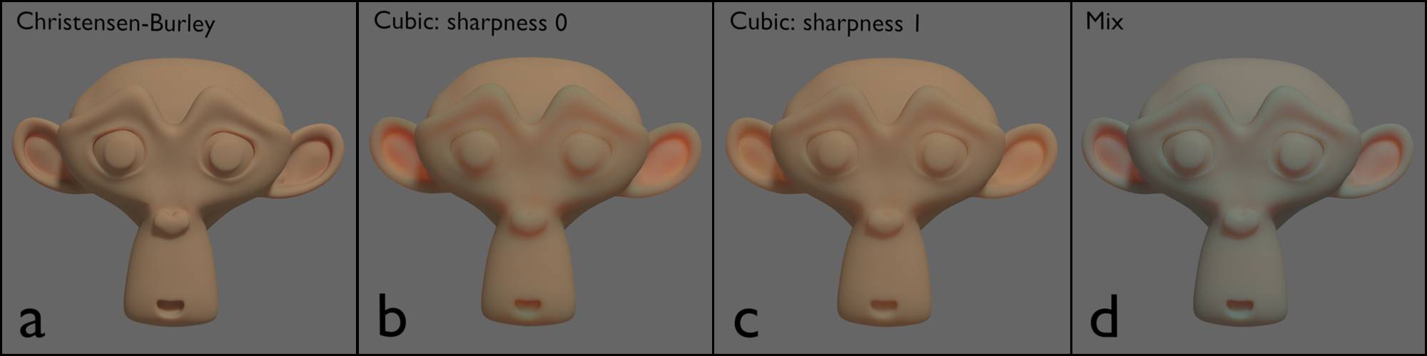
Fig. 2.32) Monkey head rendered with different SSS settings. All SSS nodes were assigned the BI Skin1 values as radius and a scale of 0.03. a) scattering method Christensen-Burley, b) c ubic scattering, c) cubic scattering, sharpness set to 1, d) shaders from a) and b) combined by a mix node with a factor of 0.5.
Fig. 2.32 demonstrates three points:
1. Decreasing the sharpness of the cubic scattering makes the material look a lot more like wax and diminishes surface details.
2. The same values for different scattering functions produce different results.
3. You would probably expect a mix shader to create a look similar to mixing the two renderings in the compositor. However you can immediately see that this is not the case. This effect is much less noticeable when mixing cubic and Gaussian. Cubic does have a sharpness setting, which is not the case for Christensen-Burley. If you increase the sharpness to 1, again the effect is less drastic, but usually you do want to blur deeper scatter layers and make them more waxy. For this I use add shaders and multiplied the diffuse texture of each layer by
- Epidermal: pale yellow
- Dermal: purple
- Subdermal (backscatter): dark red.
Just as you have to correct the scale for each method, you may have to adjust the colors for each lighting situation. It takes some fiddling, but the results can look really good. In some setups you might find a mix of diffuse shader with a small percentage. This was used to preserve detail in the bump and normal maps. With Christensen and Burley’s method this is hardly necessary anymore, but feel free to use it anyways if it suits you better. Lastly mixing two different scattering methods seems to make noise clear more slowly.
In conclusion:
Even though the SSS shader is not 100% physically accurate, the results can look stunning. However getting good results requires a lot of trial and error, because you cannot directly tell Cycles: Thin parts get this, thicker parts get that color for transmission. Even though this might be a bit frustrating, especially for beginners, usually people get the hang of it rather quickly. Especially when they have the book you are reading right now to aid them. As a point of entry it might be useful to check the presets of the BI SSS presets and copy their radii.
Emission (E)
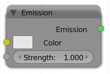
Like all path tracers Cycles is able to emit light from meshes. This usually allows a more realistic lighting situation, since those lights will also be reflected in the form of their actual shape and not as a round spot (specular), which point, sun and spot lamps will produce. The strength input controls the brightness of the light.
Note: Bigger objects will brighten your scene more than smaller objects with the same material settings.
Note: Even with strength set very low an emission shader will not be lit by any other lightsource.
Color
Input for an RGB or a texture. For a more detailed explanation on light temperature, please see .
Strength
Determines the intensity of the emitted light. When it comes to strength settings, there are three kinds of lamps.
1. Mesh light. In a mesh with an emission shader, the strength will represent the energy per area, or Watts / m². Thus the behavior of a mesh light is heavily dependent on their size. A bigger object with the same strength will emit more light, since there is more surface to emit from. It will also produce softer shadows.
2. Point and Spot lamps. Here the strength is actually the intensity of the lamp in Watts. So if you are working on a correct scale, where 1 BU ≙ 1 m, a lamp object with a strength of 1 is very dark, since conventional light bulbs have more power than just 1 W.
3. Sun lamp. You might find it confusing that a point lamp with the strength of 20 will still be pretty dark, whereas a sun with the same strength will almost blow out your scene entirely. The reason for this is that the sun emits roughly 4 x 10 26 Watts of light, so to enter an accurate number, you’d need a lot of 0s. So for your convenience the huge amount of energy has already been divided by the also huge surface of the sun and included the fact that not all the light actually reaches earth, which means that sun intensities between 1 and 5 usually deliver useful results.
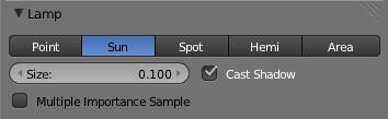
Note: Scaling up a lamp in the viewport does not change its behavior. Increasing the size in the lamp tab will not increase the intensity of the light, but only produce softer shadows.
For more information about lamps and their behavior see .
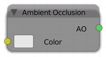
A mbient Occlusion (O)
Ambient occlusion (AO) is a method for faking or enhancing the effect of global illumination. Imagine two cubes that are close together. The gap between them will be much darker than the sides facing the open. This is due to the fact that the cubes are shadowing each other in that area, which will make it appear darker. Ambient occlusion is faking this effect by darkening faces based on their proximity to another polygon. If a ray is hitting a face, another ray is cast from that point. If that ray hits another surface, the distance is measured. If the distance is less than the setting for Distance in the Ambient Occlusion panel in the , the face gets darkened. Disabling shadow in the settings will cause an object to be ignored by the AO shader. Faked global illumination in form of ambient occlusion usually works very well and can save you a couple of light bounce calculations, but in some cases it will produce unrealistic results.
Note: This material does receive neither light nor shadows. Its local brightness is solely dependent on nearby objects. This means a mesh light nearby will actually make it darker.
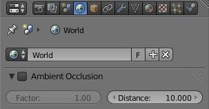
The distance of the AO is a global setting and can be found in the . Changing the value there will change the effect on all AO shaders even when AO is disabled for the scene.
Hint: Since shaders cannot be multiplied, you might consider rendering your scene twice, once with your regular shaders and once with the AO material, so you can multiply the renderings in the compositor. The material override option for render layers is perfect for this.
Color
Input for an RGB or a texture. Determines the color of the non-occluded parts of the object.
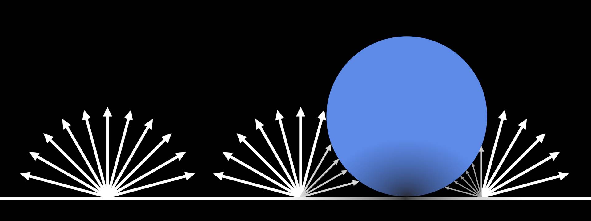
Fig. 2.33) Ambient occlusion is computed by shooting rays of a defined length in a hemisphere from the sampling point. Rays that hit geometry result in a darker shading.
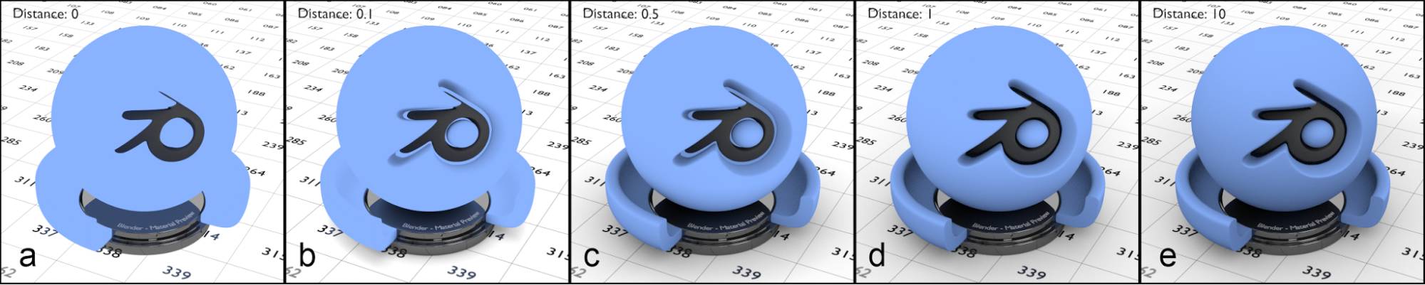
Fig. 2.34) Renderings with the ambient occlusion shader. The test object as well as the ground plane were rendered with an AO material. From left to right the distance was increased in the world panel: 0, 0.1, 0.5, 1, 10. In a) you can plainly see that the AO shader does not receive shadows. With increasing distance the areas with gaps between objects became darker, while the top of the object remained the same color in all tests.
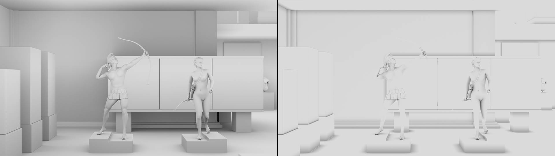
Fig. 2.35) Ambient occlusion (AO) is great for clay renderings. Using the material override option for render layers, an entire scene can be rendered just with AO. For interiors, using a value of half the ceiling height for distance results in perfectly smooth gradients along the walls and all objects (left). When the AO distance is set too low, large parts of the image will be pure white (right). V
V olume Absorption (U)
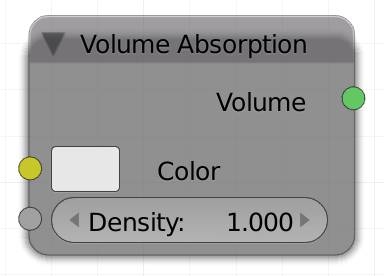
The volume absorption allows a realistic absorption of light. As light is traveling through a volume it will lose intensity, so the thicker your object, the less light will make it through to the other side, therefore it will appear darker for transmitting light. This is typically used for colored glass or smoke and fire simulations.
Hint : The output of volume absorption is actually removing light. If you combine it with a for smoke using an , the result will actually be darkened.
Color
Controls what color or light will be absorbed by the volume, thus tinting it all the more the farther a ray is penetrating the volume. The input can be an RGB or any texture.
Density
The density of the volume. Higher values result in a stronger absorption effect. If you want to vary the density of your volume in different areas, use a map for the density. A map could be a 3D (procedural) texture or the factor from a smoke or fire simulation.
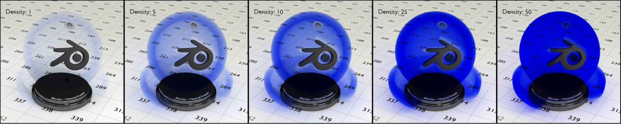
Fig. 2.36) Renderings of a volume absorption shader. From left to right the density was increased: 1, 5, 10, 25 and 50. As opposed to the volume scatter shader, this shader set to blue absorbed green and red light, so the transmitting light remained blue.
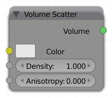
V olume Scatter ( none )
When light passes through certain objects, it may seem as if the light itself is actually visible. A great example of this effect is a very dusty room with sunlight streaming in from a window. Similar to how the light from that window reflects off all of the tiny dust particles and appears to form a shape. Volume scattering in Cycles can be thought of as light reflecting off of many tiny particles of dust. The possibilities of the volume scatter shader include anything from sunbeams (a.k.a. god rays) to thick clouds of smoke.
Color
C ontrols what color or light will be reflected by the volume. The input can be an RGB or any texture.
Density
Determines how thick the volume appears to be. You can think of this as adding more “dust” to our dusty room example. If you want to vary the density of your volume in different areas, use a map for the density. A map could be a 3D (procedural) texture or the factor from a smoke or fire simulation.
Anisotropy
Anisotropy is the scattering direction depending on which way the light ray is moving. Positive values let the ray scatter in the direction it is traveling, while negative values cause the ray to scatter opposite of its travel direction. Anisotropy can be tricky to understand without first seeing its effects, so let’s take a look at some examples:
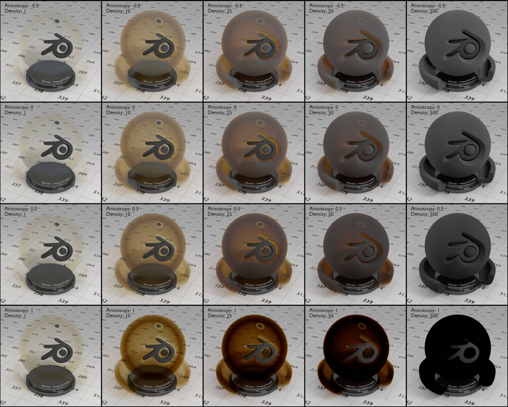
Fig. 2.37) Renderings with a volume scatter material. From left to right the density was increased, the values were: 1, 10, 25, 50, 500. Top down the anisotropy was set to -1, -0.5, 0, 0.5 and 1. Notice that a volume scatter material with a high density looks fairly similar to the diffuse shader. The color of the shader is the same powder blue we use for all of the test renderings, the appearing color however is its complementary color , since blue got scattered away. The gray parts are where the scattered powder blue mixes with its complementary color, which is most visible for high densities.
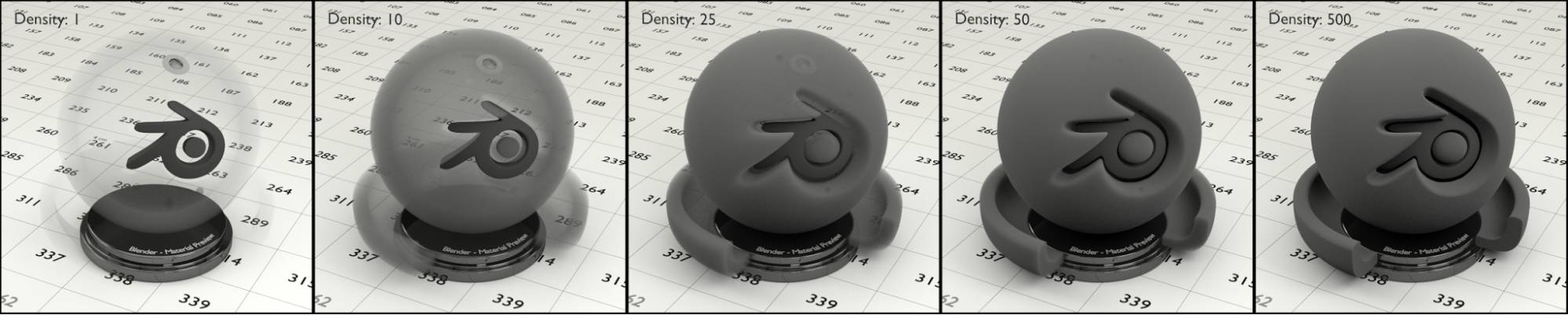
Fig. 2.38) Volume scatter material with no color but 80% gray instead. Since the color of the shader is neutral, there is no complementary color, either (compare Fig. 2.39).
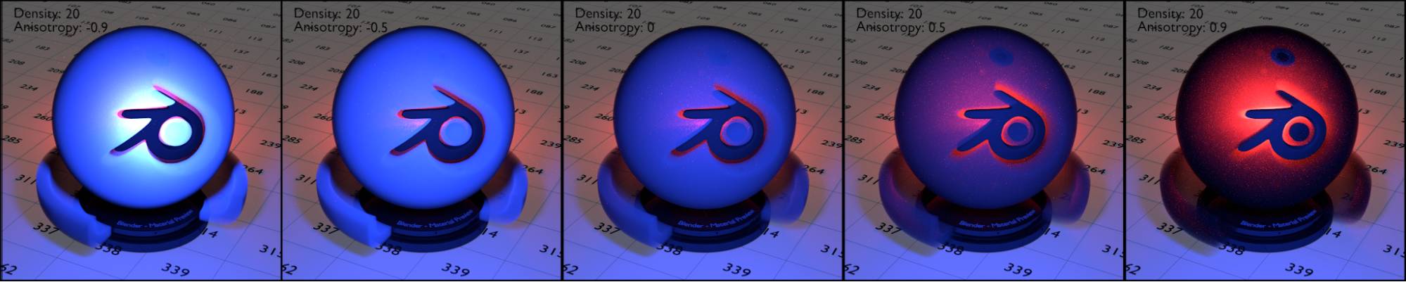
Fig. 2.39) Renderings with a volume scatter material. From left to right the anisotropy was increased. The values are -0.9, -0.5, 0, 0.5, 0.9. For this scene the only light sources are two point lights: a blue one in front of the object and a red one right behind it. Notice how negative anisotropy results in an almost reflective appearance of the volume while positive values cause the light behind the object to tint it. Compare fig. 2.40.
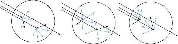
Fig. 2.40) Volume scatter with anisotropy. For positive values (left), rays mostly get scattered along the direction of the ray that entered the volume. Negative values mostly scatter into the opposite direction (right). Anisotropy of 0.0 (center) will result in random scattering directions. Depending on the density, rays might not get scattered at all.
Hint: If you want to color a scattering volumetric material like dust or smoke, combine the volume scatter shader with a using an node:
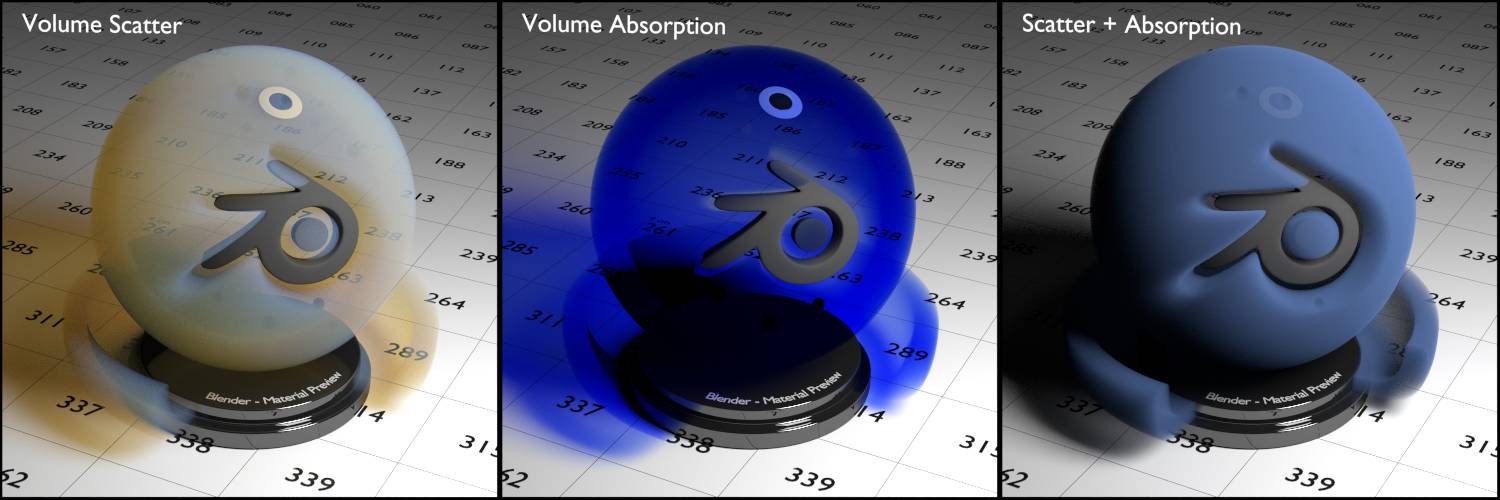
Fig. 2.41) The demo scene with just one white area light on the right. With just volume scatter (left), the input color was only visible on parts of the volume where the camera ray got scattered directly into the light. The other parts of the volume and especially the shadows are tinted in the complementary color. In the middle only volume absorption was used, tinting both the object and the shadow in the input color with thicker parts being darker. On the right volume scatter and volume absorption were combined using the node setup from below. Since inside the volume both scattering and absorption of light are taking place, the result looks much more natural. Notice the shadow becoming gray because all color is either scattered or absorbed now.
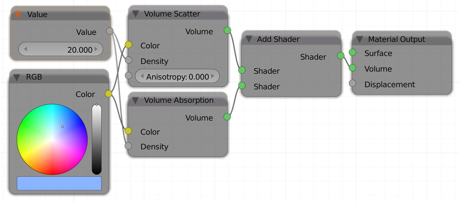
Fig. 2.42) The node setup used for the scatter + absorption shader on the right of fig. 2.41)
Hair BSDF (H)
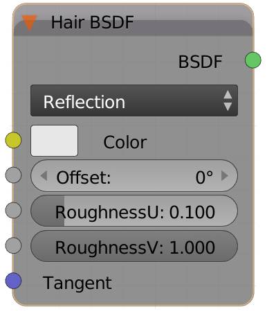
If you look at a part covered in hair, the overall behavior of the strand material will act similar to an , since the gaps between hairs can act similar to the grooves of brushed metal. Shiny hair will produce a form of tangential specular across the strands. You can alter the angle of that “line” using the offset angle input. The roughnessU value will determine the glossiness along the hair, roughnessV will increase the roughness across the strand.
The brightness of your color determines how much light gets reflected by the hair, while the hue and saturation will tint the reflection.
If you set the hair shader node to transparent, these values will affect light passing through the hair. The inputs will remain the same, higher roughness will now produce more translucent transmission effects, whereas lower values will make it look more and more like glass. The brightness of your color determines how much light travels through the hair, while the hue / saturation will tint said light.
Hint: Even though there is a hair shader, you are not forbidden to use transparent or even diffuse, glossy, anisotropic or translucent shaders for your hair. We find that there are situations where a combination of diffuse and glossy does look better.
Reflection Type
Use this type to set the attributes of the hair surface.
Transmission Type
Use this type to control the way light travels through the hair.
Color
Input for an RGB or a texture.
RoughnessU
Increases the roughness along the strand, making it more blunt and increasing the anisotropic effect of the shader.
RoughnessV
Increases the roughness across the strand, making it more blunt and less glossy.
Tangent
Tangents are usually following a hypothetical cylinder around your object that is oriented along the local z axis of your object. In an anisotropic shader, reflections will be stretched along these tangents, you can alter their direction by using a custom input in this socket.
For the following renderings, the original lamps were removed from the scene and replaced by a single strong mesh light right behind the hair, ( ). The color used in the hair shaders was a pale yellow: C8B78A.
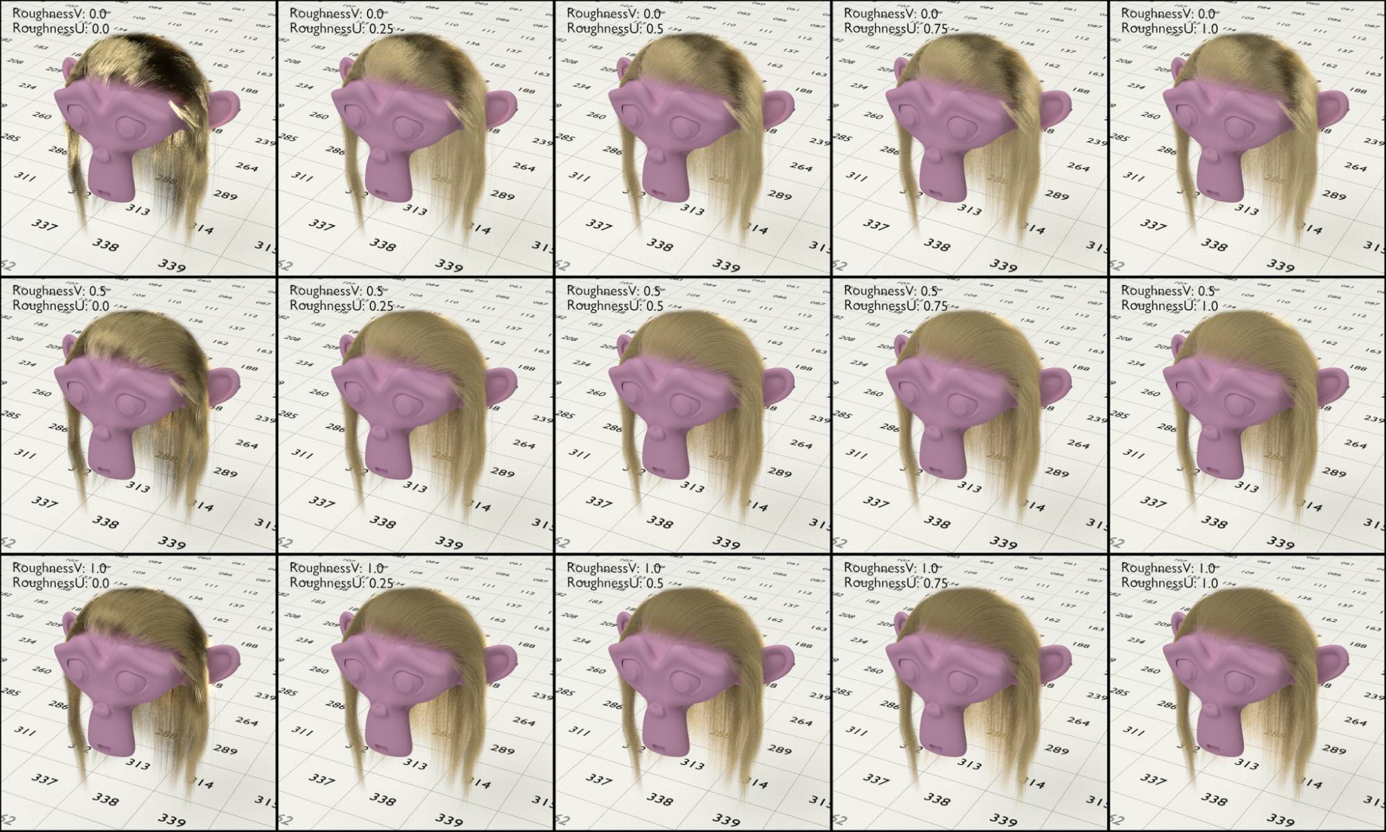
Fig. 2.43) Renderings of the hair shader set to reflection . From left to right the roughnessU was increased, 0, 0.25, 0.5, 0.75, 1. Top down the roughnessV was increased, 0, 0.5, 1. Note that 0 for both factors made the hair look like metal with unrealistically strong reflections. Increasing any of the values made the hair look more blunt. Note that a high roughnessV created an anisotropy effect across the strands, while with increased roughnessU the anisotropy was following the strands.
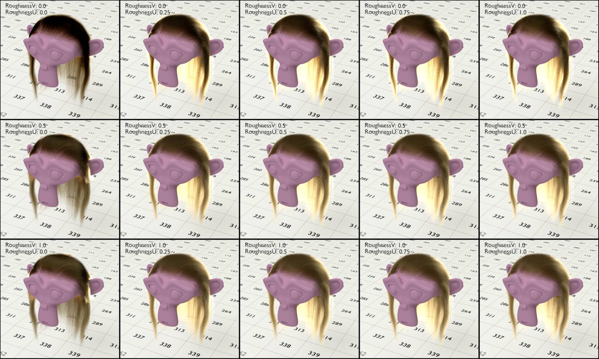
Fig. 2.44) Renderings of the hair shader set to transmission . From left to right the roughnessU was increased, 0, 0.25, 0.5, 0.75, 1. Top down the roughnessV was increased, 0, 0.5, 1. With a roughnessU of 0, there is no translucency effect in the hair, because the light passes right through without getting scattered like a glass material. Since there was a strong mesh light behind the head, the translucency effect for other values is quite visible.
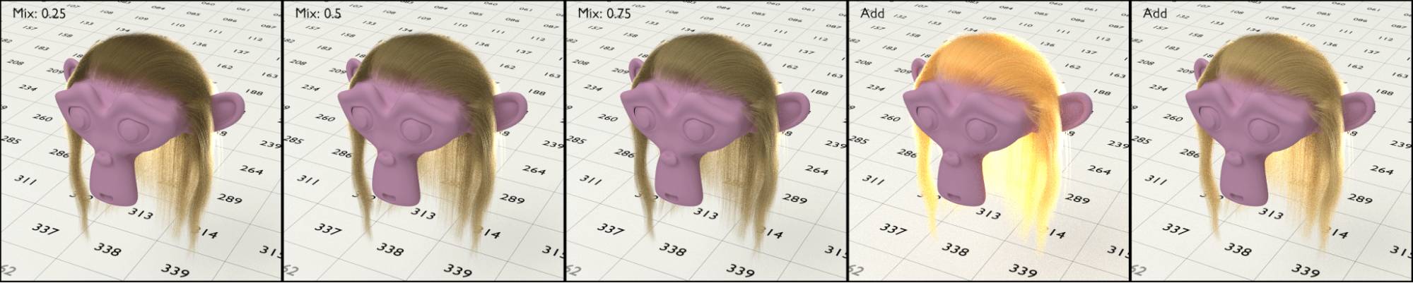
Fig. 2.45) Renderings of a mix between transmission and reflection hair shaders. Since hair is neither only glossy nor only transparent, it is usually best to mix the two together. The settings for the shaders were the default values, roughnessU: 0.2, roughnessV: 1. The first 3 from left to right were combined with a mix shader and had a percentage of 25, 50 and 75 for reflection. The last two were combined using an add shader. Due to the overly bright result, for the rightmost image the color for both shaders was darkened.
Background (none)
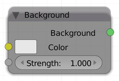
The background shader is supposed to be used with a world material that also has a world output. It will illuminate your entire scene as if it was mapped around it onto a big sphere. You can either use a uniform RGB color to illuminate and tint your entire scene, a procedural texture or an image. For improved lighting effects use an HDR image. In an image with high dynamic range there are pixels brighter than white, which means if they get reflected in a darker material they will appear white much longer than pure white pixels. This is just one of the perks of HDRis. For more detail see .
Color
Either use a single color to brighten or tint your scene or more commonly use a or environment texture.
Strength
How much the environment light affects your scene.
The three shader nodes without color inputs are the following:
Holdout (L)
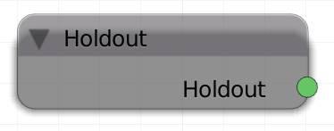
It has no color input because it only produces a transparent hole or black shape in the rendered image. It is different from the transparent shader though, because objects behind it will not be rendered, if it is not mixed with another shader. Objects with a holdout shader will either create a transparent or black part in the render, like a stencil in your scene. Great for compositing it over live footage or other renderings. Holdout also terminates rays.
In order to get transparent parts for the holdout shader, you have to enable Transparent in the settings of the .

Fig. 2.46) Holdout shader with transparency disabled (left) and enabled (right).
Mix (M)
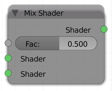
Hardly any material will be glossy or diffuse only so more realistic shaders will need you to mix aspects of different shaders. This can be done with a mix shader node. It has two shader input sockets. Both connected shaders will be mixed by the factor input value, note that a higher factor will result in the shader in the lower socket to be more dominant. You can also use other kinds of grayscale information to restrict the mixing to certain parts of your object.
Hint : A mix of 10% pure white and 90% can result in a great porcelain effect.
Factor
The mix ratio between the two shaders, higher values will make the lower shader more dominant, lower values will increase the effect of the upper shader.
Shader 1 and 2
The two shaders to be mixed together.
Add (A)
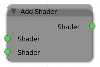
The add shader node mixes two shaders by adding up their shading information. The result is not physically correct in most cases. In other words, it is not energy conserving. This means there is a possibility that an object with an add shader will reflect more light than it received from other light sources.
This is why the result will appear brighter than either one without the add node (with the exception of volume materials). It is somewhat similar to the . Adding a shader will not influence the material, since a holdout shader is considered to be nothing.
Shader 1 and 2
The two shaders to be added.
Using the add shader in a node setup for realistic materials is somewhat frowned upon. You will often be advised not to do it, because it is not realistic light behavior. However, in our humble opinion it is legitimate to use it as long as the end result is satisfying. For example Viktor’s hair in the Gooseberry project (Cosmos Laundromat) uses an add shader, as do the SSS materials from the project. If you look at fig. 2.30 you can see, we did, too, you be the judge of the result.
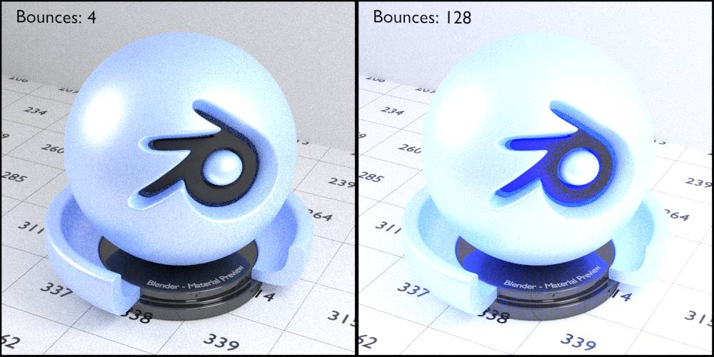
Fig. 2.47) Diffuse and glossy shader combined by an add shader in a closed environment. Left: 4 bounces, right: 128 bounces. Every time a ray hits the surface, there is a chance it be brighter than before it got reflected. This is true for all areas where the the colors of the two shaders add up to become > 1.
Since there is a chance for a light ray’s energy to increase after a bounce - which is not possible in the real world, this shader is considered not to be energy conserving. Physically speaking this is incorrect, but as so often in renderings: if you have to choose between physically accurate and good-looking, go for the latter. There is no law against cheating in rendering.