One of the great virtues of Power BI is the learning curve, which allows you to transform data into information almost immediately and perform very complex analyzes if you learn to master the tool.
This chapter is aimed at people who are faced for the first time with the blank Power BI canvas and overwhelmed by its many options that need a guide to get started.
The text is divided into four sections with practical guidance, and at the end of its reading, you will know how to connect Power BI with the data sources, transform the data and create a display panel.
On the Internet, there is more content on data visualization with Power BI than on the transformation and cleaning of these. For this reason, I have found it useful that the data transformation section is the most extensive and detailed.
ETL is the acronym for extraction, transformation, and load (in English: extraction, transformation, and load), which is the process that allows us to obtain data from multiple sources to transform and clean them and then upload them to Power BI.
The ETL process is necessary so that the data we use to mount our graphics are in the right conditions (suitable formats, without errors or blank fields, etc.).
- Power Query: is the ETL tool integrated into Power BI.
- Power BI Desktop: the desktop version of Power BI to mount the reports.
- Power BI in the Cloud: view, share, and modify models created in Power BI Desktop.
Language M: it is the programming language of Power Query, but do not worry, the editor that includes the program allows you to do almost everything without knowing how to program with this code.
DAX language: it is the equivalent to Excel formulas within Power BI, but much more powerful. Even if you do not master it, it is advisable to learn the use of formulas that are useful for improving your reports.
In a very simplified way, we can say that the measurements are the calculations made using the “formulas” of Power BI (DAX language), with the advantage that once created a measure, we can use it as many times as we want in our report.
We will see it more clearly in the example.
During the following sections, we will make a visualization panel using data on the World population of the World Bank.
The objective is that you learn to create a display panel from scratch while following the steps in the practical example.
At the end of the example, you will know how to do the following:
- Connect data with Power BI.
- From Excel files.
- From a web page.
- Transform and clean data with Power Query.
- Rows and table headers.
- Attach tables
- Rename tables and columns.
- Enable and disable table loading.
- Remove columns
- Cancel column dynamization.
- Modify column formats.
- Merge tables
- Filter rows
- Upload the transformed data to Power BI Desktop.
- Create a panel with graphics.
There are multiple options for connecting to cloud services, databases, web pages, etc. In this case, we will connect to an Excel file and a web page.
To start, we will use a file that you can download the file from the World Bank website.
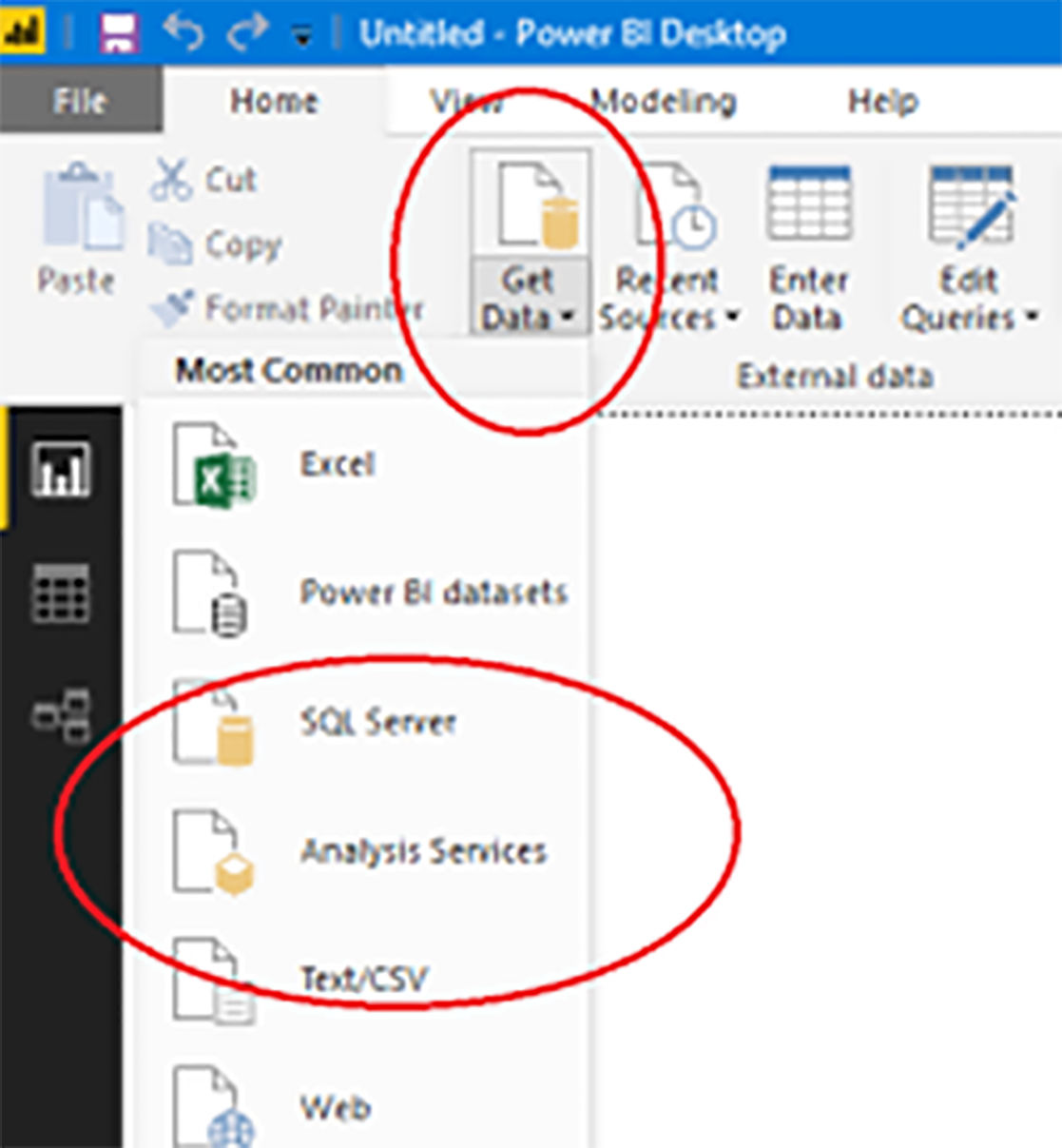
Now that we have the Excel file on the computer, let's connect it with Power BI. To do this, press the «Get data» button found in the «Start» tab, as shown in the following image.
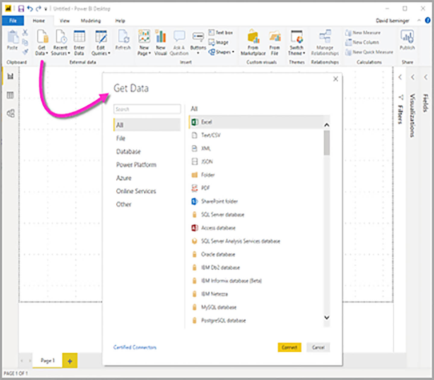
In the window that opens, you must select the Excel option and click on the "Connect" button, as we show you below.
A new window will appear to search and select the file, and you will have to search for it in the path where you have downloaded it. Once located, select it and press the open button.
Next, you must indicate to Power BI the Excel tabs that you want to connect. In this case, select the three available tabs and click on “Load.”
During the upload process, the progress will appear on a screen.
You will be able to verify that the upload was successful because the three tables appear in the Power BI field selector.
Now that you have the data from the Excel file loaded in Power BI, let's get what we are missing from a web page. To do this, click on the “Get data” button on the home tab again, look for the “Web” option in the window that opens and click on “Connect.”
In the new window that opens, enter the following Wikipedia address:
Later I will explain why we connect to this page, and the interesting thing so far is that you see how easy it is to import from different data sources.
After pasting the web address and clicking "Accept," a new window will open to select the data we want to load in Power BI.
The web page is made up of multiple tables, and the one that interests us in this exercise is what is called “Officially assigned codes [edit].”
When selected, a preview of the table will appear on the screen, and you can press the “Load” button.
At this point, you already have the four tables loaded in Power BI, and you are ready to perform the data transformation.
To start the transformation of the data, click on the "Edit queries" button on the home tab, as shown in the following image.
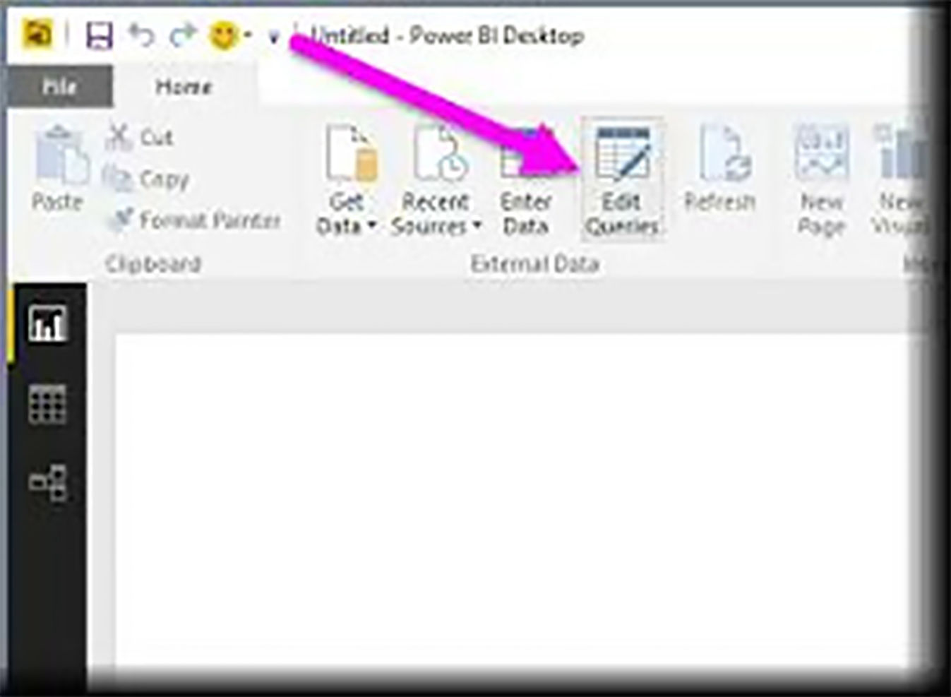
A new window will open with the Power BI query editor, which you will use to clean and transform the data.
First, select the "Active population" table and look at the rows.
- Row 1 contains the date the Excel file was updated and is not useful for our exercise.
- Row 2 contains empty cells ("null") and is not useful for exercise either.
- Row 3 contains the table headings (country code, indicator name, etc.), and you will need it.
- From row 4, there is the data, and you will also need it.
To eliminate unnecessary rows, you must press the “Remove rows” button on the “Start” tab (remember that we are working in the Power Query window) and choose the option “Remove upper rows.”
In the window that will open, we must indicate that we want to delete the top 2 rows (remember that we want to delete rows 1 and 2 that did not contain data of interest).
You will be able to observe how the first two rows of the table have disappeared and that in the right panel, the action “Upper rows removed” has been added.
If you make a mistake by doing something, you can delete it by clicking on the X or edit it if you click on the gearwheel.
The next step is to correctly assign the headings, which are now in row 1, as can be seen in the following image.

To do this, click on the “Use the first row as header” button on the “Start” tab.
With this step, you have already achieved that the table has the correct headings and is ready for the next transformation.
Reproduce these same steps in the “World Population” and “Urban Population” tables before continuing with the practice.
A reminder of the steps to reproduce:
- Delete the first two rows.
- Use the first row as a header.
Attach Tables
The next step is to join the three tables to which you have eliminated the unnecessary rows. All three tables must have the same number of columns, and their names must match.
Click on the "Append queries" button on the "Start" tab and select the option "Attach queries to create a new one."
In the pop-up window, choose the "Three or more tables" option and select the "Active population," "World population," and "Urban population" tables by pressing the "Add" button.
When the three selected tables are in the “Tables to append” area, click on “OK.”
This action creates a new table that contains all the rows of the previous tables.
Recommendation:
This function is very useful if you have an Excel file for each month of the year because it allows you to put them all together in the same table.
To rename a table or column, double click on it. By default, the new table that we have created is called “Append1,” and we will modify it by a name that is easier to interpret and thus facilitates its identification when there are many tables.
For this example, we will rename it as “World Bank Data.”
Sometimes we will not need to load all our tables to the Power BI graphics creation panel, and it is advisable to disable the loading of those that we will not use to mount graphics. For this reason, we are going to disable the “Active population,” “World population” and “Urban population” tables, since we already have all their data in “World Bank Data.”
Press the right button on each of the tables to access the menu and uncheck the option "Enable load."
A pop-up window will warn us of the risk of removing the tables from the report, but you should not worry, because we will not use that data to assemble the graphics, so you can click on “Continue.”
Our table “World Bank Data contains the column “Indicator Code” that we will not use and, therefore, we can eliminate.
Select the column and click on the "Remove" option from the pop-up menu.
The correct way to work on the Power BI model is that the same data can only appear in one column. This rule is not met in our table, as the number of inhabitants appears in column 1960, 1961, 1962, etc.
To transform the columns into one with the year and another with the number of inhabitants you must select all the columns of dates (from 1960 to 2018) as you would in Excel, holding down the “Control” key and selecting them one by one or selecting column 1960 and holding down the “Shift” key when clicking on column 2018.
Once all the columns have been selected, you must click on the “Cancel dynamization of the columns” option of the button with the same name found on the “Transform” tab.
Our table will transform the columns into rows automatically and will have one column with the years and another with the number of inhabitants corresponding to that year.
The next step will be to rename the columns, "Attribute" as "Year" and "Value" as "No. of inhabitants" by double-clicking on the column name.
You will see that the year column is represented with the letters "ABC" and the number of inhabitants with the number "1.2". This is because a text format has been assigned by default to the first and numeric to the second.
The format can be modified by clicking on the “ABC” or “1.2” symbol, although in this example, we will not modify them.
If you use the Excel VLOOKUP formula, be prepared to discover a Power Query function that will be very useful.
In the table "World Bank Data" is the "Country Code" column that contains the country's code, but not their name. To add the name of the country, we will use the table “Officially assigned codes [edit]” that we have connected from Wikipedia.
First, select the “World Bank Data” table and click on the “Merge queries” option from the “Start” menu.
Then follow these steps:
- Select the "Country Code" column from the "World Bank Data" table.
- Choose the “Officially assigned codes [edit] table from the drop-down menu.
- Choose the “Alpha-3 code” column of this last table, as it corresponds to the country codes.
- Press the "Accept" button.
After performing these actions, a new column will appear in the table with the World Bank data, and you will have to press the button with the two arrows.
In the pop-up menu, only the option "Common name" should be checked and unchecked "Use the original column name as a prefix."
Once this is done, press the "Accept" button, and you will have the name of the country in the table.
Looking closely at the table, you will see that some rows do not have the name of the country. For example, rows with code "ARB" have a country name "null."
This is because “ARB” is not the code of a country and does not appear in the Wikipedia table. The Excel files with the World Bank data contain subtotals, and “ARB” is the sum of all the countries that belong to the Arab World.
As we want to work with country data, we will filter all the rows that are not. Stop it by pressing the filter button in the "Common Name" column and unchecking the "(null)" value.
This will hide rows that do not correspond to countries and will not appear on the Power BI Desktop graphics display screen.
At this point, we have completed the transformation of the data, and you can move on to the next stage by clicking on the "Close and apply" button on the "Start" tab.
Power BI contains three main sections:
- The visualization of the model in which we can establish, among other things, relationships between tables.
- The visualization of the data that we have transformed and loaded from Power Query.
- And finally, the reporting area where we will paint the graphics, and that is now empty.
The options offered are very wide, and deepening them requires a lot of time, so in this section, we will focus on the creation of graphs from the data we have prepared previously.
During the transformation process, we have created a column with country data on the world population, the active population, and the urban population.
If we want to calculate the total urban population, we cannot use a formula that adds up the entire column “Number of inhabitants,” since we would also be adding the active population and the total population. To solve this situation, there is the CALCULATE function, which is one of the most useful when learning Power BI is explained in this example.
To start, right-click on the “World Bank Data” table found in the “Fields” section of Power BI Desktop and select “New measure” from the pop-up menu.
You will notice that the formula bar has been enabled to write the DAX function.
We will write a function that will add the number of inhabitants if the “Indicator Name” column is equal to the “Urban population.” This will not add the active population or the total population.
Type the following expression in the formula bar:
Urban population = CALCULATE (SUM ('World Bank Data' [Number of inhabitants]); 'World Bank Data' [Indicator Name] = »Urban population»)
This is what our function will do:
CALCULATE warns the system that we are going to perform a calculation by applying a filter (we just want to add the urban population).
SUM ('World Bank Data' [Number of inhabitants]) will add the values of the column “Number of inhabitants” in the “World Bank Data” table.
The 'World Bank Data' filter [Indicator Name] = »Urban population» forces only the values of the urban population to be added, ignoring the rest.
When closing the last parenthesis, we finish the calculation.
You can repeat this same procedure to calculate the total population and the active population. Here you can see the expressions you should write:
Active population = CALCULATE (SUM ('World Bank Data' [Number of inhabitants]); 'World Bank Data' [Indicator Name] = »Active population, total»)
Total population = CALCULATE (SUM ('World Bank Data' [Number of inhabitants]); 'World Bank Data' [Indicator Name] = »Population, total»)
At this point, you will have in the Power BI field selector the three measures that we have created marked with the icon of a calculator.
Now that we have the basic calculations, we are going to create the first graphics in Power BI Desktop.
Click the left mouse button on the line chart icon, and an empty graphic will appear inside the Power BI canvas.
Before continuing, be sure to select the graphic you just created and make it wider to see it better.
The next step is to take the measurements we have created to the chart. Stop it, and we must have selected the graph and click on the field of selection of the measures we want to use and the year.
They will have a graphic similar to this on the screen, and you can enlarge it by clicking on the “Focus mode” button.
The dates may appear untidy because the graph has been ordered according to the number of inhabitants and not by year.
To order it correctly, click on the “More options” button on the graph and choose the options sort by year and ascending order.
The next step is to add a filter that allows you to select countries. Click on an empty place on the canvas to make sure the graphic is not selected and then choose the “Data segmentation” display.
The empty display will appear on the canvas, and you must select the “Common Name” field from the “World Bank Data” table to transform it into a country filter.
Click on different countries to see how the graph behaves. You can also select several countries at once if you press and hold the keyboard control key.
As the list of countries is very long, we are going to add an object that helps us find a particular country.
Click on the button with the three points in the visualization box and select the option “Import from Marketplace.”
Choose the "Filters" option from the pop-up window and add the "Text Filter" object.
We already have the object in our Power BI Desktop and can use it to create a country search engine.
Place the visual object on the canvas and add the "Common name" field as you have done before.
Now you have a search engine where you can write directly the name of the country you want to analyze.
With what has been learned so far, you can build a graph with similar characteristics to the one that appears on the World Bank website.
We will enrich our panel with information that provides value for the analysis. For this, we will create a new measure.
% Active population = DIVIDE ([Active population]; [Total population])
Next, bring the chart of grouped columns and lines to the canvas.
Select the graph and add the year in the "Shared axis," in "Column values" the total population and in "Line values" the% of the active population.
With this selection, you will obtain a graph in which you will be able to observe, among other things, how the world population has been growing continuously and how the crisis of 2008 caused a decrease in the% of the active population.
Create a new page to place the maps by clicking on the button with the + symbol at the bottom of Power BI.
To create a map that shows us the population by countries, we will inform the Power BI of the field that contains the names of the countries.
First, double-click on the "Common Name" field and change the name to "Country" to make more sense.
Select the country field and choose the "Country or region" option from the drop-down menu that appears when you click on the "Data category" button of the "Modeling" tab, as shown in the following image.
Now take the visual object "Choropletic map Map" to the canvas.
Then place the country in the field "Location" and% of the urban population in the field "Information on tools."
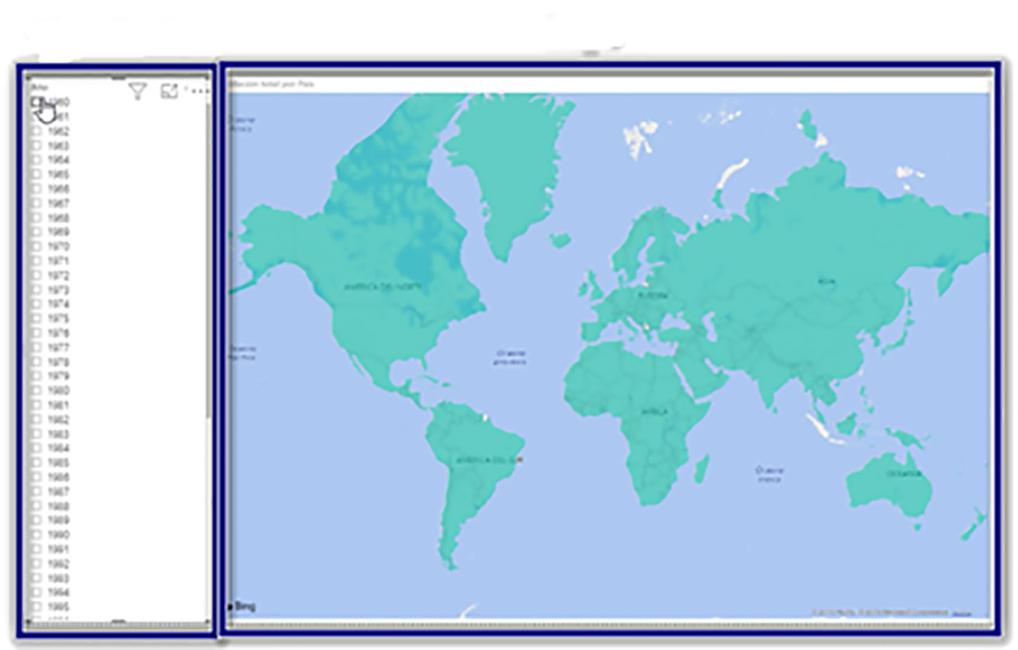
Then create a filter with the year field as you did before with the name of the countries.
You should have a structure similar to the one in the following image.
Finally, we will format the map, selecting it and clicking on the roll of the visualizations section (remember to select the map, or you will be formatting the filter of years).
Left-click on the symbol with three vertical dots in the “Data colors” menu and click on the “Conditional formatting” button.
In the pop-up window, configure the following fields:
- Format by: Color scale.
This way we will make the colors of the countries vary according to the number of inhabitants.
- Depending on the field:% Urban population
- Minimum: Lowest value à white
The country with the least urban population will appear on the map in white.
- Default format: Specific color to black.
Thus we will see in black the countries that do not have data in our Power BI table, and we will be able to detect possible errors.
- Maximum: Highest value to red
The country with the most urban population will appear in red.
You can now click on “Accept.”
To test the graph, select the year 2017, and you will see that there is little color contrast that facilitates the interpretation of the map.
To achieve greater visual contrast, press the conditional format found in “Data colors” again.
In the format window, check the box "Divergent," and the color scale will be modified by adding the yellow color.
Pressing on the control key and moving the mouse wheel, you can zoom in the map to enlarge specific areas.
Power BI is a very powerful tool with countless options, and this book intends to be a guide so you can get started in application management.
The consultancy Gartner carries out a classification of the main analytics and business intelligence providers every year, and Microsoft has been leading it for several years, so you can rest assured that all the effort you dedicate to learning to manage Microsoft Power BI will be well spent.