Graphs for analytics
Once we know which queries to execute for getting the facets and hierarchical information, we need a graphical representation of the same. There are a few open source graph engines, mostly JavaScript based, that can be used for this. Most of these engines take JSON data and use it to display the graphs. Let us see some of the engines:
- chart.js: This is an HTML5 based graph engine. It can be downloaded from .
- D3.js: This is another JavaScript library that brings data to life using HTML and CSS. D3 can be used to generate an HTML table from an array of numbers or the same numbers can be used to draw an interactive bar chart. It is available for download at .
- Google charts: This is another library provided by Google. It can be used to draw graphs based on data from Solr. Google charts provide a large range of graphs from simple line charts to complex hierarchical tree maps. Most of the charts are ready to use. Google charts can be downloaded from .
- Highcharts: This is the library that we will use here. It is one of the most used JavaScript graph libraries. Highcharts can be downloaded from .
Getting started with Highcharts
In this section, we will download and run some samples from Highcharts. We will get familiar with how to give it data for creating graphs.
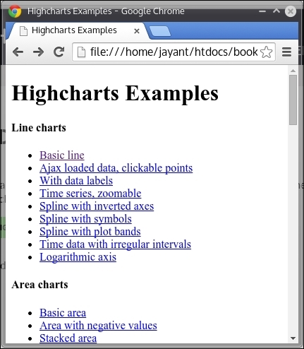
Let us download Highcharts from . We are using Highchart 4.0.4. Any version of Highcharts above this should work. Simply unzip the downloaded Highcharts-4.*.*.zip file and open the folder in your browser. When we open up the index.htm file in the browser, we will be able to see the samples of different types of charts:

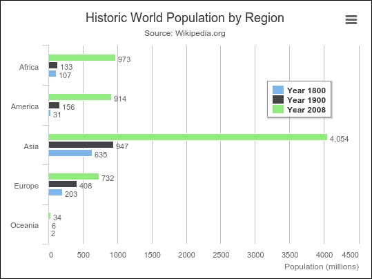
Go down to the column and bar charts section and click on basic bar. We will be able to see the bar chart as shown in the following image:

To check the code, open up the file examples/bar-basic/index.htm inside the folder where you had unzipped the highchart.zip file.
We can see that there is a div tag defined as follows called container:
<div id="container" style="min-width: 310px; max-width: 800px; height: 400px; margin: 0 auto"></div>Two JavaScripts have been included in the page:
<script src="../../js/highcharts.js"></script> <script src="../../js/modules/exporting.js"></script>
The code for creating the graph is written in inline JavaScript. We have defined the container div tag for the chart. The chart type is bar, and title and subtitle for the chart have been provided. Next, we define the labels for the X-Axis and Y-Axis classes:
<script type="text/javascript"> $(function () { $('#container').highcharts({ chart: { type: 'bar' }, title: { text: 'Historic World Population by Region' }, subtitle: { text: 'Source: Wikipedia.org' }, xAxis: { categories: ['Africa', 'America', 'Asia', 'Europe', 'Oceania'], title: { text: null } }, yAxis: { min: 0, title: { text: 'Population (millions)', align: 'high' }, labels: { overflow: 'justify' } }, tooltip: { valueSuffix: ' millions' }, plotOptions: { bar: { dataLabels: { enabled: true } } }, legend: { layout: 'vertical', align: 'right', verticalAlign: 'top', x: -40, y: 100, floating: true, borderWidth: 1, backgroundColor: ((Highcharts.theme && Highcharts.theme.legendBackgroundColor) || '#FFFFFF'), shadow: true }, credits: { enabled: false }, series: [{ name: 'Year 1800', data: [107, 31, 635, 203, 2] }, { name: 'Year 1900', data: [133, 156, 947, 408, 6] }, { name: 'Year 2008', data: [973, 914, 4054, 732, 34] }] }); }); </script>The X-Axis class contains the name of regions and the Y-Axis class represents the population count per year. The series section provides data for X-Axis. Since there are five regions, each year in the series array contains five elements in the data sub-array.
Displaying Solr data using Highcharts
Now let us modify this Highchart to display data from Solr. Start a fresh instance of Solr and index all the xml and csv files from the exampledocs folder. You can use the following commands to index all the files in the exampledocs folder:
java -jar post.jar *.xml java -Dtype=text/csv -jar post.jar *.csv
Now let us run a query that gives facets based on the cat field:
http://localhost:8983/solr/collection1/select/?q=*:*&facet=true&facet .field=cat
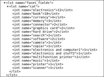
The following are the facets obtained from the execution of the snippet:

Now let us write a simple PHP script to read facets from the preceding query and create the JSON required for the Highchart. The script created uses a PHP library for Solr known as Solarium. For advanced features of Apache Solr PHP integration, please refer to an earlier book on this topic, Apache Solr PHP Integration, Packt Publishing. Thus, we will not study the installation and integration details of Solr and PHP in depth.
To run the example code, we will need a web server, Apache, with PHP installed in it. We will have to install the Solarium library using composer and then open up the script on the browser to get the graph.
Note
On a Linux or Ubuntu machine, use the following commands to get started with PHP and Solarium:
sudo apt-get install php5 apache2 libapache2-mod-php5 The web folder of Apache2 is located at the /var/www/html path.
Unzip the highcharts.zip file inside the html folder and put the code there.
To install Solarium using a composer, create the following composer.json file:
{ "require": { "solarium/solarium": "3.2.0" } }Then run the following command:
composer install This will download the composer library and install it in a folder vendor inside the /var/www/html folder. Now place facetGraph.php in the same folder.
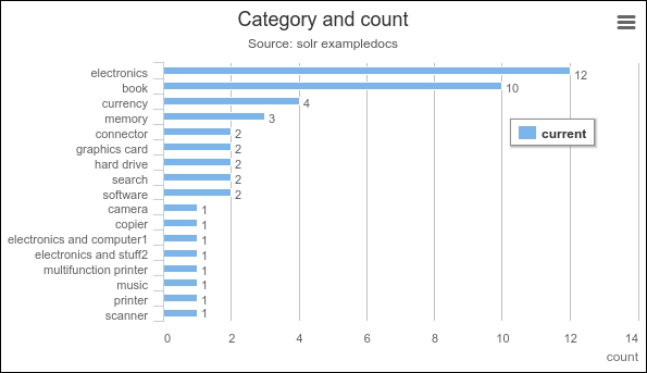
On running the PHP code, we will get the following graph:

Now let us go through and understand the code.
We have defined our Solr connection parameters using the configuration variable and created a Solarium client:
$config = array( "endpoint" => array( "localhost" => array( "host"=>"127.0.0.1", "port"=>"8983", "path"=>"/solr", "core"=>"collection1", ), ) ); $client = new Solarium\Client($config);
We are creating our select query using the following code:
$query = $client->createSelect(); $query->setQuery('*:*');We have created a facet for the cat field and named the facet as category for reference in our PHP code:
$facetset = $query->getFacetSet(); $facetset->createFacetField('category')->setField('cat');Next, we execute the query and get the facets from the result set:
$resultSet = $client->select($query); $facet_cat = $resultSet->getFacetSet()->getFacet('category');In our JavaScript code required for generating the graph, we have defined the category names in the x-Axis class:
xAxis: { categories: [<?php foreach($facet_cat as $item => $count) { echo "'".$item."',"; } ?> ], title: { text: null } },The category numbers in the series variable are defined as follows:
series: [{ name: 'current', data: [<?php foreach($facet_cat as $item => $count) { echo $count.","; } ?>] }]The highchart.js files are referred to via the following lines in our code:
<script src="js/highcharts.js"></script> <script src="js/modules/exporting.js"></script>
This shows that, using simple queries and JavaScript graph libraries, we can generate graphs required for analytics.
With SolrCloud, we can target terabytes of data—as it can be linearly scaled across multiple nodes or machines running Solr. We can create a data warehouse and use it to store massive amounts of data. We can feed the data to the system in real time and build graphs for analytics purposes. The graphs would then reflect the changes happening in real time and provide an insight into historical data.

