In this chapter, you will understand the basic and detailed concepts of Power BI Desktop implementation with clear examples. Also, you will see the advantage of Power BI Desktop in data visualization.
On-Premises Data Power BI Data Visualization
SQL, SSAS, Excel Desktop, Mobile, Browser
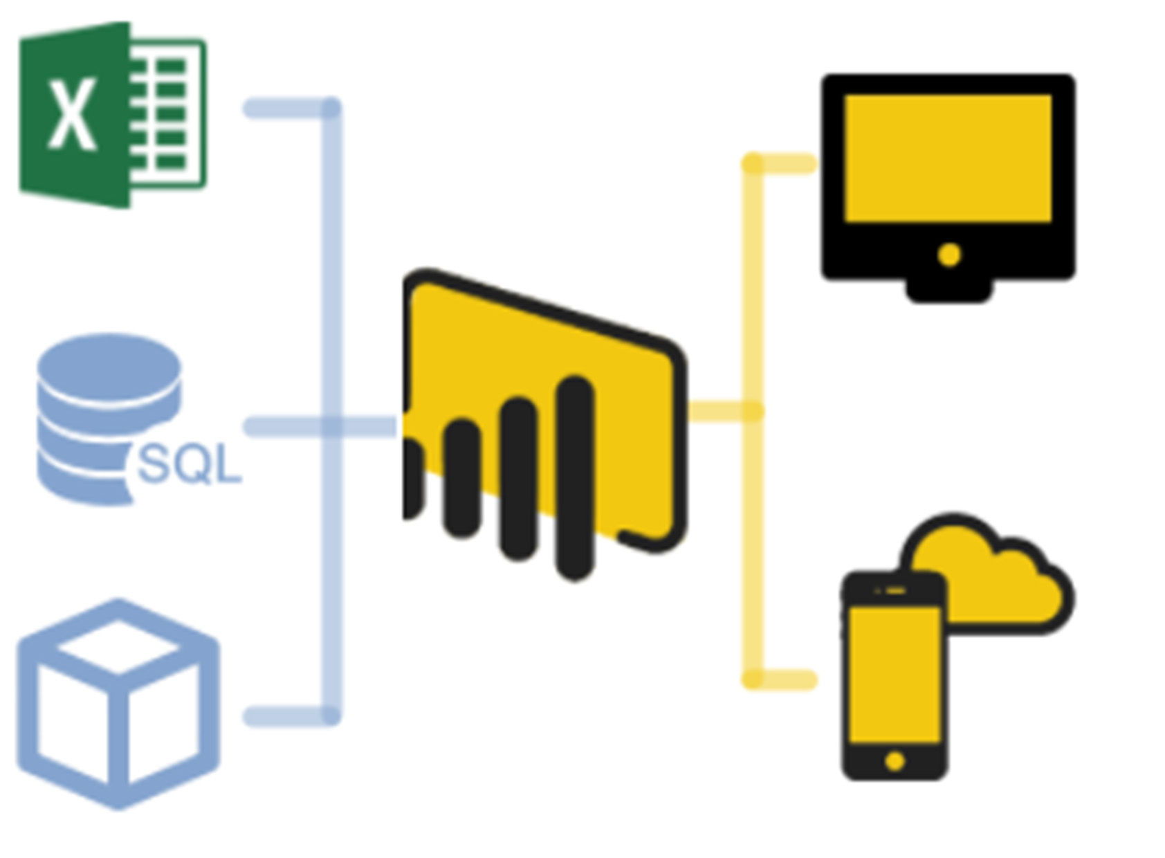
Microsoft provides Power BI as a free service for business analytics, providing fully interactive visualizations, allowing end-users to create dashboards and reports by themselves without depending on anyone.
Power BI Desktop is a free desktop application that provides report creation & generation, modeling, and advanced query features, which helps you to create reports, data models, and collaborating with team members by sharing your work with each other.
You can share the work in two ways:
1) Power BI desktop file ( .pbix/.pbit ) : Share the file to the user; if the user wants to see your report, they need to install Power BI desktop in their system.
.pbix- ( Power BI Desktop File ) Report with static output.
. pbit- ( Power BI Desktop Template ) Report should accept the changes dynamically and display the output based on the input parameters.
2) Power BI service : Publishing the PBI desktop file directly to Power BI Service, so that users can see the report and interact with it from the web browser. You need a license to connect the Power BI service.
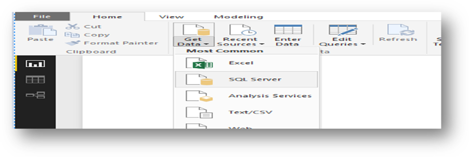
Starting Power BI Desktop
- The first step is to launch the Power BI Desktop.
- Connect the SQL Server objects to get the data loaded into PBI Desktop.
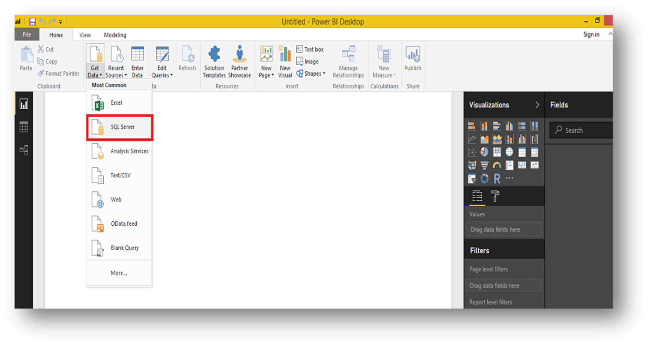
- If you are the admin of the server, then connect the SQL Server using “localhost\SQLEXPRESS” in my Local Server Instance.
- If you want to connect the Generic server with Username and password, then connect the SQL Server by providing the Username and Password.
Import
It will import all the selected tables/columns into the Power BI Desktop.
Whenever a user wants to create/interact with a visualization, the ‘Import’ won’t pull the latest data from DB; if you want to see any changes to the underlying data, then you need to do a refresh every time in Power BI desktop.
See the detailed example mentioned below by loading the “TrendData” table.
| Column_name | Type |
| WorkYear | Int |
| Workweek | Nvarchar |
| USA | Int |
| SNO | Int |
File Name = Trend.pbix
Slicer Tool will act as a filter tool. You have two-year values (2019 & 2020).
In the example, I selected the value 2019 from the slicer tool, which is coming from Query1 Dataset. So, the designed report will also show only 2019 year values information.
Add a new value to the Trend Data table to see whether it is reflecting in the Power BI Report or not.
SQL> Insert into [dbo].[TrendData] values(2019, 'SNO4', 140, 138, 123, 251, 106)
Close the Power BI Desktop file Trend.pbix and open again; you won’t see the newly inserted ‘WW07’ values in the Power BI Desktop until you do a “Refresh.”
Direct Query
It won’t copy/import any data to the Power BI Desktop.
Whenever a user wants to create/interact with a visualization, ‘Direct Query’ queries, only the underlying data from the DB. Meaning always you will view the current data.
File Name = Trend_Direct.pbix
SQL> Insert into [dbo].[TrendData] values(2020, 'SNO5', 145, 213, 126, 174, 148)
Close the Power BI Desktop file Trend_Direct.pbix and open again, you can see the newly inserted ‘WW07’ 2018 values in the Power BI Desktop without a Refresh because Direct Query will always give us the current data from DB.
- Suppose instead of pulling data from a single table; if you want to join with some other table to get the result set, then you need to right-click on the Dataset ‘Query1’ and select the ‘Edit Query’ option highlighted in the screen.
- Double click on the Source option highlighted on the screen.
- Database server connection popup will open, and you can modify the query by joining with other tables and put the statement again in the ‘SQL Statement’ window highlighted on the screen.
Note: While modifying the query statement, think you have already designed the Power BI Desktop with some attributes, make sure that the same attribute names must come again along with other new additional attributes (if any). Otherwise, you will lose the design which you had already designed before.
Example: You designed the Power BI Desktop using (Work Year, Workweek, USA, SNO) attributes while modifying the query to make sure these attributes must come in the new query also otherwise, you will lose design.
All the above explained the Pbix extension file would give only the static result. Suppose if you want to see the data based on your input parameters (Date, text, Number, etc.) in Power BI reports, you need to use the Pbit template file.
Parameters Syntax
Date Parameter = '"& Date.ToText(Column_Name) & "'
Text Parameter = '"& ToText(Column_Name) & "'
Number Parameter =" & Number.ToText(Column_Name) &”
- You are going to get the Missed Records status report for all the GEOs using Pbit template file.
- I have maintained three tables to load the missed records data counts every weekly from 2019 to till now from the daily transaction OLTP.
- Now you are going to create a Self-service Analytical Power BI report (pbit) to allow business users to leverage analytics.
- Open the Power BI Desktop and save the file in the below-mentioned format (*.pbit).
- Get the data loaded from SQL Server by following the below step.
- Load the table data with hardcoded parameter value into Power BI desktop.
- Data Loaded into the Power BI Desktop with dataset name ‘Query1’.
Create Parameters
Add Parameters in the Power BI desktop to pass the dynamic parameter value while loading the data into Power BI Desktop.
- Right-click on the ‘Query1’ and select the ‘Edit Query’ option.
- Select Manage Parameter drop-down and click on the ‘New Parameter’ option.
Now, create two Parameter with the names “Year” and “Workweek.”
- Year Parameter Creation.
- WorkWeek Parameter Creation.
After the creation of two parameters, click on the “Close & Apply” option to save.
Change the hardcoded Parameter values to the created Parameter names to get only the specific data loaded into Power BI Desktop based on the I/P Parameters.
- Right-click on the ‘Query1’ and select the ‘Edit Query’ option.
- Click on the drop-down arrow nearby Query Settings.
- You will get the hardcoded value for YearName and Week.
- Now try to replace the hardcoded values with the created parameters (Year & WorkWeek). The tick mark(Parse) will tell you whether your modified query is correct or not.
- For better understanding, you can rename the ‘Query1’ dataset to whichever name you want. “MissedRecords table loaded into PBI with dynamic parameters.”
- You need to follow the same procedure which you did for the 1 st table dataset ”MissedRecord” to load the 2 nd table “Missed Percentage” by passing the dynamically created parameter values.
- For the 3 rd table, I don’t want to pass any parameters; instead, I want to load all the data. Creating visualization for the Loaded DataSet. Select whichever objects needed from the visualization menu.
- Select whichever data fields which you want the user to see in the Power BI Report.
- I have pulled data fields from two Dataset “MissedRecords” & MissedPercentage” and created a tabular view of data.
Once you have completed the above steps, you can start the below ones.
- For formatting the text and good design, click on the red circle highlighted to see the available formatting option to alter the text format and design format.
- You can also change the Data Type of any attribute, for example, click on the Missed_Record field and click on the Modeling menu to change the data type.
- Create a new tab to create the Missed records Trend using Visualization in PBI.
- As I told before, I haven’t set up any dynamic parameter value for this Dataset MissedTrendData. Then pull all the data from this table from SQL DB.
- Copy the created design and paste on the same tab.
- Click on the pasted design and select the Line graph, then your design will change. Click on the yellow color highlighted option to change the level of data to the lowest with an ordered format.
- Change the Y-axis scale type to ‘Log’ to arrange the data in proper order. Enable the ‘Data Label’ Option to see the values for the corresponding Year & Work Week.
- You can filter the data by using the slicer tool ‘Year Name,’ then the report will also reflect based on the selected value. Save and close the Power BI desktop .
- Reopen the Power BI Desktop; it will ask for the parameter values.
Now, data got loaded, and you can see the same tabs.
- 1 st Tab - You set dynamic parameter values for the two datasets “MissedRecords” & “MissedPercentage.”
- 2 nd Tab - You loaded the “MissedTrend Data” dataset without setting up any dynamic parameters.
For testing purposes, I have pulled Week, and YearName attributes from the loaded “MissedRecords” dataset to verify the data loaded only for the selected Parameters.
Publishing Power BI Desktop to the Web (Power BI Service)
- Click on the Publish tool.
- Sign in to Power BI Login.
- Select Destination place where to save the Power BI report.
- Once the above step is done, you will receive a link to your report.
- Click on the link to open the report in your Power BI publishing site.
Minimum System Requirements to Run Power BI Desktop
Windows 7 / Windows Server 2008 R2, or later.
.NET Framework 4.5 or later.
Here you will understand how to connect to the data sources, create dashboards, availability of different kinds of visualizations, especially map visualizations and their usage in Power BI Desktop. Now let us get started.
Creating a Dashboard
Open Power BI Desktop, it will show the home screen.
Then click on Get Data, it shows the following screen showing a wide range of source connections.
Select the required option. Here I am selecting the Excel. Click on connect and browse the path where the file is located. Select the sheet which you want to load and use. Click on Edit if you need to change the dataset like adding a calculated column, deleting the unwanted column, etc. else click on Load.
Then it will load the data. To check the data loaded, click on the icon Data on the top left side on the screen.
Now you will develop dashboards using map visualizations available.
Note: If the visualization is not available in the list available, you can download and import it by clicking on the three dots (. . .)
Dashboard Using Map
For this, click on the empty or white screen then click on Map under the visualizations tab.
Then check the country and sales columns available under the Country_vs_Sales dataset. Maximize the map.
Now you will try to include other visualizations like a bar chart, a pie chart for a better understanding. For this also, click on the empty white screen available, then click on the desired visualization, then drag the fields to the desired appropriate values or check the columns.
And then, by clicking on any of the countries, you can filter only for that particular country value throughout the dashboard.
Suppose I clicked on the value New Zealand, then the total dashboard will highlight the details of New Zealand only.
Give the proper name to the dashboard and save the file.
Based on the requirements, you can use different visualizations on the dashboard.
The above dashboard consists of the Visualization Map. Now you will try to implement different kinds of maps available.
Filled Map
Now select Filled Map under Visualizations tab, then check the boxes against country and sales columns.
You can also go for the individual coloring for each country by dragging the country column to legend.
You can also specify the color saturation from one color to another, depending on the values in the data.
E.g., it will display the colors from red to green, i.e., red indicate lower values and green indicate higher values.
You can also include here one more color as the center value by setting the value of Diverging to On. The values for the Minimum, Center, and Maximum are taken by default. You can also explicitly mention the range of these values according to your needs.
If you give the consecutive values to them, they display the exact colors with no saturation.
And if consecutive values are not given to them, they display the saturated colors.
Shape Map
You use a shape map to achieve your own desired map or when you want only to specify particular regions of the map. For this, you can select the maps available under it. Or if the map which you are looking for is not available, you can create one yourself and import it. This file will be in .json format.
.g.: You shall compare the sales among the different countries of the African continent.
Now click on the shape map under visualizations.
If it is not available, enable Shape Map by navigating to File -> Options and Settings.
Then go to Options -> Preview Features.
Finally, select the Shape Map, and you have to restart the Power BI Desktop once you finalize the selection.
Now develop a map file in JSON(JavaScript Object Notation) format. (You can get from internet of desired geographical regions). I created here the countries of the African continent.
As soon as you enable the Shape Map, click on Shape Map control present in the Visualizations pane. Check a few columns and go to the Format tab, where you can see the predefined groups of countries under the Shape tab.
You can select one among the given list, or you import the map file by clicking on the tab +Add Map.
Now it will direct to browse the file option, then select the file and import.
You are allowed to use the custom maps along with Shape Map only if their format is in TopoJSON. If the map is not in this format, use the online converters like Map Shaper ( ) to convert it to TopoJSON format. Generally, the JSON files downloaded from the internet should be converted to TopoJSON format using Map Shaper.
Now the map of desired regions is visible. You can compare the sales values among these countries by having different colors for each of the sales value by having Sales in legend.