Chapter 12
XAML Essentials
What's in this chapter?
Features shared by all XAML platforms
The XAML markup language
The layout system
Building user interfaces via composition
Resources in XAML
Data binding
Data templating and ItemControls
Styles
Control templates
on the Download Code tab. The code is in the chapter 12 download and individually named according to the names throughout the chapter.
XAML has become a mainstream way of creating user interfaces in Visual Studio. There are currently three different user interface technology platforms which use the XAML markup language: Windows Presentation Foundation (WPF), Silverlight, and Window 8 / WinRT.
These platforms vary in many details. Visual elements in one platform may not be available in another. For example, WPF and Silverlight libraries contain a DataGrid element, but the WinRT libraries do not have such an element.
However, many basic concepts are the same in all three platforms. These include layout and composition of user interfaces, working with data, and styling. This chapter will cover those aspects of XAML that all three platforms have in common.
The examples shown in the chapter will work in all three platforms, though occasionally minor changes may be needed for a particular platform. The code downloads for this chapter will contain the examples done in each platform.
This chapter is aimed at those who have little or no experience with XAML. It can be helpful for developers just getting started in XAML, regardless of the XAML platform they will be using.
Readers who have created production-level applications in WPF or Silverlight, and wish to apply XAML for Windows 8 applications, may proceed directly to Chapter 13 on XAML in Windows 8.
One caution is in order. It's not possible to cover everything you'll need to know about XAML is two chapters, regardless of the platform you will be using. Entire books have been written about XAML. If you need to go past the basics presented in these two chapters, you should choose a book that targets the platform you will be using.
. The sample page of XAML, rendered in Windows 8 (left) and WPF in Windows 7 (right)
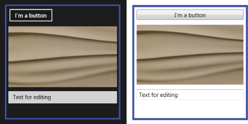
The sample page of XAML, rendered in Windows 8 (left) and WPF in Windows 7 (right)

As the screens in indicate, there are some significant differences in the way XAML is rendered on the different platforms. Sometimes defaults are different, as you see in the different default backgrounds. Varying defaults may even affect sizing, as seen in the differing Button elements. In Windows 8 XAML, the Button is left aligned by default, but it is stretched by default in WPF.
Code Behind and Naming of Elements
XAML describes object instances, and sometimes those objects generate events which must be handled. Suppose, for example, the Button defined in the XAML you saw earlier needs to cause some code to run when the Button is clicked.
Visual Studio allows you to enter such code by double-clicking the Button in the visual designer. XAML also allows hookup of event handler via an XAML attribute. Here is a line of XAML from the earlier example, with the addition of an event handler for the button.
<Button Margin="5" Click="Button_Click"> >I'm a button</Button>
The code in a code-behind module must have some way to identity a XAML element before it can work with that element. That identification is usually done with a Name property, just as it is in other designers.
Naming an element in XAML is not required unless you want to reference the element in code. In the first example of XAML discussed previously, none of the elements had a name.
You can name most elements in XAML using a Name attribute, which sets the Name property on the element. All routine controls and containers have a Name property.
Some elements do not have a name property. XAML provides a special way to reference those elements in code: the x:Name attribute. x:Name works just like the Name property for the purposes of referring to an element in code, but it is available for any element, whether or not it has a Name property.
Getting Our Terminology Straight
In most user interface technologies, the word control is used generically to refer to just about anything you might place on a visual design surface. In XAML, the word control has a more restrictive meaning. A control in XAML is a visual element that is designed with user input in mind. A TextBox, for example, clearly fits that meaning. A StackPanel does not.
Containers such as StackPanels are generically referred to as panels rather than controls. Controls and panels do not exhaust the possibilities; the Border element shown in the earlier example is in a category called decorators.
The generic word for a XAML visual object is an element. That's reflected in the base classes for visual elements, which have names like UIElement and FrameworkElement. Panels, controls, and decorators, then, are all different categories of elements.
The UIElement and FrameworkElement Classes
The UIElement base class for visual XAML elements implements functionality needed by all elements, such as input via the keyboard, mouse, touch, and stylus. The FrameworkElement base class inherits from UIElement and adds layout capabilities, data binding, and styling. For routine application development, you will not need to know anything more about these classes.
You will use the FrameworkElement type on occasion. For example, the children of a panel are a collection of FrameworkElement instances. To loop through such a collection, you'll need an index variable of type FrameworkElement.
Commonly Used Elements
All XAML platforms support some commonly used elements. Two panels are always available: StackPanel and Grid. Several standard controls are included in all three, including Button, TextBox, Image, Slider, CheckBox, and RadioButton. TextBlock is available in all three platforms for display of text. Border and ScrollViewer are used on all three platforms for drawing borders and scrolling text.
There are other elements that are included in all three platforms, but each platform also has specific elements that other platforms do not have. You'll look at several of the elements specific to Windows 8 in the next chapter.
Property Setting: Attribute Syntax vs. Element Syntax
As mentioned in the very first description of XAML, visual elements can have properties set via XML attributes. Here's another example:
<StackPanel Width="150" Background="Blue">
There is sometimes more going on with such a property setting than meets the eye. Setting the Width property to 150 units is straightforward. However, setting the Background property in this case requires more work under the covers. The setting of “Blue” is transformed by the XAML parser into an element called a SolidColorBrush. That element has a property that holds a color, and the color is set to blue.
There is another way to set a property value besides using an attribute. It's done using a specially constructed XML element. Here is another XAML example, and it yields exactly the same results as the one immediately previous one:
<StackPanel Width="150"> <StackPanel.Background>Blue</StackPanel.Background>
In this case the property value of Blue is between two element tags, one starting and one ending. The element tag is constructed from the class name and the property name.
All properties can be set this way. Normally, attributes are used because the XAML is more concise and easier to read. However, sometimes the alternative element-based syntax is needed because an attribute value cannot be used for the desired property value.
For example, the Background property can be set to other types of brushes. (The “Brushes” section to come covers basics on brushes.) One example is a linear gradient brush.
There is no simple string to set the Background to a linear gradient brush. It requires several lines of XAML to do it. Element-based syntax creates a “hole” in the XAML, so to speak, that provides a place to put such additional XAML. Let's see what the previous example of setting the Background property looks like when it is set to a linear gradient brush:
<StackPanel Width="150"> <StackPanel.Background> <LinearGradientBrush EndPoint="1,0.5" StartPoint="0,0.5"> <GradientStop Color="Black" Offset="0" /> <GradientStop Color="White" Offset="1" /> </LinearGradientBrush> </StackPanel.Background>
Don't worry at this point about the detailed syntax of LinearGradientBrush; the visual designers usually write that XAML for you. The point is that the XAML is complex enough that it can't be placed in an attribute. Element-based syntax is a necessity to set the value of the Background property to a LinearGradientBrush.
You must become comfortable switching between attribute-based and element-based syntax in XAML as necessary. In many cases, what begins as a simple attribute-based property must later be changes to a more complex value that requires element-based syntax.
Referencing Additional Namespaces in XAM
As mentioned earlier, the capability to reference a namespace with “xmlns” is a part of the XML standard. You can think of these namespace definitions as similar in concept to specifying an Imports statement in Visual Basic or a using statement in C#.
The first example only showed two namespaces:
<UserControl x:Class="SampleUC" xmlns="http://schemas.microsoft.com/winfx/2006/xaml/presentation" xmlns:x="http://schemas.microsoft.com/winfx/2006/xaml"
The first namespace is the default XML namespace, and it contains elements that can be used without a prefix, such as <Button>. The second namespace includes some helper objects; the x:Name attribute discussed previously is from that namespace.
Only one default namespace can exist per XML page. All other namespaces defined in the XML page must have an identifier. The second namespace has such an identifier.
You can add your own namespace definitions to a XAML page to reference other classes. There are several situations in which you might need to do this. If you are using third-party controls, for example, those controls will be in their own namespace, and that namespace will need to be referenced in any XAML page that uses the controls. If you drag third-party controls out of the toolbox, the visual designer may insert additional namespace references into the XAML page for you, but if you are hand-coding those controls into the XAML, you may have to specify the namespace references manually.
If you write your own classes that are used in XAML, you will also need to add a namespace reference to your XAML pages to use those classes. You'll see an example later in this chapter: value converters, which translate property values during the binding process.
Namespace references in XAML don't have to use the URI tag approach. The xmlns definition can directly reference the assembly by name.
The different XAML platforms have slightly different syntax for such namespace references. If your local project assembly were named MyXAMLApp, in WPF or Silverlight, declaring a namespace for the local assembly would be done like this:
xmlns:local="clr-namespace:MyXAMLApp "
In Windows 8 XAML, the syntax is slightly different:
xmlns:local="using:MyXAMLApp "
The XAML editor in Visual Studio offers a drop-down to help you create your namespace declarations, so you don't need to memorize this syntax.
. That example is rendered in Windows 8 XAML on the left and in WPF XAML on the right. The width of the first column is 60 unconditionally, while the width of the second column is based on the width of the button placed in it. The third and fourth columns share what's left, in a ratio of 2 to 3. A Grid with four columns defined by the XAML example shown earlier, and with four buttons included to show the sizes and locations of the columns
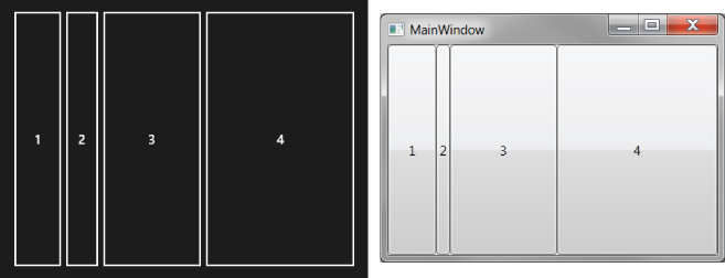
A Grid with four columns defined by the XAML example shown earlier, and with four buttons included to show the sizes and locations of the columns

Notice how narrow the second column is. The content of the button, namely the numeral “2,” is quite narrow, and the button automatically sizes to that narrow width. The Grid column then sizes itself to contain that Button element. You'll see much more in the Sizing and Layout section later in the chapter.
If you do this example in Windows 8, you'll need to tell the Button elements to stretch horizontally and vertically using the HorizontalAlignment and VerticalAlignment properties. The default for Button in WPF is to stretch, but the default for Windows 8 XAML is not to stretch.
The numbers on the last two columns could have been “6*” and “9*,” or “100*” and “150*,” or any other numbers with a ratio of 2 to 3, and the end result on the screen would be exactly the same. For proportional widths, it doesn't matter what the numbers are. It only matters what fractional portion a column's number makes up of the sum for proportional columns.
The exact same sizing options are available for rows. The only difference is that you use the Height property of a RowDefinition in place of the Width property of a ColumnDefinition. To avoid boredom, this won't go through a virtually identical example for rows.
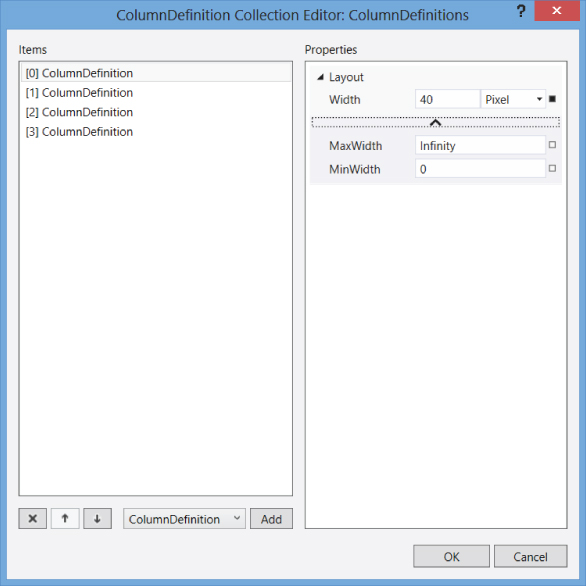
The Visual Studio visual designer contains various ways to define columns and rows. One way is to use special editors. You can get to those editors in the Properties window for the Grid. The entry in the Properties window for ColumnDefinitions has a button on the right with an ellipsis. Clicking that button brings up the ColumnDefinitions editor, which gives you precise control over all the different properties of each ColumnDefinition. The ColumnDefinition editor is shown in , with four columns as discussed in the earlier example. There is a similar editor for RowDefinitions.
The ColumnDefinition editor in Visual Studio 2012. It is accessed by pressing the button next to the ColumnDefinitions property in the Properties window
Placing Elements in a Grid
To specify the column and row for an element, you use the Grid.Column and Grid.Row attached properties. The numbering for rows and columns is zero-based, just like all collections in .NET. To place a Button in the second row and third column of a Grid, the Button would be defined inside a Grid with a line of XAML like this:
<Button Grid.Row="1" Grid.Column="2">Button text</Button>
The default for Grid.Row and Grid.Column are zero. Elements that don't set a row or column end up in the top left cell of the Grid.
You can place multiple elements in the same Grid cell. Those elements, if their areas intersect, are layered on top of one another. Elements later in the Children collection, which means further down in the XAML definition, are rendered on top of earlier elements in the Children collection.
Spanning Columns and Rows
By default, an element is placed in a single cell of a Grid. However, an element can begin in the cell assigned by Grid.Column and Grid.Row, and then span additional rows and/or columns.
The attached properties Grid.ColumnSpan and Grid.RowSpan determine the number of columns and rows an element spans. Their default is, of course, 1. You can set either or both for an element. Setting only Grid.ColumnSpan restricts an element to a single row, but extends the element into extra columns. Similarly, setting only Grid.RowSpan extends through multiple rows in the same column. Setting both causes an element to span a rectangular block of cells.
To see Grid.Column, Grid.Row, Grid.ColumnSpan, and Grid.RowSpan in action, let's look at an example. The following XAML defines a Grid with several Buttons, using varying rows, columns, and spans. shows what that Grid would look like in design view in Visual Studio for a WPF project. The design view is shown so that you can see the blue lines that define rows and columns, and how buttons span the rows and columns based on their settings in XAML (code file: GridWithButtons.xaml):
A design view of a Grid, showing elements positioned in various cells and some elements spanning multiple cells. This example is rendered in WPF on Windows 7
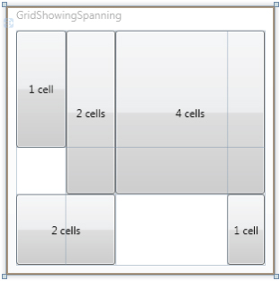
<Grid> <Grid.RowDefinitions> <RowDefinition Height="50*" /> <RowDefinition Height="20*" /> <RowDefinition Height="30*" /> </Grid.RowDefinitions> <Grid.ColumnDefinitions> <ColumnDefinition Width="20*" /> <ColumnDefinition Width="20*" /> <ColumnDefinition Width="45*" /> <ColumnDefinition Width="15*" /> </Grid.ColumnDefinitions> <Button>1 cell</Button> <Button Grid.Column="1" Grid.RowSpan="2">2 cells</Button> <Button Grid.Row="2" Grid.ColumnSpan="2">2 cells</Button> <Button Grid.Column="2" Grid.ColumnSpan="2" Grid.RowSpan="2">4 cells</Button> <Button Grid.Column="3" Grid.Row="2">1 cell</Button>
</Grid>
Canvas
The Canvas panel is perhaps the easiest panel to understand. It is placed it at the end of the panel discussion, though, because it should be used sparingly in XAML interfaces.
If you're a Windows Forms developer, you will probably feel an affinity for the Canvas panel. It positions children in almost exactly the way as a Form in Windows Forms. That may tempt you to rely on the Canvas so that you can avoid understanding the complexity of the other panels.
You should resist that temptation. While the Canvas certainly has valid uses, it should not normally be the dominant element on a XAML user interface. If it is, the interface will not possess many of the best characteristics of a XAML interface. It won't automatically adjust children to fit different aspect ratios, for example. This would be a particularly major drawback for Windows 8 XAML applications.
However, Canvas is a good choice for several application scenarios. Here are a few examples:
- Graphing and charting surfaces
- Animation of positions of elements
- Surfaces that allow users to move elements around
- Positioning elements in certain types of control
Positioning Child Elements on a Canvas
Children are positioned on a Canvas with the attached properties Canvas.Top and Canvas.Left. These correspond to the Top and Left properties of Windows Forms controls in the way they are used for positioning. The two properties position the upper left corner of an element; Canvas.Top determines the distance down from the top of the Canvas, and Canvas.Left determines the distance over from the left side.
WPF also has Canvas.Bottom and Canvas.Right attached properties, but since Silverlight and Windows 7 lack them, they are not discussed in this chapter.
Nesting Panels
It is common to nest panels to gain more flexible control over layout. For example, you might want a stack of buttons in a Grid cell. That is achieved by making a StackPanel a child element of a Grid, and then placing the buttons you want as children of the StackPanel. Here is a XAML example (code file: GridContainingStackPanel.xaml):
<Grid> <Grid.RowDefinitions> <RowDefinition /> <RowDefinition /> </Grid.RowDefinitions> <Grid.ColumnDefinitions> <ColumnDefinition /> <ColumnDefinition /> <ColumnDefinition /> </Grid.ColumnDefinitions> <StackPanel Grid.Column="2" Grid.Row="1" > <Button Margin="4">Save</Button> <Button Margin="4">Cancel</Button> </StackPanel> </Grid>
As another example, you could put a Canvas in a cell of a Grid to gain pixel-by-pixel positioning just inside that cell.
Sizing and Layout of Elements
One of the primary goals of XAML is allowing creation of interfaces that scale themselves to the space they are given. With widely varying resolutions, plus the fact that an application window can be in a wide range of sizes, many different factors affect the final rendered size and position of a XAML element. Windows 8 introduces some new complexities in the form of “snapped” application windows.
This section presents an overview of the major factors that affect sizing and layout of XAML elements. It doesn't try to tell you everything there is to know about the subject—just enough to handle the common cases you will run into during application programming.
Don't be surprised if you have to read this section a couple of times to sort out all of the factors involved in sizing and layout. It's a complex subject, but a necessary one to understand if you're going to design anything beyond very simple interfaces in XAML.
What Is Layout?
In XAML, layout means sizing and arranging the children of a panel. This is a complicated, recursive process. Since panels may contain other panels as children, sizing and positioning must be done at several “levels” before a complete Window or Page can be rendered. The process starts in the root element, and goes down through the tree of child elements. At each level, there is interaction between child elements and their parent to decide on size and position.
If you don't understand some of the mechanisms used for this process, you'll constantly be producing XAML interfaces that don't act the way you expect.
First Step: Measuring the Child Elements
Measurement is the process of determining the size that an element wants to be when it is rendered. That size is usually called the desired size, and in fact elements have a property named DesiredSize. It may or may not be the actual rendered size; that depends on several other factors, including whether the height and width values are hard-coded, and what the container holding the element wants to do with the element.
The base FrameworkElement class contains several properties that furnish information to the measurement process, including:
- Height and Width
- MinHeight, MaxHeight, MinWidth, and MaxWidth
- Margin
Using Height and Width Properties
Height and Width work exactly as you would expect. They hard-code the size of an element, just as they do in other user interface technologies. If an element with hard-coded size is placed in a panel, the panel will respect that size and will not change it, even if there's not enough room to show the element and the element must be clipped.
Since these two properties work in a way you'll find familiar, at first you may be tempted to bypass the whole process of understanding XAML's complex sizing process, and just set the sizes you want. For most XAML applications, that's a mistake. It requires giving up much of the flexibility of XAML to respond to different conditions. You should be conservative in using explicit settings for Height and Width; do it only if automatic sizing doesn't fit your needs.
One common place to explicitly set Height and Width is on the root element of your interface. For example, when you create a new WPF Window in Visual Studio, it will have Height and Width explicitly set to default values.
Applying Minimum and Maximum Values
The next level of control over size is to set a range of values for the height and width of an element. The four properties MinHeight, MaxHeight, MinWidth, and MaxWidth contain the range settings. This discussion is presented in terms of width, but the exact same discussion applies to height.
If MinWidth is set for an element, it won't be sized less than that amount. If a MaxWidth is set, the element won't be made wider than that amount.
Within that range, an element will be sized based on other factors, including the space available within the element's container and the size of child elements (if any).
Applying a Margin
For the purposes of fitting an element within its container, the element's Margin setting must also be taken into account. The container will have a certain size available for the element; that size must then be reduced by any Margin on the element. If an element has a Margin, room is always made for it, even if that means truncating the control.
Margin can be set uniformly around an element, or Margin can be different for all four sides. Consider a Button with the following XAML definition:
<Button Margin="5,10,0,-10">Save</Button>
This instructs the layout engine to place 5 units of margin on the left side, 10 units on the top, and no margin on the right side. It also includes a negative margin for the bottom of the Button, which allows the Button to flow outside its normal area by 10 units on the bottom.
Second Step: Arranging the Child Elements in a Panel
After the measurement phase, an element has either an explicit size or a desired size, and possibly a Margin that must be included. Using that information, the parent panel then arranges each child element inside a space in the panel allocated for the element. For example, for a Grid, the allocated space includes the cell or group of cells determined by the elements Grid.Row, Grid.Column, Grid.Rowspan, and Grid.Columnspan properties.
Arrangement includes placement of the element in the space available, and may include additional adjustments to the size. Any necessary adjustments are made independently for width and height.
The arrangement process depends on several factors:
- The type of panel involved
- The sizing results from the measurement phase
- The values of the HorizontalAlignment and VerticalAlignment properties for an element
Each of these factors can have many different possibilities. The number of combinations of factors is consequently quite large. To explain the process, let's simplify it a bit and leave out some of the less common cases. While the resulting explanation isn't complete, it should be enough for you to understand what happens for most of the situations you are likely to encounter as you begin developing XAML interfaces.
Because height and width are sized and arranged independently, the discussion is focused on an explanation on height. The exact same principles apply to width, with changes for the names of the properties involved.
Desired or Required Height vs. Available Height
During the arrangement phase, the final rendered height for an element must be decided. The first factor to consider is whether the element's explicit or desired height will fit in the space allocated for the element. In proper Goldilocks fashion, the allocated height in the panel might be too big, too small, or just right.
If the allocated height happens to be just what the element wants for a height, then the process is finished. That's the height that's used, and the element exactly fills the allocated space from top to bottom.
If the allocated height is too small, then the element must be sized bigger than the allocated height. In that case, the visual part of the element is a truncated portion of the element. How the truncation is done depends on the vertical positioning of the element, which you'll take up later.
If the allocated height is bigger than the element needs, then the actual height of the element depends on whether the height was explicitly set. For an explicit height, that's the height used for rendering. For a desired height, the actual rendered height depends on the value of the VerticalAlignment property. That property is also used for vertical positioning of the element.
Vertical Positioning and the VerticalAlignment Property
The VerticalAlignment property has four possible values: Top, Center, Bottom, or Stretch. Stretch is the default.
The vertical positioning of an element depends on this setting. Top, Center, and Bottom position the edges of the control. The Stretch setting causes more complex decision making, so the other settings will be considered first.
As you would probably expect, if you set your element with a VerticalAlignment of Top, the top edge of the element will be at the top of the allocated space. That's true whether the element is too tall or too short for its space. If the element is too tall for its space, then the top of the element is at the top of the space and the element is truncated at the bottom. If the element is too short for its space, then the element is positioned at the top of the space and any space that's left over is simply unused by the element. shows the visual effect of both cases. Examples are shown in of height set both with the Height property and the MinHeight property, and as you can see, the results are the same for a VerticalAlignment of Top.
Four Buttons with VerticalAlignment of Top and a Margin of 10, all contained in a Grid
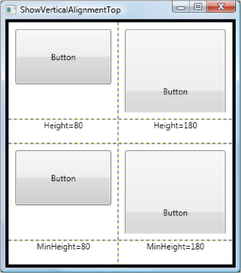
The left Buttons are too short for their allocated space. The right Buttons are too tall for their allocated height, so they are truncated. A Border decorator around the Grid is used for clarity, and the Grid has ShowGridLines set to True to let you see the Grid's cells.
Similarly, a VerticalAlignment of Bottom places the bottom edge at the bottom of the allocation space, and clips or leaves empty space at the top, as necessary. A VerticalAlignment of Center places the center of the control at the center of the allocated space, and clips or leaves empty space at both top and bottom.
If VerticalAlignment is set to Stretch, and the height is too big, then the result is the same as if VerticalAlignment has been set to Top. If VerticalAlignment is set to Stretch, and the height is smaller than the allocated height, then the result depends on whether the height was explicitly set or just a desired height. For a desired height, the element will be stretched to fill the entire vertical space available to it.
For height that is explicitly set but shorter than the allocated height, the effect is the same as if VerticalAlignment had been set to Center. The element gets its required height and is centered vertically in the allocated space, leaving extra space at the top and bottom.
There are a lot of combinations, and it's hard to keep them straight at first. However, most XAML developers find that predicting the effects of sizing and alignment becomes second nature after a while.
The process for arriving at a final width is conceptually identical to the one for height. Of course, the properties used are different. The property used for final position is named HorizontalAlignment instead of VerticalAlignment, and it has values of Left, Center, Right, and Stretch. However, if you understand the discussion on height, you should have no problem mapping the concepts to width.
Arrangement in a StackPanel
The arrangement phase is somewhat different in a StackPanel. If a StackPanel's Orientation property is at the default of Vertical, then a StackPanel will only stretch elements horizontally. Even if VerticalAlignment for an element is set to Stretch, the element won't be stretched vertically beyond its desired or hard-coded size.
This makes complete sense, because the StackPanel expects other elements to possible be stacked underneath a child, so it would not be appropriate to stretch a child arbitrarily.
However, a vertical StackPanel will stretch horizontally if the HorizontalAlignment is set to Stretch. If the HorizontalAlignment is set to anything else, the element will not be stretched. It will remain at its desired or hard-coded width, and positioned according the HorizontalAlignment, much as an element in a Grid cell would be positioned horizontally.
If the StackPanel's Orientation is set to Horizontal, then the vertical and horizontal dimensions merely swap the way they work in the above description.
shows this XAML rendered in both WPF and Windows 8. The Button on the left is rendered in Windows 8 XAML, and the Button on the right is rendered in WPF on Windows 7, both using exactly the same XAML. A Button with its interior determined by content featuring an Image and some text inside a Grid panel
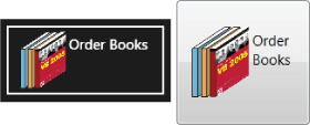
A Button with its interior determined by content featuring an Image and some text inside a Grid panel

Notice that you have complete control over how the image and text are arranged. In older technologies, some Button controls had minimal capability to display images and text, but control was always limited to a few choices.
The difference in XAML is based on the composition model. In older technologies, a Button control was totally responsible for its own internal layout. In essence, the Button had a layout engine built into it. It wasn't really practical to make that layout engine very flexible.
In XAML, the Button does not have any layout capability built in. It delegates layout to other XAML elements that specialize in layout. That means the entire spectrum of layout flexibility from the panels and related elements in XAML can be used inside a Button or other ContentControl. A Button can look like anything you like. Such capabilities as playing video inside a Button are possible and easy to construct (though you probably will not need particular capability in a typical business application).
Another example that illustrates the implications of the Content concept is XAML is the ScrollViewer. This element is responsible for scrolling on all three XAML platforms. ScrollViewer is a ContentControl, with the ability to scroll its content. That means you can make anything scrollable by placing it as content inside a ScrollViewer.
You can change our earlier example of XAML to allow scrolling of the StackPanel and its children very simply (code file: ScrollingStackPanel.xaml):
<UserControl x:Class="SampleUC" xmlns="http://schemas.microsoft.com/winfx/2006/xaml/presentation" xmlns:x="http://schemas.microsoft.com/winfx/2006/xaml" Height="300" Width="300" > <Border BorderThickness="4" BorderBrush="Blue"> <ScrollViewer> <StackPanel> <Button Margin="5">I'm a button</Button> <Image Margin="5" Source="http://billyhollis.com/TextureWavy.jpg" /> <TextBox Margin="5">Text for editing</TextBox> </StackPanel> </ScrollViewer> </Border> </UserControl>
Brushes
Controls and other elements have properties such as Foreground, Background, Fill, Stroke, and BorderBrush to control how the elements are rendered. These properties are all of type Brush. In earlier technologies, you might expect properties like these to be of type Color, but the Brush type is more general and adds flexibility.
Expressing Colors in XAML
There are colors in XAML, of course. One type of Brush is a SolidColorBrush, and a Color is used to specify the solid color to be used.
Colors can be expressed in XAML in several ways. Each XAML platform has a set of named colors, accessible in code through the Colors class. The list is longer in some XAML platforms than others, but every XAML platform has the common colors you would expect, such as Red, Blue, Yellow, and so on.
Using a named color, the XAML for defining a background of solid green in a Border element looks like this:
<Border Background="Green"></Border>
The is parsed by the XAML engine to mean “create a SolidColorBrush using the named color Green and assign it to the Background of the Border.”
Colors can also be specified by HTML-like RGB values. The Border could have a grayish-cyan color set with this XAML:
<Border Background="#20A79E"></Border>
However, even though the XAML parser understands such colors, the visual designers will never insert RGB color values this way. Instead, the designers will insert colors with 4 hex pairs instead of 3, like this:
<Border Background="#FF20A79E"></Border>
The extra hex pair is inserted before the hex pairs for the red, green, and blue channels. That beginning hex pair (FF in the previous XAML) specifies the alpha channel, which controls the translucency of the color. Translucency ranges from FF (fully opaque) to 00 (fully transparent).
Layering Translucent Elements
In addition to getting translucency via the alpha channel, elements have an Opacity property. It ranges from 1 (full opaque) to 0 (fully transparent). It is of type Double, so it can take very fine grained values in between those two.
If elements are layered, and have translucent colors and/or translucency from their Opacity setting, the rendering engine will resolve all the layers for each pixel it paints. You may wish to experiment with translucent colors and the Opacity property to see some of the effects you can produce.
LinearGradientBrush and RadialGradientBrush
Because Foreground, Background, etc. are of type Brush, they can accept any value that is descended from that base type. Besides SolidColorBrush, there is one other brush type that is available for all three XAML platforms: LinearGradientBrush. Each individual XAML platform then has additional brushes. WPF has RadialGradientBrush, ImageBrush, and VisualBrush, Silverlight has RadialGradientBrush, ImageBrush, and VideoBrush, and Windows 8 XAML has TileBrush.
LinearGradientBrush can accept more than one color. It has a collection of GradientStop objects, and each GradientStop has a color. LinearGradientBrush then blends colors in a linear interpolation during rendering.
You don't really need to know the syntax of LinearGradientBrush in detail at this point. The visual designers do a good job of letting you create a LinearGradientBrush. The following is a typical LinearGradientBrush in XAML. shows the result of using it to fill a Rectangle.
A Rectangle filled with a LinearGradientBrush that is Black in the upper left corner and White in the lower right

<LinearGradientBrush EndPoint="1,1" StartPoint="0,0"> <GradientStop Color="Black" Offset="0" /> <GradientStop Color="White" Offset="1" /> </LinearGradientBrush>
The StartPoint and EndPoint properties of the LinearGradientBrush are relative to the element's bounding box. Thus, a StartPoint of “0,0” is the upper left corner of the element, and an EndPoint of “1,1” is the lower right corner. Any fractional values can be used for these properties, including values that get outside the bounding box.
The gradient stops are then positioned along a line drawn from the StartPoint to the EndPoint. The Offset property of the GradientStop determines its position along that line. Offset of “0” means the StartPoint, and an Offset of “1” means the EndPoint. Offset values may be anywhere in between, and a single LinearGradientBrush may have any number of GradientStops with differing Offset properties.
Importance of Gradients
You might think gradient brushes are frivolous, but used judiciously, they can dramatically improve the look of your application. Instead of the monochrome battleship gray that you might have used in the past, gradients can impart a natural feel to an application. After all, the real world does not contain much monochrome. Users are primed to consider monochrome as artificial, and gradients as natural.
The key is to create subtle gradients that are almost unnoticed by the user. Many developers start by using garish gradients that stand out. That is rarely a good use of that capability.
diagrams the objects used in this example, and applies this new terminology to them. The Book object on the right contains the source property, named Title. The TitleTextBox object contains the target property, which is the Text property

The Book object on the right contains the source property, named Title. The TitleTextBox object contains the target property, which is the Text property

For XAML data binding, the target property is always a property on a XAML object. The source property might be on a XAML object, too, or it might be on some other .NET object, such as a Book object created in code.
The target property of a data binding must be a special type of property called a dependency property. Almost all the properties you would ever likely use as the target of a binding are dependency properties, so this isn't normally a concern. However, if you advance to writing your own elements that need bindable target properties, you'll need to learn more about dependency properties. Creating objects with dependency properties is an advanced XAML topic, and is not covered in this book.
The Binding Class and Binding Expressions
The ellipse in the middle of the diagram in represents the activities needed to transfer property values back and forth between the target element and the source data object. Those activities are carried out by an instance of the Binding class.
The Binding class has properties to configure the binding. The two most commonly used properties are the Path property, which specifies the source property for the binding, and the Mode, which determines which ways the property values can flow.
Binding objects are most commonly defined in XAML with a binding expression, which is a special type of markup expression.
What Is a Markup Expression?
A markup expression is a XAML construct that allows definition of a fairly complex object instance in a single string. The string is delimited by braces, and the first word inside the leading brace indicates the type of markup expression.
You have already seen one simple markup expression. The syntax for assigning a property to a resource is a markup expression:
Foreground="{StaticResource ReusableBrush}" The StaticResource type of markup expression tells the XAML parser to go look for a resource with the name that is included in the expression.
What Is a Binding Expression?
The specific type of markup expression used to define a data binding is usually called a binding expression. The result of a binding expression is an instance of the Binding class, with appropriate property values set on the instance.
Here is a simple binding expression that will bind the Text property of a TextBox to a Title property of a data object:
<TextBox Text="{Binding Title}" /> This is actually a shortcut version of a slightly longer binding expression, which is:
<TextBox Text="{Binding Path=Title}" /> In this binding expression, it's more explicit that the Path property of the Binding object is being set to point to a Title property. If necessary, additional properties can be set for the Binding object, with each property setting in the binding expression separated by a comma. This example sets both the data property and another property called Mode:
<TextBox Text="{Binding Path=Title, Mode=TwoWay}" /> The Mode property specifies whether data is transferred only from the data object to the visual element (Mode=OneWay) or if data is transferred both ways between the data object and visual element (Mode=TwoWay). Depending on the XAML platform other values for Mode are also possible. Note that a OneWay binding is essentially read-only—changes to the visual element based on user input are not transferred back to the data object.
The default for the Mode property varies depending on the XAML platform. For Silverlight and Windows 8, the default mode is always OneWay. For WPF, the default is more complicated; if you need details, consult the Mode property in the WPF documentation.
Other properties that are commonly set in binding expressions are the ElementName property, which allows the data source to be another element instead of a normal data object, and Converter, which specifies an object for converting the data during the binding process. Both are discussed in the next section.
DataContext
The previous examples assume there is a data source object (in our case with a Title property), but the binding expression contains nothing to identify the data source. How, then, does a binding on a XAML element find its data source? That is done with an element property called DataContext.
If no data source is specified in a binding, then the Binding object uses an object specified by the DataContext property as its data source. However, it's not necessary to set DataContext for every element that has a binding. DataContext can be set on a container, and elements inside the container are able to use that DataContext.
To be a bit more precise, DataContext is an inherited property. Elements that don't have a setting for the property inherit the setting from something further up the tree of elements in the user interface.
Normally, DataContext is set at the root level (for a UserControl or Page), or for a panel on a visual surface (such as Grid or StackPanel). DataContext can be set for individual elements such as TextBox elements, but it's rarely appropriate to do that.
Data Bindings between XAML Elements
As mentioned earlier, the target of a data binding is always a XAML element. The default data source is specified by the DataContext property.
However, there are other possibilities for the data source. One of them is to let the source be another XAML element.
If the source is also a XAML element, you can specify that element as part of the binding. To do that, you use the aptly named ElementName property of the binding. ElementName can be set to any XAML element in your XAML page that has a name.
Binding between XAML elements can provide more interactivity in your interface designs. Here is an example to illustrate. Suppose you would like to have a user interface with a CheckBox to indicate if a patient smokes, and a TextBox to find out how many cigarettes a day the patient smokes. Good interactive design would suggest that the TextBox needs to be enabled only when the CheckBox is checked.
Let's assume the CheckBox is named PatientSmokesCheckBox, and the TextBox is named Number-OfCigarettesTextBox. You can create that behavior described previously by binding the IsEnabled property of the TextBox to the IsChecked property of the CheckBox. The binding would be set up on the TextBox, and would look like this:
<TextBox IsEnabled="{Binding ElementName=PatientSmokesCheckBox, Path=IsChecked}"... If you include such a binding, checking the CheckBox will cause the TextBox to be enabled and thus available to the user. Unchecking the CheckBox will disable the TextBox.
In previous user interface technologies, you could only make such an association in code, by handling an event on the CheckBox and subsequently setting the TextBox to be enabled or disabled. In XAML, you can do it declaratively, allowing faster development and less chance of a bug.
Here's another example: Suppose you have a button that sits on top of content the reader might need to see. You may wish to allow the user to make the button translucent, so that the content underneath can be seen. In XAML, you can accomplish that by setting a binding between a value on a slider control and the Opacity property of the Button. The following XAML snippet contains an example. You can try it out by creating a new XAML application in Visual Studio for any of the three platforms, and including the XAML snippet:
<StackPanel> <TextBlock >The button can become translucent</TextBlock> <Slider Name="OpacitySlider" Value="1" Maximum="1" Minimum="0.1" LargeChange="0.1" SmallChange="0.01" /> <Button Opacity="{Binding Path=Value, ElementName=OpacitySlider}" Name="Button1" Width="75"> Slide the bar to make me translucent </Button> </StackPanel> Notice that the Slider restricts its value to be between 0.1 to 1. That's because the Opacity property is in the range from 0 to 1, with 0 being completely transparent. With the lowest value set to 0.1, the Button cannot completely disappear.
The binding expression on the Button is:
Opacity="{Binding Path=Value, ElementName=OpacitySlider}" This sets the Opacity property of the button to the Value property of the OpacitySlider control, with no code or event handling required. If you create the example, you can see this in action. As you move the slider, the Button will become translucent to match the slider's Value setting.
Other Ways to Specify a Data Source
There are two additional properties of a binding that can specify the source object; the Source property and the RelativeSource property.
The Source property names an object already defined in XAML as the source object. It differs from ElementName because the source object need not be a XAML element. It can be any .NET object that can be defined in XAML.
Most commonly, the Source property is set to an object that is defined in XAML as a XAML resource. That can lead to a fairly complex binding expression. Here's an example of the syntax:
<UserControl.Resources> <local:Settings x:Key="MySettings" MaxPages="50" /> </UserControl.Resources> <Grid> <TextBlock Text="{Binding Source={StaticResource MySettings}, Path=MaxPages}" /> </Grid> The Source property is set with another markup expression inside the binding expression. That inner markup expression indicates that the data source is the Settings object declared as a resource.
The RelativeSource property points to an object indirectly, by using the bound element as a starting point of the reference. The object can point to itself, so that one of its properties is bound to another.
The RelativeSource property can also point to the parent of the bound object, or to some other ancestor. This capability is most often used in data templates and control templates. You won't be showing any examples of that usage in this chapter.
Property Change Notification
Binding objects always know when properties change in XAML elements. That capability is part of the dependency property system.
However, binding objects also need to know when data source objects change. That's no problem if they are elements, that is, if ElementName or RelativeSource is used to specify the data source. However, for normal data objects, an additional capability is needed called property change notification, which means that the object raises an event when a property changes.
Data objects that you create do not have property change notification unless you build it into the classes for those data objects. If you leave it out, changing the value of a source property in code will not typically cause the XAML element that is bound to the property to be updated.
To give property change notification capability to your data objects, you must implement an interface called INotifyPropertyChanged. This interface predates XAML, so many data object frameworks will have this interface in place on the data objects they create.
Data Conversion during Binding
Sometimes the value in a data object can't be used directly to set an element property. For example, a phone number might be represented in a data object as nine consecutive digits, but you would prefer it to be placed in a TextBox as a formatted phone number with parentheses and dashes. When an edited phone number is transferred back to the data object, the formatting needs to be stripped out.
Direct binding also might not work if the data types of the source and target properties don't match. For example, suppose you had a TextBox that was bound to the quantity on hand of an item. A negative quantity means the item is on backorder. You might want the background of that TextBox to be different for items on backorder.
That means the Background property for the TextBox needs to be bound to a Quantity property on a data object. However, the Quantity is probably an integer property, and Background is a Brush. So it's necessary to peek at the value in Quantity and return an appropriate Brush to paint the background of the TextBox.
To handle such binding cases in XAML, you must create a type of object called a value converter. This object is responsible for any necessary conversion of values in either binding direction. It can convert between two properties of the same type, as in the phone number scenario, or between two properties of different types. The binding between a Quantity (of type Integer) and a Background (of type Brush) would be an example of a binding between two different data types. An example of such a value converter is presented in the section “Example: A Quantity-to-Brush converter.”
The IValueConverter Interface
A value converter is a .NET class that implements the IValueConverter interface. In WPF and Silverlight, this interface is in the System.Windows.Data namespace. In Windows 8 / WinRT, the interface is in Windows.UI.Xaml.Data.
The IValueConverter interface contains two methods. The Convert method takes the value in the source property (usually a property of a data object) and creates the value that should be placed in the target property (usually a property of some XAML element). The ConvertBack method does the reverse; it takes the value in the target XAML element and changes it as necessary to place it back in the source.
Note that the ConvertBack method isn't needed if the binding is one-way, because it will never be called. It still must be implemented in the class to satisfy the interface, but it can just return a null value.
The method signature for Convert and ConvertBack are slightly different in value converters for Windows 8 XAML. That means you can't simply copy value converter code used in WPF or Silverlight straight to Windows 8. You will need to make minor changes to the argument lists in the Convert and ConvertBack methods.
Example: A Quantity-to-Brush Converter
To create a value converter example for the Quantity to Brush conversion discussed earlier, three parts are needed. First, you need a data object with a Quantity property. Second, you need a value converter that peeks at a quantity value and returns a Brush. Finally, you need a data binding that applies the converter for a particular TextBox.
The complete, running example is available in the code downloads for this chapter, in all three XAML platforms. This walkthrough shows the parts needed and how they look in XAML or code.
For the data object, you will use a very simple Book class. This class is just to demonstrate the concept; it lacks even property change notification, and is not intended to show what a production data object would be like.
Public Class Book Public Property Title As String Public Property Author As String Public Property Quantity As String End Class
Our XAML will need an instance of this class declared as a DataContext for our UserControl:
<UserControl.DataContext> <local:Book Title="Ender's Game" Author="Orson Scott Card" Quantity="-5" /> </UserControl.DataContext>
The value converter, which takes in a quantity value and outputs a corresponding Brush, looks like the following code (code file: QuantityToBrushConverter.vb):
Public Class QuantityToBrushConverter Implements IValueConverter Public Property PositiveBrush As Brush = New SolidColorBrush(Colors.White) Public Property NegativeBrush As Brush = New SolidColorBrush(Colors.Yellow) Public Function Convert(value As Object, … If CInt(value) < 0 Then Return NegativeBrush Else Return PositiveBrush End If End Function Public Function ConvertBack(value As Object, … Return Nothing End Function End Class
Ellipses are used in the argument list for Convert and ConvertBack, because those lists vary a bit between platforms. The complete example in the code download contains complete code for each platform.
To be used in a binding, an instance of this value converter can be declared as a resource:
<UserControl.Resources> <local:QuantityToBrushConverter x:Key="QuantityToBrushConverter1" /> </UserControl.Resources>
Then a TextBox can be created in XAML to allow editing of the quantity value, and display a different background depending on whether the quantity is positive or negative:
<TextBox Name="QuantityTextBox" Text="{Binding Path=Quantity, Mode=TwoWay}" Background="{Binding Path=Quantity, Converter={StaticResource QuantityToBrushConverter1}}" /> The code downloads show all these parts in action, with a few minor variations between platforms. The downloads also include property change notification, so that when the user changes the quantity, if needed, the background of the TextBox also changes when the user leaves the TextBox.
The XAML parser only knows about classes after a build in Visual Studio. Sometimes when you attempt to enter XAML, such as the value converter example for converting a quantity to a brush, you'll get an error in the XAML that claims the element is unrecognized. This is usually because you have not done a build on the assembly containing the newly created value converter. Until the build is done, the XAML parser doesn't know the value converter class exists.
Another Example: Collapsing Unneeded Elements
Because value converters are such an important part of the XAML developer's toolbox, let's quickly look at one more example to stretch your mind a bit.
Sometimes there are elements on a screen that are not always needed. A typical example is the second address line in a mailing-label style address. If the second address line is an empty string, then the element holding that line (typically a TextBlock) is unnecessary or even annoying.
A better user experience is gained if the TextBlock simply disappears if it's empty. That is done by binding its Visibility property to the string. The Visibility property type can take values of Visible or Collapsed. (WPF has an additional value of Hidden.)
It's easy to write a value converter that deals with that situation. It peeks at a string value to see if it's a null value or an empty string. If so, it returns a Visibility value of Collapsed. If the string has a length greater than zero, it returns a Visibility value of Visible. Here is such a value converter in code (code file: AutoCollapse.vb):
Imports System Imports System.Windows Imports System.Windows.Data Public Class AutoCollapse Implements IValueConverter Public Function Convert(ByVal value As Object, … If value Is Nothing OrElse value.ToString.Length = 0 Then Return Visibility.Collapsed Else Return Visibility.Visible End If End Function Public Function ConvertBack(ByVal value As Object, … Return Nothing End Function End Class
Dealing with Binding Failures
Data bindings which fail do not cause an exception. Instead, the binding simply doesn't do anything, and program execution continues. This is by design, because data binding is used internally for concepts such as control templates in XAML, and a missing or malformed control template that only affects cosmetics should not cause a program to crash.
You can get information on a binding failure in the Output window in Visual Studio. This capability is important because a binding can fail for a number of reasons. For example, if you specify a property on the source data object that does not exist on that object, the binding cannot succeed, and the message in the Output window will include information about the property that was not found.
There are quite a number of other reasons a binding might fail. If a binding is attempted between properties of different types, and no value converter is available to convert the types, the binding will fail.
While the silent failure of data binding makes sense overall, it introduces the possibility of bugs in your XAML programs that you won't notice without looking very closely indeed. Take special care when crafting your bindings, and try to check each one individually in your running program if you can. And check your Output window a lot during development.
Complex Binding Paths
In some cases, a binding needs to specify a more complex source than a simple property off of the source object. For example, suppose our earlier Customer class also had a Contact property, and the Contact property itself was an object representing information about a person, such as name, phone number, and title. This scenario can be represented graphically in .
A class diagram of a Customer class and a Contact class, with a property on the Customer class that holds a Contact instance
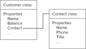
Now suppose our user interface for a customer also needs to show the name and phone number of the Contact for that customer. The following XAML defines two TextBlock elements that include bindings to that information:
<TextBlock Text="{Binding Path=Contact.Name}" . . . /> <TextBlock Text="{Binding Path=Contact.Phone}" . . . /> In this case, the Path setting for the binding is not a simple property. It is, in effect, a property of a property. The Path of a Binding can be set using dot syntax to chain together the required references to get to the final property value needed.
This example only went two levels deep on the path. A Path setting can have any number of levels.
One of the most common reasons to use a multilevel path for a binding is working with a property that is a date. Suppose you have a date property called DatePublished, and you want to bind to the month or year of the date. You would need binding paths that looks something like the following:
<TextBlock Text ="{Binding Path=DatePublished.Month}" . . . /> <TextBlock Text ="{Binding Path=DatePublished.Year}" . . . /> Working with Data Bindings in Code
So far, all the data bindings you've seen have been set up in XAML. Data binding can also be set up and managed in code. The objects that handle the binding process, including the Binding object and various helper objects such as value converters, can be instantiated and managed in code just as any other .NET object can be.
You should create your data bindings declaratively in XAML most of the time, but there are situations where that is impractical or impossible. For example, if you are creating highly dynamic user interfaces, the information needed to set up the binding might not be known until runtime. Since XAML is static and completely set when the program starts, any such dynamic management of bindings must be in code.
Creating a data binding in code is not difficult, though the syntax is more complex than the equivalent XAML. You must instantiate the binding, set its properties, and finally tie the binding to the appropriate property. Here is a code sample that creates a binding of a Text property on a TextBox to a Balance property:
Dim b As New Binding b.Path = New PropertyPath("Balance") BalanceTextBox.SetBinding(TextBox.TextProperty, b) The Path property of the binding can't just be set to a string. The Path property is of type PropertyPath, so it must be set to a PropertyPath instance. When declaring a binding in XAML, the PropertyPath instance is created automatically via a TypeConverter, but you must create it yourself if you create the binding in code.
To tie the binding to the target property, the SetBinding method of the XAML element is used. The identifier for the property is Shared/Static member of the class for the element. That is, to refer to the Text property of BalanceTextBox, you use TextBox.TextProperty.
You may set as many properties on the binding in code as you need. The same properties available in XAML (Mode, ElementName, etc.) are all available in code.
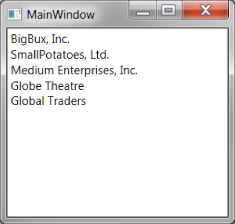
. A ListBox showing a list of Customer objects, without a data template or DisplayMemberPath set. This example is rendered in WPF on Windows 7
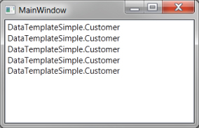
A ListBox showing a list of Customer objects, without a data template or DisplayMemberPath set. This example is rendered in WPF on Windows 7

Windows Forms developers have seen this problem before. Since the ListBox does not know how the render the item, each item is displayed by calling the ToString method of the item and showing the returned value. If the ToString method is not overridden in a class, it returns the name of the type for an object. Since the items in the bound list are Customer objects, you get the result in .
The solution will also be familiar to Windows Forms developers. The ListBox has a property to specify where the item's string comes from. The property is named DisplayMemberPath, and you set it to a property or property path on your data object. If you set DisplayMemberPath in the Visual Studio Properties window to “Name,” then the ListBox will look more like .
The same ListBox as in , with DisplayMemberPath set to show the customer's name. This example is rendered in WPF on Windows 7
However, DisplayMemberPath is rarely used in XAML production applications nearly as often as it is in Windows Forms. There's nothing wrong with it; it's just that there are better options in XAML. Once you see these options, you'll understand why they're better.
Data Templates
Instead of just displaying a simple string for each item, you can supply a ListBox with a template that describes how you want the item laid out. Then the ListBox can use the template whenever it needs to display an item. That kind of template is called a data template.
You can think of a data template as a pattern for each item in the ListBox. It specifies the controls that will be shown, how they are laid out, and where each control gets its information through data binding. Then, when an item needs to be rendered, the pattern is used to create a XAML element to display the item.
A data template in XAML is an instance of the DataTemplate element, and contains a tree of elements, just as a Window or Page does. Usually, that tree of elements is defined in XAML. A DataTemplate instance normally has a root container, such as a Border, Grid, or StackPanel, to hold other controls. That panel can then contain XAML controls such as TextBlocks and Images. All of the features you've seen previously for laying out controls in panels are also available in a data template.
Using data binding, the controls in a data template can display any information that comes from a data object. The data object is the actual item in the ListBox; the data template is just the pattern used to transform the item into a visual representation.
The ListBox has an ItemTemplate property that is used to set the desired data template for the ListBox. The data type of the property is DataTemplate. You can create such a DataTemplate right in the XAML definition for a ListBox.
Here is an example of a ListBox with a simple data template for display of records in our list of customers (code file: ListBoxWithTemplate.xaml):
<ListBox ItemsSource="{StaticResource CustomerList}" Name="CustomerListBox" HorizontalContentAlignment="Stretch"> <ListBox.ItemTemplate> <DataTemplate> <Border Margin="3" Padding="3" BorderBrush="Blue" BorderThickness="2" CornerRadius="4"> <StackPanel> <TextBlock Text="{Binding Name}" /> <TextBlock Text="{Binding ContactName}" /> <TextBlock Text="{Binding Phone}" /> </StackPanel> </Border> </DataTemplate> </ListBox.ItemTemplate> </ListBox> Notice that the DisplayMemberPath setting discussed earlier is not present. You cannot include both a data template and a DisplayMemberPath setting in the same ListBox at the same time.
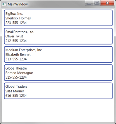
The ItemTemplate property is set to a DataTemplate instance. The DataTemplate instance contains a Border as the root element, which will cause each item in the ListBox to have a border around it. Inside the Border is a StackPanel which contains three TextBlocks. Each TextBlock is data bound to a different property of a Customer object.
shows the output of such a program in Windows 8, and shows the output of the same XAML in WPF/Windows 7. The two ListBox results are quite similar, with the main differences being the lack of window chrome in Windows 8, and a different default font.
A ListBox with a simple data template for Customer objects, rendered in WPF on Windows 7
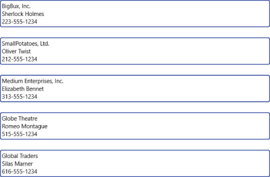
A ListBox with a simple data template for Customer objects, rendered in Windows 8 XAML
There is one other subtlety to note. The items are all the same width. That is done in WPF by setting the HorizontalContentAlignment property of the ListBox to Stretch. However, in Silverlight and Windows 8, a different technique is needed, involving a property of the ListBox called ItemContainerStyle. That syntax will be shown later in this chapter, after discussing Styles.
This is an interesting advance over list boxes in ASP.NET and Windows Forms, even with a very simple data template. However, a data template can have a layout as complex as you wish. You can set various properties, such as fonts and colors, for the various controls in the template. Or you could use a Grid instead of a StackPanel and gain more control over positioning of the controls used in the data template.
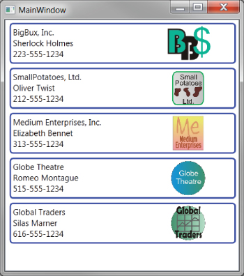
Let's look at a somewhat more interesting data template. The Customer object has a property for a logo. It's a string property that points to a file name. Loading an Image at the bottom of the StackPanel wouldn't look very nice, and there's all that lovely room on the right side of the item that is currently unused. Let's fix the data template to use a Grid as the root element, and set up the Grid to place the Image on the right (code file: CustomerDataTemplate.xaml):
<DataTemplate> <Border Margin="3" Padding="3" BorderBrush="Blue" BorderThickness="2" CornerRadius="4"> <Grid> <Grid.ColumnDefinitions> <ColumnDefinition /> <ColumnDefinition Width="100" /> <ColumnDefinition Width="15" /> </Grid.ColumnDefinitions> <StackPanel> <TextBlock Text="{Binding Name}" /> <TextBlock Text="{Binding ContactName}" /> <TextBlock Text="{Binding Phone}" /> </StackPanel> <Image Height="50" Grid.Column="1" Source="{Binding Logo}" /> </Grid> </Border> </DataTemplate> Now the ListBox will look more like when rendered in Windows 8, and like when rendered in WPF/Windows 7.
A ListBox with a data template for Customer objects, including an Image control for the logo, rendered in Windows 8 XAML
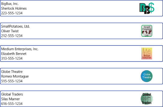
A ListBox with a data template for Customer objects, including an Image control for the logo, rendered in WPF on Windows 7
Data Binding in Data Templates
In the previous section on Data Binding, you discussed several data binding capabilities, such as value conversion. The bindings in a data template are just regular bindings, and can take advantage of any of those capabilities.
For example, suppose you wanted some visual signal in an item to reflect the customer's balance. For example, the background of an item could be changed if the customer had a negative balance. In this case, the Background property of the Border element would be bound to the Balance property of the Customer, with a value converter that could peek at the Balance and return an appropriate Brush. That value converter would be very similar to the QuantityToBrushConverter example covered earlier.
Items in ListBox elements are also a good place to use RelativeSource bindings. Suppose, for example, you wished to have only the logo image appear if the customer was selected. The ListBoxItem class has an IsSelected property, which is Boolean. However, to use a parent ListBoxItem as a data source, the binding must be able to locate it.
That's one of the functions of a RelativeSource binding. In this case, you don't know the name of the ListBoxItem, but you do know where it is—namely, up the tree from the items in the data template. You'll see the syntax to apply a RelativeSource binding, which locates the ListBoxItem, in just a moment. First, though, there's one other concern you need to address.
The IsSelected property is a Boolean, but the Visibility property of the Image is of type Visibility. As you saw earlier, that property type can take values of Visible or Collapsed. (WPF has an additional value of Hidden.) To bind a Boolean property to a Visibility property, a value converter is needed.
In WPF, that value converter is built in, and is called, naturally enough, BooleanToVisibilityConverter. Silverlight and Windows 8 XAML lack that built-in converter, but it's quite easy to write one. It looks like this (code file: BooleanToVisibilityConverter.vb):
Public Class BooleanToVisibilityConverter Implements IValueConverter Public Function Convert(value As Object, … If CBool(value) Then Return Visibility.Visible Else Return Visibility.Collapsed End If End Function Public Function ConvertBack(value As Object, … If CType(value, Visibility) = Visibility.Visible Then Return True Else Return False End If End Function End Class
Again, ellipses are used to deal with the differing method signatures in Windows 8 XAML vs. WPF and Silverlight.
You can create an instance of this converter as a resource, giving it a key of “B2VConverter”:
<local:BooleanToVisibilityConverter x:Key="B2VConverter" />
Then you can create the RelativeSource binding you need to make the logo visible only for a selected Customer, but changing the Image element in the earlier DataTemplate to look like this:
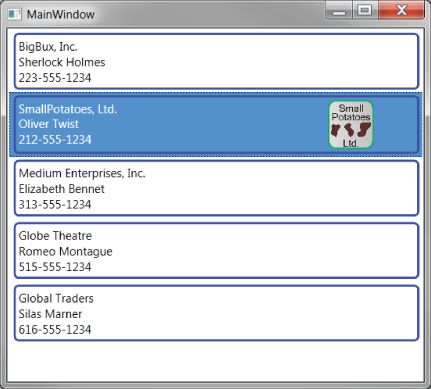
<Image Height="50" Grid.Column="1" Source="{Binding Logo}" Visibility="{Binding RelativeSource={RelativeSource FindAncestor, AncestorType=ListBoxItem, AncestorLevel=1}, Path=IsSelected, Converter={StaticResource B2VConverter}}" /> The result rendered in WPF would look like , with only the selected item showing the logo.
A ListBox with a data template for Customer objects, including an Image control for the logo. It is rendered in WPF on Windows 7
Switching between Data Templates
Designing user interfaces can be frustrating, because you usually have a wide range of users. What works best for one type of user might not work well for another type. One of XAML's strengths is to give more options for dealing with that challenge.
You have seen two different data templates for the Customer object, one that includes the logo and a simpler one that does not. Neither of these templates is particular well designed; they're intended simply to demonstrate the syntax of data templates. However, let's pretend that they're both worthy templates for different situations. Some users like the richer template with the logo, while others prefer the simpler template.
You can provide users a means to switch between the two templates. Each template is just an object instance of a DataTemplate class. The ListBox has an ItemTemplate property that points to the currently used data template. While our examples set the ItemTemplate property in XAML, there's nothing stopping us from setting it in code.
However, you need to be able to locate data templates to use them in code. If you know what resource dictionary the data templates are defined in, that's easy.
Let's run through an example that does all this.
First, you'll need to place both our data templates in the Resources property of the UserControl. The XAML for that is exactly the same as the earlier XAML for our two data templates, except that each template needs an x:Key. The template with the logo will get the key “TemplateWithLogo” and the other one will get “TemplateWithoutLogo.” Here are those resource declarations (code file: TwoDataTemplates.xaml):
<DataTemplate x:Key="TemplateWithLogo"> <Border Margin="3" Padding="3" BorderBrush="Blue" BorderThickness="2" CornerRadius="4"> <Grid> <Grid.ColumnDefinitions> <ColumnDefinition /> <ColumnDefinition Width="100" /> <ColumnDefinition Width="15" /> </Grid.ColumnDefinitions> <StackPanel> <TextBlock Text="{Binding Name}" /> <TextBlock Text="{Binding ContactName}" /> <TextBlock Text="{Binding Phone}" /> </StackPanel> <Image Height="50" Grid.Column="1" Source="{Binding Logo}"/> </Grid> </Border> </DataTemplate> <DataTemplate x:Key="TemplateWithoutLogo"> <Border Margin="3" Padding="3" BorderBrush="Blue" BorderThickness="2" CornerRadius="4"> <StackPanel> <TextBlock Text="{Binding Name}" /> <TextBlock Text="{Binding ContactName}" /> <TextBlock Text="{Binding Phone}" /> </StackPanel> </Border> </DataTemplate> To arrange switching between the templates, you could use two Button elements, a CheckBox, a ComboBox, or various other possibilities for user interaction. To keep our example simple, let's assume it's a CheckBox. One of the templates will be used when the CheckBox is checked and the other when it is unchecked.
The declaration for the CheckBox would look something like this:
<CheckBox VerticalAlignment="Bottom" IsChecked="True" Checked="CheckBox_Checked" Unchecked="CheckBox_Checked" Content="Use template with logo" />
The event handler referenced in this XAML, plus a helper routine, would look something like this (code file: SwitchDataTemplates.vb):
Private Sub CheckBox_Checked(sender As System.Object, e As System.Windows.RoutedEventArgs) If CType(sender, CheckBox).IsChecked Then CustomerListBox.ItemTemplate = GetDataTemplate("TemplateWithLogo") Else CustomerListBox.ItemTemplate = GetDataTemplate("TemplateWithoutLogo") End If End Sub Private Function GetDataTemplate(sName As String) As DataTemplate If Me.Resources.Contains(sName) Then Return CType(Me.Resources.Item(sName), DataTemplate) Else Return Nothing End If End Function This code could stand some hardening, but it demonstrates the concept. As soon as the CheckBox is checked or unchecked, the appropriate template is located in the resources collection, and applied to the ItemTemplate property of CustomerListBox.
Changing Layout of ListBox Items with ItemsPanel
Befitting the philosophy of XAML, a ListBox doesn't really know how to stack up items. It only stacks items by default because it contains a variant of a StackPanel inside. The special StackPanel used by a ListBox is called a VirtualizingStackPanel, and has special rendering logic for long lists.
The default VirtualizingStackPanel can be replaced. For example, if you would like the items in your ListBox to stack horizontally instead of vertically, you can change the panel used for stacking to a StackPanel with Orientation set to Horizontal.
The panel used to arrange items is set with the ItemsPanel property of the ListBox. Here is a ListBox with the ItemsPanel property modified to use a horizontal StackPanel:
<ListBox.ItemsPanel> <ItemsPanelTemplate> <StackPanel Orientation="Horizontal" /> </ItemsPanelTemplate> </ListBox.ItemsPanel>
Any available panel can be used as a layout panel for a ListBox, though some of them require additional work to get items properly positioned. The code download for this chapter includes a ListBox in WPF that uses a Canvas as a layout panel.
Additional ItemControls
As mentioned at the start of this section, the ListBox was used to discuss concepts that apply to all ItemControls. Each XAML platform has other ItemControls, and all of them use DataTemplates for determining layout of their items.
Examples of other ItemControls on the various XAML platforms include ComboBox, TreeView, ListView, ContextMenu, and DataGrid. If you understand how data templates work, you should have no difficulty in applying that understanding to any of these controls.
shows such a ListBox. A ListBox in which the items are ragged
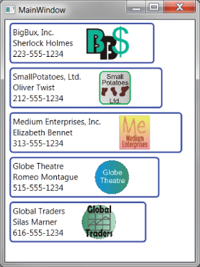
A ListBox in which the items are ragged

In WPF, this is easy to remedy. Just set the HorizontalContentAlignment of the ListBox to Stretch. However, for Silverlight and Windows 8 XAML, that technique will not work.
The difficulty in this situation is that the ListBoxItem elements that need to be stretched are not created until runtime. Therefore, there is no place in XAML to set the HorizontalContentAlignment for them.
This is just one example of a scenario in which it's desirable to affect the ListBoxItems that will be created at runtime. To provide that capability, the ListBox includes a property named ItemContainerStyle. That property holds a Style with any number of Setter objects, and the Style is automatically applied to all ListBoxItem elements that are created at runtime.
The ItemContainerStyle that will make ListBoxItem elements stretched looks like this:
<ListBox.ItemContainerStyle> <Style TargetType="ListBoxItem"> <Setter Property="HorizontalContentAlignment" Value="Stretch" /> </Style> </ListBox.ItemContainerStyle>
shows our reskinned CheckBox, in both unchecked and checked states. On the left is the unchecked state. On the right is the checked state. The top of the microphone is maroon in the checked state. The rendering is the same on Windows 8 and WPF if the background is the same. A CheckBox reskinned with a control template to look like a microphone

A CheckBox reskinned with a control template to look like a microphone

Here is the XAML for the CheckBox (code file: MicrophoneCheckBox.xaml):
<CheckBox IsChecked="True" Height="120" Width="40"> <CheckBox.Template> <ControlTemplate TargetType="CheckBox"> <Grid> <Grid.RowDefinitions> <RowDefinition /> <RowDefinition /> <RowDefinition /> </Grid.RowDefinitions> <Grid > <Grid.RowDefinitions> <RowDefinition /> <RowDefinition /> </Grid.RowDefinitions> <Ellipse Grid.RowSpan="2" Fill="Gray" /> <Ellipse Grid.RowSpan="2" Fill="Maroon" Visibility="{Binding RelativeSource={RelativeSource TemplatedParent}, Path=IsChecked, Converter={StaticResource B2VConverter}}" /> <Rectangle Grid.Row="1" Fill="Gray" /> </Grid> <Rectangle Grid.Row="1" Fill="Black" /> <Grid Grid.Row="2" > <Grid.RowDefinitions> <RowDefinition /> <RowDefinition /> </Grid.RowDefinitions> <Grid.ColumnDefinitions > <ColumnDefinition /> <ColumnDefinition /> <ColumnDefinition /> </Grid.ColumnDefinitions> <Rectangle Grid.Column="1" Fill="Black" /> <Rectangle Grid.Row="1" Grid.ColumnSpan="3" Fill="Black" /> </Grid> </Grid> </ControlTemplate> </CheckBox.Template> </CheckBox> This XAML may look a bit complex at first, but you have seen all the techniques it uses in this chapter. The root of the control template is a Grid with three rows. In the first row, another Grid contains two circles and a rectangle.
One of the circles is Maroon, and its visibility is tied to the control's IsChecked property by a data binding. That binding requires a converter for changing a Boolean to a Visibility value, and you saw such a converter in the section on data templates. When the CheckBox is clicked, the IsSelected property changes, and the binding ties that change to a change in the visibility of the Maroon circle.
In the second row, another rectangle extends the “microphone” down a bit further. Then, in the third row, a Grid with some Rectangle elements draw a “base” for the “microphone.”
This control template works equally well in Windows 8, and it can be resized. The interior elements will change size proportionally, because the control template is based on Grid elements with proportional rows.
Creating Control Templates
It is beyond the scope of this chapter to get into several other concepts and techniques commonly used for control templates. The main area that's being left out is the use of visual states to change the control's appearance under various circumstances. XAML contains a VisualStateManager for that capability. The preferred tool for working with the VisualStateManager is Expression Blend.
Summary
This chapter has covered the most important concepts and capabilities needed by a beginning XAML developer. However, there is still much to know to take complete advantage of what XAML can do.
Chapter 13 goes into more detail on using XAML in Windows 8. If your preferred platform for XAML will be Windows 8, that chapter should be your next step.
If you will be doing WPF or Silverlight development, then you will need to turn to other resources to go more in-depth on XAML. Some of the topics that you should learn next include:
- Additional panels: WrapPanel, Canvas
- Additional controls: TabControl, DataGrid, TreeView, etc.
- Transforms
- Animation
- VisualStateManager
- Using the visual designers in Visual Studio and Expression Blend
Later, you may need to cover some advanced concepts. If you will be writing XAML frameworks, for example, you will need to be quite familiar with the dependency property system, attached properties, and other internal aspects of XAML.

